
Manage a Giving Microsite Campaign

The default options are prepopulated for your convenience. You can customize the interface as needed and then select the Save button to save your changes. Before using the Giving microsite, ensure you have the prerequisites.

Understand the Giving Microsite Builder Interface

This interface provides a centralized workspace to design and manage your Giving Microsite campaign pages. You can use the Pages tab to configure project settings and navigate between pages, the center canvas to build and preview content, and the Styles tab to customize styles and colors. The Action Region is an editable area of the microsite where administrators add and arrange content sections such as images, text, leaderboards, donation widgets, and campaign progress components. It helps organize the page layout and control the order in which content is displayed to visitors. The top toolbar lets you save, preview, and publish your work once your setup is complete.
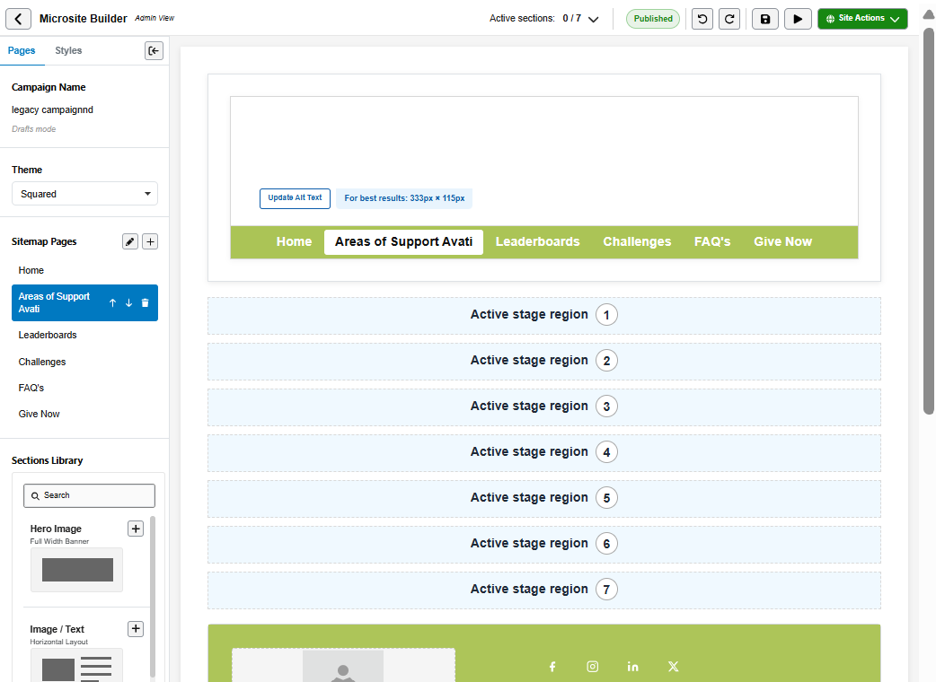
Giving-microsite-builder-main-screen.png

Customize the Giving Microsite

To create and customize the Giving Microsite:

  1. Configure the Action stage region with Pages tab.

  2. Configure the Styles.

  3. Manage Giving Microsite publication.

Pages Tab

This interface allows institutions to configure and build a customizable project by defining its structure, theme, and content. It provides tools to manage pages, add pre-designed sections, and organize the layout for a complete and functional experience.

Table 13. Interface- Pages Tab

Side Bar Menu

Function

Options

Actions to take

Project Name

The project is not yet published.

Drafts mode

You can change the project name.

Theme Settings

Theme Selected:

This defines the overall visual style/layout of the project.

  • Squared

  • Rounded

You can select your theme based on your preference.

Sitemap Pages

These pages are configured in the sitemap (navigation structure)

  • Home (currently selected)

  • Areas of Support

  • Leaderboards

  • Challenges

  • FAQ's

  • Give Now

You can:

  • Edit the existing pages

  • Add new pages

  • Lock the pages

  • Move the position of pages as they appear on the menu

  • Delete any page excepting the Home page

Sections Library

This library allows adding pre-designed content blocks to pages. Search field available to find sections quickly.

  • Hero Image

    Layout Type: Full-width layout, Single section spanning the entire container width, Typically includes a large image or visual banner, often with overlay text or call-to-action. You can drag, clone, move up, move down, hide, delete, update Alt Text, and Click to upload the hero image. It is recommended to use an image of 1600px x 800px resolution.

    Use Cases:

    - Homepage header to create a strong first impression

    - Highlighting promotions, announcements, or key campaigns

    - Introducing a product, service, or brand message

    - Landing pages where immediate visual impact is important

    - Event banners or seasonal messaging

  • Image / Text Horizontal Layout

    Layout Type: Two-column layout, Image and text placed side-by-side (left-right alignment), Responsive stacking on smaller screens (usually image above or below text). You can drag, clone, move up, move down, hide, delete, update Alt Text, and Click to upload the hero image. It is recommended to use an image of 605px x 340px resolution.

    Use Cases:

    - Product or feature descriptions where visuals support content

    - Storytelling sections (e.g., “About Us”)

    - Step-by-step explanations with accompanying visuals

    - Marketing sections highlighting benefits or features

    - Case studies where image and explanation need equal emphasis

  • Image / Text Vertical Layout

    Layout Type: Single-column stacked layout, Image placed above text (or vice versa), Linear, scroll-based content flow. You can drag, clone, move up, move down, hide, delete, update Alt Text, and Click to upload the hero image. It is recommended to use an image of 1270px × 800px.

    Uses Cases

    - Blog-style or article content sections

    - Mobile-friendly content blocks Detailed descriptions where reading flow is primary

    - Showcasing visuals followed by explanation or captions

    - Educational or informational pages

  • Text Full Width Horizontal Layout

    Layout Type: Horizontal Layout. You can drag, clone, move up, move down, hide, delete, update Alt Text, and Click to upload the hero image. You can drag, clone, move up, move down, hide, delete and Click to upload the hero image.

    Use Cases:

    - Display a campaign introduction on Home page

    - Add a single key message or announcement

  • Text + Countdown with Timer Element. You can drag, clone, move up, move down, hide, delete and Click to upload the hero image.

    Layout Type: With Timer Element

    Use Cases:

    - Show time remaining until campaign ends

    - Highlight deadline for matching gifts or challenges

  • Leaderboard Top Contributors. You can drag, clone, move up, move down, hide, delete and Click to upload the hero image.

    Layout Type: Structured Content Display

    Use Cases:

    - Show top donors or teams on Leaderboards page

    - Highlight competition standings in fundraising challenges

  • Text + Campaign Progress

    Layout Type: Text with Progress Indicator. You can drag, clone, move up, move down, hide, delete, update Alt Text, and Click to upload the hero image.

    You can also configure campaign progress by selecting the settings icon. Configuration options are:

    Goal Type- Choose how progress is measured. Options:

    - Monetary Amount (currently selected)- Tracks progress based on total funds raised.

    - Number of Unique Donors- Tracks progress based on the count of individual donors.

    Goal Amount- Displayed when the Goal Type is set to Monetary Amount. Numeric input field, must be a positive whole number, accepts 1 to 8 digits, no decimals allowed. Set the target amount/count.

    Donor Goal- Displayed when the Goal Type is set to Number of Unique Donors. Numeric input field, must be a positive whole number, accepts 1 to 8 digits, no decimals allowed.

    Designation- Used to associate the campaign progress widget with a specific designation, fund, cause, or giving area.

    Use Cases:

    - Display percentage of goal achieved

    - Highlight progress toward a specific milestone

    - Configure how campaign progress is measured and displayed, either by fundraising amount or by the number of unique donors

    - Track overall campaign goals or goals tied to a specific designation, fund, or cause

  • RSS Feed News & Updates, You can drag, clone, move up, move down, hide, delete, update Alt Text, and Click to upload the hero image. You can also add Feed URL by selecting the settings icon.

    Category: News & Updates

    Use Cases:

    - Show live campaign updates during a Day of Giving event

    - Integrate a university/news blog feed to keep content fresh

    - Highlight media coverage or press mentions

    - Provide ongoing engagement content without manual updates

  • Text + Donor Roll Text section adjacent to (H2), You can drag, clone, move up, move down, hide, delete, update Alt Text, and Click to upload the hero image.

    Layout Type: Text with donor list (H2 section heading)

    Use Cases:

    - Display recent donors in real time

    - Highlight major contributors or sponsors

    - Create a “Wall of Gratitude” section

    - Encourage giving by showing peer participation (“others are donating”)

  • Donation Buttons

    Use Cases:

    - Offer preset donation tiers (e.g., ₹500, ₹1000, ₹5000)

    - Create targeted giving levels (e.g., “Sponsor a student”, “Fund a meal”)

    - Enable quick mobile donations without manual entry

    - Support campaign-specific asks (e.g., “Give ₹100 for 100 donors challenge”)

  • Designation Progress + Indicator Goal & Progress Bar

    Layout Type: Progress Tracking / Status Dashboard

    Use Cases:

    - Display employee promotion or career progression status

    - Track certification or training completion

    - Show onboarding progress for new hires

    - Visualize achievement milestones or goal completion

    - Indicate workflow stage completion in HR or business processes

  • Footer Brand, social links & CTA

    Layout Type: Progress Tracking / Status Dashboard

    Use Cases

    - Display company branding and logo.

    - Provide social media links

    - Include contact information

    - Add call-to-action (CTA) buttons such as Contact Us, Subscribe, or Learn More

    - Show copyright, legal, privacy policy, and terms links

    - Provide secondary navigation links

You can drag and drop pre-designed content blocks to design a specific page or add using the "+" button


Styles Tab

This section enables users to define the global visual styling of the project, ensuring consistency across all pages and components. It centralizes typography and color settings so design updates can be applied quickly and uniformly.

Table 14. Interface- Styles Tab

Side bar menu

Function

Options

Actions to take

Global Text Styles

The Global Text Styles options control how different text elements (H1–H5 headings, body text, and links) appear across the entire project.

  • Headings (H1–H5) and Body text

  • Style controls: Bold (B), Italic (I), Color selector and Font size (numeric input)

Adjust font weight (bold), style (italic), color, and size so that all text maintains a consistent look without needing manual updates in each section.

Global Colors

The Global Colors options define the primary and secondary color palette used throughout the project.

  • Primary color (used for buttons, highlights, key actions)

  • Secondary color (used for accents and supporting elements)

Select the primary color for buttons, highlights, key actions


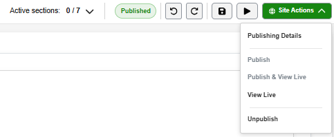
Top Toolbar

The top navigation bar of a campaign is designed for administrators to configure and manage a fundraising or campaign page.
Giving-microsite-builder-main-screen-header.png

On the right side, there is a series of action buttons:

  • Active stage - You are currently viewing/editing Stage 1. There are 7 total stages/pages configured in the microsite. Active stages are visible to site visitors.

  • Hidden stage - You are currently viewing/editing Hidden Stage 2. Hidden stages exist in the microsite but are not displayed to visitors until they are activated or published.

  • Undo icon - Reverses the last change made in the builder

  • Redo icon - Reapplies a previously undone change

  • Save button - Stores current changes

  • Preview button (with a play icon) - View the campaign before publishing

  • Site Actions button (highlighted in green) - Indicates the action to make the campaign live

    - Publishing Details: Takes you back to Giving Microsite Builder dashboard.

    - Publish: Makes the page/content live and accessible to visitors.

    - Publish & View: Publishes the content and immediately opens the live version in a new tab/window so you can verify it.

    - View Live: Opens the currently published version of the page without making any new changes live.

    - Unpublish: Removes the page/content from public view while keeping it in the system for future editing or republishing. This option is enabled only when you select a microsite that has a live status.