Email Campaign Comparison
Email Campaign Comparison helps admins quickly compare engagement results across multiple recently deployed email campaigns without exporting data. You must compare at least 2 campaigns and no more than 5. You can view key metrics side-by-side along with charts that highlight engagement trends and differences between campaigns.
Access Method
Navigate to Encompass Admin > Email > Email Reporting.
In Email Reporting, locate the Recently Deployed Emails section. Note: Optionally, you can use existing filters (such as date range or category) or the text search feature to narrow down the campaigns you want to compare.
How to Compare Email Campaigns
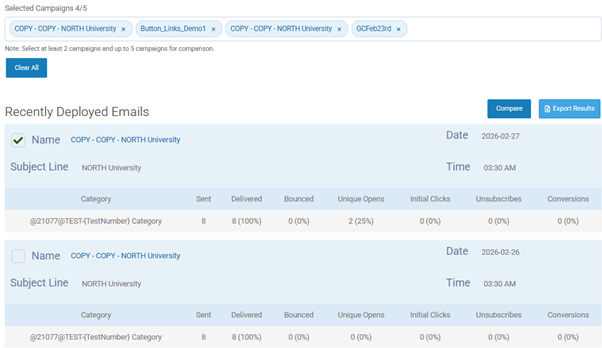
In the Recently Deployed Emails section, use the checkbox next to each campaign name to select it.
Select at least 2 campaigns.
Note: You must compare at least 2 campaigns and no more than 5. Once 5 campaigns are selected, you cannot add a 6th until one is deselected.
Select Compare button. The Email Campaign Comparison view is displayed on the screen.
How to Explore the Campaign Comparison View
Comparison table (side-by-side metrics)
At the top of the comparison view, you will see a table that includes the following columns:
Campaign Name
Date Sent
Sent
Delivered
Opens
Clicks
Conversions
Open Rate
Click Rate
Conv Rate
This table provides a quick, high‑level overview of each selected campaign’s performance.
How to Read Charts in the Comparison View
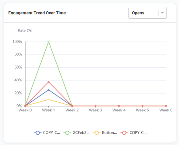
Engagement Trend Over Time (line chart)
This chart helps you compare the following across the selected campaigns using a consistent timeline:
Opens
Clicks
Conversions
Campaigns are aligned so you can view performance side-by-side as though they started on the same day, making it easier to see which campaign gained the most engagement over time.
The comparison view displays a 6‑week line chart, helping you distinguish between campaigns that performed strongly right away and those that gradually built engagement over time.
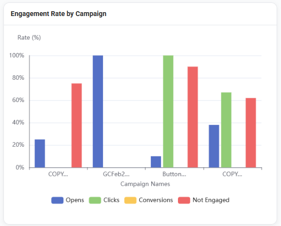
Engagement Rate by Campaign (bar chart)
This chart provides a visual comparison of engagement across campaigns using a bar chart format. It displays the following for users for each campaign.
Opens
Clicks
Conversions
Not Engaged
You can toggle individual metrics on or off within the chart to focus your analysis (for example, viewing only clicks and conversions).
Best Practices
Compare campaigns with similar audiences or goals to gain clearer insights.
Use the table and charts to quickly identify outliers (campaigns that performed unusually well or poorly).
Toggle chart metrics on or off to focus your analysis on what matters most (for example, clicks and conversions).