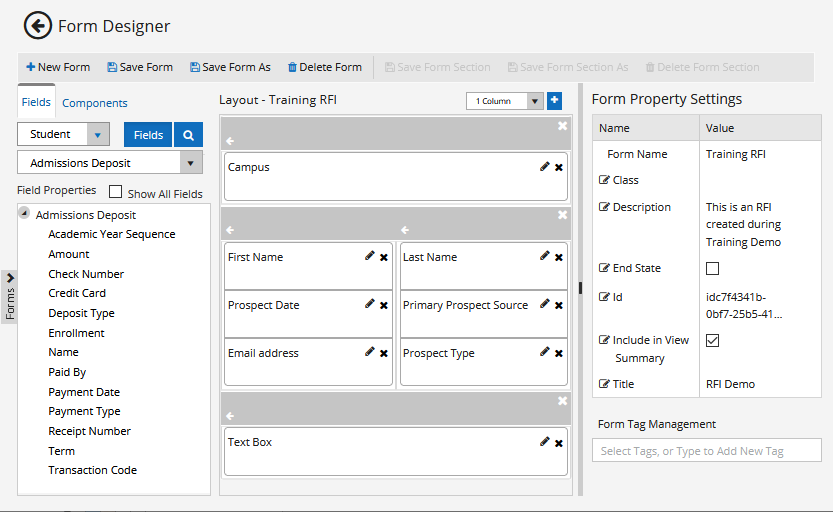
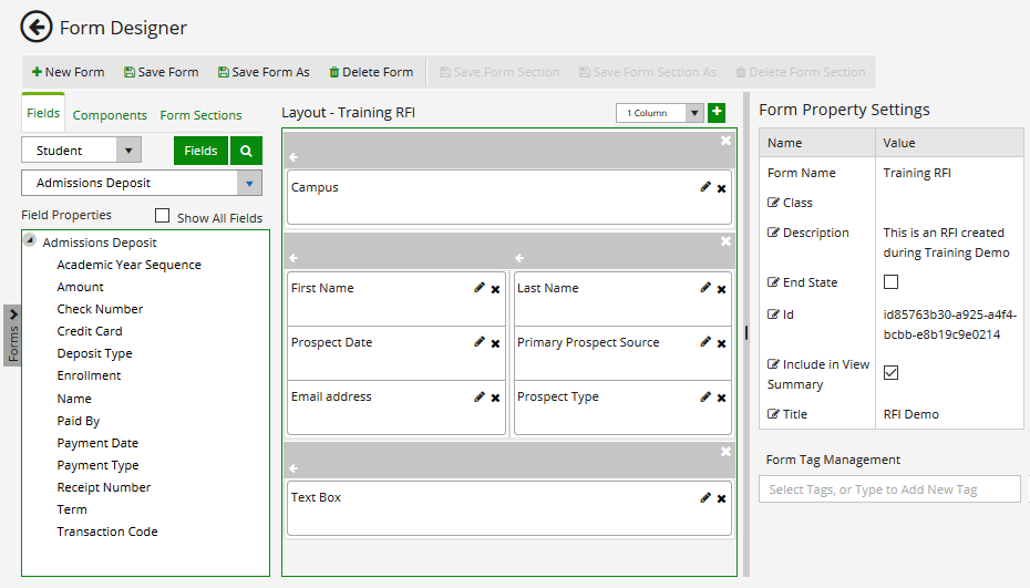
Form Designer
The Form Designer workspace is displayed when you select the Form Designer tile in the home page. This workspace enables you to create and edit forms. The workspace presents database entities with associated fields and custom controls available for the form design. 
| Element | Description |
|---|---|
 |
Return to the Forms Builder home page. |
|
Create a new form and clear the Layout pane. On the initial entry to the page, the Layout pane is disabled until New Form is selected. |
|
Save a form.
This button is enabled only if a form is selected. When you click the Save button, the Unsaved Changes Dialog is displayed. The form is validated before it is saved. See Validation on Form Save. |
|
Save a form with a different Form Name, Title, Description, or End State. This button is enabled only if a form is selected. |
|
Delete a form. This button is enabled only if a form is selected. See Delete Forms. |
|
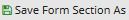
Save a form section.
This button is enabled only if a control or form section is selected in the Layout pane. The Unsaved Changes dialog is displayed prompting you to specify the Form Section Name (required), Title (optional), and Description (optional). The Title, if assigned, appears on the section divider in the Layout pane. See Form Sections. |
|
Save a form section with a different Form Section Name, Title, or Description. This button is enabled only if a form section is selected. |
|
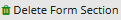
Delete a form section. This button is enabled only if a form section is selected. |
| Forms (flyout) | |
|
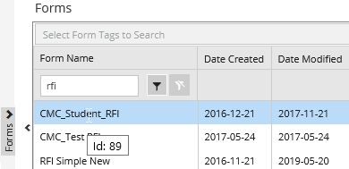
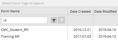
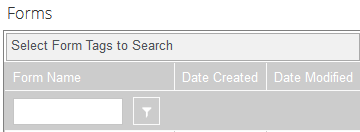
Click the vertical tab on the left to access saved forms. The list of all saved forms is folded out. The Forms flyout provides the following search and filter options:
When you hover over a form name, the form Id is displayed. When you select a form:
|
| Fields Tab | |
| Click the Fields tab to access controls for database fields. When you click a control in the Layout pane, the Property Settings pane shows the attributes for the selected control. You can edit the attribute values. For more information, see Fields. | |
|
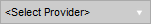
Use this drop-down list to select the product that provides the database. The drop-down list is not displayed if only one database provider is available. The options are CRM and Student. Depending on the selected option, the Entities drop-down list will contain the entities associated with the data source. |

|
Click the Fields button and select an entity in the drop-down list below the Fields button to populate the Field Properties pane. Click the search tool to locate database fields. The entered search/filter string not only lists properties (fields) that match what is entered but will also include any entities that contain the entered string. Enter at least 3 characters of a field name. The Field Properties pane will display the fields found in the database. The fields are categorized by entities. |
|
Select an entity from the drop-down list. The Field Properties pane will list the available fields for the selected entity. For more information, see Anthology Student Entities and CampusNexus CRM Entities. |
|
The Show All Fields check box controls whether a subset or the entire list of fields (categorized by entities) in the CampusNexus data model is exposed. The Show All Fields check box is cleared by default. When cleared, a prescribed list of entities is exposed. The prescribed list of entities was determined by analysis of the fields available in Forms Builder 2.x. The prescribed list of entities is aligned as much as possible with what is exposed in Forms Builder 2.x.
|
|
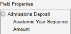
The Field Properties pane displays the fields available for a selected entity. Depending on the selected entity, navigation properties may be available. Navigation properties signify a relationship between the selected entity and another entity in the data model. Click Drag items from the Field Properties pane into the Layout pane to build a form. When a field is brought into focus (click the item in the Layout pane), the Property Settings pane is refreshed and shows the attributes for the selected field. |
| Components Tab | |
Click the Components tab to access custom controls. When you click a control in the Layout pane, the Control Property Settings pane shows the associated properties. You can edit the property values. When you save a form, any custom controls (and their property values) are persisted with the rest of the form data if the custom controls are bound to an In/Out argument in the workflow using the Model property. For more information, see Components. |
|
| Form Sections Tab | |
| Click the Form Sections tab to access form sections. Form sections contain fields and components that are reused in multiple forms. For more information, see Form Sections. | |
| Layout Pane | |
| Use the Layout pane to assemble and organize controls/fields and form sections. Drag controls from the Fields and Components tabs or form sections into the Layout pane and rearrange them in the Layout pane. Note: You must drag a control/field over another control. You cannot drag a control over an empty space in the Layout pane. If you drag a control over the top half of an existing control, it will be inserted before the existing control; if you drag it over the bottom half, it will be inserted after. |
|
|
Select the maximum number of columns for a form section (1-12 columns). For more details about the form section design, see Layout Enhancements. The default value for the number of columns in a new form is 1. For a form that was previously saved, the default value for the number of columns is the last value specified when saving the form. |
|
Add a form section. |
|
Remove a form section. |
|
Remove a field. |
|
|
Use this tool to specify an optional short description for each control. This is user information about the purpose of the control. It does not affect the rendered component. Overflow text is visible within the tooltip. |
| Property Settings Pane | |
| The Property Settings pane displays the property settings of a form, control, or form section. Use the slider to the left of the Properties Settings pane to adjust the width of the pane. You can also adjust the widths of the Name and Value columns. |
|
| Form Property Settings | When a form is loaded from the Forms tab, the Property Settings pane displays the form properties including Form Name, Title, etc. These properties are saved with the form. For more information, see Save Forms and Form Properties. When the control or form section properties are displayed, click the form title above the Layout pane to recall the form properties in the Property Settings pane. |
| From Section Property Settings | When a form section is selected in the Layout pane, the Form Section Property Settings are shown. For more information, see Form Sections. |
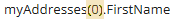
| Control Property Settings | When a control (Field or Component) is selected in the Layout pane, the Control Property Settings are shown. The Property Settings pane exposes the metadata for the selected control. Metadata include default values. Some property values are editable; others are read-only. When a form instance is saved, the property values associated with the controls on that form instance are persisted to the database. For more information, see Control Property Settings. Notation for array variables Array variables in the Property Settings pane of Form Designer use AngularJS notation with "square brackets" []. Example
Array variables in Workflow Composer require VB.NET notation with "rounded brackets" (). Example
|
 to filter the list.
  to expand the navigation property entity.

The Form Designer workspace is displayed when you select the Form Designer tile in the home page. This workspace enables you to create and edit forms. The workspace presents database entities with associated fields and custom controls available for the form design.
The Form Designer workspace is displayed when you select the Form Designer tile in the home page. This workspace enables you to create and edit forms. The workspace presents database entities with associated fields and custom controls available for the form design.
| Element | Description |
|---|---|
|
|
Click the left arrow to return to the Forms Builder home page. |
|
Create a new form and clear the Layout pane. On the initial entry to the page, the Layout pane is disabled until New Form is selected. |
|
Save a form.
This button is enabled only if a form is selected. The Unsaved Changes dialog is displayed prompting you to specify the Form Name (required), Title (optional), Description (optional), and End State (optional). The Title, if assigned, appears on the webpage after a form is rendered. The Title, Description, and Form Name are displayed in the Sequence List. You can search or filter forms in the Sequence List based on Title, Description, and Form Name. Select the End State check box if the form is used as a Confirmation form in a sequence. See Welcome and Confirmation Forms. The form is validated before it is saved. See Validation on Form Save. |
|
Save a form with a different Form Name, Title, Description, or End State. This button is enabled only if a form is selected. |
|
This button is enabled only if a form is selected.Delete a form. For more information, see Delete Forms. |
|
Save a form section.
This button is enabled only if a control or form section is selected in the Layout pane. The Unsaved Changes dialog is displayed prompting you to specify the Form Section Name (required), Title (optional), and Description (optional). The Title, if assigned, appears on the section divider in the Layout pane. See Form Sections. |
|
Save a form section with a different Form Section Name, Title, or Description. This button is enabled only if a form section is selected. |
|
Delete a form section. This button is enabled only if a form section is selected. |
| Forms (flyout) | |
|
|
Click the vertical tab on the left to access saved forms. The list of all saved forms is folded out. The Forms flyout provides the following search and filter options:
When you select a form, the Layout pane displays the form fields, and the Form Property Settings pane shows the form properties. |
| Fields Tab | |
| Click the Fields tab to access controls for database fields. When you click a control in the Layout pane, the Property Settings pane shows the attributes for the selected control. You can edit the attribute values. For more information, see Fields. | |
|
|
Use this drop-down list to select the product that provides the database. The drop-down list is not displayed if only one database provider is available. The options are CRM and Student. Depending on the selected option, the Entities drop-down list will contain the entities associated with the data source. |

|
Click the Fields button and select an entity in the drop-down list below the Fields button to populate the Field Properties pane. Click the search tool to locate database fields. The entered search/filter string not only lists properties (fields) that match what is entered but will also include any entities that contain the entered string. Enter at least 3 characters of a field name. The Field Properties pane will display the fields found in the database. The fields are categorized by entities. |
|
|
Select an entity from the drop-down list. The Field Properties pane will list the available fields for the selected entity. For more information, see Anthology Student Entities and CampusNexus CRM Entities. |
|
|
The Show All Fields check box controls whether a subset or the entire list of fields (categorized by entities) in the CampusNexus data model is exposed. The Show All Fields check box is cleared by default. When cleared, a prescribed list of entities is exposed. The prescribed list of entities was determined by analysis of the fields available in Forms Builder 2.x. The prescribed list of entities is aligned as much as possible with what is exposed in Forms Builder 2.x.
|
|
|
The Field Properties pane displays the fields available for a selected entity. Depending on the selected entity, navigation properties may be available. Navigation properties signify a relationship between the selected entity and another entity in the data model. Click Drag items from the Field Properties pane into the Layout pane to build a form. When a field is brought into focus (click the item in the Layout pane), the Property Settings pane is refreshed and shows the attributes for the selected field. |
| Components Tab | |
Click the Components tab to access custom controls. When you click a control in the Layout pane, the Control Property Settings pane shows the associated properties. You can edit the property values. When you save a form, any custom controls (and their property values) are persisted with the rest of the form data if the custom controls are bound to an In/Out argument in the workflow using the Model property. For more information, see Components. |
|
| Form Sections Tab | |
| Click the Form Sections tab to access form sections. Form sections contain fields and components that are reused in multiple forms. For more information, see Form Sections. | |
| Layout Pane | |
| Use the Layout pane to assemble and organize controls and form sections. Drag controls from the Fields and Components tabs or form sections into the Layout pane and rearrange them in the Layout pane. Note: You must drag a control/field over another control. You cannot drag a control over an empty space in the Layout pane. If you drag a control over the top half of an existing control, it will be inserted before the existing control; if you drag it over the bottom half, it will be inserted after. |
|
|
|
Select the maximum number of columns for a form section (1-12 columns). For more details about the form section design, see Layout Enhancements. The default value for the number of columns in a new form is 1. For a form that was previously saved, the default value for the number of columns is the last value specified when saving the form. |
|
Add a form section. |
|
|
Remove a form section. |
|
|
Remove a field. |
|
|
Use this tool to specify an optional short description for each control. This is user information about the purpose of the control. It does not affect the rendered component. Overflow text is visible within the tooltip. |
| Property Settings Pane | |
| The Property Settings pane displays the property settings of a form, control, or form section. Use the slider to the left of the Properties Settings pane to adjust the width of the pane. You can also adjust the widths of the Name and Value columns. |
|
| Form Property Settings | When a form is loaded from the Forms tab, the Property Settings pane displays the form properties including Form Name, Title, etc. These properties are saved with the form. For more information, see Save Forms and Form Properties. When the control or form section properties are displayed, click the form title above the Layout pane to recall the form properties in the Property Settings pane. |
| From Section Property Settings | When a form section is selected in the Layout pane, the Form Section Property Settings are shown. For more information, see Form Sections. |
| Control Property Settings | When a control (Field or Component) is selected in the Layout pane, the Control Property Settings are shown. The Property Settings pane exposes the metadata for the selected control. Metadata include default values. Some property values are editable; others are read-only. When a form instance is saved, the property values associated with the controls on that form instance are persisted to the database. For more information, see Control Property Settings. Notation for array variables Array variables in the Property Settings pane of Form Designer use AngularJS notation with "square brackets" []. Example
Array variables in Workflow Composer require VB.NET notation with "rounded brackets" (). Example
|
| Element | Description |
|---|---|
| Header | |
 |
Click the product name or the left arrow to return to the Forms Builder home page. |
|
Click  next to the name of the logged in user to Sign Out or to view the About Forms Builder window. next to the name of the logged in user to Sign Out or to view the About Forms Builder window.The About Forms Builder window contains important information about the Version, Connection Strings for database access, Web Client URLs for the Web Clients of Anthology Student and CampusNexus CRM, and the Installation Date. |
|
Access to this Help system. |
|
Create a new form and clear the Layout pane. On the initial entry to the page, the Layout pane is disabled until New is selected. |
|
Save a form.
The Unsaved Changes dialog is displayed prompting you to specify the Form Name (required), Title (optional), Description (optional), and End State (optional). The Title, if assigned, appears on the webpage after a form is rendered. The Title, Description, and Form Name are displayed in the Sequence List. You can search or filter forms based on Title, Description, and Form Name. Select the End State check box if the form is used as a Confirmation form in a sequence. See Welcome and Confirmation Forms. The form is validated before it is saved. See Validation on Form Save. |
|
Save a form with a different Form Name, Title, Description, or End State. |
|
Save a form section.
The Unsaved Changes dialog is displayed prompting you to specify the Form Section Name (required), Title (optional), and Description (optional). The Title, if assigned, appears on the section divider on the Layout pane. See Form Sections. |
|
Save a form section with a different Form Section Name, Title, or Description. |
|
Delete a form section. |
|
Delete a form. For more information, see Delete Forms. |
| Forms (flyout) | |
|
Click the vertical tab to the left of the Field Properties area to access saved forms. The list of all saved forms is folded out. The flyout for Forms provides the following search/filter options:
When you select a form, the form fields are displayed in the Layout pane. The form properties are displayed in the Form Property Settings pane. |
| Fields Tab | |
| Click the Fields tab to access controls for database fields for forms. When you click a control in the Layout pane, the Property Settings pane shows the attributes for the selected control. You can edit the attribute values. For more information, see Fields. | |
|
Use this drop-down list to select the product that provides the database. The drop-down list is not displayed if only one database provider is available. The options are CRM and Student. Depending on the selected option, the Entities drop-down list will contain the entities associated with the data source. |
|
Click the Fields button and select an entity in the drop-down list below the Fields button to populate the Field Properties pane. |

|
This is a search tool for database fields. The entered search/filter string not only lists properties (fields) that match what is entered but will also include any entities that contain the entered string. Click |
<Entities> |
Select an entity from the drop-down list. The Field Properties pane will list the available fields for the selected entity. For more information, see Anthology Student Entities and CampusNexus CRM Entities. |
|
|
The Show All Fields check box controls whether a subset or the entire list of fields (categorized by entities) in the CampusNexus data model is exposed. The Show All Fields check box is cleared by default. When cleared, a prescribed list of entities is exposed. The prescribed list of entities was determined by analysis of the fields available in Forms Builder 2.x. The prescribed list of entities is aligned as much as possible with what is exposed in Forms Builder 2.x.
|
|
|
The Field Properties pane displays the fields available for a selected entity. Depending on the selected entity, navigation properties may be available. Navigation properties signify a relationship between the selected entity and another entity in the data model. Click Drag items from the Field Properties pane into the Layout pane to build a form. When a field is brought into focus (click the item in the Layout pane), the Property Settings pane is refreshed and shows the attributes for the selected field. |
| Components Tab | |
Click the Components tab to access custom controls for forms. When you click a control in the Layout pane, the Property Settings pane shows the attributes for the selected control. You can edit the attribute values. When you save a form, any custom controls (and their attribute values) are persisted with the rest of the form data if the custom controls are bound to an In/Out argument in their workflow using the Model field. For more information, see Components. |
|
| Form Sections Tab | |
| Click the Form Sections tab to access form sections for forms. Form sections contain fields and components that are reused in multiple forms. For more information, see Form Sections. | |
| Layout Pane | |
| Use the Layout pane to assemble and organize controls in a form. Drag controls from the Fields and Components tabs into the Layout pane and rearrange the controls within the Layout pane. Note: You must drag a control/field over another control. You cannot drag a control over an empty space in the Layout pane. If you drag a control over the top half of an existing control, it will be inserted before the existing control; if you drag it over the bottom half, it will be inserted after. |
|
|
|
Select the maximum number of columns for a form section (1, 2, 3, 4, or 6 columns). To create a form with 5 columns, select the 6-column option but use only 5 of the 6 available columns. Note: The default value for the number of columns in a new form is 1. For a form that was previously saved, the default value for the number of columns is the last value specified when saving the form. |
|
Add a form section. |
|
|
Remove a form section. |
|
|
Remove a field. |
|
|
Use this tool to specify an optional short description for each control. This is user information about the purpose of the control. It does not affect the rendered component. Overflow text is visible within the tooltip. |
| Property Settings Pane | |
| The Properties Pane displays the properties of a form or of a control selected in the Layout pane. Form properties are displayed when a form is loaded. Properties of a control are displayed when a control is selected in the Layout pane. When the properties of a control are displayed, click the title of the Layout pane to recall the form properties in the Property Settings pane. Use the slider to the left of the Properties Settings pane to adjust the width of the pane. You can also adjust the widths of the Name and Value columns. |
|
| Property Settings for a Form | When a form is loaded from the Forms tab, the Property Settings pane displays the form properties including Form Name, Title, etc. These properties are saved with the form. For more information, see Save Forms and Form Properties. |
| Property Settings for a Field or Component | When a field or component is selected in the Layout pane, the Property Settings pane exposes the metadata for the selected control. Metadata include default values. Some property values are editable; others are read-only. When a form instance is saved, the property values associated with the controls on that form instance are persisted to the database. For more information, see Control Property Settings. Notation for variables: Array variables in the Property Settings pane of Form Designer use AngularJS notation with "square brackets" []. Example
Array variables in Workflow Composer require VB.NET notation with "rounded brackets" (). Example
|
 and enter at least 3 characters of a field name. The Field Properties pane will display the fields found in the database. The fields are categorized by entities.