Control Property Settings
When a Field or Component is dragged to the Layout pane, the Property Settings pane is refreshed and the Control Property Settings are displayed.
The OData service exposes the metadata of the database Fields as defined in the Entity Data Model (EDM) for CampusNexus. See OData Queries.
The Control Property Settings include the control type, which is read-only. Other properties can be modified. The list of editable properties (marked with  ) varies depending on the control type.
Binding Properties
If you want to use a different control type for a property from the CampusNexus model than what the default is, you can create a custom component, bind it to the field using the Model property, and save the component. For more information, see Components.
When binding controls, String and Integer properties require the Model value to be enclosed in double curly braces, for example, {{vm.models.myTooltip}} for Tooltip or {{vm.models.myMinValue}} for a Text Box of Type Number.
Boolean properties do not need the curly braces, for example, vm.models.myRequired.
You can also bind fields using dynamic AngularJS expressions in the property settings (see https://docs.angularjs.org/guide/expression). For example, you could define the Visible property on the Citizenship Status field to be visible only when the following expression evaluates to true:
vm.models.studentEntity.CountryId==7
Where the CountryId value 7 represents United States, and Country is a field in the same sequence.
With this expression, if the user selects a country other than the United States (i.e., country==7), the Citizenship Status field will not be displayed on the form.

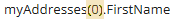
Notation for Array Variables
Array variables in the Property Settings pane of Form Designer use AngularJS notation with "square brackets" [].
Example

Array variables in Workflow Composer require VB.NET notation with "rounded brackets" ().
Example
AngularJS Expression Sandbox Security
When you use AngularJS expressions in the Property Settings pane of Forms Builder, be careful not to use arbitrary JavaScript in HTML template expressions. Use the expression sandbox only for data binding.
-
If you dynamically generate AngularJS templates or expressions from user-provided content, you are at risk of cross-site scripting (XSS) attacks.
-
If you do not generate your AngularJS templates or expressions from user-provided content, you are not at risk of these attacks.
Database Tables for Property Settings
The control types and their property settings are persisted as part of the JSON string stored when saving the form. The following database tables hold the control types and their properties:
-
The ControlTemplate table stores the available control types and has one row per control type instance.
-
The ControlProperty table stores all of the property settings that can have values specified for each control type. This table has one row per instance of each property setting.
Update of Properties
Prior to Forms Builder 3.4, when properties were added to controls (such as the Visible property added in Forms Builder 3.3), you had to drag the updated control into the Layout pane, fill out the properties again, and remove the original control from the Layout pane.
In Forms Builder 3.4 and later, when properties are added to the ControlProperty table, the properties are automatically updated in the Property Settings pane. Default values are assigned to any new properties. You no longer need to replace the original control in the Layout pane.
Note: To save new properties in JSON/HTML format in the database, you still need to re-save the form.
Editable Properties
The following table lists common editable properties for database fields and components. For more details about component properties, refer to the Components topics.
Note: For Boolean type properties, the literal values true and false must be entered in lowercase. Uppercase TRUE/FALSE will always evaluate to false.
| Property | Description | Required | Default | Data Type |
|---|---|---|---|---|
| Allow Multiple Files | File Upload component: Specify whether multiple files can be uploaded. | false | Boolean | |
| Class | Optional CSS class specific to the control. The class must be defined in a Renderer CSS file. For more information, see Custom Styles. | No | ||
| Disabled | Specify whether the field is disabled on the rendered form. | false | Boolean | |
| Extensions Allowed | File Upload component: Specify the allowed extensions of files to be uploaded. | doc, docx, gif, jpg, pdf, png | String | |
| Format | Display format for the Masked Text Box or Date Picker control types. Masked Text Box: For more information about the formats, see Kendo UI: MaskedTextBox. Date Picker: For more information about date formats, see Date Formats. |
See EDM Attribute: Format. | ||
| Grid Columns | Specify the grid columns displayed in Single-select Search control types. The "field" value must match the fields returned by the Lookup Query. | [ {"field": "Name", "title": "Name"} ] | ||
| Hyperlink Target | Specify where to open the link. Possible values are _self (default), _blank, _parent, and _top. | _self | ||
| Id | Id is a globally unique identifier (GUID) for the field instance within the form in which it is included. It is automatically created by Forms Builder. | Yes | String | |
| Label | Specify the label assigned to the field on the rendered form. | String | ||
| Link Text | Specify the link text for a Hyperlink control. | String | ||
| Lookup Display Member | Specify the name of the column that is displayed in the control. | Yes | Name | String |
| Lookup Query | Specify the OData query associated with the property when a list control such as a drop-down is used to display the property. Lookup Queries for CampusNexus CRM Metadata For any drop-down or search controls that will be populated via a lookup query, the CampusNexus CRM user needs to enter values for the Lookup Display Member and Lookup Sort Member attributes. The Lookup Query and Lookup Value Member property settings should have default values (if applicable for the selected property) as these are currently specified in the metadata. |
Yes | null | OData Query |
| Lookup Sort Member | Specify the name of the database column that is to be used to sort the values returned by the lookup. | Yes | Name | String |
| Lookup Value Member | Specify the name of the column in the query that is used as the value of a selection. | Yes | Id | String |
| Max Size Allowed | File Upload component: Specify the maximum file size (in bytes) for files to be uploaded. The default is 0 (unlimited). Note: If this control is bound to a model, depending on the product, the Max Size allowed may be limited by the service used to persist the attachment. |
0 | ||
| Max (for number type) | Specify the maximum value for an Input Type of number. The default is 0 (unlimited). | String | ||
| Max Length | Specify the maximum length of a string property. | field specific | String | |
| Min (for number type) | Specify the minimum value for an Input Type of number. The default is 0 (unlimited). | String | ||
| Min Length | Specify the minimum length of a string property. | 1 | String | |
| Model | Specify the model of the component in the Entity Data Model (EDM) for CampusNexus for a bound control (e.g., vm.models.<entityname>.<propertyname>) or any unbound control (e.g., vm.models.CustomTextbox).
|
String | ||
| Option Label | Specify the label for the options in a Drop-Down List control. | <Select> | Enum | |
| Page Size | Specify the size of the page when paging is true. | 100 | Int32 | |
| Placeholder | Specify the ghost prompt text in an input box before anything is typed. | String | ||
| Product Name | Specify "Student" or "CRM" depending on whether Anthology Student or CampusNexus CRM is used with Forms Builder. | Yes | Student | String |
| Read-only | Specify whether a control is read-only. | false | Boolean | |
| Required | Specify whether input for a field or component is required on the rendered form. | false | Boolean | |
| Required Message | Specify the validation message displayed on the rendered form. | String | ||
| Tooltip | Specify the text to be displayed when the cursor is placed over the component. | String | ||
| Type | Applicable only to the Text Box control. Specify the input type for the component. The directive for this property produces a standard <input> tag. The default for the Type value is |
Enum | ||
| Url | Specify the URL for a Hyperlink control. | String | ||
| Visible | Specify whether a field or component is visible on the rendered form. Like most properties, this property can be also bound to a variable in a workflow or another control’s value. |
true | Boolean |
 In
In