Drop-down List
You can use the Drop-down List component to select a single value from a list of values.
Forms Builder supports the following types of drop-down controls:
-
Default drop-down controls for fields in the CampusNexus entity model. Built-in Lookup Queries retrieve the list values for default drop-down controls.
-
Custom drop-down controls with a Value List defined using the Edit button on the Value List property. See Drop-down List with Value List.
-
Custom drop-down controls with a Workflow Initialized List defined using the Edit button on the Value List property.
Properties
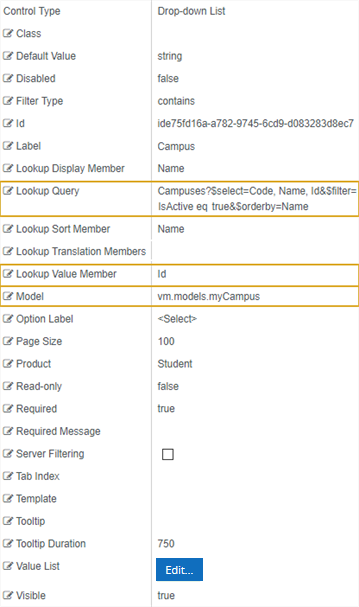
Example: Campus Drop-down List
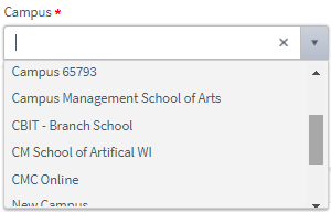
This example shows a Drop-down List component for the selection of a Campus.
Control Property Settings
Rendered Component
Workflow Argument

Example: Program Field with Area of Study Drop-down List
This example shows a default drop-down list control for the Program field paired with a Drop-down List component for Areas of Study associated with a selected Program value.
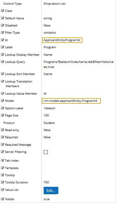
Control Property Settings for the Program Field
The Program field in the Applicant entity provides the following properties and is bound to the ProgramId value.
Control Property Settings for the Area of Study Component
The Area of Study Drop-down List component has an OData Query that retrieves the Area of Study values for a selected ProgramId.
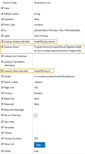
The OData Query is as follows:
ProgramVersionAreasOfStudy?$select=Id&$expand=AreaOfStudy($select=Name)&$filter=ProgramVersion/Program/Id eq {{vm.models.applicantEntity.ProgramId}}
For more information, see Build Queries Using the Data Model.
Rendered Program Field and Associated Area of Study Drop-down List Component

-
Class is an optional CSS class (or space separated classes) added to the top level of the control. CSS specific to the control can be applied. The class must be defined in a Renderer CSS file. For more information, see Custom Styles.
-
Disabled sets a control to disabled.
-
Must be true or false, or a binding beginning with "vm.models.".
-
A property array string index requires single quotes, e.g., vm.models.xxx.CustomProperties['yyyyy'].
-
An expression can be used that evaluates to true or false, e.g., vm.models.myvalue==7 (>,<, !=, ==, >=, <=).
-
If comparing to a string, it must be in single quotes.
- (true and false must be all lowercase)
-
-
Filter Type defines how search values will be filtered. Select from the following filter types: contains (default), endswith, and startswith. Values typed using the keyboard will be used to filter the list according to the selection.
-
Id is required. It can be any valid JavaScript id attribute value. (Must start with a letter followed by 0 to 9, a to z, dash, or underscore characters).
-
Using a globally unique identifier (GUID) from GuidGen or GuidGenerator prefixed by at least one letter prevents a clash with any other id.
-
Id should contain only a to z (uppercase or lowercase), 0 to 9, dash, or underscore. It should not have spaces.
-
Binding is not supported for this property.
-
-
Label is the value displayed in the label.
-
If this value is bound, it must be enclosed in double braces, e.g., {{vm.models.myLabel}}.
-
Allowable suffix characters: starts with letter, then letters, numerals, or underscore.
-
-
Lookup Display Member is the name of the property in the OData query string to use for the display.
For example, if the query string for a list of Campuses contains the Code, Name, and ID fields, the Lookup Display Member value can be set to Code, Name, or ID.
-
Lookup Query is the OData query string to retrieve values for the control.
The following is an example of an OData query string that retrieves the Code, Name, and ID values from the Campus table, where
isActiveequals true and the returned values are sorted by Name.Campuses?$select=Code, Name, Id&$filter=IsActive eq true&$orderby=NameLookup Query is not used if a custom Value List is specified. See Drop-down List with Value List.
-
Lookup Sort Member is the name of a property in a Lookup query string to sort on. By default, the Lookup query sort order is used.
-
Lookup Translation Members is a comma separated list of property names in an OData query string to be translated. You should always validate the query will work in a browser. Only basic errors can be detected in Form Designer.
-
Lookup Value Member is the name of the property in the OData query string to use as the value.
-
If the Lookup Value Member is an Id, the associated data type in Workflow Composer is
Int32. -
If the Lookup Value Member is a Code or Name, the associated data type in Workflow Composer is
String.
-
-
Model is required for binding to a workflow argument or another control. If the Model property is not specified, the component will be displayed on the form, but any values the user enters on the form cannot be captured or used in the workflow.
-
The Model value must always start with "vm.models.", e.g., vm.models.myArgument.
-
This value may initialize the control, and may be updated by the control, and if matched to a workflow argument, is available in the workflow (readable or writable).
-
Ensure your model argument is defined in your workflow for custom components if it is used in the workflow. Otherwise, a workflow argument is not required.
-
The casing of an argument used in the workflow MUST match the "vm.models." suffix casing.
-
If the model addresses CustomProperties or MultiValueCustomProperties, the property identifier string must be enclosed in single quotes, e.g., vm.models.myentity.CustomProperties['mycustomprop']
If an OData query is specified and this binding is specified, it will be overwritten with the value of the OData query results and thus be available read-only in the workflow.
If only "Model Data" is specified and the workflow variable is either not initialized or set to an empty array, this value will be initialized to the "Model Data" value.
Construction of the model in the workflow is done by assigning data from a provider.
Note: When the Drop-down List is used to retrieve integer values and the field is optional (can be empty or null), this must be accounted for when defining the variable for the model binding in the workflow. Instead of defining the variable as an
Int32, it must be defined asNullable<Int32>. To do so: In the "Browse and Select a .Net Type" window, browse to Type System.Nullable<T> and select Int32 in the System.Nullable field.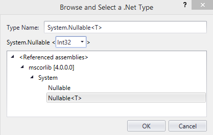
-
-
Option Label is the label in a drop-down list when no list value is selected. The default value is <Select>.
Note: In forms created prior to Forms Builder 3.3, the default Option Label is rendered blank. Re-save these forms in Forms Builder 3.3 to render the default Option Label as <Select>.
-
Page Size is the size of the page when paging for returned values is true. The default value is 100. Example: If Page Size is set to 10 and the number of returned values exceeds 10, paging occurs.
-
Product indicates the product from which OData query results are returned. Specify one of the following values:
- Student
- CRM
- Occupation Insight
The specified product must be configured in the <products> section of the Renderer web.config file.
The default Product value will be "Student" if "Student" is selected in the <Select Provider> list on the Fields tab.
The default Product value will be "CRM" if "CRM" is selected in the <Select Provider> list on the Fields tab.
Specify "Occupation Insight" in the Product property if the source of the query will come from a different data source other than Student/CRM. For more information, see Build Queries for Occupation Insight.
A form can have multiple controls that retrieve data from different providers. For example, a form can have a control that is populated by a query to the Student database. The same form can have another control that retrieves data from Occupation Insight.
Specify the query to retrieve data from the selected provider using the Lookup Query or ODataQuery property (as applicable for the control). The query contains only the URL specific part of an OData URI. The Base URL and Product will be supplied by the configuration.
-
Read-only makes the control read-only. It is set to false by default. If you want the component to be read-only, set the property value to true. It is typically used for an input box.
-
Can be bound to a workflow argument or another control's value.
-
A property array string index requires single quotes, e.g., vm.models.xxx.CustomProperties['yyyyy'].
-
An expression can be used that evaluates to true or false, e.g., vm.models.myvalue==7 (>,<, !=, ==, >=, <=).
-
If comparing to a string, it must be in single quotes.
-
(true and false must be all lowercase)
-
-
Required makes the control required and will raise a validation error on the form. It is set to false by default. If input is required, set the property value to true. The rendered form will display a red asterisk (
 ) next to the component.
-
Can be bound to a workflow argument or another control's value.
-
A property array string index requires single quotes, e.g., vm.models.xxx.CustomProperties['yyyyy'].
-
An expression can be used that evaluates to true or false, e.g., vm.models.myvalue==7 (>,<, !=, ==, >=, <=).
-
If comparing to a string, it must be in single quotes.
-
(true and false must be all lowercase)
-
-
Required Message is optional. It overrides the default "Required" message.
-
If this value is bound, it must be enclosed in double braces, e.g., {{vm.models.myMessage}}.
-
Allowable suffix characters: starts with letter, then letters, numerals, or underscore.
-
-
Server Filtering turns on server filtering. An input box is provided for text, and values containing the typed text will be displayed up to the page size. This property is not bindable.
Impact of Server Filtering on large drop-down lists:
-
If Server Filtering is set to false, all list items will be displayed in the drop-down list as specified by the page size value.
-
If Server Filtering is set to true, only the first list items will be displayed in the drop-down list. Any list items in positions higher than the page size value will not be visible. The user must enter search text to find matching list items. The server filter returns any occurrence of the search text in the list items.
If Server Filtering is set to true, we suggest using the Tooltip property on the Drop-down List component to instruct the user to enter search text to view all matching list values.
-
-
Tab Index allows you to specify the order of elements that are brought into focus when the user presses the Tab key on the rendered form. Allowed values are -1, 0, and positive numbers.
-
A value of "-1" removes the element from the sequential tab order preventing keyboard users from focusing on it.
-
A value of "0" means the element is ignored in the tab order, but that does not mean users cannot tab to and focus an element.
-
A value of "1" sets the element as the first item to gain focus when tabbing through the page followed by any higher numbered tab indices, followed by any other keyboard focusable elements such as buttons. required fields, and CAPTCHA.
The tab index value should not match another control's tab index.
-
A blank value (default) will not add a tab index in the HTML.
For more information, see https://html.spec.whatwg.org/multipage/interaction.html#the-tabindex-attribute and https://www.alexlande.com/articles/cross-browser-tabindex-woes/.
-
-
Template is optional. You can use this property to define a custom template to format data in a rendered drop-down list. For an example, see Drop-down List with Workflow Initialized List and Template.
For information on how to use the Kendo embedded JavaScript to write a conditional template, see https://docs.telerik.com/kendo-ui/framework/templates/overview.
-
Tooltip is the value to display when hovering over the control's label.
-
If this value is bound, it must be enclosed in double braces, e.g., {{vm.models.myTooltip}}.
-
Allowable suffix characters: starts with letter, then letters, numerals, or underscore.
-
-
Tooltip Duration is the amount of time in milliseconds a tooltip is displayed (default=750). The value must be greater than 0. If it is set to 0, a form validation error will occur.
-
If this value is bound, it must be enclosed in double braces, e.g., {{vm.models.myToolTip}}.
-
Allowable suffix characters: starts with letter, then letters, numerals, or underscore.
-
-
Value List is optional. Click the Edit button to specify the source of the values to be displayed in the Drop-down List.
For examples of custom drop-down controls with Value Lists, see Drop-down List with Value List and Drop-down List with Workflow Initialized List.
-
Visible makes the control visible or hidden.
-
Can be bound to a workflow argument or another control's value. This property is dynamic.
-
A property array string index requires single quotes, e.g., vm.models.xxx.CustomProperties['yyyyy'].
-
An expression can be used that evaluates to true or false, e.g., vm.models.myvalue==7 (>,<, !=, ==, >=, <=). If comparing to a string, it must be in single quotes.
-
(true and false must be all lowercase)
- When the control is not visible (usually based on some condition) and is a required field, the required field validation will not be triggered.
-
You can use the Drop-down List component to select a single value from a list of values.
Forms Builder supports the following types of drop-down controls:
-
Default drop-down controls for fields in the CampusNexus entity model. Built-in Lookup Queries retrieve the list values for default drop-down controls. See example below.
-
Custom drop-down controls with a Value List defined using the Edit button on the Value List property. See Drop-down List with Value List.
-
Custom drop-down controls with a Workflow Initialized List defined using the Edit button on the Value List property.
- Drop-down List with Workflow Initialized List
- Drop-down List with Workflow Initialized List via ExecuteQuery
- Drop-down List with Workflow Initialized List and Template
The example shows a default drop-down list control for the Campus field.
Control Property Settings

Rendered Component

Workflow Argument

Properties
-
Class is an optional CSS class (or space separated classes) added to the top level of the control. CSS specific to the control can be applied. The class must be defined in a Renderer CSS file. For more information, see Custom Styles.
-
Disabled sets a control to disabled.
-
Must be true or false, or a binding beginning with "vm.models.".
-
A property array string index requires single quotes, e.g., vm.models.xxx.CustomProperties['yyyyy'].
-
An expression can be used that evaluates to true or false, e.g., vm.models.myvalue==7 (>,<, !=, ==, >=, <=).
-
If comparing to a string, it must be in single quotes.
- (true and false must be all lowercase)
-
-
Filter Type defines how search values will be filtered. Select from the following filter types: contains (default), endswith, and startswith. Values typed using the keyboard will be used to filter the list according to the selection.
-
Id is required. It can be any valid JavaScript id attribute value. (Must start with a letter followed by 0 to 9, a to z, dash, or underscore characters).
-
Using a globally unique identifier (GUID) from GuidGen or GuidGenerator prefixed by at least one letter prevents a clash with any other id.
-
Id should contain only a to z (uppercase or lowercase), 0 to 9, dash, or underscore. It should not have spaces.
-
Binding is not supported for this property.
-
-
Label is the value displayed in the label.
-
If this value is bound, it must be enclosed in double braces, e.g., {{vm.models.myLabel}}.
-
Allowable suffix characters: starts with letter, then letters, numerals, or underscore.
-
-
Lookup Display Member is the name of the property in the OData query string to use for the display.
For example, if the query string for a list of Campuses contains the Code, Name, and ID fields, the Lookup Display Member value can be set to Code, Name, or ID.
-
Lookup Query is the OData query string to retrieve values for the control.
The following is an example of an OData query string that retrieves the Code, Name, and ID values from the Campus table, where
isActiveequals true and the returned values are sorted by Name.Campuses?$select=Code, Name, Id&$filter=IsActive eq true&$orderby=NameLookup Query is not used if a custom Value List is specified. See Drop-down List with Value List.
-
Lookup Sort Member is the name of a property in a Lookup query string to sort on. By default, the Lookup query sort order is used.
-
Lookup Translation Members is a comma separated list of property names in an OData query string to be translated. You should always validate the query will work in a browser. Only basic errors can be detected in Form Designer.
-
Lookup Value Member is the name of the property in the OData query string to use as the value.
-
If the Lookup Value Member is an Id, the associated data type in Workflow Composer is
Int32. -
If the Lookup Value Member is a Code or Name, the associated data type in Workflow Composer is
String.
-
-
Model is required for binding to a workflow argument or another control. If the Model property is not specified, the component will be displayed on the form, but any values the user enters on the form cannot be captured or used in the workflow.
-
The Model value must always start with "vm.models.", e.g., vm.models.myArgument.
-
This value may initialize the control, and may be updated by the control, and if matched to a workflow argument, is available in the workflow (readable or writable).
-
Ensure your model argument is defined in your workflow for custom components if it is used in the workflow. Otherwise, a workflow argument is not required.
-
The casing of an argument used in the workflow MUST match the "vm.models." suffix casing.
-
If the model addresses CustomProperties or MultiValueCustomProperties, the property identifier string must be enclosed in single quotes, e.g., vm.models.myentity.CustomProperties['mycustomprop']
If an OData query is specified and this binding is specified, it will be overwritten with the value of the OData query results and thus be available read-only in the workflow.
If only "Model Data" is specified and the workflow variable is either not initialized or set to an empty array, this value will be initialized to the "Model Data" value.
Construction of the model in the workflow is done by assigning data from a provider.
Note: When the Drop-down List is used to retrieve integer values and the field is optional (can be empty or null), this must be accounted for when defining the variable for the model binding in the workflow. Instead of defining the variable as an
Int32, it must be defined asNullable<Int32>. To do so: In the "Browse and Select a .Net Type" window, browse to Type System.Nullable<T> and select Int32 in the System.Nullable field.
-
-
Option Label is the label in a drop-down list when no list value is selected. The default value is <Select>.
Note: In forms created prior to Forms Builder 3.3, the default Option Label is rendered blank. Re-save these forms in Forms Builder 3.3 to render the default Option Label as <Select>.
-
Page Size is the size of the page when paging for returned values is true. The default value is 100. Example: If Page Size is set to 10 and the number of returned values exceeds 10, paging occurs.
-
Product indicates the product from which OData query results are returned. Specify one of the following values:
- Student
- CRM
- Occupation Insight
The specified product must be configured in the <products> section of the Renderer web.config file.
The default Product value will be "Student" if "Student" is selected in the <Select Provider> list on the Fields tab.
The default Product value will be "CRM" if "CRM" is selected in the <Select Provider> list on the Fields tab.
Specify "Occupation Insight" in the Product property if the source of the query will come from a different data source other than Student/CRM. For more information, see Build Queries for Occupation Insight.
A form can have multiple controls that retrieve data from different providers. For example, a form can have a control that is populated by a query to the Student database. The same form can have another control that retrieves data from Occupation Insight.
Specify the query to retrieve data from the selected provider using the Lookup Query or ODataQuery property (as applicable for the control). The query contains only the URL specific part of an OData URI. The Base URL and Product will be supplied by the configuration.
-
Read-only makes the control read-only. It is set to false by default. If you want the component to be read-only, set the property value to true. It is typically used for an input box.
-
Can be bound to a workflow argument or another control's value.
-
A property array string index requires single quotes, e.g., vm.models.xxx.CustomProperties['yyyyy'].
-
An expression can be used that evaluates to true or false, e.g., vm.models.myvalue==7 (>,<, !=, ==, >=, <=).
-
If comparing to a string, it must be in single quotes.
-
(true and false must be all lowercase)
-
-
Required makes the control required and will raise a validation error on the form. It is set to false by default. If input is required, set the property value to true. The rendered form will display a red asterisk (
 ) next to the component.
-
Can be bound to a workflow argument or another control's value.
-
A property array string index requires single quotes, e.g., vm.models.xxx.CustomProperties['yyyyy'].
-
An expression can be used that evaluates to true or false, e.g., vm.models.myvalue==7 (>,<, !=, ==, >=, <=).
-
If comparing to a string, it must be in single quotes.
-
(true and false must be all lowercase)
-
-
Required Message is optional. It overrides the default "Required" message.
-
If this value is bound, it must be enclosed in double braces, e.g., {{vm.models.myMessage}}.
-
Allowable suffix characters: starts with letter, then letters, numerals, or underscore.
-
-
Server Filtering turns on server filtering. An input box is provided for text, and values containing the typed text will be displayed up to the page size. This property is not bindable.
Impact of Server Filtering on large drop-down lists:
-
If Server Filtering is set to false, all list items will be displayed in the drop-down list as specified by the page size value.
-
If Server Filtering is set to true, only the first list items will be displayed in the drop-down list. Any list items in positions higher than the page size value will not be visible. The user must enter search text to find matching list items. The server filter returns any occurrence of the search text in the list items.
If Server Filtering is set to true, we suggest using the Tooltip property on the Drop-down List component to instruct the user to enter search text to view all matching list values.
-
-
Tab Index allows you to specify the order of elements that are brought into focus when the user presses the Tab key on the rendered form. Allowed values are -1, 0, and positive numbers.
-
A value of "-1" removes the element from the sequential tab order preventing keyboard users from focusing on it.
-
A value of "0" means the element is ignored in the tab order, but that does not mean users cannot tab to and focus an element.
-
A value of "1" sets the element as the first item to gain focus when tabbing through the page followed by any higher numbered tab indices, followed by any other keyboard focusable elements such as buttons. required fields, and CAPTCHA.
The tab index value should not match another control's tab index.
-
A blank value (default) will not add a tab index in the HTML.
For more information, see https://html.spec.whatwg.org/multipage/interaction.html#the-tabindex-attribute and https://www.alexlande.com/articles/cross-browser-tabindex-woes/.
-
-
Template is optional. You can use this property to define a custom template to format data in a rendered drop-down list. For an example, see Drop-down List with Workflow Initialized List and Template.
For information on how to use the Kendo embedded JavaScript to write a conditional template, see https://docs.telerik.com/kendo-ui/framework/templates/overview.
-
Tooltip is the value to display when hovering over the control's label.
-
If this value is bound, it must be enclosed in double braces, e.g., {{vm.models.myTooltip}}.
-
Allowable suffix characters: starts with letter, then letters, numerals, or underscore.
-
-
Tooltip Duration is the amount of time in milliseconds a tooltip is displayed (default=750). The value must be greater than 0. If it is set to 0, a form validation error will occur.
-
If this value is bound, it must be enclosed in double braces, e.g., {{vm.models.myToolTip}}.
-
Allowable suffix characters: starts with letter, then letters, numerals, or underscore.
-
-
Value List is optional. Click the Edit button to specify the source of the values to be displayed in the Drop-down List.
For examples of custom drop-down controls with Value Lists, see Drop-down List with Value List and Drop-down List with Workflow Initialized List.
-
Visible makes the control visible or hidden.
-
Can be bound to a workflow argument or another control's value. This property is dynamic.
-
A property array string index requires single quotes, e.g., vm.models.xxx.CustomProperties['yyyyy'].
-
An expression can be used that evaluates to true or false, e.g., vm.models.myvalue==7 (>,<, !=, ==, >=, <=). If comparing to a string, it must be in single quotes.
-
(true and false must be all lowercase)
-
Forms Builder supports the following types of drop-down controls:
-
Default drop-down controls for fields in the CampusNexus entity model. Built-in Lookup Queries retrieve the list values for default drop-down controls. See example below.
-
Custom drop-down controls with a Value List defined using the Edit button on the Value List property. See Drop-down List with Value List.
-
Custom drop-down controls with a Workflow Initialized List defined using the Edit button on the Value List property.
- Drop-down List with Workflow Initialized List
- Drop-down List with Workflow Initialized List via ExecuteQuery
- Drop-down List with Workflow Initialized List and Template
The example shows a default drop-down list control for the Campus field.
Control Property Settings
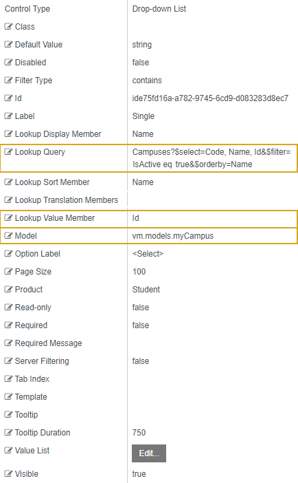
Rendered Component

Workflow Argument

Properties
-
Class is an optional CSS class (or space separated classes) added to the top level of the control. CSS specific to the control can be applied. The class must be defined in a Renderer CSS file. For more information, see Custom Styles.
-
Disabled sets a control to disabled.
-
Must be true or false, or a binding beginning with "vm.models.".
-
A property array string index requires single quotes, e.g., vm.models.xxx.CustomProperties['yyyyy'].
-
An expression can be used that evaluates to true or false, e.g., vm.models.myvalue==7 (>,<, !=, ==, >=, <=).
-
If comparing to a string, it must be in single quotes.
- (true and false must be all lowercase)
-
-
Filter Type defines how search values will be filtered. Select from the following filter types: contains (default), endswith, and startswith. Values typed using the keyboard will be used to filter the list according to the selection.
-
Id is required. It can be any valid JavaScript id attribute value. (Must start with a letter followed by 0 to 9, a to z, dash, or underscore characters).
-
Using a globally unique identifier (GUID) from GuidGen or GuidGenerator prefixed by at least one letter prevents a clash with any other id.
-
Id should contain only a to z (uppercase or lowercase), 0 to 9, dash, or underscore. It should not have spaces.
-
Binding is not supported for this property.
-
-
Label is the value displayed in the label.
-
If this value is bound, it must be enclosed in double braces, e.g., {{vm.models.myLabel}}.
-
Allowable suffix characters: starts with letter, then letters, numerals, or underscore.
-
-
Lookup Display Member is the name of the property in the OData query string to use for the display.
For example, if the query string for a list of Campuses contains the Code, Name, and ID fields, the Lookup Display Member value can be set to Code, Name, or ID.
-
Lookup Query is the OData query string to retrieve values for the control.
The following is an example of an OData query string that retrieves the Code, Name, and ID values from the Campus table, where
isActiveequals true and the returned values are sorted by Name.Campuses?$select=Code, Name, Id&$filter=IsActive eq true&$orderby=NameLookup Query is not used if a custom Value List is specified. See Drop-down List with Value List.
-
Lookup Sort Member is the name of a property in a Lookup query string to sort on. By default, the Lookup query sort order is used.
-
Lookup Translation Members is a comma separated list of property names in an OData query string to be translated. You should always validate the query will work in a browser. Only basic errors can be detected in Form Designer.
-
Lookup Value Member is the name of the property in the OData query string to use as the value.
-
If the Lookup Value Member is an Id, the associated data type in Workflow Composer is
Int32. -
If the Lookup Value Member is a Code or Name, the associated data type in Workflow Composer is
String.
-
-
Model is required for binding to a workflow argument or another control. If the Model property is not specified, the component will be displayed on the form, but any values the user enters on the form cannot be captured or used in the workflow.
-
The Model value must always start with "vm.models.", e.g., vm.models.myArgument.
-
This value may initialize the control, and may be updated by the control, and if matched to a workflow argument, is available in the workflow (readable or writable).
-
Ensure your model argument is defined in your workflow for custom components if it is used in the workflow. Otherwise, a workflow argument is not required.
-
The casing of an argument used in the workflow MUST match the "vm.models." suffix casing.
-
If the model addresses CustomProperties or MultiValueCustomProperties, the property identifier string must be enclosed in single quotes, e.g., vm.models.myentity.CustomProperties['mycustomprop']
If an OData query is specified and this binding is specified, it will be overwritten with the value of the OData query results and thus be available read-only in the workflow.
If only "Model Data" is specified and the workflow variable is either not initialized or set to an empty array, this value will be initialized to the "Model Data" value.
Construction of the model in the workflow is done by assigning data from a provider.
Note: When the Drop-down List is used to retrieve integer values and the field is optional (can be empty or null), this must be accounted for when defining the variable for the model binding in the workflow. Instead of defining the variable as an
Int32, it must be defined asNullable<Int32>. To do so: In the "Browse and Select a .Net Type" window, browse to Type System.Nullable<T> and select Int32 in the System.Nullable field.
-
-
Option Label is the label in a drop-down list when no list value is selected. The default value is <Select>.
Note: In forms created prior to Forms Builder 3.3, the default Option Label is rendered blank. Re-save these forms in Forms Builder 3.3 to render the default Option Label as <Select>.
-
Page Size is the size of the page when paging for returned values is true. The default value is 100. Example: If Page Size is set to 10 and the number of returned values exceeds 10, paging occurs.
-
Product indicates the product from which OData query results are returned. Specify one of the following values:
- Student
- CRM
- Occupation Insight
The specified product must be configured in the <products> section of the Renderer web.config file.
The default Product value will be "Student" if "Student" is selected in the <Select Provider> list on the Fields tab.
The default Product value will be "CRM" if "CRM" is selected in the <Select Provider> list on the Fields tab.
Specify "Occupation Insight" in the Product property if the source of the query will come from a different data source other than Student/CRM. For more information, see Build Queries for Occupation Insight.
A form can have multiple controls that retrieve data from different providers. For example, a form can have a control that is populated by a query to the Student database. The same form can have another control that retrieves data from Occupation Insight.
Specify the query to retrieve data from the selected provider using the Lookup Query or ODataQuery property (as applicable for the control). The query contains only the URL specific part of an OData URI. The Base URL and Product will be supplied by the configuration.
-
Read-only makes the control read-only. It is set to false by default. If you want the component to be read-only, set the property value to true. It is typically used for an input box.
-
Can be bound to a workflow argument or another control's value.
-
A property array string index requires single quotes, e.g., vm.models.xxx.CustomProperties['yyyyy'].
-
An expression can be used that evaluates to true or false, e.g., vm.models.myvalue==7 (>,<, !=, ==, >=, <=).
-
If comparing to a string, it must be in single quotes.
-
(true and false must be all lowercase)
-
-
Required makes the control required and will raise a validation error on the form. It is set to false by default. If input is required, set the property value to true. The rendered form will display a red asterisk (
 ) next to the component.
-
Can be bound to a workflow argument or another control's value.
-
A property array string index requires single quotes, e.g., vm.models.xxx.CustomProperties['yyyyy'].
-
An expression can be used that evaluates to true or false, e.g., vm.models.myvalue==7 (>,<, !=, ==, >=, <=).
-
If comparing to a string, it must be in single quotes.
-
(true and false must be all lowercase)
-
-
Required Message is optional. It overrides the default "Required" message.
-
If this value is bound, it must be enclosed in double braces, e.g., {{vm.models.myMessage}}.
-
Allowable suffix characters: starts with letter, then letters, numerals, or underscore.
-
-
Server Filtering is set to false by default. When this property is set to true, an input box is provided for text. Values containing the typed text will be displayed in a drop-down list. The number of list items in the drop-down is controlled by the Page Size property.
Impact of Server Filtering on large drop-down lists:
-
If Server Filtering is set to false, all list items will be displayed in the drop-down list as specified by the page size value.
-
If Server Filtering is set to true, only the first list items will be displayed in the drop-down list. Any list items in positions higher than the page size value will not be visible. The user must enter search text to find matching list items. The server filter returns any occurrence of the search text in the list items.
If Server Filtering is set to true, we suggest using the Tooltip property on the Drop-down List component to instruct the user to enter search text to view all matching list values.
-
-
Tab Index allows you to specify the order of elements that are brought into focus when the user presses the Tab key on the rendered form. Allowed values are -1, 0, and positive numbers.
-
A value of "-1" removes the element from the sequential tab order preventing keyboard users from focusing on it.
-
A value of "0" means the element is ignored in the tab order, but that does not mean users cannot tab to and focus an element.
-
A value of "1" sets the element as the first item to gain focus when tabbing through the page followed by any higher numbered tab indices, followed by any other keyboard focusable elements such as buttons. required fields, and CAPTCHA.
The tab index value should not match another control's tab index.
-
A blank value (default) will not add a tab index in the HTML.
For more information, see https://html.spec.whatwg.org/multipage/interaction.html#the-tabindex-attribute and https://www.alexlande.com/articles/cross-browser-tabindex-woes/.
-
-
Template is optional. You can use this property to define a custom template to format data in a rendered drop-down list. For an example, see Drop-down List with Workflow Initialized List and Template.
For information on how to use the Kendo embedded JavaScript to write a conditional template, see https://docs.telerik.com/kendo-ui/framework/templates/overview.
-
Tooltip is the value to display when hovering over the control's label.
-
If this value is bound, it must be enclosed in double braces, e.g., {{vm.models.myTooltip}}.
-
Allowable suffix characters: starts with letter, then letters, numerals, or underscore.
-
-
Tooltip Duration is the amount of time in milliseconds a tooltip is displayed (default=750). The value must be greater than 0. If it is set to 0, a form validation error will occur.
-
If this value is bound, it must be enclosed in double braces, e.g., {{vm.models.myToolTip}}.
-
Allowable suffix characters: starts with letter, then letters, numerals, or underscore.
-
-
Value List is optional. Click the Edit button to specify the source of the values to be displayed in the Drop-down List.
For examples of custom drop-down controls with Value Lists, see Drop-down List with Value List and Drop-down List with Workflow Initialized List.
-
Visible makes the control visible or hidden.
-
Can be bound to a workflow argument or another control's value. This property is dynamic.
-
A property array string index requires single quotes, e.g., vm.models.xxx.CustomProperties['yyyyy'].
-
An expression can be used that evaluates to true or false, e.g., vm.models.myvalue==7 (>,<, !=, ==, >=, <=). If comparing to a string, it must be in single quotes.
-
(true and false must be all lowercase)
-
Lookup Queries for CampusNexus CRM Metadata
For any drop-down or search controls that will be populated via a lookup query, the CampusNexus CRM user needs to enter values for the Lookup Display Member and Lookup Sort Member attributes. The Lookup Query and Lookup Value Member property settings should have default values (if applicable for the selected property) as these are currently specified in the metadata.