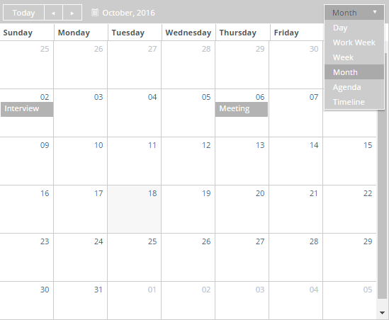
Calendar/Scheduler
You can use the Calendar/Scheduler component to design forms with a calendar control that is populated with events retrieved from the CampusNexus CRM or Anthology Student database. The rendered form will enable users to register for an event by clicking a link in the calendar control.
Note: The calendar can be read-only or editable. Added entries can be determined by their Id value. Updated and deleted entries can only be determined by storing the original items to a separate list and comparing to the updated list after the user interaction with the calendar is complete.
Enhancements in Forms Builder 3.7
The Calendar component has been enhanced to handle add, edit, and delete cases for calendar entries. The component now returns the EntityState property for the affected entity. The sequence workflow can check if the EntityState property has been added, deleted, or modified. For more information, see Calendar with EntityState Property.
Enhancements in Forms Builder 3.5
The code for the Calendar/Scheduler component was completely revised to provide enhanced functionality. Several properties related to time zone offsets were added (see Time Zone properties), the Group Header Template property was added, the Model and Model Data properties were added, properties to map data property names to Calendar/Scheduler built-in names were added, and the Autobind and Data Source properties were removed.
When you drag and drop the Calendar/Scheduler into the Layout pane, the underlying functionality will be that of the new component. Existing forms that already include the Calendar/Scheduler continue to execute the previous version of the code. For these forms, if you want to use the enhanced functionality, remove the Calendar/Scheduler from the previously created form and then re-drag and drop the Calendar/Scheduler into the Layout pane.
Mapped Properties
Special properties were added in Forms Builder 3.5 to map built-in names of the Calendar/Scheduler control to names of OData properties. The mapped properties allow for field names coming from an OData query to not match hard-coded values, i.e., the event fields can be "mapped" to new values.
| Component Property | Default | Mapped to |
|---|---|---|
| Mapped Description | EventDescription | description |
| Mapped End | EventEndDate | end |
| Mapped ID | EventId | id |
| Mapped Start | EventStartDate | start |
| Mapped Title | EventName | title |
| Mapped URL | EventUrl | eventUrl and sequenceUrl |
Example
When a CRM query for events returns the Event Data URL as "RegistrationURL", the Mapped URL property would be updated to "RegistrationURL".
When mapped names are matched to data properties in an OData query, the properties in the OData query are not case sensitive because SQL is not case sensitive.
When mapped names are used in templates, they are case sensitive. When the mapped names are matched, they create properties which will be used in templates. The default properties in templates are cased as follows:
- start
- end
- id
- description
- title
- eventUrl (also "sequenceUrl" which is the same property with a different variable name. It is maintained for compatibility with existing forms.)
Either the property name or the mapped name can be used in a template. The start, end, and id properties are not usually used in a template but are necessary to render the Calendar/Scheduler. You can use any other property name found in the data in a template. No mapping is necessary for them.
|
All mapped value properties need to match templates, Model Data references, and/or OData query result fields. |
Basic Properties for a Calendar/Scheduler
Since the Calendar/Scheduler has an overwhelming set of properties, we have added the steps to build a basic Calendar/Scheduler and provided the following examples of property settings to initialize a calendar control:
- Minimal Calendar/Scheduler
- Calendar/Scheduler Initialized by Model Data
- Calendar/Scheduler Initialized by OData Query
For workflow arguments used with the Calendar/Scheduler in Forms Builder 3.5 and later, see Default Argument Types for Components.
Control Property Settings
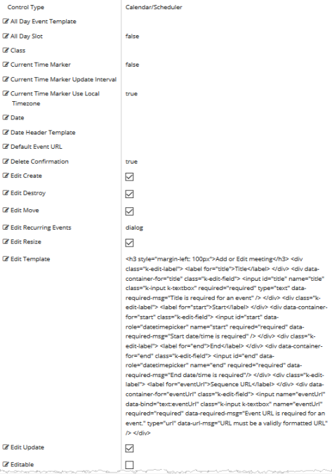
Rendered Component
Properties
The Calendar/Scheduler component provides numerous property settings, the majority of which are for more complex scenarios and are not needed for a simple calendar. The default component has an example of the only properties that are needed. The following descriptions reflect the rollover text in the Property Settings pane.
Properties values in quotes must use double quotes. Template is an HTML string.
See Telerik Scheduler documentation for more general information on the Scheduler.
-
All Day Event Template is the template used to render "all day" scheduler events. The fields which can be used in the template are:
-
description - the event description (String)
-
end - the event end date (Date)
-
isAllDay - if true, the event is "all day" (Boolean)
-
resources - the event resources (Array)
-
start - the event start date (Date)
-
title - the event title (String)
-
-
All Day Slot — If set to true, the scheduler will display a slot for "all day" events. Default: false.
-
If this property is bound, it must start with "vm.models.".
-
A property array string index requires single quotes, e.g., vm.models.xxx.CustomProperties['yyyyy'].
-
An expression can be used that evaluates to true or false, e.g., vm.models.myvalue==7 (>,<, !=, ==, >=, <=).
-
If comparing to a string, it must be in single quotes.
-
(true and false must be all lowercase)
See Telerik Scheduler documentation for more general information on the Scheduler.
-
-
Auto Bind — In Forms Builder 3.5, this property is removed. It is always set to true.
-
Class is an optional CSS class (or space separated classes) added to the top level of the control. CSS specific to the control can be applied. The class must be defined in a Renderer CSS file. For more information, see Custom Styles.
-
Current Time Marker — If this property is set to true, the "current time" marker of the scheduler will be displayed. Default: false.
-
If this property is bound, it must start with "vm.models.".
-
A property array string index requires single quotes, e.g., vm.models.xxx.CustomProperties['yyyyy'].
-
An expression can be used that evaluates to true or false, e.g., vm.models.myvalue==7 (>,<, !=, ==, >=, <=).
-
If comparing to a string, it must be in single quotes.
-
(true and false must be all lowercase)
See Telerik Scheduler documentation for more general information on the Scheduler.
-
-
Current Time Marker Update Interval — This is the update interval of the "current time" marker in milliseconds. Default: 100000 (10 seconds)
See Telerik Scheduler documentation for more general information on the Scheduler.
-
Current Time Marker Use Local Timezone — If this property is set to false, the "current time" marker will be displayed using the scheduler time zone. Default: true
-
If this property is bound, it must start with "vm.models.".
-
A property array string index requires single quotes, e.g., vm.models.xxx.CustomProperties['yyyyy'].
-
An expression can be used that evaluates to true or false, e.g., vm.models.myvalue==7 (>,<, !=, ==, >=, <=).
-
If comparing to a string, it must be in single quotes.
-
(true and false must be all lowercase)
See Telerik Scheduler documentation for more general information on the Scheduler.
-
-
Date sets the current date of the event scheduler. The date is used to determine the period which is displayed. If date is not specified, the current date is assumed.
To provide forward compatibility, the date string should be ISO 8601 compatible format, e.g., 2017-09-23 (which is a universal non-ambiguous format).
See Telerik Scheduler documentation for more general information on the Scheduler.
-
Date Header Template is the template used to render the date header cells. Template is an HTML string.
See Telerik Scheduler documentation for more general information on the Scheduler.
-
Default Event Url — If no Event Url is contained in the provider event data, this URL will be used for the event.
The provider EventId will be added to the end of the URL as ?EventId=27 or &EventId=27. The former will occur if the URL ends with a / or ? and the latter otherwise. A workflow can use it to look up the event.
This information will be available in the workflow as formInstance.QueryParams.DataDictionary("EventId"), e.g.,
-
http://myserver/#/renderer/27/?EventId=1020 or
-
http://myserver/#/renderer/27/?Mydata=xxxx&EventId=1020
-
-
Delete Confirmation — If this property set to true, the scheduler will display a confirmation dialog when the user clicks the "destroy" X button on an event. If this is neither true nor false, then a value is interpreted as a string value that becomes the confirmation message. Default: true.
-
This property is not used for event calendars where Editable is false.
-
This property is not bindable.
-
(true and false must be all lowercase)
See Telerik Scheduler documentation for more general information on the Scheduler.
-
-
Edit Create — If this property is set to true (default), the user can create new events. This property is not used for event calendars where Editable is false. This property is not bindable.
See Telerik Scheduler documentation for more general information on the Scheduler.
-
Edit Destroy — If this property is set to true (default), the user can delete events. This property is not used for event calendars where Editable is false. This property is not bindable.
See Telerik Scheduler documentation for more general information on the Scheduler.
-
Edit Move — If this property is set to true (default), the scheduler allows event moving. Dragging the event changes the start and end time. This property is not used for event calendars where Editable is false. This property is not bindable.
See Telerik Scheduler documentation for more general information on the Scheduler.
-
Edit Recurring Events — This property sets the edit mode for recurring events. The available modes are: "dialog" (default), "occurrence", and "series". This property is not used for event calendars where Editable is false. A blank Edit template will contain this property.
See Telerik Scheduler documentation for more general information on the Scheduler.
-
Edit Resize — If this property is set to true (default), the scheduler allows event resizing. Dragging the resize handles changes the start or end time of the event. This property is not used for event calendars where Editable is false. This property is not bindable.
See Telerik Scheduler documentation for more general information on the Scheduler.
-
Edit Template allows the user to edit the template which renders the popup editor. Template is an HTML string.
The default template is:
<h3 style="margin-left: 100px">Add or Edit meeting</h3>
    <div class="k-edit-label">
	<label for="title">Title</label>
    </div>
    <div data-container-for="title" class="k-edit-field">
	<input id="title" name="title" class="k-input k-textbox" required="required" type="text" data-required-msg="Title is required for an event" />
    </div>
    <div class="k-edit-label">
	<label for="start">Start</label>
    </div>
    <div data-container-for="start" class="k-edit-field">
	<input id="start" data-role="datetimepicker" name="start" />
    </div>
    <div class="k-edit-label">
	<label for="end">End</label>
    </div>
    <div data-container-for="end" class="k-edit-field">
	<input id="end" data-role="datetimepicker" name="end" />
    </div>
    <div class="k-edit-label">
	<label for="eventUrl">Sequence URL</label>
    </div>
    <div data-container-for="eventUrl" class="k-edit-field">
	<input name="eventUrl" data-bind="text:eventUrl" class="k-input k-textbox" name="eventUrl" required="required" data-required-msg="Event URL is required for an event." type="url" data-url-msg="URL must be a validly formatted URL" />
    </div>
The title has a validation and “required” has a message to override the default validation message. The eventUrl has two validations, a “required” and a “url” type validation which validates a URL. Both have override messages for their validation. It would be unusual to use anything except the standard HTML5 validations. Special code would be required for custom validations, so this would take some JavaScript expertise. See Custom Validations for more information about validation.
This default template matches the Event Template and the Schema Model for property names. Failure to match property names to mapped names or use of properties not defined in the model can lead to JavaScript errors during render.
See Telerik Scheduler documentation for more general information on the Scheduler.
-
Edit Update — If this property is set to true (default), the user can update events. This property is not used for event calendars where Editable is false. This property is not bindable.
See Telerik Scheduler documentation for more general information on the Scheduler.
-
Editable — If this property is set to true, the user can create new scheduler events and modify or delete existing events. For event calendars this is normally false. Default: false.
-
This property is not bindable.
-
When an event is editable, it cannot use custom property names. It must use the start, end, id, title, and description properties.
Note: If a user clicks Cancel while adding or editing a new appointment, it is deleted. If user clicks Cancel on an existing appointment, the popup editor closes without saving changes.
See Telerik Scheduler documentation for more general information on the Scheduler.
-
-
End Time sets the end time of the week and day views. Overridden by data from the schedule provider if supplied.
Example
2016-10-1 19:00 or 2016-10-1 7:00 PM.
You must specify a date with the time because the time by itself will not be parsed correctly.
See Telerik Scheduler documentation for more general information on the Scheduler.
-
Event Template is the template used to render the scheduler events. The fields which can be used in the template are:
-
description - the event description (String)
-
end - the event end date (Date)
-
resources - the event resources (Array)
-
start - the event start date (Date)
-
title - the event title (String)
Additional fields defined in the Event data can be used in a template. They MUST match the properties returned in the data. Additional properties cannot be used if Editable is true without defining them in the Schema Model.
Template is an HTML string.
See Telerik Scheduler documentation for more general information on the Scheduler.
Example
<div class="event-template">
<p>
<span class="event-template-title">#: title #</span>
<span class="event-template-url">
<a href="#= EventUrl #" target="_top">Registration</a>
</span>
</p>
<p>
<span class="event-template-description">#: description #</span>
</p>
</div>If this property (or any other in this template) is missing in the data (normal), it will cause an error. This should match the data property that you are using for this value. The Mapped URL default is “EventUrl, so this matches the template.
-
-
Footer — If this property is set to false, the footer of the scheduler will not be displayed.
-
If this property is bound, it must start with "vm.models.".
-
A property array string index requires single quotes, e.g., vm.models.xxx.CustomProperties['yyyyy'].
-
An expression can be used that evaluates to true or false, e.g., vm.models.myvalue==7 (>,<, !=, ==, >=, <=).
-
If comparing to a string, it must be in single quotes.
-
(true and false must be all lowercase)
See Telerik Scheduler documentation for more general information on the Scheduler.
-
-
Footer Command sets the command which will be displayed in the scheduler footer. Currently, only the "workDay" option is supported. If the option is set to false, the "workDay" button will be removed from the footer.
-
Properties values in quotes must use double quotes.
-
(true and false must be all lowercase)
See Telerik Scheduler documentation for more general information on the Scheduler.
-
-
Group Header Template is the template used to render the group headers of scheduler day, week, workWeek, and timeline views. Template is an HTML string.
See Telerik Scheduler documentation for more general information on the Scheduler.
-
Group Object sets the configuration of the scheduler resource(s) grouping. Properties values in quotes must use double quotes.
This is an extensive object with many properties. See Telerik Scheduler documentation for more general information on the Scheduler.
-
Height sets the height of the widget. Numeric values are treated as pixels. Default: 600.
-
If it is bound it must begin with {{vm.models. and end with }}.
-
Allowable suffix characters: starts with letter, then letters, numerals, or underscore.
See Telerik Scheduler documentation for more general information on the Scheduler.
-
-
Id is required. It can be any valid JavaScript id attribute value. (Must start with a letter followed by 0 to 9, a to z, dash, or underscore characters).
-
Using a globally unique identifier (GUID) from GuidGen or GuidGenerator prefixed by at least one letter prevents a clash with any other id.
-
Id should contain only a to z (uppercase or lowercase), 0 to 9, dash, or underscore. It should not have spaces.
-
Binding is not supported for this property.
-
-
Major Tick sets the number of minutes represented by a major tick. Default: 60.
See Telerik Scheduler documentation for more general information on the Scheduler.
-
Major Time Header Template is the template used to render the major ticks. Template is an HTML string.
See Telerik Scheduler documentation for more general information on the Scheduler.
-
Mapped Description – sets the data property name that maps to “description”. The default is “EventDescription”.
-
Mapped End – sets the data property name that maps to “end”. The default is “EventEndDate”. “end” is a built-in name required by the Calendar/Scheduler, so if your data does not have this name, set the mapped name.
-
Mapped ID – sets the data property name that maps to “id”. Default is “EventId”. The “id” in the event data must be unique for every event, or the calendar may fail to work as expected.
-
Mapped Start - sets the data property name that maps to “start”. The default is “EventStartDate”. “start” is a built-in name required by the Calendar/Scheduler, so if your data does not have this name, set the mapped name.
-
Mapped Title – sets the data property name that maps to “title”. The default is “EventName”.
-
Mapped URL – sets the data property name that defines the data item that contains a URL to which the EventId= in the data is appended. The default is “EventUrl”, e.g., the data “EventUrl”:”http://mysite.com/#/renderer/myform” will become http://mysite.com/#/renderer/mysequence?EventId=2232. This “EventId” can be used in a workflow to look up the original event to get more information than was possible to put in the scheduler. Obviously, you can add your own parameters to cause the workflow to do something based on a parameter value. This URL can be embedded in an <a> HTML link in the template.
-
Max Date constrains the maximum date which can be selected via the scheduler navigation. To provide forward compatibility, the date string should be ISO 8601 compatible format. e.g. 2017-09-23 (which is a universal non-ambiguous format).
See Telerik Scheduler documentation for more general information on the Scheduler.
-
Messages Object — The configuration of scheduler messages. Use this option to customize or localize scheduler messages.
Properties values in quotes must use double quotes.
This is an extensive object with many properties. See Telerik Scheduler documentation for more general information on the Scheduler.
-
Min Date constrains the minimum date which can be selected via the scheduler navigation.
To provide forward compatibility, the date string should be ISO 8601 compatible format, e.g., 2017-09-23 (which is a universal non-ambiguous format).
See Telerik Scheduler documentation for more general information on the Scheduler.
-
Minor Tick Count sets the number of time slots to display per major tick. Default: 2.
If set, the minorTickCount value should be set to a number greater than 0.See Telerik Scheduler documentation for more general information on the Scheduler.
-
Minor Time Header Template is the template used to render the minor ticks. Template is an HTML string.
See Telerik Scheduler documentation for more general information on the Scheduler.
-
Mobile Rendering — If set to true and the Calendar/Scheduler is viewed on a mobile browser, it will use adaptive rendering. The value can be set to a string "phone" or "tablet" to force the widget to use adaptive rendering regardless of browser type. Default: false.
See Telerik Scheduler documentation for more general information on the Scheduler.
Forms Builder currently does not support rendering of the Calendar/Scheduler component on mobile devices.
-
Model is required for binding to a workflow argument or another control. If the Model property is not specified, the component will be displayed on the form, but any values the user enters on the form cannot be captured or used in the workflow.
-
The Model value must always start with "vm.models.", e.g., vm.models.myArgument.
-
This value may initialize the control, and may be updated by the control, and if matched to a workflow argument, is available in the workflow (readable or writable).
-
Ensure your model argument is defined in your workflow for custom components if it is used in the workflow. Otherwise, a workflow argument is not required.
-
The casing of an argument used in the workflow MUST match the "vm.models." suffix casing.
-
If the model addresses CustomProperties or MultiValueCustomProperties, the property identifier string must be enclosed in single quotes, e.g., vm.models.myentity.CustomProperties['mycustomprop']
If an OData query is specified and this binding is specified, it will be overwritten with the value of the OData query results and thus be available read-only in the workflow.
If only "Model Data" is specified and the workflow variable is either not initialized or set to an empty array, this value will be initialized to the "Model Data" value.
Construction of the model in the workflow is done by assigning data from a provider.
Note: Editing the Calendar/Scheduler currently does not update the Model value. This functionality will be added in a future release.
-
-
Model Data — The initial data specified as a JSON object. This will be ignored if data is directly provided by an OData Query from a data provider or when a bound Model is provided.
Property names and values must use double quotes. Names of properties must match those in a template if they are to be used by the template. The default template has several default property names.
Dates are entered as ISO 8601 compatible strings and Date objects will be created out of them, e.g., 2016-06-13 or 2016-06-13T09:08:01-05:00 (Google ISO 8601 for explanation).
See Telerik Scheduler documentation for more general information on the Scheduler.
Note: When the Model Data property is used in conjunction with the Locale component and the user navigates back to select a different locale, the data displayed in the sequence will not be updated to reflect the new locale selection.
-
OData Query — The URL specific part of an OData URI. Base URL and Product will be supplied by the configuration. Does not include the web address or product, e.g., Students?$top=10. This part is the implementation of the specifications for the provider API to get event data.
-
OData Translation Members is a comma separated list of property names in an OData query string to be translated. You should always validate the query will work in a browser. Only basic errors can be detected in Form Designer.
-
PDF Object — Configures the Kendo UI Scheduler PDF export settings and is specified by a Json string.
-
Must be specified as a JSON string.
-
Properties values in quotes must use double quotes.
This is an extensive object with many properties. See Telerik Scheduler documentation for more general information on the Scheduler.
-
-
Product indicates the product from which OData query results are returned. Select from:
- Student
- CRM
- Occupation Insight
The selected product must be configured in the <products> section of the Renderer web.config file.
The default Product value will be "Student" if "Student" is selected in the <Select Provider> list on the Fields tab.
The default Product value will be "CRM" if "CRM" is selected in the <Select Provider> list on the Fields tab.
Select "Occupation Insight" in the Product property if the source of the query will come from a different data source other than Student/CRM. For more information, see Build Queries for Occupation Insight.
A form can have multiple controls that retrieve data from different providers. For example, a form can have a control that is populated by a query to the Student database. The same form can have another control that retrieves data from Occupation Insight.
Specify the query to retrieve data from the selected provider using the Lookup Query or OData Query property (as applicable for the control). The query contains only the URL specific part of an OData URI. The Base URL and Product will be supplied by the configuration.
-
Resources Object — The configuration of the scheduler resource(s). A scheduler resource is optional metadata that can be associated with a scheduler event. Must be specified as a JSON string.
Properties values in quotes must use double quotes.
Overridden by data from the schedule provider if supplied.
This is an extensive object with many properties. See Telerik Scheduler documentation for more general information on the Scheduler.
-
Schema Model is specified as a JSON object. The Schema Model is only necessary if using a template such as the Event Template and you wish to add or edit events in the calendar with a non-standard data property. Fields that are standard properties like
id,start,end,title, ordescription, need not be redefined in the schema to be edited; however, non-standard properties (likeeventUrl) will throw an error (seen with an F12 console).A Schema Model must contain all non-standard properties used in the Event Template. See documentation for the scheduler for the required format of the schema. A default one is provided and includes
eventUrl, which is a non-standard property that matches the property used in the default Event Template.id,title,start,end, anddescriptionare built-in and only need to be redefined to override them with different values. If the data source contains properties with their mapped name (see Mapped Properties), they are populated by those values.See Telerik Scheduler documentation for more general information on the Scheduler.
Example
The Schema Model JSON object defines the dataSource schema.model. The JSON which matches the default Event Template is:
{
  "id": "id",
  "fields": {
    "id": {
      "type": "number"
    },
    "title": {
    },
    "start": {
      "type": "date"
    },
    "end": {
      "type": "date"
    },
    "description": {},
    "sequenceUrl": {}
  }
}
This JSON code defines two properties:
idandfields. The latter is an object which defines each field in an Event Template. Experimentation has shown that it is not necessary to define the built-in fieldsid,start,end, and the optionaltitleanddescription, unless you want to add something to the definition like a default value or a type. But you do have to define additional fields you want to use likesequenceUrl. Casing is important. For more information, see https://docs.telerik.com/kendo-ui/api/javascript/data/model/methods/defineThe properties that can be used for each field are
type,editable,nullable,from, andvalidation. However,validationis not useful unless there is some active JavaScript to call the validator.validate() method. Instead validation is defined with attributes in the Edit Template. See Edit Template above.About the only one that is necessary in most circumstances is
type, but it defaults to “string”, which is why some have an empty object definition.The Editable property has a warning on it. If it is set to true, the Schema Model should be defined, otherwise you will get an F12 error when you use an undefined template variables during add or edit, i.e.,
sequenceUrlis undefined, but the built-in onesid,title,description,start, andendcan be redefined along withsequenceUrl. If your data uses the mapped names, the built-in ones will be populated with values from them. -
Selectable Event — If this property is set to true, the user can select scheduler cells and events. By default, selection is disabled. This is not currently used by any feature and can be left false. This property is not bindable.
See Telerik Scheduler documentation for more general information on the Scheduler.
-
Show Work Hours — If this property is set to true, the view will be initially shown in business hours mode. By default, the view is displayed in full day mode.
-
This property is not bindable.
-
(true and false must be all lowercase)
See Telerik Scheduler documentation for more general information on the Scheduler.
-
-
Snap To Slot — If this property is set to true, the scheduler will snap events to the nearest slot during dragging (resizing or moving). Set it to false to allow free moving and resizing of events. For event calendars, where Editable is false, this is not used.
-
This property is not bindable.
-
(true and false must be all lowercase)
See Telerik Scheduler documentation for more general information on the Scheduler.
-
-
Start Time — The start time of the week and day views. The scheduler will display events starting after the startTime, e.g., "2016-10-22 9:00 PM or 2016-10-22 21:00".
You must specify a date with the time because the time by itself will not be parsed correctly.
To provide forward compatibility, the date string should be ISO 8601 compatible format. e.g. 2017-09-23 (which is a universal non-ambiguous format).
See Telerik Scheduler documentation for more general information on the Scheduler.
-
Tab Index allows you to specify the order of elements that are brought into focus when the user presses the Tab key on the rendered form. Allowed values are -1, 0, and positive numbers.
-
A value of "-1" removes the element from the sequential tab order preventing keyboard users from focusing on it.
-
A value of "0" means the element is ignored in the tab order, but that does not mean users cannot tab to and focus an element.
-
A value of "1" sets the element as the first item to gain focus when tabbing through the page followed by any higher numbered tab indices, followed by any other keyboard focusable elements such as buttons. required fields, and CAPTCHA.
The tab index value should not match another control's tab index.
-
A blank value (default) will not add a tab index in the HTML.
For more information, see https://html.spec.whatwg.org/multipage/interaction.html#the-tabindex-attribute and https://www.alexlande.com/articles/cross-browser-tabindex-woes/.
-
-
Time Zone — The time zone which the scheduler will use to display the scheduler appointment dates. Setting this pins the browser relative time zone no matter where the browser is.
When set and the date does not contain an offset, then the time will not be changed and will be the same in any browser worldwide.
Examples:
-
"2018-06-15T17:00:00" or "2018/06/15 05:00 PM" which is 5 PM will remain 5PM in every time zone.
This is also true if a time zone is present and "Time Zone - Ignore Input" is true because the offset will be removed first.
Otherwise, if an offset is present in the date, then the date-time will be translated to the set time zone first. This could change the date.
-
"2018-06-15T23:00:00-04:00" which is 11 PM EDT (Florida during daylight saving hours) and the set time zone is PST8PDT (California), then this will be translated to "2018-06-15T02:00-07:00" which is 2 AM the next day.
The scheduler will display this as 2AM in any browser worldwide.
If not set, the current time zone of the browser is used. This means that while date-times without offsets will not be affected, date-times with offsets will be different in different browser time zones, because the time will be translated to the local time zone.
-
"2018-06-15T17:00:00-08:00" which is 5 PM PDT, will be translated to 8PM EDT for a browser in Florida, but midnight in London.
A list of IANA Canonical, Alias and Deprecated time zones can be found here.
The list of actual supported time zones is available in the time zone property of the moment-timezone source.
See Telerik Scheduler documentation for more general information on the Scheduler.
-
-
Time Zone - Ignore Input — If true, a time zone (offset) that is present on the incoming data will be removed.
Example
"2018-06-15T17:00:00-04:00" which represents 5PM EDT (daylight savings date), will be truncated to "2018-06-15T17:00:00". This actually represents 5PM in any time zone.
This property is not bindable.
Use cases
-
Set this property to true when the form uses an OData query to retrieve CRM events for an onsite event such a as fixed time onsite campus orientation. A person in a different time zone would need to show up at that fixed time in the destination time zone.
-
Set this property to false when the form is used for registration to an online event where you want the user to see the appropriate time zone in the user's location. Online the time is going to be different in each time zone, but the same universal time for everyone.
-
-
Time Zone - Remove Output — If true, the time zone is removed from the model date-time.
Example
"2018-06-15T17:00:00-04:00" which represents 5PM EDT (daylight savings date), will be truncated to "2018-06-15T17:00:00". This actually represents 5PM in any time zone and information on which time zone it might have been created in is not available.
-
This property is not bindable.
Use cases
The setting for this property would almost always match the Time Zone - Ignore Input setting, i.e., both true or both false. But if desired, you can set the properties differently.
-
-
Toolbar Object — List of commands that the scheduler will display in its toolbar as buttons. Currently supports only the "pdf" command. Properties values in quotes must use double quotes.
See Telerik Scheduler documentation for more general information on the Scheduler.
-
View For Agenda Selection — On an agenda view, when a non-editable event is clicked, this is the view that will be shown, if available.
-
View For Month Selection — On a month view, when a non-editable event is clicked, this is the view that will be shown, if available.
-
View For Week Selection — On a week or workWeek view, when a non-editable event is clicked, this is the view that will be shown, if available.
-
Views Object — The views displayed by the scheduler and their configuration. The array items can be either objects specifying the view configuration or strings representing the view types (assuming default configuration).
-
If not specified, the Kendo UI Scheduler widget displays "day" and "week" view.
-
Properties values in quotes must use double quotes.
-
If using the "eventTemplate" property, it is an HTML string.
-
If single quotes are required in HTML elements, use '
This is an extensive object with many properties. See Telerik Scheduler documentation for more general information on the Scheduler.
Example 1
This example shows 5 views: day, workweek, week, month, and agenda in JSON format. Each of them can be a simple string if no other properties are required. In this example both month and agenda have extra properties, so they are set as an object with properties, 2 in each case. “type” is required to set the view name. Month is selected by default by the “selected”: true. For other properties which can be added to each of them, refer to the Telerik documentation for views property of the Scheduler.
[
  "day",
  "workWeek",
  "week",
  {
    "type": "month",
    "selected": true
  },
  "agenda",
  {
    "type": "timeline",
    "eventHeight": 50
  }
]
Example 2
In this example, day and month have templates for different views (others could too instead of the default).
Note: Since the entire property value is in single quotes, single quotes cannot be used again inside the template. Anywhere a single quote is needed inside double-quote HTML elements, the HTML substitute
'is used.[ { "type": "day", "eventTemplate": "<div class='event-template'><p>Click this link to go to <span class='event-template-url'><a href='#= eventUrl #' target='_blank'>Registration</a></span></p></div>" }, "workWeek", "week", { "type": "month", "selected": true, "eventTemplate": "<div class='event-template'><p><span class='event-template-title' title='#: title #'>#: title #</span></p></div>" }, "agenda", { "type": "timeline", "eventHeight": 50 } ] -
-
Visible makes the control visible or hidden.
-
Can be bound to a workflow argument or another control's value. This property is dynamic.
-
A property array string index requires single quotes, e.g., vm.models.xxx.CustomProperties['yyyyy'].
-
An expression can be used that evaluates to true or false, e.g., vm.models.myvalue==7 (>,<, !=, ==, >=, <=). If comparing to a string, it must be in single quotes.
-
(true and false must be all lowercase)
-
-
Width — Sets the width of the widget. Numeric values are treated as pixels. This property is not bindable.
See Telerik Scheduler documentation for more general information on the Scheduler.
-
Work Day End — Sets the end of the work day when the "Show business hours" button is clicked, e.g., "2016/10/1 19:00".
See Telerik Scheduler documentation for more general information on the Scheduler.
-
Work Day Start — Sets the start of the work day when the "Show business hours" button is clicked, e.g., "2016/10/1 09:00 AM".
See Telerik Scheduler documentation for more general information on the Scheduler.
-
Work Week End — Sets the end of the work week (index based). Default: 5
See Telerik Scheduler documentation for more general information on the Scheduler.
-
Work Week Start — Sets the start of the work week (index based). Default: 1
See Telerik Scheduler documentation for more general information on the Scheduler.
You can use the Calendar/Scheduler component to design forms with a calendar control that is populated with events retrieved from the CampusNexus CRM or Anthology Student database. The rendered form will enable users to register for an event by clicking a link in the calendar control.
Note: The calendar can be read-only or editable. Added entries can be determined by their Id value. Updated and deleted entries can only be determined by storing the original items to a separate list and comparing to the updated list after the user interaction with the calendar is complete.
Enhancements in Forms Builder 3.5 and Later
The code for the Calendar/Scheduler component was completely revised to provide enhanced functionality. Several properties related to time zone offsets were added (see Time Zone properties), the Group Header Template property was added, the Model and Model Data properties were added, properties to map data property names to Calendar/Scheduler built-in names were added, and the Autobind and Data Source properties were removed.
When you drag and drop the Calendar/Scheduler into the Layout pane, the underlying functionality will be that of the new component. Existing forms that already include the Calendar/Scheduler continue to execute the previous version of the code. For these forms, if you want to use the enhanced functionality, remove the Calendar/Scheduler from the previously created form and then re-drag and drop the Calendar/Scheduler into the Layout pane.
The following properties were added in Forms Builder 3.5 to map built-in names of the Calendar/Scheduler control to the names of OData properties. The mapped properties allow for field names coming from an OData query to not match hard-coded values, i.e., the event fields can be "mapped" to new values.
| Component Property | Default | Mapped to |
|---|---|---|
| Mapped Description | EventDescription | description |
| Mapped End | EventEndDate | end |
| Mapped ID | EventId | id |
| Mapped Start | EventStartDate | start |
| Mapped Title | EventName | title |
| Mapped URL | EventUrl | eventUrl and sequenceUrl |
Example
When a CRM query for events returns the Event Data URL as "RegistrationURL", the Mapped URL property would be updated to "RegistrationURL".
When mapped names are matched to data properties in an OData query, the properties in the OData query are not case sensitive because SQL is not case sensitive.
When mapped names are used in templates, they are case sensitive. When the mapped names are matched, they create properties which will be used in the templates. The default properties in templates are cased as follows:
- start
- end
- id
- description
- title
- eventUrl (also "sequenceUrl" which is the same property with a different variable name. It is maintained for compatibility with existing forms.)
Either the property name or the mapped name can be used in a template. The start, end, and id properties are not usually used in a template but are necessary to render the Calendar/Scheduler. You can use any other property name found in the data in a template. No mapping is necessary for them.
|
|
All mapped value properties need to match templates, Model Data references, and/or OData query result fields. |
Basic Properties for a Calendar/Scheduler
Since the Calendar/Scheduler has an overwhelming set of properties, we have added the steps to build a basic Calendar/Scheduler and provided examples of property settings to initialize a calendar control.
- Minimal Calendar/Scheduler
- Calendar/Scheduler Initialized by Model Data
- Calendar/Scheduler Initialized by OData Query
For workflow arguments used with the Calendar/Scheduler in Forms Builder 3.5 and later, see Default Argument Types for Components.
Control Property Settings
Rendered Component
Properties
The Calendar/Scheduler component provides numerous property settings, the majority of which are for more complex scenarios and are not needed for a simple calendar. The default component has an example of the only properties that are needed. The following descriptions reflect the rollover text in the Property Settings pane.
Properties values in quotes must use double quotes. Template is an HTML string.
See Telerik Scheduler documentation for more general information on the Scheduler.
-
All Day Event Template is the template used to render "all day" scheduler events. The fields which can be used in the template are:
-
description - the event description (String)
-
end - the event end date (Date)
-
isAllDay - if true, the event is "all day" (Boolean)
-
resources - the event resources (Array)
-
start - the event start date (Date)
-
title - the event title (String)
-
-
All Day Slot — If set to true, the scheduler will display a slot for "all day" events. Default: false.
-
If this property is bound, it must start with "vm.models.".
-
A property array string index requires single quotes, e.g., vm.models.xxx.CustomProperties['yyyyy'].
-
An expression can be used that evaluates to true or false, e.g., vm.models.myvalue==7 (>,<, !=, ==, >=, <=).
-
If comparing to a string, it must be in single quotes.
-
(true and false must be all lowercase)
See Telerik Scheduler documentation for more general information on the Scheduler.
-
-
Auto Bind — In Forms Builder 3.5, this property is removed. It is always set to true.
-
Class is an optional CSS class (or space separated classes) added to the top level of the control. CSS specific to the control can be applied. The class must be defined in a Renderer CSS file. For more information, see Custom Styles.
-
Current Time Marker — If this property is set to true, the "current time" marker of the scheduler will be displayed. Default: false.
-
If this property is bound, it must start with "vm.models.".
-
A property array string index requires single quotes, e.g., vm.models.xxx.CustomProperties['yyyyy'].
-
An expression can be used that evaluates to true or false, e.g., vm.models.myvalue==7 (>,<, !=, ==, >=, <=).
-
If comparing to a string, it must be in single quotes.
-
(true and false must be all lowercase)
See Telerik Scheduler documentation for more general information on the Scheduler.
-
-
Current Time Marker Update Interval — This is the update interval of the "current time" marker in milliseconds. Default: 100000 (10 seconds)
See Telerik Scheduler documentation for more general information on the Scheduler.
-
Current Time Marker Use Local Timezone — If this property is set to false, the "current time" marker will be displayed using the scheduler time zone. Default: true
-
If this property is bound, it must start with "vm.models.".
-
A property array string index requires single quotes, e.g., vm.models.xxx.CustomProperties['yyyyy'].
-
An expression can be used that evaluates to true or false, e.g., vm.models.myvalue==7 (>,<, !=, ==, >=, <=).
-
If comparing to a string, it must be in single quotes.
-
(true and false must be all lowercase)
See Telerik Scheduler documentation for more general information on the Scheduler.
-
-
Date sets the current date of the event scheduler. The date is used to determine the period which is displayed. If date is not specified, the current date is assumed.
To provide forward compatibility, the date string should be ISO 8601 compatible format, e.g., 2017-09-23 (which is a universal non-ambiguous format).
See Telerik Scheduler documentation for more general information on the Scheduler.
-
Date Header Template is the template used to render the date header cells. Template is an HTML string.
See Telerik Scheduler documentation for more general information on the Scheduler.
-
Default Event Url — If no Event Url is contained in the provider event data, this URL will be used for the event.
The provider EventId will be added to the end of the URL as ?EventId=27 or &EventId=27. The former will occur if the URL ends with a / or ? and the latter otherwise. A workflow can use it to look up the event.
This information will be available in the workflow as formInstance.QueryParams.DataDictionary("EventId"), e.g.,
-
http://myserver/#/renderer/27/?EventId=1020 or
-
http://myserver/#/renderer/27/?Mydata=xxxx&EventId=1020
-
-
Delete Confirmation — If this property set to true, the scheduler will display a confirmation dialog when the user clicks the "destroy" X button on an event. If this is neither true nor false, then a value is interpreted as a string value that becomes the confirmation message. Default: true.
-
This property is not used for event calendars where Editable is false.
-
This property is not bindable.
-
(true and false must be all lowercase)
See Telerik Scheduler documentation for more general information on the Scheduler.
-
-
Edit Create — If this property is set to true (default), the user can create new events. This property is not used for event calendars where Editable is false. This property is not bindable.
See Telerik Scheduler documentation for more general information on the Scheduler.
-
Edit Destroy — If this property is set to true (default), the user can delete events. This property is not used for event calendars where Editable is false. This property is not bindable.
See Telerik Scheduler documentation for more general information on the Scheduler.
-
Edit Move — If this property is set to true (default), the scheduler allows event moving. Dragging the event changes the start and end time. This property is not used for event calendars where Editable is false. This property is not bindable.
See Telerik Scheduler documentation for more general information on the Scheduler.
-
Edit Recurring Events — This property sets the edit mode for recurring events. The available modes are: "dialog" (default), "occurrence", and "series". This property is not used for event calendars where Editable is false. A blank Edit template will contain this property.
See Telerik Scheduler documentation for more general information on the Scheduler.
-
Edit Resize — If this property is set to true (default), the scheduler allows event resizing. Dragging the resize handles changes the start or end time of the event. This property is not used for event calendars where Editable is false. This property is not bindable.
See Telerik Scheduler documentation for more general information on the Scheduler.
-
Edit Template allows the user to edit the template which renders the popup editor. Template is an HTML string.
The default template is:
<h3 style="margin-left: 100px">Add or Edit meeting</h3>
    <div class="k-edit-label">
	<label for="title">Title</label>
    </div>
    <div data-container-for="title" class="k-edit-field">
	<input id="title" name="title" class="k-input k-textbox" required="required" type="text" data-required-msg="Title is required for an event" />
    </div>
    <div class="k-edit-label">
	<label for="start">Start</label>
    </div>
    <div data-container-for="start" class="k-edit-field">
	<input id="start" data-role="datetimepicker" name="start" />
    </div>
    <div class="k-edit-label">
	<label for="end">End</label>
    </div>
    <div data-container-for="end" class="k-edit-field">
	<input id="end" data-role="datetimepicker" name="end" />
    </div>
    <div class="k-edit-label">
	<label for="eventUrl">Sequence URL</label>
    </div>
    <div data-container-for="eventUrl" class="k-edit-field">
	<input name="eventUrl" data-bind="text:eventUrl" class="k-input k-textbox" name="eventUrl" required="required" data-required-msg="Event URL is required for an event." type="url" data-url-msg="URL must be a validly formatted URL" />
    </div>
Note how the title has a validation and the way “required” has a message to override the default validation message. Note also that eventUrl has two validations, a “required” and a “url” type validation which validates a URL. Both have override messages for their validation. It would be unusual to use anything except the standard HTML5 validations. Special code would be required for custom validations, so this would take some JavaScript expertise. See Custom Validations for more information about validation.
This default template matches the Event Template and the Schema Model for property names. Failure to match property names to mapped names or use of properties not defined in the model can lead to JavaScript errors during render.
See Telerik Scheduler documentation for more general information on the Scheduler.
-
Edit Update — If this property is set to true (default), the user can update events. This property is not used for event calendars where Editable is false. This property is not bindable.
See Telerik Scheduler documentation for more general information on the Scheduler.
-
Editable — If this property is set to true, the user can create new scheduler events and modify or delete existing events. For event calendars this is normally false. Default: false.
-
This property is not bindable.
-
When an event is editable, it cannot use custom property names. It must use the start, end, id, title, and description properties.
Note: If a user clicks Cancel while adding or editing a new appointment, it is deleted. If user clicks Cancel on an existing appointment, the popup editor closes without saving changes.
See Telerik Scheduler documentation for more general information on the Scheduler.
-
-
End Time sets the end time of the week and day views. Overridden by data from the schedule provider if supplied.
Example
2016-10-1 19:00 or 2016-10-1 7:00 PM.
You must specify a date with the time because the time by itself will not be parsed correctly.
See Telerik Scheduler documentation for more general information on the Scheduler.
-
Event Template is the template used to render the scheduler events. The fields which can be used in the template are:
-
description - the event description (String)
-
end - the event end date (Date)
-
resources - the event resources (Array)
-
start - the event start date (Date)
-
title - the event title (String)
Additional fields defined in the Event data can be used in a template. They MUST match the properties returned in the data. Additional properties cannot be used if Editable is true without defining them in the Schema Model.
Template is an HTML string.
See Telerik Scheduler documentation for more general information on the Scheduler.
Example
<div class="event-template">
<p>
<span class="event-template-title">#: title #</span>
<span class="event-template-url">
<a href="#= EventUrl #" target="_top">Registration</a>
</span>
</p>
<p>
<span class="event-template-description">#: description #</span>
</p>
</div>Note that if this property (or any other in this template) is missing in the data (normal), it will cause an error. This should match the data property that you are using for this value. The Mapped URL default is “EventUrl, so this matches the template.
-
-
Footer — If this property is set to false, the footer of the scheduler will not be displayed.
-
If this property is bound, it must start with "vm.models.".
-
A property array string index requires single quotes, e.g., vm.models.xxx.CustomProperties['yyyyy'].
-
An expression can be used that evaluates to true or false, e.g., vm.models.myvalue==7 (>,<, !=, ==, >=, <=).
-
If comparing to a string, it must be in single quotes.
-
(true and false must be all lowercase)
See Telerik Scheduler documentation for more general information on the Scheduler.
-
-
Footer Command sets the command which will be displayed in the scheduler footer. Currently, only the "workDay" option is supported. If the option is set to false, the "workDay" button will be removed from the footer.
-
Properties values in quotes must use double quotes.
-
(true and false must be all lowercase)
See Telerik Scheduler documentation for more general information on the Scheduler.
-
-
Group Header Template is the template used to render the group headers of scheduler day, week, workWeek, and timeline views. Template is an HTML string.
See Telerik Scheduler documentation for more general information on the Scheduler.
-
Group Object sets the configuration of the scheduler resource(s) grouping. Properties values in quotes must use double quotes.
This is an extensive object with many properties. See Telerik Scheduler documentation for more general information on the Scheduler.
-
Height sets the height of the widget. Numeric values are treated as pixels. Default: 600.
-
If it is bound it must begin with {{vm.models. and end with }}.
-
Allowable suffix characters: starts with letter, then letters, numerals or underscore.
See Telerik Scheduler documentation for more general information on the Scheduler.
-
-
Id is required. It can be any valid JavaScript id attribute value. (Must start with a letter followed by 0 to 9, a to z, dash, or underscore characters).
-
Using a globally unique identifier (GUID) from GuidGen or GuidGenerator prefixed by at least one letter prevents a clash with any other id.
-
Id should contain only a to z (uppercase or lowercase), 0 to 9, dash, or underscore. It should not have spaces.
-
Binding is not supported for this property.
-
-
Major Tick sets the number of minutes represented by a major tick. Default: 60.
See Telerik Scheduler documentation for more general information on the Scheduler.
-
Major Time Header Template is the template used to render the major ticks. Template is an HTML string.
See Telerik Scheduler documentation for more general information on the Scheduler.
-
Mapped Description – sets the data property name that maps to “description”. The default is “EventDescription”.
-
Mapped End – sets the data property name that maps to “end”. The default is “EventEndDate”. “end” is a built-in name required by the Calendar/Scheduler, so if your data does not have this name, set the mapped name.
-
Mapped ID – sets the data property name that maps to “id”. Default is “EventId”. The “id” in the event data must be unique for every event, or the calendar may fail to work as expected.
-
Mapped Start - sets the data property name that maps to “start”. The default is “EventStartDate”. “start” is a built-in name required by the Calendar/Scheduler, so if your data does not have this name, set the mapped name.
-
Mapped Title – sets the data property name that maps to “title”. The default is “EventName”.
-
Mapped URL – sets the data property name that defines the data item that contains a URL to which the EventId= in the data is appended. The default is “EventUrl”, e.g., the data “EventUrl”:”http://mysite.com/#/renderer/myform” will become http://mysite.com/#/renderer/mysequence?EventId=2232. This “EventId” can be used in a workflow to look up the original event to get more information than was possible to put in the scheduler. Obviously, you can add your own parameters to cause the workflow to do something based on a parameter value. This URL can be embedded in an <a> HTML link in the template.
-
Max Date constrains the maximum date which can be selected via the scheduler navigation. To provide forward compatibility, the date string should be ISO 8601 compatible format. e.g. 2017-09-23 (which is a universal non-ambiguous format).
See Telerik Scheduler documentation for more general information on the Scheduler.
-
Messages Object — The configuration of scheduler messages. Use this option to customize or localize scheduler messages.
Properties values in quotes must use double quotes.
This is an extensive object with many properties. See Telerik Scheduler documentation for more general information on the Scheduler.
-
Min Date constrains the minimum date which can be selected via the scheduler navigation.
To provide forward compatibility, the date string should be ISO 8601 compatible format, e.g., 2017-09-23 (which is a universal non-ambiguous format).
See Telerik Scheduler documentation for more general information on the Scheduler.
-
Minor Tick Count sets the number of time slots to display per major tick. Default: 2.
If set, the minorTickCount value should be set to a number greater than 0.See Telerik Scheduler documentation for more general information on the Scheduler.
-
Minor Time Header Template is the template used to render the minor ticks. Template is an HTML string.
See Telerik Scheduler documentation for more general information on the Scheduler.
-
Mobile Rendering — If set to true and the Calendar/Scheduler is viewed on a mobile browser, it will use adaptive rendering. The value can be set to a string "phone" or "tablet" to force the widget to use adaptive rendering regardless of browser type. Default: false.
See Telerik Scheduler documentation for more general information on the Scheduler.
Forms Builder currently does not support rendering of the Calendar/Scheduler component on mobile devices.
-
Model is required for binding to a workflow argument or another control. If the Model property is not specified, the component will be displayed on the form, but any values the user enters on the form cannot be captured or used in the workflow.
-
The Model value must always start with "vm.models.", e.g., vm.models.myArgument.
-
This value may initialize the control, and may be updated by the control, and if matched to a workflow argument, is available in the workflow (readable or writable).
-
Ensure your model argument is defined in your workflow for custom components if it is used in the workflow. Otherwise, a workflow argument is not required.
-
The casing of an argument used in the workflow MUST match the "vm.models." suffix casing.
-
If the model addresses CustomProperties or MultiValueCustomProperties, the property identifier string must be enclosed in single quotes, e.g., vm.models.myentity.CustomProperties['mycustomprop']
If an OData query is specified and this binding is specified, it will be overwritten with the value of the OData query results and thus be available read-only in the workflow.
If only "Model Data" is specified and the workflow variable is either not initialized or set to an empty array, this value will be initialized to the "Model Data" value.
Construction of the model in the workflow is done by assigning data from a provider.
Note: Editing the Calendar/Scheduler currently does not update the Model value. This functionality will be added in a future release.
-
-
Model Data — The initial data specified as a JSON object. This will be ignored if data is directly provided by an OData Query from a data provider or when a bound Model is provided.
Property names and values must use double quotes. Names of properties must match those in a template if they are to be used by the template. The default template has several default property names.
Dates are entered as ISO 8601 compatible strings and Date objects will be created out of them, e.g., 2016-06-13 or 2016-06-13T09:08:01-05:00 (Google ISO 8601 for explanation).
See Telerik Scheduler documentation for more general information on the Scheduler.
Note: When the Model Data property is used in conjunction with the Locale component and the user navigates back to select a different locale, the data displayed in the sequence will not be updated to reflect the new locale selection.
-
OData Query — The URL specific part of an OData URI. Base URL and Product will be supplied by the configuration. Does not include the web address or product, e.g., Students?$top=10. This part is the implementation of the specifications for the provider API to get event data.
-
OData Translation Members is a comma separated list of property names in an OData query string to be translated. You should always validate the query will work in a browser. Only basic errors can be detected in Form Designer.
-
PDF Object — Configures the Kendo UI Scheduler PDF export settings and is specified by a Json string.
-
Must be specified as a JSON string.
-
Properties values in quotes must use double quotes.
This is an extensive object with many properties. See Telerik Scheduler documentation for more general information on the Scheduler.
-
-
Product indicates the product from which OData query results are returned. Select from:
- Student
- CRM
- Occupation Insight
The selected product must be configured in the <products> section of the Renderer web.config file.
The default Product value will be "Student" if "Student" is selected in the <Select Provider> list on the Fields tab.
The default Product value will be "CRM" if "CRM" is selected in the <Select Provider> list on the Fields tab.
Select "Occupation Insight" in the Product property if the source of the query will come from a different data source other than Student/CRM. For more information, see Build Queries for Occupation Insight.
A form can have multiple controls that retrieve data from different providers. For example, a form can have a control that is populated by a query to the Student database. The same form can have another control that retrieves data from Occupation Insight.
Specify the query to retrieve data from the selected provider using the Lookup Query or OData Query property (as applicable for the control). The query contains only the URL specific part of an OData URI. The Base URL and Product will be supplied by the configuration.
-
Resources Object — The configuration of the scheduler resource(s). A scheduler resource is optional metadata that can be associated with a scheduler event. Must be specified as a JSON string.
Properties values in quotes must use double quotes.
Overridden by data from the schedule provider if supplied.
This is an extensive object with many properties. See Telerik Scheduler documentation for more general information on the Scheduler.
-
Schema Model is specified as a JSON object. The Schema Model is only necessary if using a template such as the Event Template and you wish to add or edit events in the calendar with a non-standard data property. Fields that are standard properties like
id,start,end,title, ordescription, need not be redefined in the schema to be edited; however, non-standard properties (likeeventUrl) will throw an error (seen with an F12 console).A Schema Model must contain all non-standard properties used in the Event Template. See documentation for the scheduler for the required format of the schema. A default one is provided and includes
eventUrl, which is a non-standard property that matches the property used in the default Event Template.id,title,start,end, anddescriptionare built-in and only need to be redefined to override them with different values. If the data source contains properties with their mapped name (see Mapped Properties), they are populated by those values.See Telerik Scheduler documentation for more general information on the Scheduler.
Example
The Schema Model JSON object defines the dataSource schema.model. The JSON which matches the default Event Template is:
{
  "id": "id",
  "fields": {
    "id": {
      "type": "number"
    },
    "title": {
    },
    "start": {
      "type": "date"
    },
    "end": {
      "type": "date"
    },
    "description": {},
    "sequenceUrl": {}
  }
}
This JSON code defines two properties:
idandfields. The latter is an object which defines each field in an Event Template. Experimentation has shown that it is not necessary to define the built-in fieldsid,start,end, and the optionaltitleanddescription, unless you want to add something to the definition like a default value or a type. But you do have to define additional fields you want to use likesequenceUrl. Casing is important. For more information, see https://docs.telerik.com/kendo-ui/api/javascript/data/model/methods/defineThe properties that can be used for each field are
type,editable,nullable,from, andvalidation. However,validationis not useful unless there is some active JavaScript to call the validator.validate() method. Instead validation is defined with attributes in the Edit Template. See Edit Template above.About the only one that is necessary in most circumstances is
type, but it defaults to “string”, which is why some have an empty object definitions.The Editable property has a warning on it. If it is set to true, the Schema Model should be defined, otherwise you will get an F12 error when you use an undefined template variables during add or edit, i.e.,
sequenceUrlis undefined, but the built-in onesid,title,description,start, andendcan be redefined along withsequenceUrl. If your data uses the mapped names, the built-in ones will be populated with values from them. -
Selectable Event — If this property is set to true, the user can select scheduler cells and events. By default, selection is disabled. This is not currently used by any feature and can be left false. This property is not bindable.
See Telerik Scheduler documentation for more general information on the Scheduler.
-
Show Work Hours — If this property is set to true, the view will be initially shown in business hours mode. By default, the view is displayed in full day mode.
-
This property is not bindable.
-
(true and false must be all lowercase)
See Telerik Scheduler documentation for more general information on the Scheduler.
-
-
Snap To Slot — If this property is set to true, the scheduler will snap events to the nearest slot during dragging (resizing or moving). Set it to false to allow free moving and resizing of events. For event calendars, where Editable is false, this is not used.
-
This property is not bindable.
-
(true and false must be all lowercase)
See Telerik Scheduler documentation for more general information on the Scheduler.
-
-
Start Time — The start time of the week and day views. The scheduler will display events starting after the startTime, e.g., "2016-10-22 9:00 PM or 2016-10-22 21:00".
You must specify a date with the time because the time by itself will not be parsed correctly.
To provide forward compatibility, the date string should be ISO 8601 compatible format. e.g. 2017-09-23 (which is a universal non-ambiguous format).
See Telerik Scheduler documentation for more general information on the Scheduler.
-
Tab Index allows you to specify the order of elements that are brought into focus when the user presses the Tab key on the rendered form. Allowed values are -1, 0, and positive numbers.
-
A value of "-1" removes the element from the sequential tab order preventing keyboard users from focusing on it.
-
A value of "0" means the element is ignored in the tab order, but that does not mean users cannot tab to and focus an element.
-
A value of "1" sets the element as the first item to gain focus when tabbing through the page followed by any higher numbered tab indices, followed by any other keyboard focusable elements such as buttons. required fields, and CAPTCHA.
The tab index value should not match another control's tab index.
-
A blank value (default) will not add a tab index in the HTML.
For more information, see https://html.spec.whatwg.org/multipage/interaction.html#the-tabindex-attribute and https://www.alexlande.com/articles/cross-browser-tabindex-woes/.
-
-
Time Zone — The time zone which the scheduler will use to display the scheduler appointment dates. Setting this pins the browser relative time zone no matter where the browser is.
When set and the date does not contain an offset, then the time will not be changed and will be the same in any browser worldwide.
Examples:
-
"2018-06-15T17:00:00" or "2018/06/15 05:00 PM" which is 5 PM will remain 5PM in every time zone.
This is also true if a time zone is present and "Time Zone - Ignore Input" is true, because the offset will be removed first.
Otherwise, if an offset is present in the date, then the date-time will be translated to the set time zone first. This could change the date.
-
"2018-06-15T23:00:00-04:00" which is 11 PM EDT (Florida during daylight saving hours) and the set time zone is PST8PDT (California), then this will be translated to "2018-06-15T02:00-07:00" which is 2 AM the next day.
The scheduler will display this as 2AM in any browser worldwide.
If not set, the current time zone of the browser is used. This means that while date-times without offsets will not be affected, date-times with offsets will be different in different browser time zones, because the time will be translated to the local time zone.
-
"2018-06-15T17:00:00-08:00" which is 5 PM PDT, will be translated to 8PM EDT for a browser in Florida, but midnight in London.
A list of IANA Canonical, Alias and Deprecated time zones can be found here.
The list of actual supported time zones is available in the time zone property of the moment-timezone source.
See Telerik Scheduler documentation for more general information on the Scheduler.
-
-
Time Zone - Ignore Input — If true, a time zone (offset) that is present on the incoming data will be removed.
Example
"2018-06-15T17:00:00-04:00" which represents 5PM EDT (daylight savings date), will be truncated to "2018-06-15T17:00:00". This actually represents 5PM in any time zone.
This property is not bindable.
Use cases
-
Set this property to true when the form uses an OData query to retrieve CRM events for an onsite event such a as fixed time onsite campus orientation. A person in a different time zone would need to show up at that fixed time in the destination time zone.
-
Set this property to false when the form is used for registration to an online event where you want the user to see the appropriate time zone in the user's location. Online the time is going to be different in each time zone, but the same universal time for everyone.
-
-
Time Zone - Remove Output — If true, the time zone is removed from the model date-time.
Example
"2018-06-15T17:00:00-04:00" which represents 5PM EDT (daylight savings date), will be truncated to "2018-06-15T17:00:00". This actually represents 5PM in any time zone and information on which time zone it might have been created in is not available.
-
This property is not bindable.
Use cases
The setting for this property would almost always match the Time Zone - Ignore Input setting, i.e., both true or both false. But if desired, you can set the properties differently.
-
-
Toolbar Object — List of commands that the scheduler will display in its toolbar as buttons. Currently supports only the "pdf" command. Properties values in quotes must use double quotes.
See Telerik Scheduler documentation for more general information on the Scheduler.
-
View For Agenda Selection — On an agenda view, when a non-editable event is clicked, this is the view that will be shown, if available.
-
View For Month Selection — On a month view, when a non-editable event is clicked, this is the view that will be shown, if available.
-
View For Week Selection — On a week or workWeek view, when a non-editable event is clicked, this is the view that will be shown, if available.
-
Views Object — The views displayed by the scheduler and their configuration. The array items can be either objects specifying the view configuration or strings representing the view types (assuming default configuration).
-
If not specified, the Kendo UI Scheduler widget displays "day" and "week" view.
-
Properties values in quotes must use double quotes.
-
If using the "eventTemplate" property, it is an HTML string.
-
If single quotes are required in HTML elements, use '
This is an extensive object with many properties. See Telerik Scheduler documentation for more general information on the Scheduler.
Example 1
This example shows 5 views: day, workweek, week, month, and agenda in JSON format. Each of them can be a simple string if no other properties are required. In this example both month and agenda have extra properties, so they are set as an object with properties, 2 in each case. “type” is required to set the view name. Month is selected by default by the “selected”: true. For other properties which can be added to each of them, refer to the Telerik documentation for views property of the Scheduler.
[
  "day",
  "workWeek",
  "week",
  {
    "type": "month",
    "selected": true
  },
  "agenda",
  {
    "type": "timeline",
    "eventHeight": 50
  }
]
Example 2
In this example, day and month have templates for different views (others could too instead of the default).
Note: Since the entire property value is in single quotes, single quotes cannot be used again inside the template. Anywhere a single quote is needed inside double-quote HTML elements, the HTML substitute
'is used.[ { "type": "day", "eventTemplate": "<div class='event-template'><p>Click this link to go to <span class='event-template-url'><a href='#= eventUrl #' target='_blank'>Registration</a></span></p></div>" }, "workWeek", "week", { "type": "month", "selected": true, "eventTemplate": "<div class='event-template'><p><span class='event-template-title' title='#: title #'>#: title #</span></p></div>" }, "agenda", { "type": "timeline", "eventHeight": 50 } ] -
-
Visible makes the control visible or hidden.
-
Can be bound to a workflow argument or another control's value. This property is dynamic.
-
A property array string index requires single quotes, e.g., vm.models.xxx.CustomProperties['yyyyy'].
-
An expression can be used that evaluates to true or false, e.g., vm.models.myvalue==7 (>,<, !=, ==, >=, <=). If comparing to a string, it must be in single quotes.
-
(true and false must be all lowercase)
-
-
Width — Sets the width of the widget. Numeric values are treated as pixels. This property is not bindable.
See Telerik Scheduler documentation for more general information on the Scheduler.
-
Work Day End — Sets the end of the work day when the "Show business hours" button is clicked, e.g., "2016/10/1 19:00".
See Telerik Scheduler documentation for more general information on the Scheduler.
-
Work Day Start — Sets the start of the work day when the "Show business hours" button is clicked, e.g., "2016/10/1 09:00 AM".
See Telerik Scheduler documentation for more general information on the Scheduler.
-
Work Week End — Sets the end of the work week (index based). Default: 5
See Telerik Scheduler documentation for more general information on the Scheduler.
-
Work Week Start — Sets the start of the work week (index based). Default: 1
See Telerik Scheduler documentation for more general information on the Scheduler.
You can use the Calendar/Scheduler component to design forms with a calendar control that is populated with events retrieved from the CampusNexus CRM or Anthology Student database. The rendered form will enable users to register for an event by clicking a link in the calendar control.
Enhancements in Forms Builder 3.5 (and Later)
The code for the Calendar/Scheduler component was completely revised to provide enhanced functionality. Several properties related to time zone offsets were added (see Time Zone properties), the Group Header Template property was added, the Model and Model Data properties were added, properties to map data property names to Calendar/Scheduler built-in names were added, and the Autobind and Data Source properties were removed.
When you drag and drop the Calendar/Scheduler into the Layout pane, the underlying functionality will be that of the new component. Existing forms that already include the Calendar/Scheduler continue to execute the previous version of the code. For these forms, if you want to use the enhanced functionality, remove the Calendar/Scheduler from the previously created form and then re-drag and drop the Calendar/Scheduler into the Layout pane.
The following properties were added in Forms Builder 3.5 to map built-in names of the Calendar/Scheduler control to the names of OData properties. The mapped properties allow for field names coming from an OData query to not match hard-coded values, i.e., the event fields can be "mapped" to new values.
- Mapped Description – default EventDescription
- Mapped ID – default EventId
- Mapped Start - default EventStartDate
- Mapped End - default EventEndDate
- Mapped Title – default EventName
- Mapped URL – default EventUrl
Example
When a CRM query for events returns the Event Data URL as "RegistrationURL", the Mapped URL property would be updated to "RegistrationURL".
When mapped names are matched to data properties in an OData query, the properties in the OData query are not case sensitive because SQL is not case sensitive.
When mapped names are used in templates, they are case sensitive. When the mapped names are matched, they create properties which will be used in the templates. The default properties in templates are cased as follows:
- start
- end
- id
- description
- title
- eventUrl (also "sequenceUrl" which is the same property with a different variable name. It is maintained for compatibility with existing forms.)
Either the property name or the mapped name can be used in a template. The start, end, and id properties are not usually used in a template but are necessary to render the Calendar/Scheduler. You can use any other property name found in the data in a template. No mapping is necessary for them.
All mapped value properties need to match templates, Model Data references, and/or OData query result fields.
Basic Properties for a Calendar/Scheduler
Since the Calendar/Scheduler has an overwhelming set of properties, we have added the steps to build a basic Calendar/Scheduler and provided examples of property settings to initialize a calendar control.
- Minimal Calendar/Scheduler
- Calendar/Scheduler Initialized by Model Data
- Calendar/Scheduler Initialized by OData Query
For workflow arguments used with the Calendar/Scheduler in Forms Builder 3.5 and later, see Default Argument Types for Components.
Calendar/Scheduler Properties
Control Property Settings
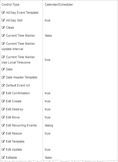
Rendered Component
The Calendar/Scheduler component provides numerous property settings, the majority of which are for more complex scenarios and are not needed for a simple calendar. The default component has an example of the only properties that are needed. The following descriptions reflect the rollover text in the Property Settings pane.
Properties values in quotes must use double quotes. Template is an HTML string.
See Telerik Scheduler documentation for more general information on the Scheduler.
-
All Day Event Template is the template used to render "all day" scheduler events. The fields which can be used in the template are:
-
description - the event description (String)
-
end - the event end date (Date)
-
isAllDay - if true, the event is "all day" (Boolean)
-
resources - the event resources (Array)
-
start - the event start date (Date)
-
title - the event title (String)
-
-
All Day Slot — If set to true, the scheduler will display a slot for "all day" events.
-
If this property is bound, it must start with "vm.models.".
-
A property array string index requires single quotes, e.g., vm.models.xxx.CustomProperties['yyyyy'].
-
An expression can be used that evaluates to true or false, e.g., vm.models.myvalue==7 (>,<, !=, ==, >=, <=).
-
If comparing to a string, it must be in single quotes.
See Telerik Scheduler documentation for more general information on the Scheduler.
(true and false must be all lowercase)
-
-
Auto Bind — In Forms Builder 3.5, this property is removed. It is always set to true.
-
Class is an optional CSS class (or space separated classes) added to the top level of the control. CSS specific to the control can be applied. The class must be defined in a Renderer CSS file. For more information, see Custom Styles.
-
Current Time Marker — If this property is set to false, the "current time" marker of the scheduler will not be displayed.
-
If this property is bound, it must start with "vm.models.".
-
A property array string index requires single quotes, e.g., vm.models.xxx.CustomProperties['yyyyy'].
-
An expression can be used that evaluates to true or false, e.g., vm.models.myvalue==7 (>,<, !=, ==, >=, <=).
-
If comparing to a string, it must be in single quotes.
See Telerik Scheduler documentation for more general information on the Scheduler.
(true and false must be all lowercase)
-
-
Current Time Marker Update Interval — This is the update interval of the "current time" marker in milliseconds. Default: 100000 (10 seconds)
See Telerik Scheduler documentation for more general information on the Scheduler.
-
Current Time Marker Use Local Timezone — If this property is set to false, the "current time" marker will be displayed using the scheduler time zone.
-
If this property is bound, it must start with "vm.models.".
-
A property array string index requires single quotes, e.g., vm.models.xxx.CustomProperties['yyyyy'].
-
An expression can be used that evaluates to true or false, e.g., vm.models.myvalue==7 (>,<, !=, ==, >=, <=).
-
If comparing to a string, it must be in single quotes.
See Telerik Scheduler documentation for more general information on the Scheduler.
(true and false must be all lowercase)
-
-
Data Source — In Forms Builder 3.5, this property is replaced with the Model Data property.
-
Date sets the current date of the event scheduler. The date is used to determine the period which is displayed.
If date is not specified, the current date is assumed.
To provide forward compatibility, the date string should be ISO 8601 compatible format, e.g., 2017-09-23 (which is a universal non-ambiguous format).
See Telerik Scheduler documentation for more general information on the Scheduler.
-
Date Header Template is the template used to render the date header cells. Template is an HTML string.
See Telerik Scheduler documentation for more general information on the Scheduler.
-
Default Event Url — If no Event Url is contained in the provider event data, this URL will be used for the event.
The provider EventId will be added to the end of the URL as ?EventId=27 or &EventId=27. The former will occur if the URL ends with a / or ? and the latter otherwise. The workflow can use it to look up the event.
This information will be available in the workflow as formInstance.QueryParams.DataDictionary("EventId"), e.g.,
-
http://myserver/#/renderer/27/?EventId=1020 or
-
http://myserver/#/renderer/27/?Mydata=xxxx&EventId=1020
-
-
Edit Confirmation — If this property is set to true, the scheduler will display a confirmation dialog when the user clicks the "destroy" button. This property is not used for event calendars where Editable is false.
This property is not bindable.
See Telerik Scheduler documentation for more general information on the Scheduler.
(true and false must be all lowercase)
-
Edit Create — If this property is set to true, the user can create new events. This property is not used for event calendars where Editable is false.
This property is not bindable.
See Telerik Scheduler documentation for more general information on the Scheduler.
(true and false must be all lowercase)
-
Edit Destroy — If this property is set to true, the user can delete events. This property is not used for event calendars where Editable is false.
This property is not bindable.
See Telerik Scheduler documentation for more general information on the Scheduler.
(true and false must be all lowercase)
-
Edit Move — If this property is set to true, the scheduler allows event moving. Dragging the event changes the start and end time. This property is not used for event calendars where Editable is false.
This property is not bindable.
See Telerik Scheduler documentation for more general information on the Scheduler.
(true and false must be all lowercase)
-
Edit Recurring Events — This property sets the edit mode for recurring events. The available modes are: "dialog" (default), "occurrence" and "series". This property is not used for event calendars where Editable is false.
See Telerik Scheduler documentation for more general information on the Scheduler.
-
Edit Resize — If this property is set to true, the scheduler allows event resizing. Dragging the resize handles changes the start or end time of the event. This property is not used for event calendars where Editable is false.
This property is not bindable.
See Telerik Scheduler documentation for more general information on the Scheduler.
(true and false must be all lowercase)
-
Edit Template allows the user to edit the template which renders the editor. Template is an HTML string.
See Telerik Scheduler documentation for more general information on the Scheduler.
-
Edit Update — If this property is set to true, the user can update events. This property is not used for event calendars where Editable is false.
This property is not bindable.
See Telerik Scheduler documentation for more general information on the Scheduler.
(true and false must be all lowercase)
-
Editable — If this property is set to true, the user can create new scheduler events and modify or delete existing events. For event calendars this is normally false. Default: false
This property is not bindable. When an event is editable, it cannot use custom property names. It must use the start, end, id, title, and description properties.
See Telerik Scheduler documentation for more general information on the Scheduler.
(true and false must be all lowercase)
-
End Time sets the end time of the week and day views. Overridden by data from the schedule provider if supplied.
Example
2016-10-1 19:00 or 2016-10-1 7:00 PM.
You must specify a date with the time because the time by itself will not be parsed correctly.
See Telerik Scheduler documentation for more general information on the Scheduler.
-
Event Template is the template used to render the scheduler events. The fields which can be used in the template are:
-
description - the event description (String)
-
end - the event end date (Date)
-
resources - the event resources (Array)
-
start - the event start date (Date)
-
title - the event title (String)
Additional fields defined in the Event data can be used in a template. They MUST match the properties returned. Additional properties cannot be used if the Editable is true
Template is an HTML string.
See Telerik Scheduler documentation for more general information on the Scheduler.
Example
<div class="event-template">
<p>
<span class="event-template-title">#: title #</span>
<span class="event-template-url">
<a href="#= EventUrl #" target="_top">Registration</a>
</span>
</p>
<p>
<span class="event-template-description">#: description #</span>
</p>
</div>Note that if this property (or any other in this template) is missing in the data (normal), it will cause an error. This should match the data property that you are using for this value. The Mapped URL default is “EventUrl, so this matches the template.
-
-
Footer — If this property is set to false, the footer of the scheduler will not be displayed.
-
If this property is bound, it must start with "vm.models.".
-
A property array string index requires single quotes, e.g., vm.models.xxx.CustomProperties['yyyyy'].
-
An expression can be used that evaluates to true or false, e.g., vm.models.myvalue==7 (>,<, !=, ==, >=, <=).
-
If comparing to a string, it must be in single quotes.
See Telerik Scheduler documentation for more general information on the Scheduler.
(true and false must be all lowercase)
-
-
Footer Command sets the command which will be displayed in the scheduler footer. Currently, only the "workDay" option is supported. If the option is set to false, the "workDay" button will be removed from the footer. Properties values in quotes must use double quotes.
See Telerik Scheduler documentation for more general information on the Scheduler.
(true and false must be all lowercase)
-
Group Header Template is the template used to render the group headers of scheduler day, week, workWeek, and timeline views.
Template is an HTML string.
See Telerik Scheduler documentation for more general information on the Scheduler.
-
Group Object sets the configuration of the scheduler resource(s) grouping. Properties values in quotes must use double quotes.
This is an extensive object with many properties. See Telerik Scheduler documentation for more general information on the Scheduler.
-
Height sets the height of the widget. Numeric values are treated as pixels. Default: 600
-
If it is bound it must begin with {{vm.models. and end with }}.
-
Allowable suffix characters: starts with letter, then letters, numerals or underscore.
See Telerik Scheduler documentation for more general information on the Scheduler.
-
-
Id is required. It can be any valid JavaScript id attribute value. (Must start with a letter followed by 0 to 9, a to z, dash, or underscore characters).
-
Using a globally unique identifier (GUID) from GuidGen or GuidGenerator prefixed by at least one letter prevents a clash with any other id.
-
Id should contain only a to z (uppercase or lowercase), 0 to 9, dash, or underscore. It should not have spaces.
-
Binding is not supported for this property.
-
-
Major Tick sets the number of minutes represented by a major tick. Default: 60
See Telerik Scheduler documentation for more general information on the Scheduler.
-
Major Time Header Template is the template used to render the major ticks. Template is an HTML string.
See Telerik Scheduler documentation for more general information on the Scheduler.
-
Mapped Description – sets the data property name that maps to “description”. The default is “EventDescription”
-
Mapped End – sets the data property name that maps to “end”. The default is “EventEndDate”. “end” is a built-in name required by the Calendar/Scheduler, so if your data does not have this name, set the mapped name.
-
Mapped ID – sets the data property name that maps to “id”. Default is “EventId”. The “id” in the event data must be unique for every event, or the calendar may fail to work as expected.
-
Mapped Start - sets the data property name that maps to “start”. The default is “EventStartDate”. “start” is a built-in name required by the Calendar/Scheduler, so if your data does not have this name, set the mapped name.
-
Mapped Title – sets the data property name that maps to “title”. The default is “EventName”.
-
Mapped URL – sets the data property name that defines the data item that contains a URL to which the EventId= in the data is appended. The default is “EventUrl”, e.g., the data “EventUrl”:”http://mysite.com/#/renderer/myform” will become http://mysite.com/#/renderer/mysequence?EventId=2232. This “EventId” can be used in a workflow to look up the original event to get more information than was possible to put in the scheduler. Obviously, you can add your own parameters to cause the workflow to do something based on a parameter value. This URL can be embedded in an <a> HTML link in the template.
-
Max Date constrains the maximum date which can be selected via the scheduler navigation. To provide forward compatibility, the date string should be ISO 8601 compatible format. e.g. 2017-09-23 (which is a universal non-ambiguous format).
See Telerik Scheduler documentation for more general information on the Scheduler.
-
Messages Object — The configuration of scheduler messages. Use this option to customize or localize scheduler messages. Properties values in quotes must use double quotes.
This is an extensive object with many properties. See Telerik Scheduler documentation for more general information on the Scheduler.
-
Min Date constrains the minimum date which can be selected via the scheduler navigation. To provide forward compatibility, the date string should be ISO 8601 compatible format. e.g. 2017-09-23 (which is a universal non-ambiguous format).
See Telerik Scheduler documentation for more general information on the Scheduler.
-
Minor Tick Count sets the number of time slots to display per major tick. Default: 2
If set, the minorTickCount value should be set to a number greater than 0.See Telerik Scheduler documentation for more general information on the Scheduler.
-
Minor Time Header Template is the template used to render the minor ticks. Template is an HTML string.
See Telerik Scheduler documentation for more general information on the Scheduler.
-
Mobile Rendering — If set to true and the Calendar/Scheduler is viewed on a mobile browser, it will use adaptive rendering. The value can be set to a string "phone" or "tablet" to force the widget to use adaptive rendering regardless of browser type.
See Telerik Scheduler documentation for more general information on the Scheduler.
Forms Builder currently does not support rendering of the Calendar/Scheduler component on mobile devices.
-
Model is required for binding to a workflow argument or another control. If the Model property is not specified, the component will be displayed on the form, but any values the user enters on the form cannot be captured or used in the workflow.
-
The Model value must always start with "vm.models.", e.g., vm.models.myArgument.
-
This value may initialize the control, and may be updated by the control, and if matched to a workflow argument, is available in the workflow (readable or writable).
-
Ensure your model argument is defined in your workflow for custom components if it is used in the workflow. Otherwise, a workflow argument is not required.
-
The casing of an argument used in the workflow MUST match the "vm.models." suffix casing.
-
If the model addresses CustomProperties or MultiValueCustomProperties, the property identifier string must be enclosed in single quotes, e.g., vm.models.myentity.CustomProperties['mycustomprop']
If an OData query is specified and this binding is specified, it will be overwritten with the value of the OData query results and thus be available read-only in the workflow.
If only "Model Data" is specified and the workflow variable is either not initialized or set to an empty array, this value will be initialized to the "Model Data" value.
Construction of the model in the workflow is done by assigning data from a provider.
Note: Editing the Calendar/Scheduler currently does not update the Model value. This functionality will be added in a future release.
-
-
Model Data — The initial data specified as a JSON object. This will be ignored if data is directly provided by an OData Query from a data provider or when a bound Model is provided.
Property names and values must use double quotes. Names of properties must match those in a template if they are to be used by the template. The default template has several default property names.
Dates are entered as ISO 8601 compatible strings and Date objects will be created out of them, e.g., 2016-06-13 or 2016-06-13T09:08:01-05:00 (Google ISO 8601 for explanation).
See Telerik Scheduler documentation for more general information on the Scheduler.
-
OData Query — The URL specific part of an OData URI. Base URL and Product will be supplied by the configuration. Does not include the web address or product, e.g., Students?$top=10. This part is the implementation of the specifications for the provider API to get event data.
-
OData Translation Members is a comma separated list of property names in an OData query string to be translated. You should always validate the query will work in a browser. Only basic errors can be detected in Form Designer.
-
PDF Object — Configures the Kendo UI Scheduler PDF export settings and is specified by a Json string.
-
Must be specified as a JSON string.
-
Properties values in quotes must use double quotes.
This is an extensive object with many properties. See Telerik Scheduler documentation for more general information on the Scheduler.
-
-
Product indicates the product from which OData query results are returned. Select from:
- Student
- CRM
- Occupation Insight
The selected product must be configured in the <products> section of the Renderer web.config file.
The default Product value will be "Student" if "Student" is selected in the <Select Provider> list on the Fields tab.
The default Product value will be "CRM" if "CRM" is selected in the <Select Provider> list on the Fields tab.
Select "Occupation Insight" in the Product property if the source of the query will come from a different data source other than Student/CRM. For more information, see Build Queries for Occupation Insight.
A form can have multiple controls that retrieve data from different providers. For example, a form can have a control that is populated by a query to the Student database. The same form can have another control that retrieves data from Occupation Insight.
Specify the query to retrieve data from the selected provider using the Lookup Query or OData Query property (as applicable for the control). The query contains only the URL specific part of an OData URI. The Base URL and Product will be supplied by the configuration.
-
Resources Object — The configuration of the scheduler resource(s). A scheduler resource is optional metadata that can be associated with a scheduler event. Must be specified as a JSON string.
Properties values in quotes must use double quotes.
Overridden by data from the schedule provider if supplied.
This is an extensive object with many properties. See Telerik Scheduler documentation for more general information on the Scheduler.
-
Selectable Event — If this property is set to true, the user can select scheduler cells and events. By default, selection is disabled. This is not currently used by any feature and can be left false.
This property is not bindable.
See Telerik Scheduler documentation for more general information on the Scheduler.
(true and false must be all lowercase)
-
Show Work Hours — If this property is set to true, the view will be initially shown in business hours mode. By default, the view is displayed in full day mode.
This property is not bindable.
See Telerik Scheduler documentation for more general information on the Scheduler.
(true and false must be all lowercase)
-
Snap To Slot — If this property is set to true, the scheduler will snap events to the nearest slot during dragging (resizing or moving). Set it to false to allow free moving and resizing of events. For event calendars, where Editable is false, this is not used.
This property is not bindable.
See Telerik Scheduler documentation for more general information on the Scheduler.
(true and false must be all lowercase)
-
Start Time — The start time of the week and day views. The scheduler will display events starting after the startTime, e.g., "2016-10-22 9:00 PM or 2016-10-22 21:00"
You must specify a date with the time because the time by itself will not be parsed correctly.
To provide forward compatibility, the date string should be ISO 8601 compatible format. e.g. 2017-09-23 (which is a universal non-ambiguous format).
See Telerik Scheduler documentation for more general information on the Scheduler.
-
Tab Index allows you to specify the order of elements that are brought into focus when the user presses the Tab key on the rendered form. Allowed values are -1, 0, and positive numbers.
-
A value of "-1" removes the element from the sequential tab order preventing keyboard users from focusing on it.
-
A value of "0" means the element is ignored in the tab order, but that does not mean users cannot tab to and focus an element.
-
A value of "1" sets the element as the first item to gain focus when tabbing through the page followed by any higher numbered tab indices, followed by any other keyboard focusable elements such as buttons. required fields, and CAPTCHA.
The tab index value should not match another control's tab index.
-
A blank value (default) will not add a tab index in the HTML.
For more information, see https://html.spec.whatwg.org/multipage/interaction.html#the-tabindex-attribute and https://www.alexlande.com/articles/cross-browser-tabindex-woes/.
-
-
Time Zone — The time zone which the scheduler will use to display the scheduler appointment dates. Setting this pins the browser relative time zone no matter where the browser is.
When set and the date does not contain an offset, then the time will not be changed and will be the same in any browser worldwide.
Examples:
-
"2018-06-15T17:00:00" or "2018/06/15 05:00 PM" which is 5 PM will remain 5PM in every time zone.
This is also true if a time zone is present and "Time Zone - Ignore Input" is true, because the offset will be removed first.
Otherwise, if an offset is present in the date, then the date-time will be translated to the set time zone first. This could change the date.
-
"2018-06-15T23:00:00-04:00" which is 11 PM EDT (Florida during daylight saving hours) and the set time zone is PST8PDT (California), then this will be translated to "2018-06-15T02:00-07:00" which is 2 AM the next day.
The scheduler will display this as 2AM in any browser worldwide.
If not set, the current time zone of the browser is used. This means that while date-times without offsets will not be affected, date-times with offsets will be different in different browser time zones, because the time will be translated to the local time zone.
-
"2018-06-15T17:00:00-08:00" which is 5 PM PDT, will be translated to 8PM EDT for a browser in Florida, but midnight in London.
A list of IANA Canonical, Alias and Deprecated time zones can be found here.
The list of actual supported time zones is available in the time zone property of the moment-timezone source.
See Telerik Scheduler documentation for more general information on the Scheduler.
-
-
Time Zone - Ignore Input — If true, a time zone (offset) that is present on the incoming data will be removed.
Example
"2018-06-15T17:00:00-04:00" which represents 5PM EDT (daylight savings date), will be truncated to "2018-06-15T17:00:00". This actually represents 5PM in any time zone.
This property is not bindable.
(true and false must be all lowercase)
Use cases
-
Set this property to true when the form uses an OData query to retrieve CRM events for an onsite event such a as fixed time onsite campus orientation. A person in a different time zone would need to show up at that fixed time in the destination time zone.
-
Set this property to false when the form is used for registration to an online event where you want the user to see the appropriate time zone in the user's location. Online the time is going to be different in each time zone, but the same universal time for everyone.
-
-
Time Zone - Remove Output — If true, the time zone is removed from the model date-time.
Example
"2018-06-15T17:00:00-04:00" which represents 5PM EDT (daylight savings date), will be truncated to "2018-06-15T17:00:00". This actually represents 5PM in any time zone and information on which time zone it might have been created in is not available.
This property is not bindable.
(true and false must be all lowercase)
Use cases
The setting for this property would almost always match the Time Zone - Ignore Input setting, i.e., both true or both false. But if desired, you can set the properties differently.
-
Toolbar Object — List of commands that the scheduler will display in its toolbar as buttons. Currently supports only the "pdf" command. Properties values in quotes must use double quotes.
See Telerik Scheduler documentation for more general information on the Scheduler.
-
View For Agenda Selection — On an agenda view, when a non-editable event is clicked, this is the view that will be shown, if available.
-
View For Month Selection — On a month view, when a non-editable event is clicked, this is the view that will be shown, if available.
-
View For Week Selection — On a week or workWeek view, when a non-editable event is clicked, this is the view that will be shown, if available.
-
Views Object — The views displayed by the scheduler and their configuration. The array items can be either objects specifying the view configuration or strings representing the view types (assuming default configuration).
If not specified, the Kendo UI Scheduler widget displays "day" and "week" view.
Properties values in quotes must use double quotes.
If using the "eventTemplate" property, it is an HTML string.
If single quotes are required in HTML elements, use '
This is an extensive object with many properties. See Telerik Scheduler documentation for more general information on the Scheduler.
Example 1
This example shows 5 views: day, workweek, week, month, and agenda in JSON format. Each of them can be a simple string if no other properties are required. In this example both month and agenda have extra properties, so they are set as an object with properties, 2 in each case. “type” is required to set the view name. Month is selected by default by the “selected”: true. For other properties which can be added to each of them, refer to the Telerik documentation for views property of the Scheduler.
[
  "day",
  "workWeek",
  "week",
  {
    "type": "month",
    "selected": true
  },
  "agenda",
  {
    "type": "timeline",
    "eventHeight": 50
  }
]
Example 2
In this example, day and month have templates for different views (others could too instead of the default).
Note: Since the entire property value is in single quotes, single quotes cannot be used again inside the template. Anywhere a single quote is needed inside double-quote HTML elements, the HTML substitute
'is used.[ { "type": "day", "eventTemplate": "<div class='event-template'><p>Click this link to go to <span class='event-template-url'><a href='#= eventUrl #' target='_blank'>Registration</a></span></p></div>" }, "workWeek", "week", { "type": "month", "selected": true, "eventTemplate": "<div class='event-template'><p><span class='event-template-title' title='#: title #'>#: title #</span></p></div>" }, "agenda", { "type": "timeline", "eventHeight": 50 } ] -
Visible makes the control visible or hidden.
-
Can be bound to a workflow argument or another control's value. This property is dynamic.
-
A property array string index requires single quotes, e.g., vm.models.xxx.CustomProperties['yyyyy'].
-
An expression can be used that evaluates to true or false, e.g., vm.models.myvalue==7 (>,<, !=, ==, >=, <=). If comparing to a string, it must be in single quotes.
-
(true and false must be all lowercase)
-
-
Width — Sets the width of the widget. Numeric values are treated as pixels. This property is not bindable.
See Telerik Scheduler documentation for more general information on the Scheduler.
-
Work Day End — Sets the end of the work day when the "Show business hours" button is clicked, e.g., "2016/10/1 19:00".
See Telerik Scheduler documentation for more general information on the Scheduler.
-
Work Day Start — Sets the start of the work day when the "Show business hours" button is clicked, e.g., "2016/10/1 09:00 AM".
See Telerik Scheduler documentation for more general information on the Scheduler.
-
Work Week End — Sets the end of the work week (index based). Default: 5
See Telerik Scheduler documentation for more general information on the Scheduler.
-
Work Week Start — Sets the start of the work week (index based). Default: 1
See Telerik Scheduler documentation for more general information on the Scheduler.