Themes
A theme controls the presentation of content in a website. A theme is a collection of files that work together to control how content is displayed. The files in a theme can include style sheets (.css), images, fonts, color schemes, scripts, templates, and text files. The name of a theme maps to a .css file.
Forms Builder pre-populates a set of Bootstrap and Kendo themes.
-
Bootstrap themes are primarily used for layouts, containers for elements, and general webpage elements.
The following Bootstrap themes are available out-of-the-box:
Bootstrap Themes Common Name File Name Cerulean bootstrap.cerulean.min.css Cosmo bootstrap.cosmo.min.css Cyborg bootstrap.cyborg.min.css Darkly bootstrap.darkly.min.css Default bootstrap.default.min.css Flatly bootstrap.flatly.min.css Journal bootstrap.journal.min.css Lumen bootstrap.lumen.min.css Paper bootstrap.paper.min.css Readable bootstrap.readable.min.css Sandstone bootstrap.sandstone.min.css Simplex bootstrap.simplex.min.css Slate bootstrap.slate.min.css Spacelab bootstrap.spacelab.min.css Superhero bootstrap.superhero.min.css United bootstrap.united.min.css Yeti bootstrap.yeti.min.css -
Kendo themes are used for Kendo controls (e.g., buttons, check boxes). Kendo themes override Bootstrap elements that are used in rendering Kendo controls. Kendo themes do not just override colors and fonts, they also override borders, spacing, padding, and margins to make the controls look better.
The following Kendo themes are available out-of-the-box:
Kendo Themes Common Name File Name Black kendo.black.min.css BlueOpal kendo.blueopal.min.css Bootstrap kendo.bootstrap.min.css Default kendo.default.min.css Fiori kendo.fiori.min.css Flat kendo.flat.min.css HighContrast kendo.highcontrast.min.css Material kendo.material.min.css MaterialBlack kendo.materialblack.min.css Metro kendo.metro.min.css Metro Black kendo.metroblack.min.css Moonlight kendo.moonlight.min.css Nova kendo.nova.min.css Office365 kendo.office365.min.css Silver kendo.silver.min.css Uniform kendo.uniform.min.css For more information, see Kendo UI ThemeBuilder.
Note: Both Bootstrap and Kendo themes apply CSS based on media. That is, the size, type, and host operating system of the browser that is used. Thus, a complex interaction results where one may apply a different CSS set for a browser size, type, or host OS, while the other does not switch to different CSS.
Themes can be associated with individual sequences within the property settings in Sequence Designer.
Note:
-
Custom bootstrap and custom Kendo themes selected in version 4.0 (or in prior versions) in the Sequence Designer will no longer be available. The following default values will be set for such sequences:
-
Theme-Bootstrap: Lumen
-
Theme-Kendo: Silver
-
-
Customizations requires all custom files to be uploaded to the CustomContent data table. See Custom Content.
You can customize the style of controls using the Class property. For more information, see Custom Styles.
Apply a Theme to a Sequence
-
Select the Sequence Designer tile on the home page of Form Designer.
-
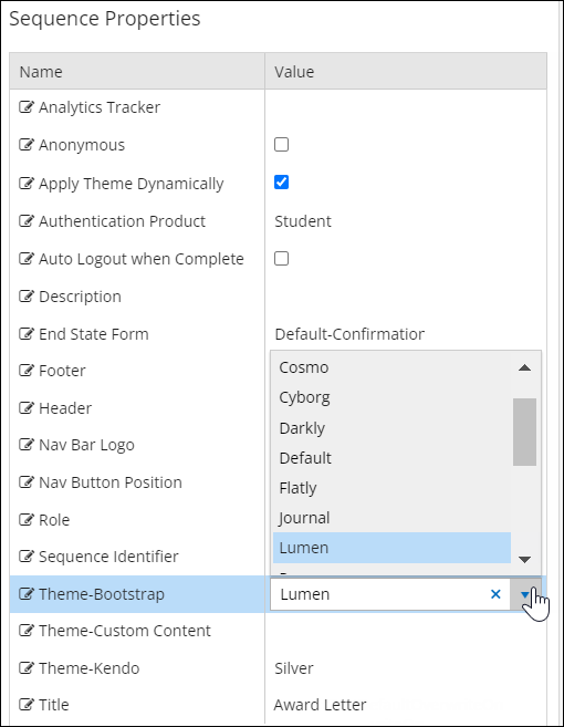
Select a sequence in the Sequences pane.
-
In the Properties pane:
-
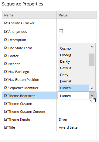
Select the Name of a theme group, e.g., Theme-Bootstrap, Theme-Custom Content, or Theme-Kendo.
-
Click the Value field and select a theme from the drop-down list.
-
-
Save the sequence.
-
Review the rendered sequence. If necessary, refresh the browser cache by pressing Ctrl+F5. Note the changes in the content presentation based on the selected theme.
To remove a previously selected theme from a sequence, select the blank option in the Value field.
A theme controls the presentation of content in a website. A theme is a collection of files that work together to control how content is displayed. The files in a theme can include style sheets (.css), images, fonts, color schemes, scripts, templates, and text files. The name of a theme maps to a .css file.
Forms Builder pre-populates a set of Bootstrap, Kendo, and Custom themes.
-
Bootstrap themes are primarily used for layouts, containers for elements, and general webpage elements. When upgrading to Forms Builder 3.6.1 and later, any new themes are installed to the Content/bootstrap directory on the Forms Builder server and are available for selection. The available themes are not automatically added to the Bootstrap themes in Settings. Click the Add Theme button and specify the theme name and CSS file name from the table below. You can change the name, but the given CSS file name must be used.
Bootstrap Themes Common Name File Name Cerulean bootstrap.cerulean.min.css Cosmo bootstrap.cosmo.min.css Cyborg bootstrap.cyborg.min.css Darkly bootstrap.darkly.min.css Default bootstrap.default.min.css Flatly bootstrap.flatly.min.css Journal bootstrap.journal.min.css Lumen bootstrap.lumen.min.css Paper bootstrap.paper.min.css Readable bootstrap.readable.min.css Sandstone bootstrap.sandstone.min.css Simplex bootstrap.simplex.min.css Slate bootstrap.slate.min.css Spacelab bootstrap.spacelab.min.css Superhero bootstrap.superhero.min.css United bootstrap.united.min.css Yeti bootstrap.yeti.min.css -
Kendo themes are used for Kendo controls (e.g., buttons, check boxes). Kendo themes override Bootstrap elements that are used in rendering Kendo controls. Kendo themes do not just override colors and fonts, they also override borders, spacing, padding, and margins to make the controls look better.
For more information, see Kendo UI ThemeBuilder.
Note: Both Bootstrap and Kendo themes apply CSS based on media. That is, the size, type, and host operating system of the browser that is used. Thus, a complex interaction results where one may apply a different CSS set for a browser size, type, or host OS, while the other does not switch to different CSS.
-
Custom themes control the presentation of elements that are specific to an institution (e.g., logos, personalized items). See Custom Content.

After December 2021 custom files in local file systems and Custom Themes will no longer be supported. We recommend that you prepare for this change at your earliest convenience. For more details, see Remove Local Custom Content.
You can add and remove Bootstrap, Kendo, and Custom themes and apply specific themes to individual sequences. The available themes are configured in the Settings workspace. Themes can then be associated with individual sequences within the property settings in Sequence Designer.
Note: Azure customers can use the default Kendo, Bootstrap, and Custom themes provided with the Forms Builder product under Settings; however, no additional custom themes will work on Azure environments. Customization in Azure environments requires all custom files to be uploaded to the CustomContent data table. See Custom Content.
You can customize the style of controls using the Class property. For more information, see Custom Styles.
Configure Themes
-
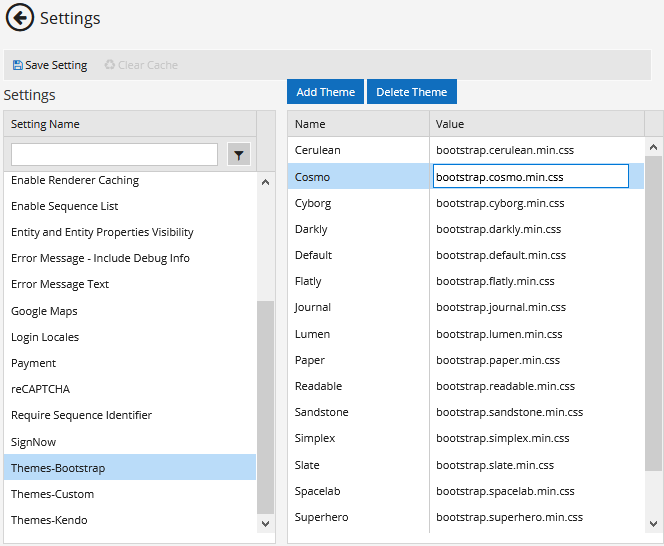
Select the Settings tile on the home page of Form Designer.
-
In the left pane, select a theme group. The available groups are Themes-Bootstrap, Themes-Custom, and Themes-Kendo.
The right pane displays themes in each theme group. Each theme has a Name and Value. The Value indicates the .css file mapped to the Name.
When a theme group is selected, the Add Theme and Delete Theme buttons appear above the right pane.

-
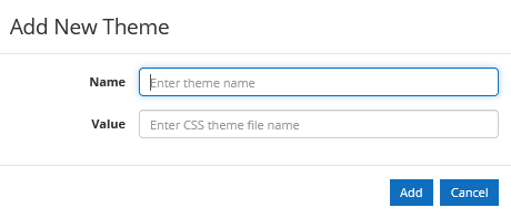
To add a theme, click Add Theme. The Add New Theme popup is displayed.
-
In the Name field, specify the name of the theme.
In the Value field, specify the .css file.
-
If the .css file is stored locally, specify only the .css file name in the Value field.
Forms Builder locates the .css file in the appropriate directory for each theme group.
<Renderer installation folder>\Content\bootstrap
<Renderer installation folder>\Content\custom
<Renderer installation folder>\Content\kendo -
If the .css file is retrieved from a website, specify the URL for the .css file in the Value field.
-
-
Click Add. The popup is closed.
-
Click Save in the Settings workspace. The added theme is now available in Sequence Designer.
Apply a Theme to a Sequence
-
Select the Sequence Designer tile on the home page of Form Designer.
-
Select a sequence in the Sequences pane.
-
In the Properties pane:
-
Select the Name of a theme group, e.g., Theme-Bootstrap, Theme-Custom, or Theme-Kendo.
Note: You cannot save a sequence with selections for both Theme-Custom Content and Theme-Custom.
-
Click the Value field and select a theme from the drop-down list.
Note: If you select the Bootstrap theme named 'Paper', a custom.css is required to apply style overrides to the check box element.
-
-
Save the sequence.
-
Review the rendered sequence. If necessary, refresh the browser cache by pressing Ctrl+F5. Note the changes in the content presentation based on the selected theme.
To remove a previously selected theme from a sequence, select the blank option in the Value field.
A theme controls the presentation of content in a website. A theme is a collection of files that work together to control how content is displayed. The files in a theme can include style sheets (.css), images, fonts, color schemes, scripts, templates, and text files. The name of a theme maps to a .css file.
Forms Builder pre-populates a set of Bootstrap, Kendo, and Custom themes.
-
Bootstrap themes are primarily used for layouts, containers for elements, and general webpage elements.
When upgrading to Forms Builder 3.6.1 and later, any new themes are installed to the Content/bootstrap directory on the Forms Builder server and are available for selection. The available themes are not automatically added to the Bootstrap themes in Settings. Click the Add Theme button and specify the theme name and CSS file name from the table below. You can change the name, but the given CSS file name must be used.
Bootstrap Themes Common Name File Name Cerulean bootstrap.cerulean.min.css Cosmo bootstrap.cosmo.min.css Cyborg bootstrap.cyborg.min.css Darkly bootstrap.darkly.min.css Default bootstrap.default.min.css Flatly bootstrap.flatly.min.css Journal bootstrap.journal.min.css Lumen bootstrap.lumen.min.css Paper bootstrap.paper.min.css Readable bootstrap.readable.min.css Sandstone bootstrap.sandstone.min.css Simplex bootstrap.simplex.min.css Slate bootstrap.slate.min.css Spacelab bootstrap.spacelab.min.css Superhero bootstrap.superhero.min.css United bootstrap.united.min.css Yeti bootstrap.yeti.min.css -
Kendo themes are used for Kendo controls (e.g., buttons, check boxes). Kendo themes override Bootstrap elements that are used in rendering Kendo controls. Kendo themes do not just override colors and fonts, they also override borders, spacing, padding, and margins to make the controls look better.
For more information, see Kendo UI ThemeBuilder.
Note: Both Bootstrap and Kendo themes apply CSS based on media. That is, the size, type, and host operating system of the browser that is used. Thus, a complex interaction results where one may apply a different CSS set for a browser size, type, or host OS, while the other does not switch to different CSS.
-
Custom themes control the presentation of elements that are specific to an institution (e.g., logos, personalized items). See Custom Content.
After December 2021 custom files in local file systems and Custom Themes will no longer be supported. We recommend that you prepare for this change at your earliest convenience. For more details, see Remove Local Custom Content.
You can add and remove Bootstrap, Kendo, and Custom themes and apply specific themes to individual sequences. The available themes are configured in the Settings workspace. Themes can then be associated with individual sequences within the property settings in Sequence Designer.
Note: Azure customers can use the default Kendo, Bootstrap, and Custom themes provided with the Forms Builder product under Settings; however, no additional custom themes will work on Azure environments. Customization in Azure environments requires all custom files to be uploaded to the CustomContent data table. See Custom Content.
You can customize the style of controls using the Class property. For more information, see Custom Styles.
Configure Themes
-
Select the Settings tile on the home page of Form Designer.
-
In the left pane, select a theme group. The available groups are Themes-Bootstrap, Themes-Custom, and Themes-Kendo.
The right pane displays themes in each theme group. Each theme has a Name and Value. The Value indicates the .css file mapped to the Name.
When a theme group is selected, the Add Theme and Delete Theme buttons appear above the right pane.
-
To add a theme, click Add Theme. The Add New Theme popup is displayed.
-
In the Name field, specify the name of the theme.
In the Value field, specify the .css file.
-
If the .css file is stored locally, specify only the .css file name in the Value field.
Forms Builder locates the .css file in the appropriate directory for each theme group.
<Renderer installation folder>\Content\bootstrap
<Renderer installation folder>\Content\custom
<Renderer installation folder>\Content\kendo -
If the .css file is retrieved from a website, specify the URL for the .css file in the Value field.
-
-
Click Add. The popup is closed.
-
Click Save in the Settings workspace. The added theme is now available in Sequence Designer.
Apply a Theme to a Sequence
-
Select the Sequence Designer tile on the home page of Form Designer.
-
Select a sequence in the Sequences pane.
-
In the Properties pane:
-
Select the Name of a theme group, e.g., Theme-Bootstrap, Theme-Custom, or Theme-Kendo.
Note: You cannot save a sequence with selections for both Theme-Custom Content and Theme-Custom.
-
Click the Value field and select a theme from the drop-down list.
Note: If you select the Bootstrap theme named 'Paper', a custom.css is required to apply style overrides to the check box element.
-
-
Save the sequence.
-
Review the rendered sequence. If necessary, refresh the browser cache by pressing Ctrl+F5. Note the changes in the content presentation based on the selected theme.
To remove a previously selected theme from a sequence, select the blank option in the Value field.