Workflow Composer
This topic describes the user interface (UI) of Workflow Composer. Some UI elements are visible when the application is opened, while additional UI elements become available when a workflow file is loaded.
When the application is opened for the first time, the UI consists of a ribbon and several task panes or windows. The ribbon organizes commands into logical groups. These groups appear on separate tabs in a strip across the top of the window. The task panes include the Designer area where the workflow sequence is composed and several resource panes. The status bar displays the version of the Workflow Composer, the name of the connected database, and the name of the activity selected in the Designer pane.

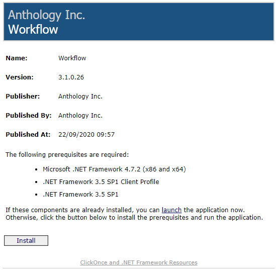
Workflow Composer 3.0 and later is deployed via a ClickOnce application that allows self-updating Windows-based applications to be installed and run with minimal user interaction. You can install Workflow Composer with one click on the Install button or launch it from a web site.
|
Depending on the settings and antivirus/malware software installed on your machine as well as your corporate policies, you may see a warning when installing Workflow Composer and its activity packages. |
When the installation is completed, you are prompted to configure Workflow Composer. For more information, see Configuration.
For details about the ClickOnce URL and login credentials, refer to https://filetransfer.campusmgmt.com > softwareupdates > WorkflowComposer > WF_ComposerInstallationSteps.pdf.
Note: If you installed Workflow Composer using ClickOnce with auto update, previously installed packages are removed and need to be reinstalled.
The  button displays a basic menu that lets you to create, open, and close a workflow, access this Help system, Package Manager, or the About window.
The About window displays the following information:
- Version
- Database (name of a Anthology Student or CampusNexus CRM database)
- Tracking Database
- Build Date
- Copyright
The  or
or  buttons on the top right show or hide the ribbon.
The Settings tab lets you reset the default layout of the task panes or select a color scheme (theme) for Workflow Composer.
The task panes include the following:
- Designer
- Toolbox
- Debug Properties
- Properties
- Error List
- Output
You can customize layout of the panes as follows:
- Move panes to different positions within the main window.
- Detach panes from the main window.
- Re-size panes.
- Hide panes.
- Close panes.
- Re-open panes.
Right-click the title bar of a pane and select from the following display settings for the current session:
- Float
- Auto Hide
- Hide
When you have closed task panes, icons representing the panes appear at the bottom of the main window. Hover over the icons to see the labels. Click an icon to re-open the associated pane.
You can select to view the Error List or the Output tabs below the Designer pane. The Error List helps to identify errors that may occur while building workflows in the Designer pane. For example, if an incorrect entity is used in an expression, an error similar to the example below is displayed. 
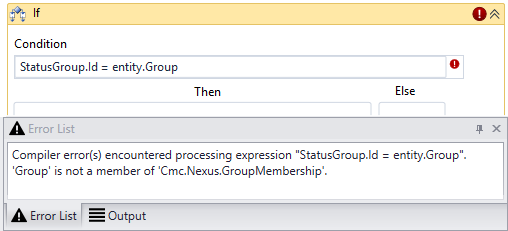
The Error List also indicates any problems encountered with data types for variables. For every activity that requires a variable, an error is displayed until the correct variable is added to the workflow.
Additional UI Elements When a Workflow is Loaded
When a workflow file (.XAML) is loaded into the Workflow Composer, toolbars appear at the top and bottom of the Designer pane.
-
The toolbar at the top of the Designer pane displays breadcrumbs for the workflow elements, an Expand All button, and a Collapse All button. The breadcrumbs appear when you double-click the icon in the header bar of a workflow activity.
-
The toolbar below the Designer pane displays buttons for Variables, Arguments, Imports, and pan/zoom controls.

Click Variables to view, edit, or create variables to be used in the workflow. The variable details include:
- Name
- Variable type
- Scope
- Default
You have the option to create variables in this pane.
Click Arguments to view, edit, or create arguments to be used in the workflow. The argument details include:
- Name
- Direction
- Argument type
- Default value
Click Imports to view the list of the imported namespaces. The default namespaces include:
- Cmc.Core.ComponentModel
- Cmc.Core.EntityModel
- Cmc.Nexus (multiple namespaces depending on the activities used in the workflow)
- Microsoft.VisualBasic.Activities
- System.Activities (multiple namespaces)
- System.Windows.Markup
You have the option to enter or select additional namespaces for import.
Note: If you copy and paste a Sequence from one workflow to another, you may need to recreate any associated variables to ensure all namespaces are properly imported.

The pan/zoom controls enable you to pan and zoom the display in the Designer pane. Tooltips are provided for these buttons.
This topic describes the user interface (UI) of Workflow Composer. Some UI elements are visible when the application is opened, while additional UI elements become available when a workflow file is loaded.
When the application is opened for the first time, the UI consists of a ribbon and several task panes or windows. The ribbon organizes commands into logical groups. These groups appear on separate tabs in a strip across the top of the window. The task panes include the Designer area where the workflow sequence is composed and several resource panes. The status bar displays the version of the Workflow Composer, the name of the connected database, and the name of the activity selected in the Designer pane.
Workflow Composer 3.0 and later is deployed via a ClickOnce application that allows self-updating Windows-based applications to be installed and run with minimal user interaction. You can install Workflow Composer with one click on the Install button or launch it from a web site.
When the installation is completed, you are prompted to configure Workflow Composer. For more information, see Configuration.
For details about the ClickOnce URL and login credentials, refer to https://filetransfer.campusmgmt.com > softwareupdates > WorkflowComposer > WF_ComposerInstallationSteps.pdf.
Note: If you installed Workflow Composer using ClickOnce with auto update, previously installed packages are removed and need to be reinstalled.
The button displays a basic menu that lets you to create, open, and close a workflow, access this Help system, Package Manager, or the About window.
The About window displays the following information:
- Version
- Database (name of a Anthology Student or CampusNexus CRM database)
- Tracking Database
- Build Date
- Copyright
The or buttons on the top right show or hide the ribbon.
The Settings tab lets you reset the default layout of the task panes or select a color scheme (theme) for Workflow Composer.
The task panes include the following:
- Designer
- Toolbox
- Debug Properties
- Properties
- Error List
- Output
You can customize layout of the panes as follows:
- Move panes to different positions within the main window.
- Detach panes from the main window.
- Re-size panes.
- Hide panes.
- Close panes.
- Re-open panes.
Right-click the title bar of a pane and select from the following display settings for the current session:
- Float
- Auto Hide
- Hide
When you have closed task panes, icons representing the panes appear at the bottom of the main window. Hover over the icons to see the labels. Click an icon to re-open the associated pane.
You can select to view the Error List or the Output tabs below the Designer pane. The Error List helps to identify errors that may occur while building workflows in the Designer pane. For example, if an incorrect entity is used in an expression, an error similar to the example below is displayed.
The Error List also indicates any problems encountered with data types for variables. For every activity that requires a variable, an error is displayed until the correct variable is added to the workflow.
Additional UI Elements When a Workflow is Loaded
When a workflow file (.XAML) is loaded into the Workflow Composer, toolbars appear at the top and bottom of the Designer pane.
-
The toolbar at the top of the Designer pane displays breadcrumbs for the workflow elements, an Expand All button, and a Collapse All button. The breadcrumbs appear when you double-click the icon in the header bar of a workflow activity.
-
The toolbar below the Designer pane displays buttons for Variables, Arguments, Imports, and pan/zoom controls.
Click Variables to view, edit, or create variables to be used in the workflow. The variable details include:
- Name
- Variable type
- Scope
- Default
You have the option to create variables in this pane.
Click Arguments to view, edit, or create arguments to be used in the workflow. The argument details include:
- Name
- Direction
- Argument type
- Default value
Click Imports to view the list of the imported namespaces. The default namespaces include:
- Cmc.Core.ComponentModel
- Cmc.Core.EntityModel
- Cmc.Nexus (multiple namespaces depending on the activities used in the workflow)
- Microsoft.VisualBasic.Activities
- System.Activities (multiple namespaces)
- System.Windows.Markup
You have the option to enter or select additional namespaces for import.
Note: If you copy and paste a Sequence from one workflow to another, you may need to recreate any associated variables to ensure all namespaces are properly imported.
The pan/zoom controls enable you to pan and zoom the display in the Designer pane. Tooltips are provided for these buttons.