The topic "SignNow Component" is not available in Version 3.5.
The topic "SignNow Component" is not available in Version 3.6.
SignNow
You can use the SignNow component to integrate SignNow fields into a form. Forms Builder supports several types of SignNow fields, e.g., Checkbox, Dropdown, Email, Initial, Signature, and Text. The fields are selected in the Type property of the Control Property Settings.
Before using the SignNow component, you must set up and account with SignNow and configure the SignNow Settings in Forms Builder.
Properties
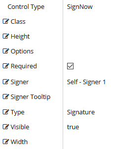
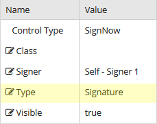
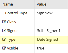
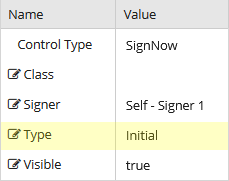
Control Property Settings
Rendered Components
- Type=Signature
- Type=Date Signed
- Type=Initial
-
Class is an optional CSS class (or space separated classes) added to the top level of the control. CSS specific to the control can be applied. The class must be defined in a Renderer CSS file. For more information, see Custom Styles.
-
Height of the field. Defaults to 15 px if not specified.
-
Options for a Dropdown field. Specify the values as a comma separated list with a space after each comma e.g.,
option1, option2, option3, ...If the spaces are missing, the Dropdown field is not displayed.
-
Required is set to false by default. Select the property if input is required for a field. This property is applicable only to Checkbox, Dropdown, Email, Phone, SSN, and Text fields.
-
Signer provides the following options:
- Self - Signer 1
- Signer 2
- Signer 3
- Signer 4
- Signer 5
-
Signer Tooltip is a label on a Type field that displays at signing for the specified signer. A Signer Tooltip can be applied to any Type field, except Checkbox.
If no Signer Tooltip is applied to a Type field, a default for the Type will be displayed.
Spaces in Signer Tooltips are stripped out. If special characters are used, the field will not be displayed.
Example:
When a Signer Tooltip is specified as "Mom Email", the Email field will be displayed as:
 .
. Without the Signer Tooltip, the Email field will be displayed as:

Note: Signer Tooltip is displayed only to the specified signer at the time of signing and will not be shown in the final pdf. To include a label for the Type field that will be displayed in the final pdf, use an HTML or Label component.
-
Type provides the following SignNow fields:
Field Description Checkbox Allows the recipient to select or clear a check box. Date Signed Allows the recipient to specify the date the document was signed. Dropdown Allows the recipient to select one of the available values. The values are hard-coded as a comma-separated listed in the Options field. Email Allows the recipient to enter text that is validated for proper email format. Initial Allows the recipient to initial the document. Phone Allows the recipient to enter text that is validated for proper phone number format. Signature Allows the recipient to sign a document. SSN Allows the recipient to enter text that is validated for proper social security number format. Text Allows the recipient to enter any text.
-
Visible makes the control visible or hidden.
-
Can be bound to a workflow argument or another control's value. This property is dynamic.
-
A property array string index requires single quotes, e.g., vm.models.xxx.CustomProperties['yyyyy'].
-
An expression can be used that evaluates to true or false, e.g., vm.models.myvalue==7 (>,<, !=, ==, >=, <=). If comparing to a string, it must be in single quotes.
-
(true and false must be all lowercase)
-
-
Width of the field. Defaults to 100 px if not specified.
Working with the SignNow Component
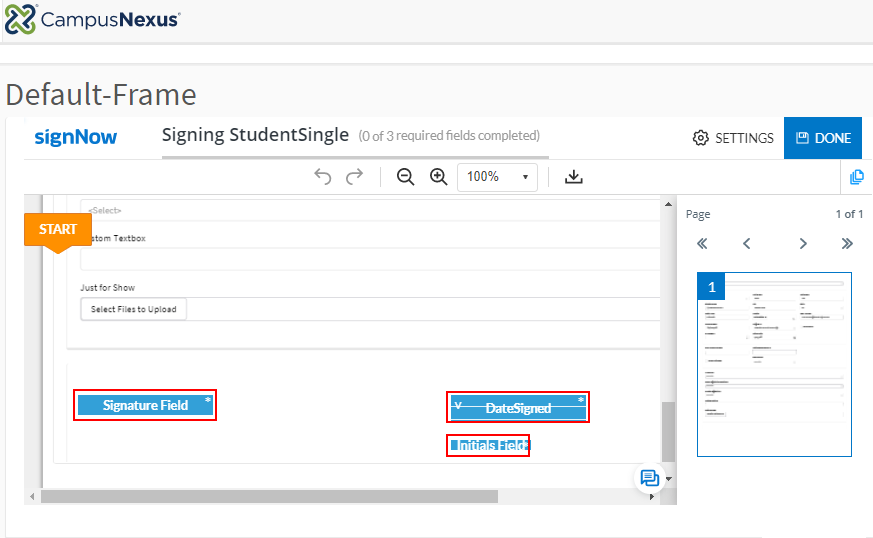
You are designing a form in which you want the person completing the form to sign and date the form electronically.
-
Drag two SignNow components into the Layout pane of your form in Form Designer.
-
On the first SignNow component, set the Signer to Self - Signer 1 and set the Type to Signature.
-
On the second SignNow component, set the Signer to Self - Signer 1 and set the Type to Date Signed.
When Anthology Student fields are inserted into a form, the student is automatically directed to the section that needs an e-signature.
If the fields are not inserted into a form but e-signature is enabled, the student is directed to electronically sign the document and can drag out the signature anywhere on the document.
You can use the SignNow component to integrate SignNow fields into a form. Forms Builder supports several types of SignNow fields, e.g., Attachment, Checkbox, Initial, Signature, and others. The fields are selected in the Type property of the Control Property Settings.
Before using the SignNow component, you must set up and account with SignNow and configure the SignNow Settings in Forms Builder.
Properties
Control Property Settings
Rendered Components (Type=Signature, Type=Date Signed, and Type=Initial)
-
Class is an optional CSS class (or space separated classes) added to the top level of the control. CSS specific to the control can be applied. The class must be defined in a Renderer CSS file. For more information, see Custom Styles.
-
Signer provides the following options:
- Self - Signer 1
- Signer 2
- Signer 3
- Signer 4
- Signer 5
-
Type provides the following SignNow fields:
Field Description Date Signed Allows the recipient to specify the date the document was signed. Initial Allows the recipient to initial the document. Signature Allows the recipient to sign a document. SignNow Text Tags
You can use SignNow text tags to specify the location, size, type of fields, and advanced optional field processing rules. SignNow text tags are specially formatted text that can be placed anywhere within the content of your form. For more information, see https://help.signnow.com/v1.0/docs/how-to-generate-text-tags-on-a-document.
-
Visible makes the control visible or hidden.
-
Can be bound to a workflow argument or another control's value. This property is dynamic.
-
A property array string index requires single quotes, e.g., vm.models.xxx.CustomProperties['yyyyy'].
-
An expression can be used that evaluates to true or false, e.g., vm.models.myvalue==7 (>,<, !=, ==, >=, <=). If comparing to a string, it must be in single quotes.
-
(true and false must be all lowercase)
-
Working with the SignNow Component
You are designing a form in which you want the person completing the form to sign and date the form electronically.
-
Drag two SignNow components into the Layout pane of your form in Form Designer.
-
On the first SignNow component, set the Signer to Self - Signer 1 and set the Type to Signature.
-
On the second SignNow component, set the Signer to Self - Signer 1 and set the Type to Date Signed.
When Anthology Student fields are inserted into a form, the student is automatically directed to the section that needs an e-signature.
If the fields are not inserted into a form but e-signature is enabled, the student is directed to electronically sign the document and can drag out the signature anywhere on the document.