Date Picker
You can use the Date Picker component to quickly select a date and prevent the entry of an invalid value.
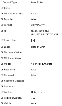
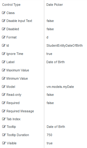
Properties
Control Property Settings
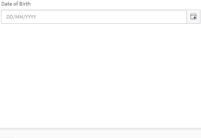
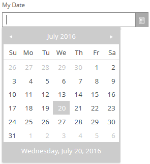
Rendered Component
Workflow Argument
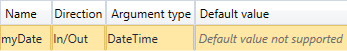
For workflow arguments used with the Date Picker in Forms Builder 3.5 and later, see Default Argument Types for Components.
-
Class is an optional CSS class (or space separated classes) added to the top level of the control. CSS specific to the control can be applied. The class must be defined in a Renderer CSS file. For more information, see Custom Styles.
-
Disable Input Text disallows typing in the field. When true, dates must be selected from the date picker popup.
-
If this property is bound, it must start with "vm.models.".
-
A property array string index requires single quotes, e.g., vm.models.xxx.CustomProperties['yyyyy'].
-
An expression can be used that evaluates to true or false, e.g., vm.models.myvalue==7 (>,<, !=, ==, >=, <=).
-
If comparing to a string, it must be in single quotes.
-
(true and false must be all lowercase)

Do not specify the Disable Input Text property if tabbing through each item in a rendered form using only the keyboard (i.e., not using a mouse) is required. -
-
Disabled sets a control to disabled.
-
Must be true or false, or a binding beginning with "vm.models.".
-
A property array string index requires single quotes, e.g., vm.models.xxx.CustomProperties['yyyyy'].
-
An expression can be used that evaluates to true or false, e.g., vm.models.myvalue==7 (>,<, !=, ==, >=, <=).
-
If comparing to a string, it must be in single quotes.
- (true and false must be all lowercase)
-
-
Format property settings depend on the control type used:
-
Date Picker:
Specifies the format of the date and, when text input is allowed (Disable Input Text = false), the parsing of typed text.
Examples: yyyy-MM-dd, MM-dd-yy (case sensitive: d for day of month, M for month, y for year)
-
Time Picker:
Specifies the format of the time and, when text input is allowed (Disable Input Text = false), the parsing of typed text.
Examples: HH:mm, hh:mm:ss tt (case sensitive: H or h for hour, m for minute, s for second)
See Kendo UI documentation for more information.
-
Date Time Picker:
Combines the two above with both date and time.
-
Numeric Textbox:
Specifies format of the numeric value. e.g., n2 - 2 decimal places, c - currency with cents
The date parsing and formats for these controls changed in Forms Builder 3.5. If you used date formats that are no longer supported, you need to update and re-save affected forms. -
-
Id is required. It can be any valid JavaScript id attribute value. (Must start with a letter followed by 0 to 9, a to z, dash, or underscore characters).
-
Using a globally unique identifier (GUID) from GuidGen or GuidGenerator prefixed by at least one letter prevents a clash with any other id.
-
Id should contain only a to z (uppercase or lowercase), 0 to 9, dash, or underscore. It should not have spaces.
-
Binding is not supported for this property.
-
-
Ignore Time is an optional property that can be set to true or false (all lowercase). The default is false for backward compatibility, but we strongly recommend that you set it to true when you use this control.
When set to true and a date is entered, the control will set a date only with no time. This prevents the server from changing the date when it is in a different time zone than the browser. This date will pair with a DateTime or DateTimeOffset type argument in the workflow and set the date and time as midnight no matter what time zone the Renderer server is in. Some entities use a Date object which does not have a time so this would not be required for them.
If a DatePicker control is used as a minimum or maximum date dynamically by another control, IgnoreTime must be set true to avoid conversion errors in the browser developer tools (F12).
The Ignore Time property is not dynamically bindable (cannot take an expression). Once set in a form, it cannot be changed.
-
Label is the value displayed in the label.
-
If this value is bound, it must be enclosed in double braces, e.g., {{vm.models.myLabel}}.
-
Allowable suffix characters: starts with letter, then letters, numerals, or underscore.
-
-
Maximum Value specifies a maximum date value.
-
To provide forward compatibility, the date string should be in ISO 8501 format, e.g., 2017-09-03 (which is a universal non-ambiguous format).
-
If bound, it starts with {{vm.models. and ends with }}.
-
-
Minimum Value specifies a minimum date value.
-
To provide forward compatibility, the date string should be in ISO 8501 format, e.g., 2017-09-03 (which is a universal non-ambiguous format).
-
If bound, it starts with {{vm.models. and ends with }}.
-
-
Model is required for binding to a workflow argument or another control. If the Model property is not specified, the component will be displayed on the form, but any values the user enters on the form cannot be captured or used in the workflow.
-
The Model value must always start with "vm.models.", e.g., vm.models.myArgument.
-
This value may initialize the control, and may be updated by the control, and if matched to a workflow argument, is available in the workflow (readable or writable).
-
Ensure your model argument is defined in your workflow for custom components if it is used in the workflow. Otherwise, a workflow argument is not required.
-
The casing of an argument used in the workflow MUST match the "vm.models." suffix casing.
-
If the model addresses CustomProperties or MultiValueCustomProperties, the property identifier string must be enclosed in single quotes, e.g., vm.models.myentity.CustomProperties['mycustomprop']
If an OData query is specified and this binding is specified, it will be overwritten with the value of the OData query results and thus be available read-only in the workflow.
If only "Model Data" is specified and the workflow variable is either not initialized or set to an empty array, this value will be initialized to the "Model Data" value.
Construction of the model in the workflow is done by assigning data from a provider.
-
-
Read-only makes the control read-only. It is set to false by default. If you want the component to be read-only, set the property value to true. It is typically used for an input box.
-
Can be bound to a workflow argument or another control's value.
-
A property array string index requires single quotes, e.g., vm.models.xxx.CustomProperties['yyyyy'].
-
An expression can be used that evaluates to true or false, e.g., vm.models.myvalue==7 (>,<, !=, ==, >=, <=).
-
If comparing to a string, it must be in single quotes.
-
(true and false must be all lowercase)
-
-
Required makes the control required and will raise a validation error on the form. It is set to false by default. If input is required, set the property value to true. The rendered form will display a red asterisk (
 ) next to the component.
-
Can be bound to a workflow argument or another control's value.
-
A property array string index requires single quotes, e.g., vm.models.xxx.CustomProperties['yyyyy'].
-
An expression can be used that evaluates to true or false, e.g., vm.models.myvalue==7 (>,<, !=, ==, >=, <=).
-
If comparing to a string, it must be in single quotes.
-
(true and false must be all lowercase)
-
-
Required Message is optional. It overrides the default "Required" message.
-
If this value is bound, it must be enclosed in double braces, e.g., {{vm.models.myMessage}}.
-
Allowable suffix characters: starts with letter, then letters, numerals, or underscore.
-
-
Tab Index allows you to specify the order of elements that are brought into focus when the user presses the Tab key on the rendered form. Allowed values are -1, 0, and positive numbers.
-
A value of "-1" removes the element from the sequential tab order preventing keyboard users from focusing on it.
-
A value of "0" means the element is ignored in the tab order, but that does not mean users cannot tab to and focus an element.
-
A value of "1" sets the element as the first item to gain focus when tabbing through the page followed by any higher numbered tab indices, followed by any other keyboard focusable elements such as buttons. required fields, and CAPTCHA.
The tab index value should not match another control's tab index.
-
A blank value (default) will not add a tab index in the HTML.
For more information, see https://html.spec.whatwg.org/multipage/interaction.html#the-tabindex-attribute and https://www.alexlande.com/articles/cross-browser-tabindex-woes/.
-
-
Tooltip is the value to display when hovering over the control's label.
-
If this value is bound, it must be enclosed in double braces, e.g., {{vm.models.myTooltip}}.
-
Allowable suffix characters: starts with letter, then letters, numerals, or underscore.
-
-
Tooltip Duration is the amount of time in milliseconds a tooltip is displayed (default=750). The value must be greater than 0. If it is set to 0, a form validation error will occur.
-
If this value is bound, it must be enclosed in double braces, e.g., {{vm.models.myToolTip}}.
-
Allowable suffix characters: starts with letter, then letters, numerals, or underscore.
-
-
Visible makes the control visible or hidden.
-
Can be bound to a workflow argument or another control's value. This property is dynamic.
-
A property array string index requires single quotes, e.g., vm.models.xxx.CustomProperties['yyyyy'].
-
An expression can be used that evaluates to true or false, e.g., vm.models.myvalue==7 (>,<, !=, ==, >=, <=). If comparing to a string, it must be in single quotes.
-
(true and false must be all lowercase)
- When the control is not visible (usually based on some condition) and is a required field, the required field validation will not be triggered.
-
When binding controls, String and Integer properties require the Model value to be enclosed in double curly braces, for example, {{vm.models.myTooltip}} for Tooltip or {{vm.models.myMinValue}} for a Text Box of Type Number.
Boolean properties do not need the curly braces, for example, vm.models.myRequired.
This control has the capability to output an ISO 8601 String value which is converted to a DateTime or DateTimeOffset object (depending on the type of the workflow argument). For more information, see Date & Time Values and Offsets.
Troubleshoot a Date Picker
When a Date Picker is populated with values from a database, the Date Picker's Control Property Settings determine whether correct date values are displayed on the form if the client browser is in a different time zone than the database server.
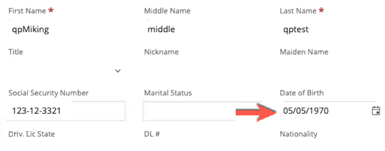
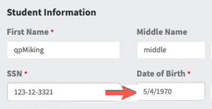
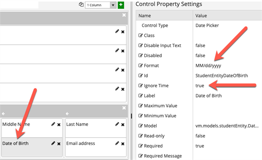
In this example, a form with Date of Birth field was bound to the Anthology Student database. However, the Date of Birth value on the form did not match the value in the database — it was off by one day. To correct this issue, the Date Picker's Control Property Settings were configured as follows:
- Format: MM/dd/yyyy
- Ignore Time: true
Date Value in Anthology Student
Incorrect Date Value on the Rendered Form
Corrected Date Picker Component
You can use the Date Picker component to quickly select a date and prevent the entry of an invalid date.
Control Property Settings
Rendered Component
Workflow Argument
For workflow arguments used with the Date Picker in Forms Builder 3.5 and later, see Default Argument Types for Components.
Properties
-
Class is an optional CSS class (or space separated classes) added to the top level of the control. CSS specific to the control can be applied. The class must be defined in a Renderer CSS file. For more information, see Custom Styles.
-
Disable Input Text disallows typing in the field. When true, dates must be selected from the date picker popup.
-
If this property is bound, it must start with "vm.models.".
-
A property array string index requires single quotes, e.g., vm.models.xxx.CustomProperties['yyyyy'].
-
An expression can be used that evaluates to true or false, e.g., vm.models.myvalue==7 (>,<, !=, ==, >=, <=).
-
If comparing to a string, it must be in single quotes.
-
(true and false must be all lowercase)
Do not specify the Disable Input Text property if tabbing through each item in a rendered form using only the keyboard (i.e., not using mouse) is required. -
-
Disabled sets a control to disabled.
-
Must be true or false, or a binding beginning with "vm.models.".
-
A property array string index requires single quotes, e.g., vm.models.xxx.CustomProperties['yyyyy'].
-
An expression can be used that evaluates to true or false, e.g., vm.models.myvalue==7 (>,<, !=, ==, >=, <=).
-
If comparing to a string, it must be in single quotes.
- (true and false must be all lowercase)
-
-
Format property settings depend on the control type used:
-
Date Picker:
Specifies the format of the date and, when text input is allowed (Disable Input Text = false), the parsing of typed text.
Examples: yyyy-MM-dd, MM-dd-yy (case sensitive: d for day of month, M for month, y for year)
-
Time Picker:
Specifies the format of the time and, when text input is allowed (Disable Input Text = false), the parsing of typed text.
Examples: HH:mm, hh:mm:ss tt (case sensitive: H or h for hour, m for minute, s for second)
See Kendo UI documentation for more information.
-
Date Time Picker:
Combines the two above with both date and time.
-
Numeric Textbox:
Specifies format of the numeric value. e.g., n2 - 2 decimal places, c - currency with cents
The date parsing and formats for these controls changed in Forms Builder 3.5. If you used date formats that are no longer supported, you need to update and re-save affected forms. -
-
Id is required. It can be any valid JavaScript id attribute value. (Must start with a letter followed by 0 to 9, a to z, dash, or underscore characters).
-
Using a globally unique identifier (GUID) from GuidGen or GuidGenerator prefixed by at least one letter prevents a clash with any other id.
-
Id should contain only a to z (uppercase or lowercase), 0 to 9, dash, or underscore. It should not have spaces.
-
Binding is not supported for this property.
-
-
Ignore Time is an optional property that can be set to true or false (all lowercase). The default is false for backward compatibility, but we strongly recommend that you set it to true when you use this control.
When set to true and a date is entered, the control will set a date only with no time. This prevents the server from changing the date when it is located in a different time zone than the browser. This date will pair with a DateTime or DateTimeOffset type argument in the workflow and set the date and the time as midnight no matter what time zone the Renderer server is in. Some entities use a Date object which does not have a time so this would not be required for them.
If a DatePicker control is going to be used as a minimum or maximum date dynamically by another control, IgnoreTime must be set true to avoid conversion errors in the browser developer tools (F12).
The Ignore Time property is not dynamically bindable (cannot take an expression). Once set in a form, it cannot be changed.
-
Label is the value displayed in the label.
-
If this value is bound, it must be enclosed in double braces, e.g., {{vm.models.myLabel}}.
-
Allowable suffix characters: starts with letter, then letters, numerals, or underscore.
-
-
Maximum Value specifies a maximum date value.
-
To provide forward compatibility, the date string should be in ISO 8501 format, e.g., 2017-09-03 (which is a universal non-ambiguous format).
-
If bound, it starts with {{vm.models. and ends with }}.
-
-
Minimum Value specifies a minimum date value.
-
To provide forward compatibility, the date string should be in ISO 8501 format, e.g., 2017-09-03 (which is a universal non-ambiguous format).
-
If bound, it starts with {{vm.models. and ends with }}.
-
-
Model is required for binding to a workflow argument or another control. If the Model property is not specified, the component will be displayed on the form, but any values the user enters on the form cannot be captured or used in the workflow.
-
The Model value must always start with "vm.models.", e.g., vm.models.myArgument.
-
This value may initialize the control, and may be updated by the control, and if matched to a workflow argument, is available in the workflow (readable or writable).
-
Ensure your model argument is defined in your workflow for custom components if it is used in the workflow. Otherwise, a workflow argument is not required.
-
The casing of an argument used in the workflow MUST match the "vm.models." suffix casing.
-
If the model addresses CustomProperties or MultiValueCustomProperties, the property identifier string must be enclosed in single quotes, e.g., vm.models.myentity.CustomProperties['mycustomprop']
If an OData query is specified and this binding is specified, it will be overwritten with the value of the OData query results and thus be available read-only in the workflow.
If only "Model Data" is specified and the workflow variable is either not initialized or set to an empty array, this value will be initialized to the "Model Data" value.
Construction of the model in the workflow is done by assigning data from a provider.
-
-
Read-only makes the control read-only. It is set to false by default. If you want the component to be read-only, set the property value to true. It is typically used for an input box.
-
Can be bound to a workflow argument or another control's value.
-
A property array string index requires single quotes, e.g., vm.models.xxx.CustomProperties['yyyyy'].
-
An expression can be used that evaluates to true or false, e.g., vm.models.myvalue==7 (>,<, !=, ==, >=, <=).
-
If comparing to a string, it must be in single quotes.
-
(true and false must be all lowercase)
-
-
Required makes the control required and will raise a validation error on the form. It is set to false by default. If input is required, set the property value to true. The rendered form will display a red asterisk (
) next to the component.-
Can be bound to a workflow argument or another control's value.
-
A property array string index requires single quotes, e.g., vm.models.xxx.CustomProperties['yyyyy'].
-
An expression can be used that evaluates to true or false, e.g., vm.models.myvalue==7 (>,<, !=, ==, >=, <=).
-
If comparing to a string, it must be in single quotes.
-
(true and false must be all lowercase)
-
-
Required Message is optional. It overrides the default "Required" message.
-
If this value is bound, it must be enclosed in double braces, e.g., {{vm.models.myMessage}}.
-
Allowable suffix characters: starts with letter, then letters, numerals, or underscore.
-
-
Tab Index allows you to specify the order of elements that are brought into focus when the user presses the Tab key on the rendered form. Allowed values are -1, 0, and positive numbers.
-
A value of "-1" removes the element from the sequential tab order preventing keyboard users from focusing on it.
-
A value of "0" means the element is ignored in the tab order, but that does not mean users cannot tab to and focus an element.
-
A value of "1" sets the element as the first item to gain focus when tabbing through the page followed by any higher numbered tab indices, followed by any other keyboard focusable elements such as buttons. required fields, and CAPTCHA.
The tab index value should not match another control's tab index.
-
A blank value (default) will not add a tab index in the HTML.
For more information, see https://html.spec.whatwg.org/multipage/interaction.html#the-tabindex-attribute and https://www.alexlande.com/articles/cross-browser-tabindex-woes/.
-
-
Tooltip is the value to display when hovering over the control's label.
-
If this value is bound, it must be enclosed in double braces, e.g., {{vm.models.myTooltip}}.
-
Allowable suffix characters: starts with letter, then letters, numerals, or underscore.
-
-
Tooltip Duration is the amount of time in milliseconds a tooltip is displayed (default=750). The value must be greater than 0. If it is set to 0, a form validation error will occur.
-
If this value is bound, it must be enclosed in double braces, e.g., {{vm.models.myToolTip}}.
-
Allowable suffix characters: starts with letter, then letters, numerals, or underscore.
-
-
Visible makes the control visible or hidden.
-
Can be bound to a workflow argument or another control's value. This property is dynamic.
-
A property array string index requires single quotes, e.g., vm.models.xxx.CustomProperties['yyyyy'].
-
An expression can be used that evaluates to true or false, e.g., vm.models.myvalue==7 (>,<, !=, ==, >=, <=). If comparing to a string, it must be in single quotes.
-
(true and false must be all lowercase)
-
When binding controls, String and Integer properties require the Model value to be enclosed in double curly braces, for example, {{vm.models.myTooltip}} for Tooltip or {{vm.models.myMinValue}} for a Text Box of Type Number.
Boolean properties do not need the curly braces, for example, vm.models.myRequired.
This control has the capability to output an ISO 8601 String value which is converted to a DateTime or DateTimeOffset object (depending on the type of the workflow argument). For more information, see Date & Time Values and Offsets.
You can use the Date Picker component to quickly select a date and prevent the entry of an invalid date.
Control Property Settings
Rendered Component
Workflow Argument
For workflow arguments used with the Date Picker in Forms Builder 3.5 and later, see Default Argument Types for Components.
-
Class is an optional CSS class (or space separated classes) added to the top level of the control. CSS specific to the control can be applied. The class must be defined in a Renderer CSS file. For more information, see Custom Styles.
-
Disable Input Text disallows typing in the field. When true, dates must be selected from the date picker popup.
-
If this property is bound, it must start with "vm.models.".
-
A property array string index requires single quotes, e.g., vm.models.xxx.CustomProperties['yyyyy'].
-
An expression can be used that evaluates to true or false, e.g., vm.models.myvalue==7 (>,<, !=, ==, >=, <=).
-
If comparing to a string, it must be in single quotes.
-
(true and false must be all lowercase)
Do not specify the Disable Input Text property if tabbing through each item in a rendered form using only the keyboard (i.e., not using mouse) is required. -
-
Disabled sets a control to disabled.
-
Must be true or false, or a binding beginning with "vm.models.".
-
A property array string index requires single quotes, e.g., vm.models.xxx.CustomProperties['yyyyy'].
-
An expression can be used that evaluates to true or false, e.g., vm.models.myvalue==7 (>,<, !=, ==, >=, <=).
-
If comparing to a string, it must be in single quotes.
- (true and false must be all lowercase)
-
-
Format property settings depend on the control type used:
-
Date Picker:
Specifies the format of the date and, when text input is allowed (Disable Input Text = false), the parsing of typed text.
Examples: yyyy-MM-dd, MM-dd-yy (case sensitive: d for day of month, M for month, y for year)
-
Time Picker:
Specifies the format of the time and, when text input is allowed (Disable Input Text = false), the parsing of typed text.
Examples: HH:mm, hh:mm:ss tt (case sensitive: H or h for hour, m for minute, s for second)
See Kendo UI documentation for more information.
-
Date Time Picker:
Combines the two above with both date and time.
-
Numeric Textbox:
Specifies format of the numeric value. e.g., n2 - 2 decimal places, c - currency with cents
The date parsing and formats for these controls changed in Forms Builder 3.5. If you used date formats that are no longer supported, you need to update and re-save affected forms. -
-
Id is required. It can be any valid JavaScript id attribute value. (Must start with a letter followed by 0 to 9, a to z, dash, or underscore characters).
-
Using a globally unique identifier (GUID) from GuidGen or GuidGenerator prefixed by at least one letter prevents a clash with any other id.
-
Id should contain only a to z (uppercase or lowercase), 0 to 9, dash, or underscore. It should not have spaces.
-
Binding is not supported for this property.
-
-
Ignore Time is an optional property that can be set to true or false (all lowercase). The default is false for backward compatibility, but we strongly recommend that you set it to true when you use this control.
When set to true and a date is entered, the control will set a date only with no time. This prevents the server from changing the date when it is located in a different time zone than the browser. This date will pair with a DateTime or DateTimeOffset type argument in the workflow and set the date and the time as midnight no matter what time zone the Renderer server is in. Some entities use a Date object which does not have a time so this would not be required for them.
If a DatePicker control is going to be used as a minimum or maximum date dynamically by another control, IgnoreTime must be set true to avoid conversion errors in the browser developer tools (F12).
The Ignore Time property is not dynamically bindable (cannot take an expression). Once set in a form, it cannot be changed.
-
Label is the value displayed in the label.
-
If this value is bound, it must be enclosed in double braces, e.g., {{vm.models.myLabel}}.
-
Allowable suffix characters: starts with letter, then letters, numerals, or underscore.
-
-
Maximum Value specifies a maximum date value.
- To provide forward compatibility, the date string should be in ISO 8501 format, e.g., 2017-09-03 (which is a universal non-ambiguous format).
- If bound, it starts with {{vm.models. and ends with }}.
-
Minimum Value specifies a minimum date value.
- To provide forward compatibility, the date string should be in ISO 8501 format, e.g., 2017-09-03 (which is a universal non-ambiguous format).
- If bound, it starts with {{vm.models. and ends with }}.
-
Model is required for binding to a workflow argument or another control. If the Model property is not specified, the component will be displayed on the form, but any values the user enters on the form cannot be captured or used in the workflow.
-
The Model value must always start with "vm.models.", e.g., vm.models.myArgument.
-
This value may initialize the control, and may be updated by the control, and if matched to a workflow argument, is available in the workflow (readable or writable).
-
Ensure your model argument is defined in your workflow for custom components if it is used in the workflow. Otherwise, a workflow argument is not required.
-
The casing of an argument used in the workflow MUST match the "vm.models." suffix casing.
-
If the model addresses CustomProperties or MultiValueCustomProperties, the property identifier string must be enclosed in single quotes, e.g., vm.models.myentity.CustomProperties['mycustomprop']
If an OData query is specified and this binding is specified, it will be overwritten with the value of the OData query results and thus be available read-only in the workflow.
If only "Model Data" is specified and the workflow variable is either not initialized or set to an empty array, this value will be initialized to the "Model Data" value.
Construction of the model in the workflow is done by assigning data from a provider.
-
-
Read-only makes the control read-only. It is set to false by default. If you want the component to be read-only, set the property value to true. It is typically used for an input box.
-
Can be bound to a workflow argument or another control's value.
-
A property array string index requires single quotes, e.g., vm.models.xxx.CustomProperties['yyyyy'].
-
An expression can be used that evaluates to true or false, e.g., vm.models.myvalue==7 (>,<, !=, ==, >=, <=).
-
If comparing to a string, it must be in single quotes.
-
(true and false must be all lowercase)
-
-
Required makes the control required and will raise a validation error on the form. It is set to false by default. If input is required, set the property value to true. The rendered form will display a red asterisk (
) next to the component.-
Can be bound to a workflow argument or another control's value.
-
A property array string index requires single quotes, e.g., vm.models.xxx.CustomProperties['yyyyy'].
-
An expression can be used that evaluates to true or false, e.g., vm.models.myvalue==7 (>,<, !=, ==, >=, <=).
-
If comparing to a string, it must be in single quotes.
-
(true and false must be all lowercase)
-
-
Required Message is optional. It overrides the default "Required" message.
-
If this value is bound, it must be enclosed in double braces, e.g., {{vm.models.myMessage}}.
-
Allowable suffix characters: starts with letter, then letters, numerals, or underscore.
-
-
Tab Index allows you to specify the order of elements that are brought into focus when the user presses the Tab key on the rendered form. Allowed values are -1, 0, and positive numbers.
-
A value of "-1" removes the element from the sequential tab order preventing keyboard users from focusing on it.
-
A value of "0" means the element is ignored in the tab order, but that does not mean users cannot tab to and focus an element.
-
A value of "1" sets the element as the first item to gain focus when tabbing through the page followed by any higher numbered tab indices, followed by any other keyboard focusable elements such as buttons. required fields, and CAPTCHA.
The tab index value should not match another control's tab index.
-
A blank value (default) will not add a tab index in the HTML.
For more information, see https://html.spec.whatwg.org/multipage/interaction.html#the-tabindex-attribute and https://www.alexlande.com/articles/cross-browser-tabindex-woes/.
-
-
Tooltip is the value to display when hovering over the control's label.
-
If this value is bound, it must be enclosed in double braces, e.g., {{vm.models.myTooltip}}.
-
Allowable suffix characters: starts with letter, then letters, numerals, or underscore.
-
-
Tooltip Duration is the amount of time in milliseconds a tooltip is displayed (default=750). The value must be greater than 0. If it is set to 0, a form validation error will occur.
-
If this value is bound, it must be enclosed in double braces, e.g., {{vm.models.myToolTip}}.
-
Allowable suffix characters: starts with letter, then letters, numerals, or underscore.
-
-
Visible makes the control visible or hidden.
-
Can be bound to a workflow argument or another control's value. This property is dynamic.
-
A property array string index requires single quotes, e.g., vm.models.xxx.CustomProperties['yyyyy'].
-
An expression can be used that evaluates to true or false, e.g., vm.models.myvalue==7 (>,<, !=, ==, >=, <=). If comparing to a string, it must be in single quotes.
-
(true and false must be all lowercase)
-
When binding controls, String and Integer properties require the Model value to be enclosed in double curly braces, for example, {{vm.models.myTooltip}} for Tooltip or {{vm.models.myMinValue}} for a Text Box of Type Number.
Boolean properties do not need the curly braces, for example, vm.models.myRequired.
This control has the capability to output an ISO 8601 String value which is converted to a DateTime or DateTimeOffset object (depending on the type of the workflow argument). For more information, see Date & Time Values and Offsets.