Grid Property Settings
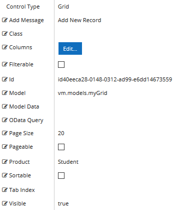
The Property Settings pane of the Grid component enables you to specify properties that apply to the entire grid and properties that apply to specific columns within the grid (see Grid Columns Properties).
The image below shows the default properties displayed when the Grid component is first added to a form. Note that the Model, Model Data, and OData Query properties are not prepopulated. Depending on the data source for the grid and depending on whether the grid data need to be bound, you must specify either Model, Model Data, or OData Query, or a combination of these properties.
Control Property Settings
Properties
-
Add Message is the text used to instruct the user to add a new record to the grid on the form.
-
If this value is bound, it must begin with {{vm.models. and end with }}.
-
Allowable suffix characters: starts with letter, then letters, numerals, or underscore.
-
A property array string index requires single quotes, e.g., vm.models.xxx.CustomProperties['yyyyy'].
-
-
Class is an optional CSS class (or space separated classes) added to the top level of the control. CSS specific to the control can be applied. The class must be defined in a Renderer CSS file. For more information, see Custom Styles.
-
Columns — Specifications of the columns that match the data properties to be bound in the grid. See Grid Columns Properties.
-
Filterable allows the data to be filtered. This property is not bindable. Default: false
-
Id is required. It can be any valid JavaScript id attribute value. (Must start with a letter followed by 0 to 9, a to z, dash, or underscore characters). Using a globally unique identifier (GUID) from GuidGen or GuidGenerator prefixed by at least one letter prevents a clash with any other id. Id should contain only a to z (uppercase or lowercase), 0 to 9, dash, or underscore. It should not have spaces. Binding is not supported for this property.
-
Model is required for binding to a workflow argument or another control. If the Model property is not specified, the component will be displayed on the form, but any values the user enters on the form cannot be captured or used in the workflow.
-
The Model value must always start with "vm.models.", e.g., vm.models.myArgument.
-
This value may initialize the control, and may be updated by the control, and if matched to a workflow argument, is available in the workflow (readable or writable).
-
Ensure your model argument is defined in your workflow for custom components if it is used in the workflow. Otherwise, a workflow argument is not required.
-
The casing of an argument used in the workflow MUST match the "vm.models." suffix casing.
-
If the model addresses CustomProperties or MultiValueCustomProperties, the property identifier string must be enclosed in single quotes, e.g., vm.models.myentity.CustomProperties['mycustomprop']
If an OData query is specified and this binding is specified, it will be overwritten with the value of the OData query results and thus be available read-only in the workflow.
If only "Model Data" is specified and the workflow variable is either not initialized or set to an empty array, this value will be initialized to the "Model Data" value.
Construction of the model in the workflow is done by assigning data from a provider.
-
The Model is passed to the workflow as an argument of type SerializableDynamicObject[]. This argument type will hold the data entered in the grid.
Examples:
-
Model Data — Defines the initial data as a JSON string.
Example: Grid Bound to Custom Model Data (non-Entity).
Note: When the Model Data property is used in conjunction with the Locale component and the user navigates back to select a different locale, the data displayed in the sequence will not be updated to reflect the new locale selection.
The Model Data property is not applicable for a grid bound to an entity.
-
OData Query — OData query that overrides Model or Model Data if supplied.
Example
Grid Initialized via OData Query
OData Query is not used for editable grids.
-
Page Size — If Pageable is true, Page Size will set the server-side paging size for the grid. Default: 20
-
Pageable — If set to true, the grid will display a pager. This property is not bindable. Default: false.
-
Product indicates the product from which OData query results are returned. Select from:
- Student
- CRM
- Occupation Insight
The selected product must be configured in the <products> section of the Renderer web.config file.
The default Product value will be "Student" if "Student" is selected in the <Select Provider> list on the Fields tab.
The default Product value will be "CRM" if "CRM" is selected in the <Select Provider> list on the Fields tab.
Select "Occupation Insight" in the Product property if the source of the query will come from a different data source other than Student/CRM. For more information, see Build Queries for Occupation Insight.
A form can have multiple controls that retrieve data from different providers. For example, a form can have a control that is populated by a query to the Student database. The same form can have another control that retrieves data from Occupation Insight.
Specify the query to retrieve data from the selected provider using the Lookup Query or OData Query property (as applicable for the control). The query contains only the URL specific part of an OData URI. The Base URL and Product will be supplied by the configuration.
-
Sortable — Allows data to be sorted. This property is not bindable. Default: false.
Note: When paging, sorting and add record are enabled in a Grid component, if a user has paged or sorted the grid, the add record operation will have inconsistent results because the grid display is being reorganized.
-
Tab Index allows you to specify the order of elements that are brought into focus when the user presses the Tab key on the rendered form. Allowed values are -1, 0, and positive numbers.
-
A value of "-1" removes the element from the sequential tab order preventing keyboard users from focusing on it.
-
A value of "0" means the element is ignored in the tab order, but that does not mean users cannot tab to and focus an element.
-
A value of "1" sets the element as the first item to gain focus when tabbing through the page followed by any higher numbered tab indices, followed by any other keyboard focusable elements such as buttons. required fields, and CAPTCHA.
The tab index value should not match another control's tab index.
-
A blank value (default) will not add a tab index in the HTML.
For more information, see https://html.spec.whatwg.org/multipage/interaction.html#the-tabindex-attribute and https://www.alexlande.com/articles/cross-browser-tabindex-woes/.
-
-
Visible makes the control visible or hidden.
-
Can be bound to a workflow argument or another control's value. This property is dynamic.
-
A property array string index requires single quotes, e.g., vm.models.xxx.CustomProperties['yyyyy'].
-
An expression can be used that evaluates to true or false, e.g., vm.models.myvalue==7 (>,<, !=, ==, >=, <=). If comparing to a string, it must be in single quotes.
-
(true and false must be all lowercase)
- When the control is not visible (usually based on some condition) and is a required field, the required field validation will not be triggered.
-
For more information, see Telerik documentation:
Grid Validation
The Grid component does not support a "Required" validation on the client-side. However, this can still be achieved via workflow logic to verify a value has been set and if not, display a custom validation error.
To check if a numeric field within a grid has a value, use an If activity with the condition "Is Nothing".
Also use If activities with appropriate conditions to check if a numeric value is in a range since numeric values within a grid do not have range properties.
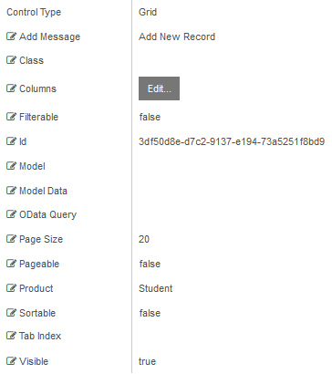
The Property Settings pane of the Grid component enables you to specify properties that apply to the entire grid and properties that apply to specific columns within the grid (see Grid Columns Properties).
The image below shows the default properties displayed when the Grid component is first added to a form. Note that the Model, Model Data, and OData Query properties are not prepopulated. Depending on the data source for the grid and depending on whether the grid data need to be bound, you must specify either Model, Model Data, or OData Query, or a combination of these properties.
Control Property Settings
Properties
-
Add Message is the text used to instruct the user to add a new record to the grid on the form.
-
If this value is bound, it must begin with {{vm.models. and end with }}.
-
Allowable suffix characters: starts with letter, then letters, numerals, or underscore.
-
A property array string index requires single quotes, e.g., vm.models.xxx.CustomProperties['yyyyy'].
-
-
Class is an optional CSS class (or space separated classes) added to the top level of the control. CSS specific to the control can be applied. The class must be defined in a Renderer CSS file. For more information, see Custom Styles.
-
Columns — Specifications of the columns that match the data properties to be bound in the grid. See Grid Columns Properties.
-
Filterable allows the data to be filtered. This property is not bindable. Default: false
-
Id is required. It can be any valid JavaScript id attribute value. (Must start with a letter followed by 0 to 9, a to z, dash, or underscore characters). Using a globally unique identifier (GUID) from GuidGen or GuidGenerator prefixed by at least one letter prevents a clash with any other id. Id should contain only a to z (uppercase or lowercase), 0 to 9, dash, or underscore. It should not have spaces. Binding is not supported for this property.
-
Model is required for binding to a workflow argument or another control. If the Model property is not specified, the component will be displayed on the form, but any values the user enters on the form cannot be captured or used in the workflow.
-
The Model value must always start with "vm.models.", e.g., vm.models.myArgument.
-
This value may initialize the control, and may be updated by the control, and if matched to a workflow argument, is available in the workflow (readable or writable).
-
Ensure your model argument is defined in your workflow for custom components if it is used in the workflow. Otherwise, a workflow argument is not required.
-
The casing of an argument used in the workflow MUST match the "vm.models." suffix casing.
-
If the model addresses CustomProperties or MultiValueCustomProperties, the property identifier string must be enclosed in single quotes, e.g., vm.models.myentity.CustomProperties['mycustomprop']
If an OData query is specified and this binding is specified, it will be overwritten with the value of the OData query results and thus be available read-only in the workflow.
If only "Model Data" is specified and the workflow variable is either not initialized or set to an empty array, this value will be initialized to the "Model Data" value.
Construction of the model in the workflow is done by assigning data from a provider.
-
The Model is passed to the workflow as an argument of type SerializableDynamicObject[]. This argument type will hold the data entered in the grid.
Examples:
-
Model Data — Defines the initial data as a JSON string.
Example: Grid Bound to Custom Model Data (non-Entity).
Note: When the Model Data property is used in conjunction with the Locale component and the user navigates back to select a different locale, the data displayed in the sequence will not be updated to reflect the new locale selection.
The Model Data property is not applicable for a grid that is bound to an entity.
-
OData Query — OData query that overrides Model or Model Data if supplied.
Example
Grid Initialized via OData Query
OData Query is not used for editable grids.
-
Page Size — If Pageable is true, Page Size will set the server-side paging size for the grid. Default: 20
-
Pageable — If set to true, the grid will display a pager. This property is not bindable. Default: false.
-
Product indicates the product from which OData query results are returned. Select from:
- Student
- CRM
- Occupation Insight
The selected product must be configured in the <products> section of the Renderer web.config file.
The default Product value will be "Student" if "Student" is selected in the <Select Provider> list on the Fields tab.
The default Product value will be "CRM" if "CRM" is selected in the <Select Provider> list on the Fields tab.
Select "Occupation Insight" in the Product property if the source of the query will come from a different data source other than Student/CRM. For more information, see Build Queries for Occupation Insight.
A form can have multiple controls that retrieve data from different providers. For example, a form can have a control that is populated by a query to the Student database. The same form can have another control that retrieves data from Occupation Insight.
Specify the query to retrieve data from the selected provider using the Lookup Query or OData Query property (as applicable for the control). The query contains only the URL specific part of an OData URI. The Base URL and Product will be supplied by the configuration.
-
Sortable — Allows data to be sorted. This property is not bindable. Default: false.
Note: When paging, sorting and add record are enabled in a Grid component, if a user has paged or sorted the grid, the add record operation will have inconsistent results because the grid display is being reorganized.
-
Tab Index allows you to specify the order of elements that are brought into focus when the user presses the Tab key on the rendered form. Allowed values are -1, 0, and positive numbers.
-
A value of "-1" removes the element from the sequential tab order preventing keyboard users from focusing on it.
-
A value of "0" means the element is ignored in the tab order, but that does not mean users cannot tab to and focus an element.
-
A value of "1" sets the element as the first item to gain focus when tabbing through the page followed by any higher numbered tab indices, followed by any other keyboard focusable elements such as buttons. required fields, and CAPTCHA.
The tab index value should not match another control's tab index.
-
A blank value (default) will not add a tab index in the HTML.
For more information, see https://html.spec.whatwg.org/multipage/interaction.html#the-tabindex-attribute and https://www.alexlande.com/articles/cross-browser-tabindex-woes/.
-
-
Visible makes the control visible or hidden.
-
Can be bound to a workflow argument or another control's value. This property is dynamic.
-
A property array string index requires single quotes, e.g., vm.models.xxx.CustomProperties['yyyyy'].
-
An expression can be used that evaluates to true or false, e.g., vm.models.myvalue==7 (>,<, !=, ==, >=, <=). If comparing to a string, it must be in single quotes.
-
(true and false must be all lowercase)
-
For more information, see Telerik documentation:
Grid Validation
The Grid component does not support a "Required" validation on the client-side. However, this can still be achieved via workflow logic to verify a value has been set and if not, display a custom validation error.
To check if a numeric field within a grid has a value, use an If activity with the Condition "Is Nothing".
Also use If activities with appropriate conditions to check if a numeric value is in a range since numeric values within a grid do not have range properties.
The Property Settings pane of the Grid component enables you to specify properties that apply to the entire grid and properties that apply to specific columns within the grid (see Grid Columns Properties).
The image below shows the default properties displayed when the Grid component is first added to a form. Note that the Model, Model Data, and OData Query properties are not prepopulated. Depending on the data source for the grid and depending on whether the grid data need to be bound, you must specify either Model, Model Data, or OData Query, or a combination of these properties.
Control Property Settings
-
Add Message is the text used to instruct the user to add a new record to the grid on the form.
-
If this value is bound, it must begin with {{vm.models. and end with }}.
-
Allowable suffix characters: starts with letter, then letters, numerals, or underscore.
-
A property array string index requires single quotes, e.g., vm.models.xxx.CustomProperties['yyyyy'].
-
-
Class is an optional CSS class (or space separated classes) added to the top level of the control. CSS specific to the control can be applied. The class must be defined in a Renderer CSS file. For more information, see Custom Styles.
-
Columns — Specifications of the columns that match the data properties to be bound in the grid. See Grid Columns Properties.
-
Filterable allows the data to be filtered. Default: false
-
Id is required. It can be any valid JavaScript id attribute value. (Must start with a letter followed by 0 to 9, a to z, dash, or underscore characters). Using a globally unique identifier (GUID) from GuidGen or GuidGenerator prefixed by at least one letter prevents a clash with any other id. Id should contain only a to z (uppercase or lowercase), 0 to 9, dash, or underscore. It should not have spaces. Binding is not supported for this property.
-
Model is required for binding to a workflow argument or another control. If the Model property is not specified, the component will be displayed on the form, but any values the user enters on the form cannot be captured or used in the workflow.
-
The Model value must always start with "vm.models.", e.g., vm.models.myArgument.
-
This value may initialize the control, and may be updated by the control, and if matched to a workflow argument, is available in the workflow (readable or writable).
-
Ensure your model argument is defined in your workflow for custom components if it is used in the workflow. Otherwise, a workflow argument is not required.
-
The casing of an argument used in the workflow MUST match the "vm.models." suffix casing.
-
If the model addresses CustomProperties or MultiValueCustomProperties, the property identifier string must be enclosed in single quotes, e.g., vm.models.myentity.CustomProperties['mycustomprop']
If an OData query is specified and this binding is specified, it will be overwritten with the value of the OData query results and thus be available read-only in the workflow.
If only "Model Data" is specified and the workflow variable is either not initialized or set to an empty array, this value will be initialized to the "Model Data" value.
Construction of the model in the workflow is done by assigning data from a provider.
-
The Model is passed to the workflow as an argument of type SerializableDynamicObject[]. This argument type will hold the data entered in the grid.
Examples:
-
Model Data — Defines the initial data as a JSON string.
Example: Grid Bound to Custom Model Data (non-Entity).
The Model Data property is not applicable for a grid that is bound to an entity.
-
OData Query — OData query that overrides Model or Model Data if supplied.
Example
Grid Initialized via OData Query
OData Query is not used for editable grids.
-
Page Size — If Pageable is true, Page Size will set the server-side paging size for the grid. Default: 20
-
Pageable — If set to true, the grid will display a pager. Default: false
-
Product indicates the product from which OData query results are returned. Select from:
- Student
- CRM
- Occupation Insight
The selected product must be configured in the <products> section of the Renderer web.config file.
The default Product value will be "Student" if "Student" is selected in the <Select Provider> list on the Fields tab.
The default Product value will be "CRM" if "CRM" is selected in the <Select Provider> list on the Fields tab.
Select "Occupation Insight" in the Product property if the source of the query will come from a different data source other than Student/CRM. For more information, see Build Queries for Occupation Insight.
A form can have multiple controls that retrieve data from different providers. For example, a form can have a control that is populated by a query to the Student database. The same form can have another control that retrieves data from Occupation Insight.
Specify the query to retrieve data from the selected provider using the Lookup Query or OData Query property (as applicable for the control). The query contains only the URL specific part of an OData URI. The Base URL and Product will be supplied by the configuration.
-
Sortable — Allows data to be sorted. Default: false
Note: When paging, sorting and add record are enabled in a Grid component, if a user has paged or sorted the grid, the add record operation will have inconsistent results because the grid display is being reorganized.
-
Tab Index allows you to specify the order of elements that are brought into focus when the user presses the Tab key on the rendered form. Allowed values are -1, 0, and positive numbers.
-
A value of "-1" removes the element from the sequential tab order preventing keyboard users from focusing on it.
-
A value of "0" means the element is ignored in the tab order, but that does not mean users cannot tab to and focus an element.
-
A value of "1" sets the element as the first item to gain focus when tabbing through the page followed by any higher numbered tab indices, followed by any other keyboard focusable elements such as buttons. required fields, and CAPTCHA.
The tab index value should not match another control's tab index.
-
A blank value (default) will not add a tab index in the HTML.
For more information, see https://html.spec.whatwg.org/multipage/interaction.html#the-tabindex-attribute and https://www.alexlande.com/articles/cross-browser-tabindex-woes/.
-
-
Visible makes the control visible or hidden.
-
Can be bound to a workflow argument or another control's value. This property is dynamic.
-
A property array string index requires single quotes, e.g., vm.models.xxx.CustomProperties['yyyyy'].
-
An expression can be used that evaluates to true or false, e.g., vm.models.myvalue==7 (>,<, !=, ==, >=, <=). If comparing to a string, it must be in single quotes.
-
(true and false must be all lowercase)
-
For more information, see Telerik documentation:
The Grid component does not support a "Required" validation on the client-side. However, this can still be achieved via workflow logic to verify a value has been set and if not, display a custom validation error.
To check if a numeric field within a grid has a value, use an If activity with the Condition "Is Nothing".
Also use If activities with appropriate conditions to check if a numeric value is in a range since numeric values within a grid do not have range properties.