Grid Columns Properties
The Property Settings pane of the Grid component includes an Edit button that brings up an editor for properties associated with the columns and rows of a grid.
The properties available in the editor override the property settings for the Grid component. For example, when the Sortable property for the Grid component is set to true, you can set the Sortable property for a column X to false so that column X is not sortable while all other columns in the grid are sortable. To change the column title, add formats, attributes, or change the sortable and filterable properties, you need to specify this for each column.
When editing Columns property settings, Google Chrome and Microsoft Edge browsers will provide the best experience.
To specify properties using the Columns editor:
-
In the Property Settings pane of the Grid component, click the Edit button next to the Columns property setting.
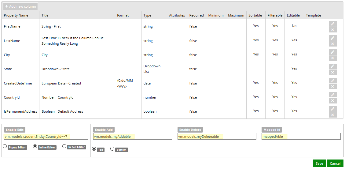
The editor is displayed in a popup window. It contains properties for the columns and rows in a grid. Place the cursor over the fields to view the tooltips.
-
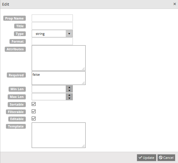
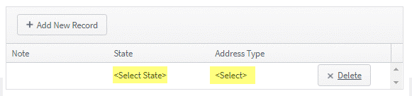
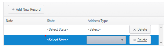
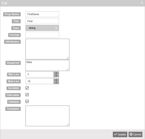
To specify column properties, click Add new column. The Edit window is displayed.

-
Specify the properties for the newly added column in the Edit window.
Columns
-
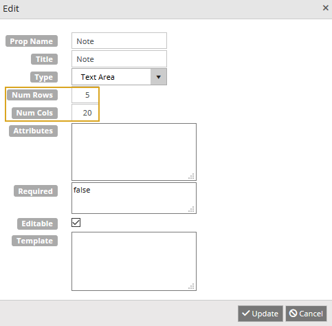
Required (Kendo "field" name). Property Name must be a simple case sensitive string starting with a letter, and followed by numbers, letters, or underscores. It must match a property in your bound data, i.e., in the OData query or Model.
Rows of properties can be dragged in the grid to reorder them.
The Property Name and the Mapped Id must be different. For more information, see Mapped Id.
-
Title
The title of the grid column. If no titles are added, the title row will not be displayed.
-
If the data is a date or a number, and the formatting is specified for either, this must be set to the type the format acts on. The default is "string" and is not saved. The Type options are:
- string
- number
- boolean
- date
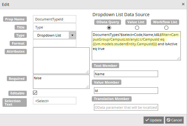
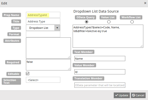
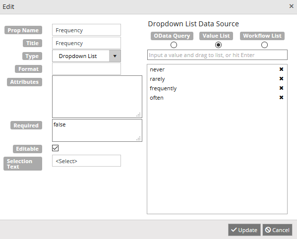
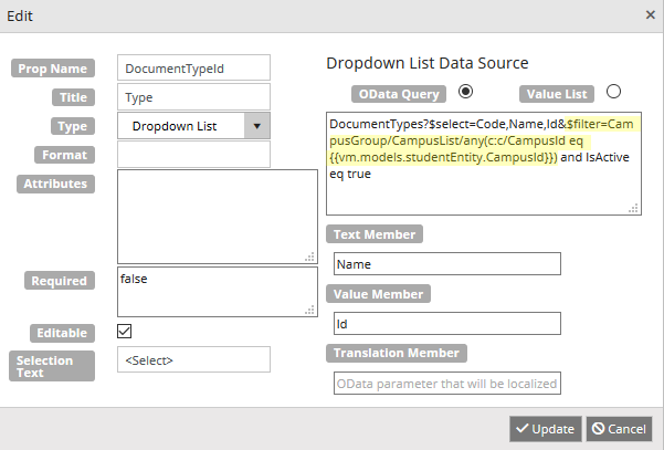
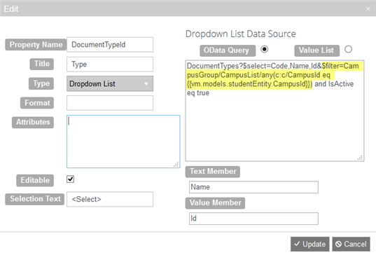
- Drop-down List
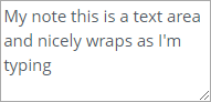
- Text Area
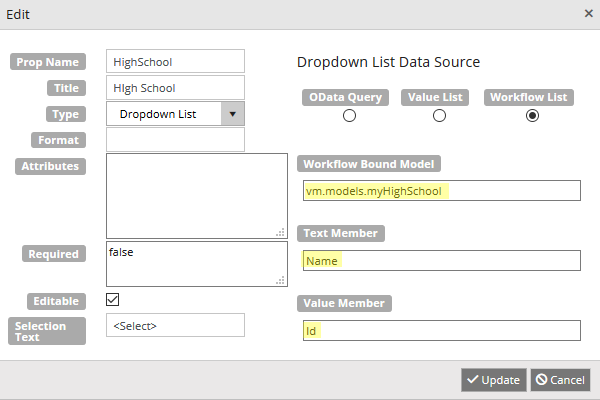
The data source for the possible values in a Drop-down List Type can be an OData Query, a Value List, or a Workflow List.
Example 1: OData Query as Data Source for a Drop-down

Example 2: OData Query for Id Value to Name Conversion in a Drop-down
Example 3: Value List as Data Source for a Drop-down
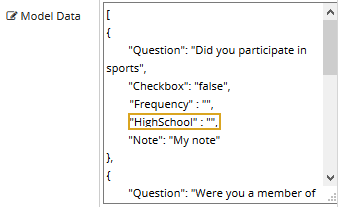
Example 4: Workflow List as Data Source for a Drop-down
Example 5: Drop-down Selection Text Initialization
-
The format that is applied to the value before it is displayed. It takes the form "{0:format} where "format" is a standard number format. To format a date or number, the Data Type must be set to "date" or "number".
When a date is selected, if there is no format, a default is used. The default date format is
{0:d}.
The default date format applies to Forms Builder 3.5 and later. The
{0:d}format allows for internationalization, whereas the previous default format{0:MM/dd/yyyy}caused problems when used with European locales.Any forms with Format property created prior to Forms Builder 3.5 will need to be manually updated and resaved to use the new default date format.
If internationalization is required, any forms created prior to Forms Builder 3.5 that use the Format property with a date value need to be manually updated and re-saved to use the new default date format .
Forms Builder 3.7 and later accepts the date format {0:dd/MM/yyyy}. It is no longer necessary to add a Locale component to force a sequence to accept dd/MM/yyyy dates.
For more information, see standard number and date formats in Kendo documentation.
-
HTML attributes of the table cell (<td>) rendered for the column. HTML attributes which are JavaScript keyword (e.g., class) must be quoted, e.g., {"class":"myClass", style:text-align:right; font size: 14px}
The value in the Attributes field can be a comma separated list within a pair of braces. Use quotes around all properties and values. The Attributes value is added to the <td> element in the rendered table for the grid.
The attribute value ...
{"class":"myCustomFormat","style":"text-align: right; font-size: 14px"}... results in the following <td> element:
<td class="myCustomFormat" style="text-align: right; font-size: 14px"><span ng-bind=”dataItem.MyPropName”>My text</span></td>
You can also use this class to color the text in the cell since the attribute cannot do it with a “style”. While background-color is a property of the cell, color is not because only the contents can be colored. In our case, text is embedded in a span element, so we need the class to define the color for the span contents.
/* Color the text red */ .myCustomFormat > span { color: rgb(255,0,0); (or color:red; ) } -
Required
Makes the column required and marks it with a red asterisk on the rendered form.
When a column is required, any row where the column does not have a value will trigger a validation message. The user will not be allowed to transition to the next page in the sequence until a value is provided in the required column for all rows in the grid.
The Required property field can be set to false (default), true, or a Boolean expression.
If an expression is specified, the expression will be evaluated at run time to determine if the column is required or not. The expression is evaluated on page load of the page that contains the grid. It cannot be updated on the same page.
If the data type for the column is Boolean, the Required property will either be hidden or disabled.
-
Minimum and maximum values can be assigned to the following data types:
String
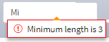
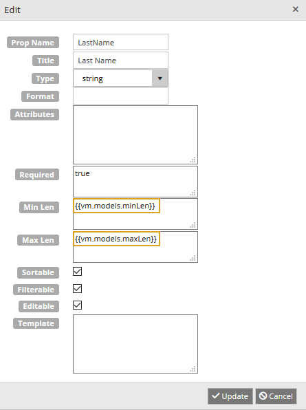
Min Len and Max Len
Specify the number of characters allowed in a string.
Be careful if you are using a query to populate grid because string values can have trailing blanks.
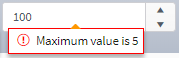
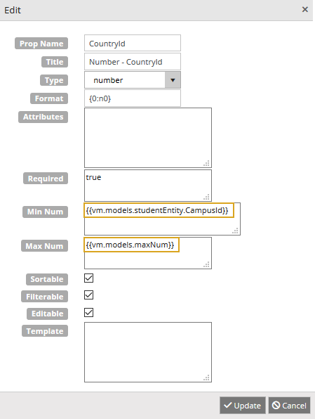
Number
Min Num and Max Num
Specify the allowed numeric values. You can use decimal values.
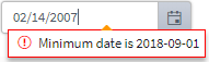
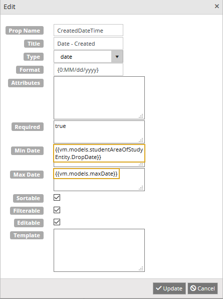
Date
Min Date and Max Date
Specify the allowed dates using the ISO 8601 format, e.g., 2018-10-28.
If you do not want to enforce minimum and maximum values, leave the min, max, or both fields blank.
If you want to bind the minimum and maximum values, specify the model bindings as follows:
String
{{vm.models.minLen}} and {{vm.models.maxLen}}
Number
{{vm.models.minNum}} and {{vm.models.maxNum}}
Date
{{vm.models.minDate}}and {{vm.models.maxDate}}
Notes
-
Model bindings within a Grid component will not be used for initial workflow argument creation. That means you need to create the corresponding arguments in the workflow unless the arguments were already created for fields in other forms.
-
Model bindings for database fields can be used for min/max value bindings, e.g., studentAreaOfStudyEntity.DropDate can be used as a min value.
-
Model bindings for School Defined Fields (SDFs) cannot be used because the ‘ ‘ character cannot be handled. However, you could assign an SDF to another argument in workflow and use that.
-
Model bindings for min/max values are not “dynamically” bound, i.e., user cannot change values on the same form once the form is loaded. The values must be set on a preceding form in the sequence.
-
-
Sortable
Makes the column sortable. Default is true if the Sortable property is set. Set true or false.
-
Filterable
Adds the ability to filter a column. Set true or false.
-
Editable
Allows the column to be editable. When Enable Edit is set and this is turned off, the column is read only.
This has no effect if Edit is not selected or a non-editable OData query is specified.
-
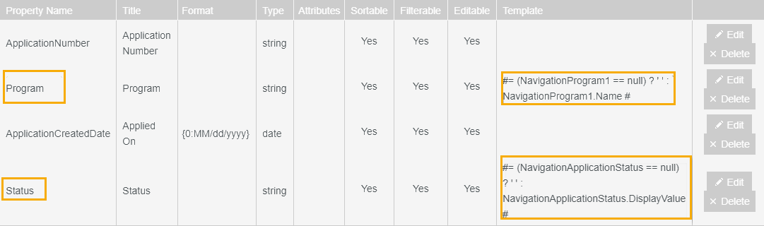
A template can be supplied for a column. This option is limited because Renderer must support the template. A Boolean data type does not use this property.
Example 6: Grid with Nullable Column
Example 7: Grid with Navigation Properties where the Navigation Property can be Null
-
-
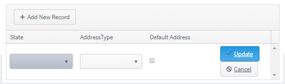
Click Update. The Edit window is closed, and the new record is added to the property editor.
-
Click Add new record again, specify properties for the next grid column, and click Update again. Repeat this step for each column in the grid.
-
When you have completed the properties for the columns, select appropriate properties for the rows in the lower section of the editor.
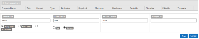
Rows
-
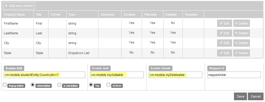
Enable Edit
Makes the row editable on the rendered form. The default setting for this property is false. You can set it to true or specify a binding (e.g., vm.models.myEdit or vm.models.studentEntity).
When users are allowed to edit rows in the grid, the final transition in the workflow for the associated sequence requires a SaveEntity activity for each entity item that is modified.
-
Enable Add
Allows the addition of new rows to the grid. The default setting for this property is false. You can set it to true or specify a binding (e.g., vm.models.myAdd).
Enable Add and Enable Edit should be used as coordinated pairs. If Enable Add=true and Enable Edit=false, the rendered form will display a
 button that does not have any functionality. To prevent the Confirm button from appearing on the form, set both Enable Edit and Enable Add to the same value (false or true).
When users are allowed to add rows to the grid, the final transition in the workflow for the associated sequence requires a SaveEntity activity for each item that is added.
-
Enable Delete
Allows deletion of rows in the grid. The default setting for this property is false. You can set it to true or specify a binding (e.g., vm.models.myDelete).
When users are allowed to delete rows from the grid, the final transition in the workflow for the associated sequence requires a DeleteEntity activity for the entity item that is deleted.
Enable Edit, Enable Add, and Enable Delete can be bound dynamically (i.e., based on another setting in the form or workflow). You may also use a Boolean value or expression.
If Enable Edit, Enable Add, or Enable Delete are bound with a vm.models.binding, when they are changed fromtruetofalseor vice versa in a rendered form, the grid is completely refreshed with the original data. You will lose any additions, modifications, or deletions from the grid up to that point. -
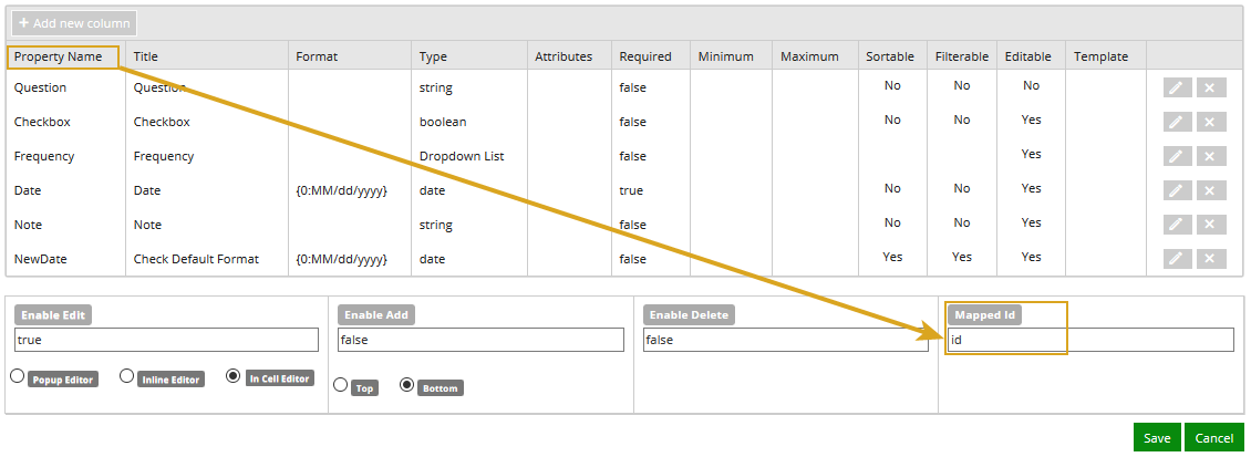
This property is used to uniquely identify rows within the grid. The Ids are used internally by the grid to save records to the database. The Ids are exposed only in the JSON in debug mode.
Mapped Id defaults to “Id” if not specified. If not present in the bound data, it will be assigned values starting at 1. New rows will be given a value of -1.
An Id that is present in an entity argument in the workflow is used to find the row to update in the database on a SaveEntity.
This property does not need to be mapped to a column. However, if the grid is initialized by an OData query, ensure that this field is included in the Select statement.
-
For most Anthology Student entities, the Id field can be used.
-
For CampusNexus CRM entities, the KeyId field can be used.
If using a SerializableDynamicObject not bound to a defined entity, the grid will automatically assign a unique Id to be used.
The Mapped Id is validated to ensure it is unique (case sensitive) for every row in the grid and based on the data being passed to the grid.
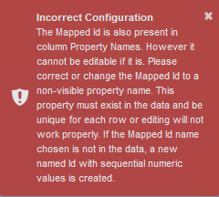
If the Mapped Id is the same name as a Property Name, the Property Name must be not be editable. If the Property Name is editable, an "Incorrect Configuration" error will be shown when you attempt to save.
-
-
Popup Editor
When edited, shows a popup editor containing the row being edited.
The Popup Editor may not display the entire cell content for a drop-down list. In those cases, the In Cell Editor can be more appropriate. -
Inline Editor
When edited, puts the entire row into edit mode until saved or canceled.
-
In Cell Editor
No edit button will be displayed. Clicking on a cell puts that cell into edit mode.
Use the In Cell Editor to ensure proper tabbing through each item in a row and each row in grid if data is entered using only the keyboard (i.e., not using mouse).
If you select Enable Add, adding and editing will both be enabled. Enable Edit=false will be overridden by Enable Add.
-
Top
Adds a new row at the top of the grid.
-
Bottom
Adds a new row at the bottom of the grid.
-
-
Click Save. The property editor is closed.

To modify column and row properties:
-
In the Property Settings pane of the Grid component, click the Edit button next to the Column property. The property editor is displayed.
-
Click Edit to modify the column properties.
-
Click Delete to remove the column properties.
-
Drag rows in the column properties grid to reorder them.
-
Edit the row properties as needed,
-
Click Save to close the property editor.
The Property Settings pane of the Grid component contains the Columns property settings with an Edit button that brings up an editor for properties associated with the columns and rows of a grid. The properties available in the editor override the property settings for the Grid component.
For example, when the Sortable property for the Grid component is set to true, you can set the Sortable property for a column X to false so that column X is not sortable while all other columns in the grid are sortable. To change the column title, add formats, attributes, or change the sortable and filterable properties, you need to specify this for each column.
When editing Columns property settings, Chrome and Edge browsers will provide the best experience.
To specify properties using the Columns editor:
-
In the Property Settings pane of the Grid component, click the Edit button next to the Columns property setting.
The editor is displayed in a popup window. It contains properties for the columns and rows in a grid. Place the cursor over the fields to view the tooltips.
-
To specify column properties, click Add new column. The Edit window is displayed.
-
Specify the properties for the newly added column in the Edit window.
The column properties include:
-
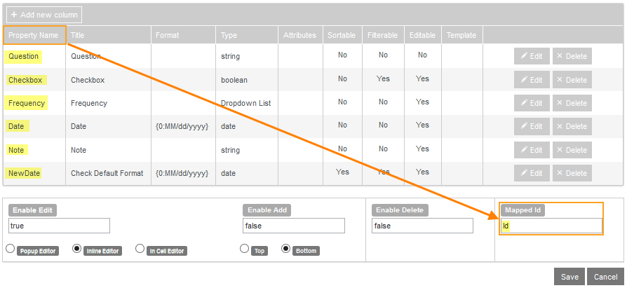
Property Name — Required (Kendo "field" name). Property Name must be a simple case sensitive string starting with a letter, and followed by numbers, letters, or underscores. It must match a property in your bound data, i.e., in the OData query or Model.
Rows of properties can be dragged in the grid to reorder them.
The Property Name and the Mapped Id must be different. For more information, see Mapped Id.
-
Title — The title of the grid column. If no titles are added, the title row will not be displayed.
-
Type — If the data is a date or a number, and the formatting is specified for either, this must be set to the type the format acts on. The default is "string" and is not saved.
The Type options are string, number, Boolean, Date, and Drop-down List.
The data source for the values in a Drop-down List Type can be an OData Query or a Value List derived from the possible values for this property in the Model or Model Data.
Example 1: OData Query as Data Source for a Drop-down
Example 2: OData Query for Id Value to Name Conversion in a Drop-down
Example 3: Value List as Data Source for a Drop-down
Example 4: Drop-down Selection Text Initialization
-
Format — The format that is applied to the value before it is displayed. It takes the form "{0:format} where "format" is a standard number format. To format a date or number, the Data Type must be set to "date" or "number".
When a date is selected, if there is no format, a default is used. The default date format is {0:d}.
The default date format applies to Forms Builder 3.5 and later. The {0:d} format allows for internationalization, whereas the previous default format {0:MM/dd/yyyy} caused problems when used with a European locales. Any forms with Format property created prior to Forms Builder 3.5 will need to be manually updated and resaved to use the new default date format. Any forms created prior to Forms Builder 3.5 that use the Format property with a date value need to be manually updated and re-saved to use the new default date format if internationalization is required.For more information, see standard number and date formats in Kendo documentation.
-
Attributes — HTML attributes of the table cell (<td>) rendered for the column. HTML attributes which are JavaScript keyword (e.g., class) must be quoted, e.g., {"class":"myClass", style:text-align:right; font size: 14px}
The value in the Attributes field can be a comma separated list within a pair of braces. Use quotes around all properties and values. The Attributes value is added to the <td> element in the rendered table for the grid.
The attribute value ... {"class":"myCustomFormat","style":"text-align: right; font-size: 14px"} ... results in the following <td> element: <td "class":"myCustomFormat","style":"text-align: right; font-size: 14px">my grid data</td> -
Required — Makes the column required and marks it with a red asterisk on the rendered form.
When a column is required, any row where the column does not have a value will trigger a validation message. The user will not be allowed to transition to the next page in the sequence until a value is provided in the required column for all rows in the grid.
The Required property field can be set to false (default), true, or a Boolean expression.
If an expression is specified, the expression will be evaluated at run time to determine if the column is required or not. The expression is evaluated on page load of the page that contains the grid. It cannot be updated on the same page.
If the data type for the column is Boolean, the Required property will either be hidden or disabled.
-
Minimum and Maximum values can be assigned to the following data types:
String
Min Len and Max Len
Specify the number of characters allowed in a string.
Be careful if you are using a query to populate grid because string values can have trailing blanks.
Number
Min Num and Max Num
Specify the allowed numeric values. You can use decimal values.
Date
Min Date and Max Date
Specify the allowed dates using the ISO 8601 format, e.g., 2018-10-28.
If you do not want to enforce minimum and maximum values, leave the min, max, or both fields blank.
If you want to bind the minimum and maximum values, specify the model bindings as follows:
String
{{vm.models.minLen}} and {{vm.models.maxLen}}
Number
{{vm.models.minNum}} and {{vm.models.maxNum}}
Date
{{vm.models.minDate}}and {{vm.models.maxDate}}
Notes:
-
Model bindings within a Grid component will not be used for initial workflow argument creation. That means you need to create the corresponding arguments in the workflow, unless the arguments were already created for fields in other forms.
-
Model bindings for database fields can be used for min/max value bindings, e.g., studentAreaOfStudyEntity.DropDate can be used as a min value.
-
Model bindings for School Defined Fields (SDFs) cannot be used because the ‘ ‘ character cannot be handled. However, you could assign an SDF to another argument in workflow and use that.
-
Model bindings for min/max values are not “dynamically” bound, i.e., user cannot change values on the same form once the form is loaded. The values must be set on a preceding form in the sequence.
-
-
Sortable — Makes the column sortable. Default is true if the Sortable property is set. Set true or false.
-
Filterable — Adds the ability to filter a column. Set true or false.
-
Editable — Allows the column to be editable. When Enable Edit is set and this is turned off, the column is read only.
This has no effect if Edit is not selected or a non-editable OData query is specified.
-
Template — A template can be supplied for a column. This option is limited because Renderer must support the template. A Boolean data type does not use this property.
Example 5: Grid with Nullable Column
Example 6: Grid with Navigation Properties where the Navigation Property can be Null
-
-
Click Update. The Edit window is closed and the new record is added to the property editor.
-
Click Add new record again, specify properties for the next grid column, and click Update again. Repeat this step for each column in the grid.
-
When you have completed the properties for the columns, select appropriate properties for the rows in the lower section of the editor.
The row properties include:
-
Enable Edit — Makes the row editable on the rendered form.
The default setting for this property is false. You can set it to true or specify a binding (e.g., vm.models.myEdit or vm.models.studentEntity).
When users are allowed to edit rows in the grid, the final transition in the workflow for the associated sequence requires a SaveEntity activity for each entity item that is modified.
-
Enable Add — Allows the addition of new rows to the grid.
The default setting for this property is false. You can set it to true or specify a binding (e.g., vm.models.myAdd).
Enable Add and Enable Edit should be used as coordinated pairs. If Enable Add=true and Enable Edit=false, the rendered form will display a
button that does not have any functionality. To prevent the Confirm button from appearing on the form, set both Enable Edit and Enable Add to the same value (false or true).When users are allowed to add rows to the grid, the final transition in the workflow for the associated sequence requires a SaveEntity activity for each item that is added.
-
Enable Delete — Allows deletion of rows in the grid. The default setting for this property is false. You can set it to true or specify a binding (e.g., vm.models.myDelete).
When users are allowed to delete rows from the grid, the final transition in the workflow for the associated sequence requires a DeleteEntity activity for the entity item that is deleted.
Enable Edit, Enable Add, and Enable Delete can be bound dynamically (i.e., based on another setting in the form or workflow). You may also use a Boolean value or expression.
If Enable Edit, Enable Add, or Enable Delete are bound with a vm.models. binding, when they are changed from true to false or vice versa in a rendered form, the grid is completely refreshed with the original data. You will lose any additions, modifications, or deletions from the grid up to that point. -
Mapped Id — This property is used to uniquely identify rows within the grid. The Ids are used internally by the grid to save records to the database. The Ids are exposed only in the JSON in debug mode.
Mapped Id defaults to “Id” if not specified. If not present in the bound data, it will be assigned values starting at 1. New rows will be given a value of -1.
An Id that is present in an entity argument in the workflow is used to find the row to update in the database on a SaveEntity.
This property does not need to be mapped to a column. However, if the grid is initialized by an OData query, ensure that this field is included in the Select statement.
-
For most Anthology Student entities, the Id field can be used.
-
For CampusNexus CRM entities, the KeyId field can be used.
If using a SerializableDynamicObject not bound to a defined entity, the grid will automatically assign a unique Id to be used.
The Mapped Id is validated to ensure it is unique (case sensitive) for every row in the grid and based on the data being passed to the grid.
If the Mapped Id is the same name as a Property Name, the Property Name must be not be editable. If the Property Name is editable, an "Incorrect Configuration" error will be shown when you attempt to save.
-
-
Popup Editor — When edited, shows a popup editor containing the row being edited.
The Popup Editor may not display the entire cell content for a drop-down list. In those cases, the In Cell Editor can be more appropriate. -
Inline Editor — When edited, puts the entire row into edit mode until saved or canceled.
-
In Cell Editor — No edit button will be displayed. Clicking on a cell puts that cell into edit mode.
Use the In Cell Editor to ensure proper tabbing through each item in a row and each row in grid if data is entered using only the keyboard (i.e., not using mouse).
If you select Enable Add, adding and editing will both be enabled. Enable Edit=false will be overridden by Enable Add.
-
Top — Adds a new row at the top of the grid.
-
Bottom — Adds a new row at the bottom of the grid.
-
-
Click Save. The property editor is closed.
To modify column and row properties:
-
In the Property Settings pane of the Grid component, click the Edit button next to the Column property. The property editor is displayed.
-
Click Edit to modify the column properties.
-
Click Delete to remove the column properties.
-
Drag rows in the column properties grid to reorder them.
-
Edit the row properties as needed,
-
Click Save to close the property editor.
The Property Settings pane of the Grid component contains the Columns property settings with an Edit button that brings up an editor for properties associated with the columns and rows of a grid. The properties available in the editor override the property settings for the Grid component.
For example, when the Sortable property for the Grid component is set to true, you can set the Sortable property for a column X to false so that column X is not sortable while all other columns in the grid are sortable. To change the column title, add formats, attributes, or change the sortable and filterable properties, you need to specify this for each column.
When editing Columns property settings, Chrome and Edge browsers will provide the best experience.
To specify properties using the Columns editor:
-
In the Property Settings pane of the Grid component, click the Edit button next to the Columns property setting.
The editor is displayed in a popup window. It contains properties for the columns and rows in a grid. Place the cursor over the fields to view the tooltips.
-
To specify column properties, click Add new column. The Edit window is displayed.
-
Specify the properties for the newly added column in the Edit window.
The column properties include:
-
Property Name — Required (Kendo "field" name). Property Name must be a simple case sensitive string starting with a letter, and followed by numbers, letters, or underscores. It must match a property in your bound data, i.e., in the OData query or Model.
Rows of properties can be dragged in the grid to reorder them.
The Property Name and the Mapped Id must be different. For more information, see Mapped Id.
-
Title — The title of the grid column. If no titles are added, the title row will not be displayed.
-
Type — If the data is a date or a number, and the formatting is specified for either, this must be set to the type the format acts on. The default is "string" and is not saved.
The Type options are string, number, Boolean, Date, and Drop-down List.
The data source for the values in a Drop-down List Type can be an OData Query or a Value List derived from the possible values for this property in the Model or Model Data.
Example 1: OData Query as Data Source for a Drop-down
Example 2: OData Query for Id Value to Name Conversion in a Drop-down
Example 3: Value List as Data Source for a Drop-down
Example 4: Drop-down Selection Text Initialization
-
Format — The format that is applied to the value before it is displayed. It takes the form "{0:format} where "format" is a standard number format. To format a date or number, the Data Type must be set to "date" or "number".
When a date is selected, if there is no format, a default is used. The default date format is {0:d}.
The default date format applies to Forms Builder 3.5 and later. The {0:d} format allows for internationalization, whereas the previous default format {0:MM/dd/yyyy} caused problems when used with a European locales. Any forms with Format property created prior to Forms Builder 3.5 will need to be manually updated and resaved to use the new default date format. Any forms created prior to Forms Builder 3.5 that use the Format property with a date value need to be manually updated and re-saved to use the new default date format if internationalization is required.For more information, see standard number and date formats in Kendo documentation.
-
Attributes — HTML attributes of the table cell (<td>) rendered for the column. HTML attributes which are JavaScript keyword (e.g., class) must be quoted, e.g., {"class":"myClass", style:text-align:right; font size: 14px}
The value in the Attributes field can be a comma separated list within a pair of braces. Use quotes around all properties and values. The Attributes value is added to the <td> element in the rendered table for the grid.
The attribute value ... {"class":"myCustomFormat","style":"text-align: right; font-size: 14px"} ... results in the following <td> element: <td "class":"myCustomFormat","style":"text-align: right; font-size: 14px">my grid data</td> -
Required — Makes the column required and marks it with a red asterisk on the rendered form.
When a column is required, any row where the column does not have a value will trigger a validation message. The user will not be allowed to transition to the next page in the sequence until a value is provided in the required column for all rows in the grid.
The Required property field can be set to false (default), true, or a Boolean expression.
If an expression is specified, the expression will be evaluated at run time to determine if the column is required or not. The expression is evaluated on page load of the page that contains the grid. It cannot be updated on the same page.
If the data type for the column is Boolean, the Required property will either be hidden or disabled.
-
Minimum and Maximum values can be assigned to the following data types:
String
Min Len and Max Len
Specify the number of characters allowed in a string.
Be careful if you are using a query to populate grid because string values can have trailing blanks.
Number
Min Num and Max Num
Specify the allowed numeric values. You can use decimal values.
Date
Min Date and Max Date
Specify the allowed dates using the ISO 8601 format, e.g., 2018-10-28.
If you do not want to enforce minimum and maximum values, leave the min, max, or both fields blank.
-
Sortable — Makes the column sortable. Default is true if the Sortable property is set. Set true or false.
-
Filterable — Adds the ability to filter a column. Set true or false.
-
Editable — Allows the column to be editable. When Enable Edit is set and this is turned off, the column is read only.
This has no effect if Edit is not selected or a non-editable OData query is specified.
-
Template — A template can be supplied for a column. This option is limited because Renderer must support the template. A Boolean data type does not use this property.
Example 5: Grid with Nullable Column
Example 6: Grid with Navigation Properties where the Navigation Property can be Null
-
-
Click Update. The Edit window is closed and the new record is added to the property editor.
-
Click Add new record again, specify properties for the next grid column, and click Update again. Repeat this step for each column in the grid.
-
When you have completed the properties for the columns, select appropriate properties for the rows in the lower section of the editor.
The row properties include:
-
Enable Edit — Makes the row editable on the rendered form.
The default setting for this property is false. You can set it to true or specify a binding (e.g., vm.models.myEdit or vm.models.studentEntity).
When users are allowed to edit rows in the grid, the final transition in the workflow for the associated sequence requires a SaveEntity activity for each entity item that is modified.
-
Enable Add — Allows the addition of new rows to the grid.
The default setting for this property is false. You can set it to true or specify a binding (e.g., vm.models.myAdd).
Enable Add and Enable Edit should be used as coordinated pairs. If Enable Add=true and Enable Edit=false, the rendered form will display a
button that does not have any functionality. To prevent the Confirm button from appearing on the form, set both Enable Edit and Enable Add to the same value (false or true).When users are allowed to add rows to the grid, the final transition in the workflow for the associated sequence requires a SaveEntity activity for each item that is added.
-
Enable Delete — Allows deletion of rows in the grid. The default setting for this property is false. You can set it to true or specify a binding (e.g., vm.models.myDelete).
When users are allowed to delete rows from the grid, the final transition in the workflow for the associated sequence requires a DeleteEntity activity for the entity item that is deleted.
Enable Edit, Enable Add, and Enable Delete can be bound dynamically (i.e., based on another setting in the form or workflow). You may also use a Boolean value or expression.
If Enable Edit, Enable Add, or Enable Delete are bound with a vm.models. binding, when they are changed from true to false or vice versa in a rendered form, the grid is completely refreshed with the original data. You will lose any additions, modifications, or deletions from the grid up to that point. -
Mapped Id — This property is used to uniquely identify rows within the grid. The Ids are used internally by the grid to save records to the database. The Ids are exposed only in the JSON in debug mode.
Mapped Id defaults to “Id” if not specified. If not present in the bound data, it will be assigned values starting at 1. New rows will be given a value of -1.
An Id that is present in an entity argument in the workflow is used to find the row to update in the database on a SaveEntity.
This property does not need to be mapped to a column. However, if the grid is initialized by an OData query, ensure that this field is included in the Select statement.
-
For most Anthology Student entities, the Id field can be used.
-
For CampusNexus CRM entities, the KeyId field can be used.
If using a SerializableDynamicObject not bound to a defined entity, the grid will automatically assign a unique Id to be used.
The Mapped Id is validated to ensure it is unique (case sensitive) for every row in the grid and based on the data being passed to the grid.
If the Mapped Id is the same name as a Property Name, the Property Name must be not be editable. If the Property Name is editable, an "Incorrect Configuration" error will be shown when you attempt to save.
-
-
Popup Editor — When edited, shows a popup editor containing the row being edited.
The Popup Editor may not display the entire cell content for a drop-down list. In those cases, the In Cell Editor can be more appropriate. -
Inline Editor — When edited, puts the entire row into edit mode until saved or canceled.
-
In Cell Editor — No edit button will be displayed. Clicking on a cell puts that cell into edit mode.
Use the In Cell Editor to ensure proper tabbing through each item in a row and each row in grid if data is entered using only the keyboard (i.e., not using mouse).
If you select Enable Add, adding and editing will both be enabled. Enable Edit=false will be overridden by Enable Add.
-
Top — Adds a new row at the top of the grid.
-
Bottom — Adds a new row at the bottom of the grid.
-
-
Click Save. The property editor is closed.
To modify column and row properties:
-
In the Property Settings pane of the Grid component, click the Edit button next to the Column property. The property editor is displayed.
-
Click Edit to modify the column properties.
-
Click Delete to remove the column properties.
-
Drag rows in the column properties grid to reorder them.
-
Edit the row properties as needed,
-
Click Save to close the property editor.