Single-select Search
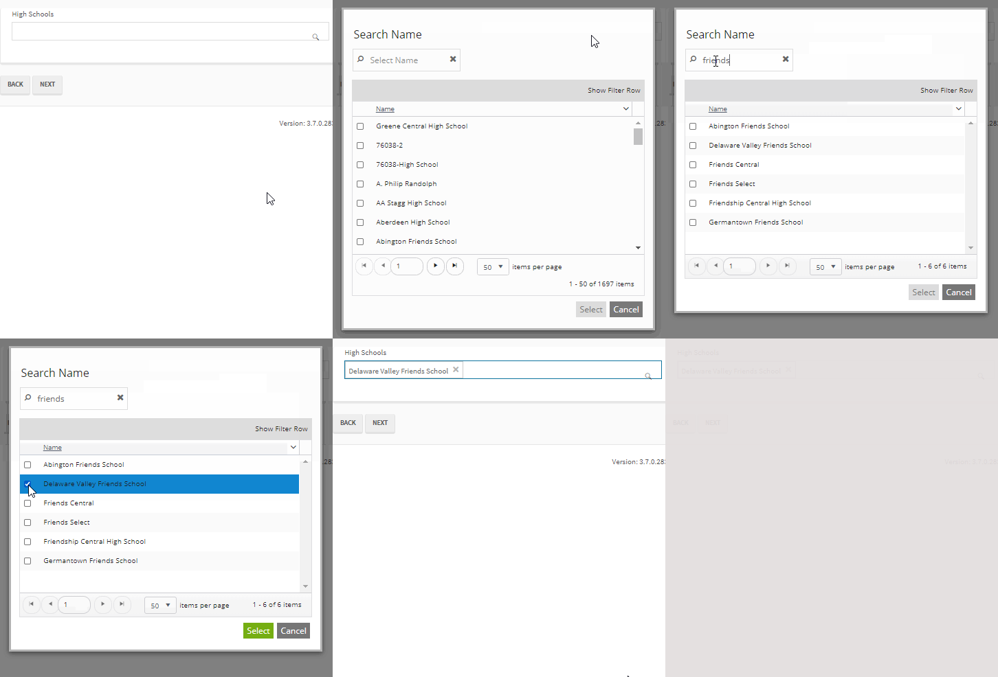
You can use the Single-select Search component to enable users to find and select a single item from a list. When the user clicks on the component in a form, the Search Name dialog is displayed. The dialog allows the user to search for a name, filter the list, or browse through the list pages, and select one item.
Note: The CampusNexus data model specifies the DisplayControlType of "SearchControl" for many properties. When the Single-select Search component is dropped onto the Layout pane in Form Designer, the Single-select Search component will be the default control type for properties that have the DisplayControlType of "SearchControl" in the metadata.
Properties
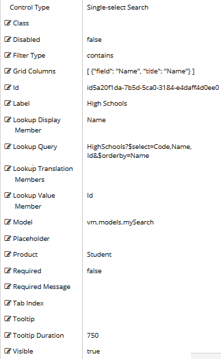
Control Property Settings
Rendered Component
Workflow Argument

For workflow arguments used with the Single-select Search in Forms Builder 3.5 and later, see Default Argument Types for Components.
|
|
When using OData queries in the properties of the Single-select Search component, do not mix dotted notation to access members from an $expand and non-dotted notation to access member from the main $select. |
-
Class is an optional CSS class (or space separated classes) added to the top level of the control. CSS specific to the control can be applied. The class must be defined in a Renderer CSS file. For more information, see Custom Styles.
-
Disabled sets a control to disabled.
-
Must be true or false, or a binding beginning with "vm.models.".
-
A property array string index requires single quotes, e.g., vm.models.xxx.CustomProperties['yyyyy'].
-
An expression can be used that evaluates to true or false, e.g., vm.models.myvalue==7 (>,<, !=, ==, >=, <=).
-
If comparing to a string, it must be in single quotes.
- (true and false must be all lowercase)
-
-
Filter Type defines how search values will be filtered. Select from the following filter types: contains (default), endswith, and startswith. Values typed using the keyboard will be used to filter the list according to the selection.
-
Grid Columns is set to an array of JSON objects. The "field" value is mandatory for each object. Use this property to specify the columns displayed in the search results. For more details, see Adjust the Search Grid Columns Property.
-
Id is required. It can be any valid JavaScript id attribute value. (Must start with a letter followed by 0 to 9, a to z, dash, or underscore characters).
-
Using a globally unique identifier (GUID) from GuidGen or GuidGenerator prefixed by at least one letter prevents a clash with any other id.
-
Id should contain only a to z (uppercase or lowercase), 0 to 9, dash, or underscore. It should not have spaces.
-
Binding is not supported for this property.
-
-
Label is the value displayed in the label.
-
If this value is bound, it must be enclosed in double braces, e.g., {{vm.models.myLabel}}.
-
Allowable suffix characters: starts with letter, then letters, numerals, or underscore.
-
-
Lookup Display Member is the name of the property in the OData query string to use for the display.
Also see Adjust the Search Grid Columns Property.
-
Lookup Query is the OData query string to retrieve values for the control.
Example
HighSchools
-
Lookup Translation Members is a comma separated list of property names in an OData query string to be translated. You should always validate the query will work in a browser. Only basic errors can be detected in Form Designer.
-
Lookup Value Member is the name of the property in the OData query string to use as the value.
-
If the Lookup Value Member is an Id, the associated data type in Workflow Composer is
Int32. -
If the Lookup Value Member is a Code or Name, the associated data type in Workflow Composer is
String.
-
-
Model is required for binding to a workflow argument or another control. If the Model property is not specified, the component will be displayed on the form, but any values the user enters on the form cannot be captured or used in the workflow.
-
The Model value must always start with "vm.models.", e.g., vm.models.myArgument.
-
This value may initialize the control, and may be updated by the control, and if matched to a workflow argument, is available in the workflow (readable or writable).
-
Ensure your model argument is defined in your workflow for custom components if it is used in the workflow. Otherwise, a workflow argument is not required.
-
The casing of an argument used in the workflow MUST match the "vm.models." suffix casing.
-
If the model addresses CustomProperties or MultiValueCustomProperties, the property identifier string must be enclosed in single quotes, e.g., vm.models.myentity.CustomProperties['mycustomprop']
If an OData query is specified and this binding is specified, it will be overwritten with the value of the OData query results and thus be available read-only in the workflow.
If only "Model Data" is specified and the workflow variable is either not initialized or set to an empty array, this value will be initialized to the "Model Data" value.
Construction of the model in the workflow is done by assigning data from a provider.
-
-
Placeholder is the prompt text displayed in a ghost style in an input box when nothing has been entered.
-
If this property is bound, it must start with {{vm.models. and end with }}.
-
Allowable suffix characters: starts with letter, then letters, numerals, or underscore.
-
-
Product indicates the product from which OData query results are returned. Select from:
- Student
- CRM
- Occupation Insight
The selected product must be configured in the <products> section of the Renderer web.config file.
The default Product value will be "Student" if "Student" is selected in the <Select Provider> list on the Fields tab.
The default Product value will be "CRM" if "CRM" is selected in the <Select Provider> list on the Fields tab.
Select "Occupation Insight" in the Product property if the source of the query will come from a different data source other than Student/CRM. For more information, see Build Queries for Occupation Insight.
A form can have multiple controls that retrieve data from different providers. For example, a form can have a control that is populated by a query to the Student database. The same form can have another control that retrieves data from Occupation Insight.
Specify the query to retrieve data from the selected provider using the Lookup Query or OData Query property (as applicable for the control). The query contains only the URL specific part of an OData URI. The Base URL and Product will be supplied by the configuration.
The argument type for list items in Workflow Composer will be an integer array:
System.Int32[]
-
Required makes the control required and will raise a validation error on the form. It is set to false by default. If input is required, set the property value to true. The rendered form will display a red asterisk (
 ) next to the component.
-
Can be bound to a workflow argument or another control's value.
-
A property array string index requires single quotes, e.g., vm.models.xxx.CustomProperties['yyyyy'].
-
An expression can be used that evaluates to true or false, e.g., vm.models.myvalue==7 (>,<, !=, ==, >=, <=).
-
If comparing to a string, it must be in single quotes.
-
(true and false must be all lowercase)
-
-
Required Message is optional. It overrides the default "Required" message.
-
If this value is bound, it must be enclosed in double braces, e.g., {{vm.models.myMessage}}.
-
Allowable suffix characters: starts with letter, then letters, numerals, or underscore.
-
-
Tab Index allows you to specify the order of elements that are brought into focus when the user presses the Tab key on the rendered form. Allowed values are -1, 0, and positive numbers.
-
A value of "-1" removes the element from the sequential tab order preventing keyboard users from focusing on it.
-
A value of "0" means the element is ignored in the tab order, but that does not mean users cannot tab to and focus an element.
-
A value of "1" sets the element as the first item to gain focus when tabbing through the page followed by any higher numbered tab indices, followed by any other keyboard focusable elements such as buttons. required fields, and CAPTCHA.
The tab index value should not match another control's tab index.
-
A blank value (default) will not add a tab index in the HTML.
For more information, see https://html.spec.whatwg.org/multipage/interaction.html#the-tabindex-attribute and https://www.alexlande.com/articles/cross-browser-tabindex-woes/.
-
-
Tooltip is the value to display when hovering over the control's label.
-
If this value is bound, it must be enclosed in double braces, e.g., {{vm.models.myTooltip}}.
-
Allowable suffix characters: starts with letter, then letters, numerals, or underscore.
-
-
Tooltip Duration is the amount of time in milliseconds a tooltip is displayed (default=750). The value must be greater than 0. If it is set to 0, a form validation error will occur.
-
If this value is bound, it must be enclosed in double braces, e.g., {{vm.models.myToolTip}}.
-
Allowable suffix characters: starts with letter, then letters, numerals, or underscore.
-
-
Visible makes the control visible or hidden.
-
Can be bound to a workflow argument or another control's value. This property is dynamic.
-
A property array string index requires single quotes, e.g., vm.models.xxx.CustomProperties['yyyyy'].
-
An expression can be used that evaluates to true or false, e.g., vm.models.myvalue==7 (>,<, !=, ==, >=, <=). If comparing to a string, it must be in single quotes.
-
(true and false must be all lowercase)
- When the control is not visible (usually based on some condition) and is a required field, the required field validation will not be triggered.
-
Lookup Queries for CampusNexus CRM Metadata
For any drop-down or search controls that will be populated via a lookup query, the CampusNexus CRM user needs to enter values for the Lookup Display Member and Lookup Sort Member attributes. The Lookup Query and Lookup Value Member property settings should have default values (if applicable for the selected property) as these are currently specified in the metadata.
Adjust the Search Grid Columns Property
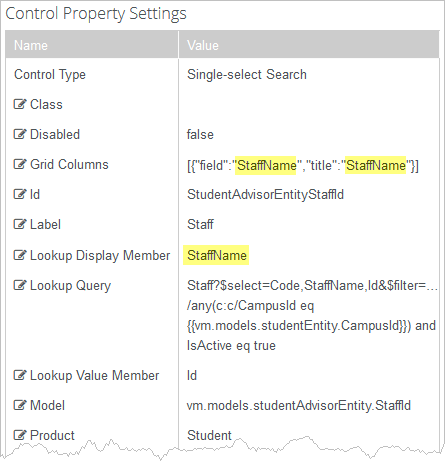
In Forms Builder 3.4 and later, the LookupDisplayMember value is used to populate default value for the Grid Columns property on Single-select Search control types.
For example, when the LookupDisplayMember value is StaffName, the Grid Columns property default is [{"field":"StaffName","title":"StaffName"}]. ![]()
If no LookupDisplayMember value is present, the default Grid Columns property will be [ {"field": "Name", "title": "Name"} ] .
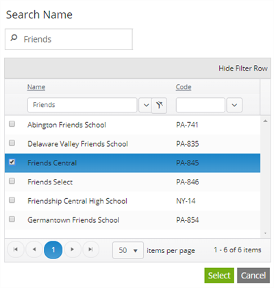
To display the Single-select Search control with two grid columns for the StaffName field and Code field, modify the Grid Columns property as follows:
[ {"field": "StaffName", "title": "StaffName"},{"field": "Code", "title": "Code"}]
You can use the Single-select Search component to enable users to find and select a single item from a list. When the user clicks on the component in a form, the Search Name dialog is displayed. The dialog allows the user to search for a name, filter the list, or browse through the list pages, and select one item.
Note: The CampusNexus data model specifies the DisplayControlType of "SearchControl" for many properties. When the Single-select Search component is dropped onto the Layout pane in Form Designer, the Single-select Search component will be the default control type for properties that have the DisplayControlType of "SearchControl" in the metadata.
Properties
Control Property Settings

Rendered Component

Workflow Argument

For workflow arguments used with the Single-select Search in Forms Builder 3.5 and later, see Default Argument Types for Components.
-
Class is an optional CSS class (or space separated classes) added to the top level of the control. CSS specific to the control can be applied. The class must be defined in a Renderer CSS file. For more information, see Custom Styles.
-
Disabled sets a control to disabled.
-
Must be true or false, or a binding beginning with "vm.models.".
-
A property array string index requires single quotes, e.g., vm.models.xxx.CustomProperties['yyyyy'].
-
An expression can be used that evaluates to true or false, e.g., vm.models.myvalue==7 (>,<, !=, ==, >=, <=).
-
If comparing to a string, it must be in single quotes.
- (true and false must be all lowercase)
-
-
Filter Type defines how search values will be filtered. Select from the following filter types: contains (default), endswith, and startswith. Values typed using the keyboard will be used to filter the list according to the selection.
-
Grid Columns is set to an array of JSON objects. The "field" value is mandatory for each object. Use this property to specify the columns displayed in the search results. For more details, see Adjust the Search Grid Columns Property.
-
Id is required. It can be any valid JavaScript id attribute value. (Must start with a letter followed by 0 to 9, a to z, dash, or underscore characters).
-
Using a globally unique identifier (GUID) from GuidGen or GuidGenerator prefixed by at least one letter prevents a clash with any other id.
-
Id should contain only a to z (uppercase or lowercase), 0 to 9, dash, or underscore. It should not have spaces.
-
Binding is not supported for this property.
-
-
Label is the value displayed in the label.
-
If this value is bound, it must be enclosed in double braces, e.g., {{vm.models.myLabel}}.
-
Allowable suffix characters: starts with letter, then letters, numerals, or underscore.
-
-
Lookup Display Member is the name of the property in the OData query string to use for the display.
Also see Adjust the Search Grid Columns Property.
-
Lookup Query is the OData query string to retrieve values for the control.
Example
HighSchools
-
Lookup Translation Members is a comma separated list of property names in an OData query string to be translated. You should always validate the query will work in a browser. Only basic errors can be detected in Form Designer.
-
Lookup Value Member is the name of the property in the OData query string to use as the value.
-
If the Lookup Value Member is an Id, the associated data type in Workflow Composer is
Int32. -
If the Lookup Value Member is a Code or Name, the associated data type in Workflow Composer is
String.
-
-
Model is required for binding to a workflow argument or another control. If the Model property is not specified, the component will be displayed on the form, but any values the user enters on the form cannot be captured or used in the workflow.
-
The Model value must always start with "vm.models.", e.g., vm.models.myArgument.
-
This value may initialize the control, and may be updated by the control, and if matched to a workflow argument, is available in the workflow (readable or writable).
-
Ensure your model argument is defined in your workflow for custom components if it is used in the workflow. Otherwise, a workflow argument is not required.
-
The casing of an argument used in the workflow MUST match the "vm.models." suffix casing.
-
If the model addresses CustomProperties or MultiValueCustomProperties, the property identifier string must be enclosed in single quotes, e.g., vm.models.myentity.CustomProperties['mycustomprop']
If an OData query is specified and this binding is specified, it will be overwritten with the value of the OData query results and thus be available read-only in the workflow.
If only "Model Data" is specified and the workflow variable is either not initialized or set to an empty array, this value will be initialized to the "Model Data" value.
Construction of the model in the workflow is done by assigning data from a provider.
-
-
Placeholder is the prompt text displayed in a ghost style in an input box when nothing has been entered.
-
If this property is bound, it must start with {{vm.models. and end with }}.
-
Allowable suffix characters: starts with letter, then letters, numerals, or underscore.
-
-
Product indicates the product from which OData query results are returned. Select from:
- Student
- CRM
- Occupation Insight
The selected product must be configured in the <products> section of the Renderer web.config file.
The default Product value will be "Student" if "Student" is selected in the <Select Provider> list on the Fields tab.
The default Product value will be "CRM" if "CRM" is selected in the <Select Provider> list on the Fields tab.
Select "Occupation Insight" in the Product property if the source of the query will come from a different data source other than Student/CRM. For more information, see Build Queries for Occupation Insight.
A form can have multiple controls that retrieve data from different providers. For example, a form can have a control that is populated by a query to the Student database. The same form can have another control that retrieves data from Occupation Insight.
Specify the query to retrieve data from the selected provider using the Lookup Query or OData Query property (as applicable for the control). The query contains only the URL specific part of an OData URI. The Base URL and Product will be supplied by the configuration.
The argument type for list items in Workflow Composer will be an integer array:
System.Int32[]
-
Required makes the control required and will raise a validation error on the form. It is set to false by default. If input is required, set the property value to true. The rendered form will display a red asterisk (
 ) next to the component.
-
Can be bound to a workflow argument or another control's value.
-
A property array string index requires single quotes, e.g., vm.models.xxx.CustomProperties['yyyyy'].
-
An expression can be used that evaluates to true or false, e.g., vm.models.myvalue==7 (>,<, !=, ==, >=, <=).
-
If comparing to a string, it must be in single quotes.
-
(true and false must be all lowercase)
-
-
Required Message is optional. It overrides the default "Required" message.
-
If this value is bound, it must be enclosed in double braces, e.g., {{vm.models.myMessage}}.
-
Allowable suffix characters: starts with letter, then letters, numerals, or underscore.
-
-
Tab Index allows you to specify the order of elements that are brought into focus when the user presses the Tab key on the rendered form. Allowed values are -1, 0, and positive numbers.
-
A value of "-1" removes the element from the sequential tab order preventing keyboard users from focusing on it.
-
A value of "0" means the element is ignored in the tab order, but that does not mean users cannot tab to and focus an element.
-
A value of "1" sets the element as the first item to gain focus when tabbing through the page followed by any higher numbered tab indices, followed by any other keyboard focusable elements such as buttons. required fields, and CAPTCHA.
The tab index value should not match another control's tab index.
-
A blank value (default) will not add a tab index in the HTML.
For more information, see https://html.spec.whatwg.org/multipage/interaction.html#the-tabindex-attribute and https://www.alexlande.com/articles/cross-browser-tabindex-woes/.
-
-
Tooltip is the value to display when hovering over the control's label.
-
If this value is bound, it must be enclosed in double braces, e.g., {{vm.models.myTooltip}}.
-
Allowable suffix characters: starts with letter, then letters, numerals, or underscore.
-
-
Tooltip Duration is the amount of time in milliseconds a tooltip is displayed (default=750). The value must be greater than 0. If it is set to 0, a form validation error will occur.
-
If this value is bound, it must be enclosed in double braces, e.g., {{vm.models.myToolTip}}.
-
Allowable suffix characters: starts with letter, then letters, numerals, or underscore.
-
-
Visible makes the control visible or hidden.
-
Can be bound to a workflow argument or another control's value. This property is dynamic.
-
A property array string index requires single quotes, e.g., vm.models.xxx.CustomProperties['yyyyy'].
-
An expression can be used that evaluates to true or false, e.g., vm.models.myvalue==7 (>,<, !=, ==, >=, <=). If comparing to a string, it must be in single quotes.
-
(true and false must be all lowercase)
- When the control is not visible (usually based on some condition) and is a required field, the required field validation will not be triggered.
-
Lookup Queries for CampusNexus CRM Metadata
For any drop-down or search controls that will be populated via a lookup query, the CampusNexus CRM user needs to enter values for the Lookup Display Member and Lookup Sort Member attributes. The Lookup Query and Lookup Value Member property settings should have default values (if applicable for the selected property) as these are currently specified in the metadata.
Adjust the Search Grid Columns Property
In Forms Builder 3.4 and later, the LookupDisplayMember value is used to populate default value for the Grid Columns property on Single-select Search control types.
For example, when the LookupDisplayMember value is StaffName, the Grid Columns property default is [{"field":"StaffName","title":"StaffName"}]. ![]()
If no LookupDisplayMember value is present, the default Grid Columns property will be [ {"field": "Name", "title": "Name"} ] .
To display the Single-select Search control with two grid columns for the StaffName field and Code field, modify the Grid Columns property as follows:
[ {"field": "StaffName", "title": "StaffName"},{"field": "Code", "title": "Code"}]
You can use the Single-select Search component to enable users to find and select a single item from a list. When the user clicks on the component in a form, the Search Name dialog is displayed. The dialog allows the user to search for a name, filter the list, or browse through the list pages, and select one item.
Note: The CampusNexus data model specifies the DisplayControlType of "SearchControl" for many properties. When the Single-select Search component is dropped onto the Layout pane in Form Designer, the Single-select Search component will be the default control type for properties that have the DisplayControlType of "SearchControl" in the metadata.
Control Property Settings

Rendered Component

Workflow Argument

For workflow arguments used with the Single-select Search in Forms Builder 3.5 and later, see Default Argument Types for Components.
Properties
-
Class is an optional CSS class (or space separated classes) added to the top level of the control. CSS specific to the control can be applied. The class must be defined in a Renderer CSS file. For more information, see Custom Styles.
-
Disabled sets a control to disabled.
-
Must be true or false, or a binding beginning with "vm.models.".
-
A property array string index requires single quotes, e.g., vm.models.xxx.CustomProperties['yyyyy'].
-
An expression can be used that evaluates to true or false, e.g., vm.models.myvalue==7 (>,<, !=, ==, >=, <=).
-
If comparing to a string, it must be in single quotes.
- (true and false must be all lowercase)
-
-
Filter Type defines how search values will be filtered. Select from the following filter types: contains (default), endswith, and startswith. Values typed using the keyboard will be used to filter the list according to the selection.
-
Grid Columns is set to an array of JSON objects. The "field" value is mandatory for each object. Use this property to specify the columns displayed in the search results. For more details, see Adjust the Search Grid Columns Property.
-
Id is required. It can be any valid JavaScript id attribute value. (Must start with a letter followed by 0 to 9, a to z, dash, or underscore characters).
-
Using a globally unique identifier (GUID) from GuidGen or GuidGenerator prefixed by at least one letter prevents a clash with any other id.
-
Id should contain only a to z (uppercase or lowercase), 0 to 9, dash, or underscore. It should not have spaces.
-
Binding is not supported for this property.
-
-
Label is the value displayed in the label.
-
If this value is bound, it must be enclosed in double braces, e.g., {{vm.models.myLabel}}.
-
Allowable suffix characters: starts with letter, then letters, numerals, or underscore.
-
-
Lookup Display Member is the name of the property in the OData query string to use for the display.
Also see Adjust the Search Grid Columns Property.
-
Lookup Query is the OData query string to retrieve values for the control.
Example
HighSchools
-
Lookup Translation Members is a comma separated list of property names in an OData query string to be translated. You should always validate the query will work in a browser. Only basic errors can be detected in Form Designer.
-
Lookup Value Member is the name of the property in the OData query string to use as the value.
-
If the Lookup Value Member is an Id, the associated data type in Workflow Composer is
Int32. -
If the Lookup Value Member is a Code or Name, the associated data type in Workflow Composer is
String.
-
-
Model is required for binding to a workflow argument or another control. If the Model property is not specified, the component will be displayed on the form, but any values the user enters on the form cannot be captured or used in the workflow.
-
The Model value must always start with "vm.models.", e.g., vm.models.myArgument.
-
This value may initialize the control, and may be updated by the control, and if matched to a workflow argument, is available in the workflow (readable or writable).
-
Ensure your model argument is defined in your workflow for custom components if it is used in the workflow. Otherwise, a workflow argument is not required.
-
The casing of an argument used in the workflow MUST match the "vm.models." suffix casing.
-
If the model addresses CustomProperties or MultiValueCustomProperties, the property identifier string must be enclosed in single quotes, e.g., vm.models.myentity.CustomProperties['mycustomprop']
If an OData query is specified and this binding is specified, it will be overwritten with the value of the OData query results and thus be available read-only in the workflow.
If only "Model Data" is specified and the workflow variable is either not initialized or set to an empty array, this value will be initialized to the "Model Data" value.
Construction of the model in the workflow is done by assigning data from a provider.
-
-
Placeholder is the prompt text displayed in a ghost style in an input box when nothing has been entered.
-
If this property is bound, it must start with {{vm.models. and end with }}.
-
Allowable suffix characters: starts with letter, then letters, numerals, or underscore.
-
-
Product indicates the product from which OData query results are returned. Select from:
- Student
- CRM
- Occupation Insight
The selected product must be configured in the <products> section of the Renderer web.config file.
The default Product value will be "Student" if "Student" is selected in the <Select Provider> list on the Fields tab.
The default Product value will be "CRM" if "CRM" is selected in the <Select Provider> list on the Fields tab.
Select "Occupation Insight" in the Product property if the source of the query will come from a different data source other than Student/CRM. For more information, see Build Queries for Occupation Insight.
A form can have multiple controls that retrieve data from different providers. For example, a form can have a control that is populated by a query to the Student database. The same form can have another control that retrieves data from Occupation Insight.
Specify the query to retrieve data from the selected provider using the Lookup Query or OData Query property (as applicable for the control). The query contains only the URL specific part of an OData URI. The Base URL and Product will be supplied by the configuration.
The argument type for list items in Workflow Composer will be an integer array:
System.Int32[]
-
Required makes the control required and will raise a validation error on the form. It is set to false by default. If input is required, set the property value to true. The rendered form will display a red asterisk (
 ) next to the component.
-
Can be bound to a workflow argument or another control's value.
-
A property array string index requires single quotes, e.g., vm.models.xxx.CustomProperties['yyyyy'].
-
An expression can be used that evaluates to true or false, e.g., vm.models.myvalue==7 (>,<, !=, ==, >=, <=).
-
If comparing to a string, it must be in single quotes.
-
(true and false must be all lowercase)
-
-
Required Message is optional. It overrides the default "Required" message.
-
If this value is bound, it must be enclosed in double braces, e.g., {{vm.models.myMessage}}.
-
Allowable suffix characters: starts with letter, then letters, numerals, or underscore.
-
-
Tab Index allows you to specify the order of elements that are brought into focus when the user presses the Tab key on the rendered form. Allowed values are -1, 0, and positive numbers.
-
A value of "-1" removes the element from the sequential tab order preventing keyboard users from focusing on it.
-
A value of "0" means the element is ignored in the tab order, but that does not mean users cannot tab to and focus an element.
-
A value of "1" sets the element as the first item to gain focus when tabbing through the page followed by any higher numbered tab indices, followed by any other keyboard focusable elements such as buttons. required fields, and CAPTCHA.
The tab index value should not match another control's tab index.
-
A blank value (default) will not add a tab index in the HTML.
For more information, see https://html.spec.whatwg.org/multipage/interaction.html#the-tabindex-attribute and https://www.alexlande.com/articles/cross-browser-tabindex-woes/.
-
-
Tooltip is the value to display when hovering over the control's label.
-
If this value is bound, it must be enclosed in double braces, e.g., {{vm.models.myTooltip}}.
-
Allowable suffix characters: starts with letter, then letters, numerals, or underscore.
-
-
Tooltip Duration is the amount of time in milliseconds a tooltip is displayed (default=750). The value must be greater than 0. If it is set to 0, a form validation error will occur.
-
If this value is bound, it must be enclosed in double braces, e.g., {{vm.models.myToolTip}}.
-
Allowable suffix characters: starts with letter, then letters, numerals, or underscore.
-
-
Visible makes the control visible or hidden.
-
Can be bound to a workflow argument or another control's value. This property is dynamic.
-
A property array string index requires single quotes, e.g., vm.models.xxx.CustomProperties['yyyyy'].
-
An expression can be used that evaluates to true or false, e.g., vm.models.myvalue==7 (>,<, !=, ==, >=, <=). If comparing to a string, it must be in single quotes.
-
(true and false must be all lowercase)
-
Lookup Queries for CampusNexus CRM Metadata
For any drop-down or search controls that will be populated via a lookup query, the CampusNexus CRM user needs to enter values for the Lookup Display Member and Lookup Sort Member attributes. The Lookup Query and Lookup Value Member property settings should have default values (if applicable for the selected property) as these are currently specified in the metadata.
Adjust the Search Grid Columns Property
In Forms Builder 3.4 and later, the LookupDisplayMember value is used to populate default value for the Grid Columns property on Single-select Search control types.
For example, when the LookupDisplayMember value is StaffName, the Grid Columns property default is [{"field":"StaffName","title":"StaffName"}]. ![]()
If no LookupDisplayMember value is present, the default Grid Columns property will be [ {"field": "Name", "title": "Name"} ] .
To display the Single-select Search control with two grid columns for the StaffName field and Code field, modify the Grid Columns property as follows:
[ {"field": "StaffName", "title": "StaffName"},{"field": "Code", "title": "Code"}]
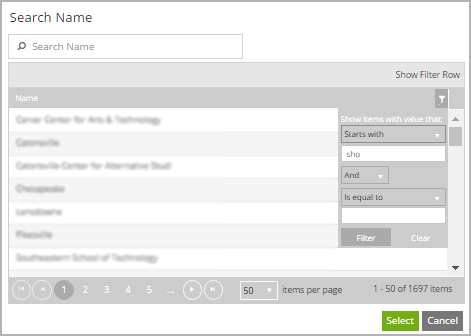
You can use the Single-select Search component to enable users to find and select a single item from a list. When the user clicks on the component in a form, the Search Name dialog is displayed. The dialog allows the user to search for a name, filter the list, or browse through the list pages, and select one item.
Note: The CampusNexus data model specifies the DisplayControlType of "SearchControl" for many properties. When the Single-select Search component is dropped onto the Layout pane in Form Designer, the Single-select Search component will be the default control type for properties that have the DisplayControlType of "SearchControl" in the metadata.
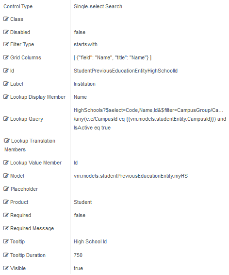
Control Property Settings
Rendered Component

Workflow Argument

For workflow arguments used with the Single-select Search in Forms Builder 3.5 and later, see Default Argument Types for Components.
-
Class is an optional CSS class (or space separated classes) added to the top level of the control. CSS specific to the control can be applied. The class must be defined in a Renderer CSS file. For more information, see Custom Styles.
-
Disabled sets a control to disabled.
-
Must be true or false, or a binding beginning with "vm.models.".
-
A property array string index requires single quotes, e.g., vm.models.xxx.CustomProperties['yyyyy'].
-
An expression can be used that evaluates to true or false, e.g., vm.models.myvalue==7 (>,<, !=, ==, >=, <=).
-
If comparing to a string, it must be in single quotes.
- (true and false must be all lowercase)
-
-
Filter Type defines how search values will be filtered. Select from the following filter types: contains (default), endswith, and startswith. Values typed using the keyboard will be used to filter the list according to the selection.
-
Grid Columns is set to an array of JSON objects. The "field" value is mandatory for each object. Use this property to specify the columns displayed in the search results. For more details, see Adjust the Search Grid Columns Property.
-
Id is required. It can be any valid JavaScript id attribute value. (Must start with a letter followed by 0 to 9, a to z, dash, or underscore characters).
-
Using a globally unique identifier (GUID) from GuidGen or GuidGenerator prefixed by at least one letter prevents a clash with any other id.
-
Id should contain only a to z (uppercase or lowercase), 0 to 9, dash, or underscore. It should not have spaces.
-
Binding is not supported for this property.
-
-
Label is the value displayed in the label.
-
If this value is bound, it must be enclosed in double braces, e.g., {{vm.models.myLabel}}.
-
Allowable suffix characters: starts with letter, then letters, numerals, or underscore.
-
-
Lookup Display Member is the name of the property in the OData query string to use for the display.
Also see Adjust the Search Grid Columns Property.
-
Lookup Query is the OData query string to retrieve values for the control.
Example
HighSchools
-
Lookup Translation Members is a comma separated list of property names in an OData query string to be translated. You should always validate the query will work in a browser. Only basic errors can be detected in Form Designer.
-
Lookup Value Member is the name of the property in the OData query string to use as the value.
-
If the Lookup Value Member is an Id, the associated data type in Workflow Composer is
Int32. -
If the Lookup Value Member is a Code or Name, the associated data type in Workflow Composer is
String.
-
-
Model is required for binding to a workflow argument or another control. If the Model property is not specified, the component will be displayed on the form, but any values the user enters on the form cannot be captured or used in the workflow.
-
The Model value must always start with "vm.models.", e.g., vm.models.myArgument.
-
This value may initialize the control, and may be updated by the control, and if matched to a workflow argument, is available in the workflow (readable or writable).
-
Ensure your model argument is defined in your workflow for custom components if it is used in the workflow. Otherwise, a workflow argument is not required.
-
The casing of an argument used in the workflow MUST match the "vm.models." suffix casing.
-
If the model addresses CustomProperties or MultiValueCustomProperties, the property identifier string must be enclosed in single quotes, e.g., vm.models.myentity.CustomProperties['mycustomprop']
If an OData query is specified and this binding is specified, it will be overwritten with the value of the OData query results and thus be available read-only in the workflow.
If only "Model Data" is specified and the workflow variable is either not initialized or set to an empty array, this value will be initialized to the "Model Data" value.
Construction of the model in the workflow is done by assigning data from a provider.
-
-
Placeholder is the prompt text displayed in a ghost style in an input box when nothing has been entered.
-
If this property is bound, it must start with {{vm.models. and end with }}.
-
Allowable suffix characters: starts with letter, then letters, numerals, or underscore.
-
-
Product indicates the product from which OData query results are returned. Select from:
- Student
- CRM
- Occupation Insight
The selected product must be configured in the <products> section of the Renderer web.config file.
The default Product value will be "Student" if "Student" is selected in the <Select Provider> list on the Fields tab.
The default Product value will be "CRM" if "CRM" is selected in the <Select Provider> list on the Fields tab.
Select "Occupation Insight" in the Product property if the source of the query will come from a different data source other than Student/CRM. For more information, see Build Queries for Occupation Insight.
A form can have multiple controls that retrieve data from different providers. For example, a form can have a control that is populated by a query to the Student database. The same form can have another control that retrieves data from Occupation Insight.
Specify the query to retrieve data from the selected provider using the Lookup Query or OData Query property (as applicable for the control). The query contains only the URL specific part of an OData URI. The Base URL and Product will be supplied by the configuration.
The argument type for list items in Workflow Composer will be an integer array:
System.Int32[]
-
Required makes the control required and will raise a validation error on the form. It is set to false by default. If input is required, set the property value to true. The rendered form will display a red asterisk (
 ) next to the component.
-
Can be bound to a workflow argument or another control's value.
-
A property array string index requires single quotes, e.g., vm.models.xxx.CustomProperties['yyyyy'].
-
An expression can be used that evaluates to true or false, e.g., vm.models.myvalue==7 (>,<, !=, ==, >=, <=).
-
If comparing to a string, it must be in single quotes.
-
(true and false must be all lowercase)
-
-
Required Message is optional. It overrides the default "Required" message.
-
If this value is bound, it must be enclosed in double braces, e.g., {{vm.models.myMessage}}.
-
Allowable suffix characters: starts with letter, then letters, numerals, or underscore.
-
-
Tooltip is the value to display when hovering over the control's label.
-
If this value is bound, it must be enclosed in double braces, e.g., {{vm.models.myTooltip}}.
-
Allowable suffix characters: starts with letter, then letters, numerals, or underscore.
-
-
Tooltip Duration is the amount of time in milliseconds a tooltip is displayed (default=750). The value must be greater than 0. If it is set to 0, a form validation error will occur.
-
If this value is bound, it must be enclosed in double braces, e.g., {{vm.models.myToolTip}}.
-
Allowable suffix characters: starts with letter, then letters, numerals, or underscore.
-
-
Visible makes the control visible or hidden.
-
Can be bound to a workflow argument or another control's value. This property is dynamic.
-
A property array string index requires single quotes, e.g., vm.models.xxx.CustomProperties['yyyyy'].
-
An expression can be used that evaluates to true or false, e.g., vm.models.myvalue==7 (>,<, !=, ==, >=, <=). If comparing to a string, it must be in single quotes.
-
(true and false must be all lowercase)
-
Lookup Queries for CampusNexus CRM Metadata
For any drop-down or search controls that will be populated via a lookup query, the CampusNexus CRM user needs to enter values for the Lookup Display Member and Lookup Sort Member attributes. The Lookup Query and Lookup Value Member property settings should have default values (if applicable for the selected property) as these are currently specified in the metadata.
Adjust the Search Grid Columns Property
In Forms Builder 3.4 and later, the LookupDisplayMember value is used to populate default value for the Grid Columns property on Single-select Search control types.
For example, when the LookupDisplayMember value is StaffName, the Grid Columns property default is [{"field":"StaffName","title":"StaffName"}]. ![]()
If no LookupDisplayMember value is present, the default Grid Columns property will be [ {"field": "Name", "title": "Name"} ] .
To display the Single-select Search control with two grid columns for the StaffName field and Code field, modify the Grid Columns property as follows:
[ {"field": "StaffName", "title": "StaffName"},{"field": "Code", "title": "Code"}]
