Label
You can use the Label component to assign a stand-alone label, that is, a label not associated with a control (controls have their own labels).
Properties
Control Property Settings
Rendered Component
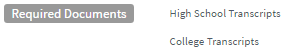
This example uses the Label component for the text "Required Documents" and the HTML component for the listed items.
-
Class is an optional CSS class (or space separated classes) added to the top level of the control. CSS specific to the control can be applied. The class must be defined in a Renderer CSS file. For more information, see Custom Styles.
-
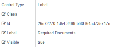
Id is required. It can be any valid JavaScript id attribute value. (Must start with a letter followed by 0 to 9, a to z, dash, or underscore characters).
-
Using a globally unique identifier (GUID) from GuidGen or GuidGenerator prefixed by at least one letter prevents a clash with any other id.
-
Id should contain only a to z (uppercase or lowercase), 0 to 9, dash, or underscore. It should not have spaces.
-
Binding is not supported for this property.
-
-
Label is the value displayed in the label.
-
If this value is bound, it must be enclosed in double braces, e.g., {{vm.models.myLabel}}.
-
Allowable suffix characters: starts with letter, then letters, numerals, or underscore.
-
You can use HTML markup to customize the appearance of the label text (font, color, etc.).
If label text is not specified, some empty space will be displayed on the form.
The style of the label control is a default Bootstrap style. It can be modified. For more information, see Modify the CSS for the Label.
-
Visible makes the control visible or hidden.
-
Can be bound to a workflow argument or another control's value. This property is dynamic.
-
A property array string index requires single quotes, e.g., vm.models.xxx.CustomProperties['yyyyy'].
-
An expression can be used that evaluates to true or false, e.g., vm.models.myvalue==7 (>,<, !=, ==, >=, <=). If comparing to a string, it must be in single quotes.
-
(true and false must be all lowercase)
-
Modify the CSS for the Label
The following styles determine the default styles for labels. They can be modified as needed. Copy the styles and save your changes in a custom style sheet. For more information, see Custom Content and Custom Styles.
Default Style for Labels
The default style for the Label component can be modified by uncommenting the style definition below.
/* Defaults for a Label component. Applying one or more of these styles will override a default bootstrap style, applying all will make it look like a control label. For the default theme you may just want to set font-size: 100% (bootstrap sets it to 75%).
*/

/*.cmc-div-label.form-group span {
    white-space: normal;
    display: inline-block;
    color: rgb(102,102,102);
    background-color: white;
    font-weight: 400;
    text-align: left;
    font-size: 14px;
    font-style: normal;
    line-height: normal;
    font-family: "Source Sans Pro","Helvetica Neue",Helvetica,Arial,sans-serif";
    }*/
You can adjust the style per your needs. For example, you may just want to specify a font size of 100% using the following CSS code:
.cmc-div-label.form-group span {
    font-size: 100%;
    }
Note: You can also use an HTML component to style the label.
Text Wrapping on Labels
The text wrapping on the Label component is controlled by the style definition shown below.
/* This rule applies automatically to divs surrounding the labels to make them wrap around */
.label-wrap > span { white-space: normal; }