Themes
A theme controls the presentation of content in a website. A theme is a collection of files that work together to control how content is displayed. The files in a theme can include style sheets (.css), images, fonts, color schemes, scripts, templates, and text files. The name of a theme maps to a .css file.
Forms Builder pre-populates a set of Bootstrap and Kendo themes.
-
Bootstrap themes are primarily used for layouts, containers for elements, and general webpage elements.
The following Bootstrap themes are available out-of-the-box:
Bootstrap Themes Common Name File Name Cerulean bootstrap.cerulean.min.css Cosmo bootstrap.cosmo.min.css Cyborg bootstrap.cyborg.min.css Darkly bootstrap.darkly.min.css Default bootstrap.default.min.css Flatly bootstrap.flatly.min.css Journal bootstrap.journal.min.css Lumen bootstrap.lumen.min.css Paper bootstrap.paper.min.css Readable bootstrap.readable.min.css Sandstone bootstrap.sandstone.min.css Simplex bootstrap.simplex.min.css Slate bootstrap.slate.min.css Spacelab bootstrap.spacelab.min.css Superhero bootstrap.superhero.min.css United bootstrap.united.min.css Yeti bootstrap.yeti.min.css -
Kendo themes are used for Kendo controls (e.g., buttons, check boxes). Kendo themes override Bootstrap elements that are used in rendering Kendo controls. Kendo themes do not just override colors and fonts, they also override borders, spacing, padding, and margins to make the controls look better.
The following Kendo themes are available out-of-the-box:
Kendo Themes Common Name File Name Black kendo.black.min.css BlueOpal kendo.blueopal.min.css Bootstrap kendo.bootstrap.min.css Default kendo.default.min.css Fiori kendo.fiori.min.css Flat kendo.flat.min.css HighContrast kendo.highcontrast.min.css Material kendo.material.min.css MaterialBlack kendo.materialblack.min.css Metro kendo.metro.min.css Metro Black kendo.metroblack.min.css Moonlight kendo.moonlight.min.css Nova kendo.nova.min.css Office365 kendo.office365.min.css Silver kendo.silver.min.css Uniform kendo.uniform.min.css For more information, refer to Kendo UI ThemeBuilder.
Both Bootstrap and Kendo themes apply CSS based on media. That is, the size, type, and host operating system of the browser that is used. Thus, a complex interaction results where one may apply a different CSS set for a browser size, type, or host OS, while the other does not switch to different CSS.
Themes can be associated with individual sequences within the property settings in Sequence Designer.
Note:
-
Custom bootstrap and custom Kendo themes selected in version 4.0 (or in prior versions) in the Sequence Designer will no longer be available. The following default values will be set for such sequences:
-
Theme-Bootstrap: Lumen
-
Theme-Kendo: Silver
-
-
Customizations requires all custom files to be uploaded to the CustomContent data table. Refer to Custom Content.
You can customize the style of controls using the Class property. For more information, refer to Custom Styles.
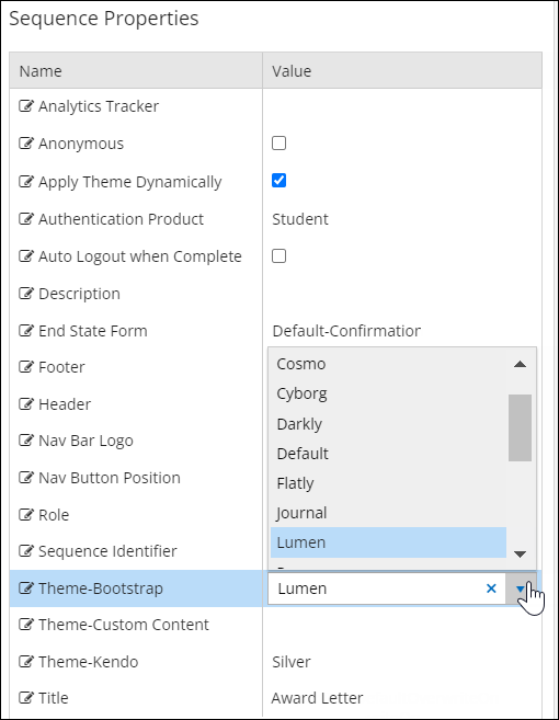
Apply a Theme to a Sequence
-
Select the Sequence Designer tile on the home page of Form Designer.
-
Select a sequence in the Sequences pane.
-
In the Properties pane:
-
Select the Name of a theme group, e.g., Theme-Bootstrap, Theme-Custom Content, or Theme-Kendo.
-
Select the Value field and select a theme from the drop-down list.
-
-
Save the sequence.
-
Review the rendered sequence. If necessary, refresh the browser cache by pressing Ctrl+F5. Note the changes in the content presentation based on the selected theme.
To remove a previously selected theme from a sequence, select the blank option in the Value field.