Custom Styles
Forms Builder enables you to customize the styling of forms and form elements using cascading style sheets (CSS). Style sheets determine the look and feel of your forms including logos, controls, backgrounds, font, etc.
It is not the purpose of this topic to teach you CSS. Many references can be found on the web on how to create style sheets. One good example is at w3schools.com/css. There are also free CSS editors with extra features, among them Microsoft Visual Studio Community Edition, but any text editor can be used as well.
There are 4 ways to style sequences:
-
Apply styles globally for all sequences
Create a CSS file and then select the Custom Content tile on the home page to upload the file to the CustomContent table in the database. In the Custom Content tile, select the check box in the Global column, the uploaded CSS file will apply globally to all sequences. For more information, refer to the section Applying a Global CSS in Custom Content.
-
In the Sequence Designer
Add CSS files and campus logos to the CustomContent table in the database and reference them by selecting Apply Themes Dynamically in the Sequence Properties area in Sequence Designer. This option enables institutions to configure form sequences to be displayed at different URLs with different branding using a single instance of Forms Builder (Designer and Renderer).
For more information, refer to Sequence Designer and Multiple Renderer URLs.
OR
Upload custom css files to the database and then select a custom css file in the Theme-Custom Content drop-down list in the Sequence Properties. The selected css file will be applied to the entire sequence. For more information, refer to Sequence Designer and the section Applying a CSS to a Sequence in Custom Content.
You cannot save a sequence with selections for both Apply Themes Dynamically and Theme-Custom Content.
-
Add the style to an HTML component on a form.
This can be set to Visible=false so it does not reserve space on the form. The style will apply to the form it is contained in and all remaining forms in the sequence. Once it is loaded, it will apply also if you go back in the sequence (which is why it is best in the first form in a sequence). Use the style tags like this:
<style>
Styles here
</style> -
Use Custom Content
Upload a file and refer to it with a simple directive tag in an HTML component. Refer to the CSS Files (Style Sheets) section in Custom Content for details on how to reference the uploaded file.
Create a Style for a Label Control
Each control has a Class property. When you fill in this property with your own class name (or multiple class names), your class (or classes) will be added to a top level HTML <div> element for a control. The class name you specify will need to be defined in a custom style sheet file and will then need to be uploaded to the database. For information on uploading files, refer to Custom Content.
Unlike most other controls in Forms Builder, the Label control does not use AngularJS directives to define custom HTML tags which are then translated to "regular" HTML/CSS/JS when they are rendered in a browser.
-
In the Property Settings on Form Designer, fill in the class name for a Label control with the name
my-custom-style. (The convention is lowercase with hyphenation ("snake case"), but any unique name would work).When a Label is rendered, it will now look like the following:
<div class="form-group my-custom-style cmc-div-label">
<span id="my-id-13232" class="label label-default">This is my label</span>
</div> -
To apply a style to this class, create a style sheet file (
.css) which contains your style. -
Upload the custom style sheet using the steps described in Custom Content.
-
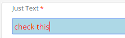
Let’s say we want to make this label red with a light blue background and force it to wrap if it is too long.
Since you want to style the
<span>within the<div>, the following contents of your.cssfile will do this. The class at the top level (refer to step 1) has a 2nd selector which tells it to drill down to thespanelement and apply the style in the braces to it..my-custom-style span {
white-space: normal;
display: inline-block;
background-color: lightblue;
color: red;
}For control types that use directives, e.g., input (Text Box), the custom style must be defined similar to the following example to override the default style. The
!importantrule forces the override of the default style..my-custom-style input {
white-space: normal;
display: inline-block;
background-color:lightblue !important;
color: red !important;
}This style only affects the Text Box input control itself not the label above control.
-
On other controls (look at the HTML generated in the browser), you may have a different 2nd selector like
label. -
Notice that there is another class above:
cmc-div-label. This fixed class is in all labels. If you create a style for it, all labels on your site will have this style..cmc-div-label span {
white-space: normal;
display: inline-block;
background-color: lightblue;
color: red;
} -
Similarly,
form-groupis in all controls, so a style (if appropriate) can be applied to all controls.
One caveat is that multiple definitions for the same element have a priority scheme. The label and label-default classes in the span are a default Bootstrap style and produce white text with a gray background. Your style may not override a higher priority style. If your style doesn’t seem to take effect, most browsers have a development mode where you can examine the styles being applied to each element on the page.
Replace the Logo
You can designate image files as logo files and associate a logo with a sequence. For more information, refer to Navigation Bar Logos.
Video: Combine Form Sections on a Form
The following remains as an example of custom styling techniques, however, Forms Builder 3.6, this particular style can be accomplished with the new Merge with Next and Merge with Previous properties on two successive Form Sections. Refer to Merged Form Sections for information.
This short video demonstrates how you can modify form sections using a custom class name. It includes the following steps:
-
Modifying and capturing a style using browser developer tools
-
Creating a custom CSS file using form section Ids as CSS selectors
To link the custom CSS file to a form, upload the file using custom content and then link it to a form using the functionality of the Theme-Custom Content property.
-
Not shown in the video, a 3rd way is to add an HTML component to the page with <style>…..</style> tags and set property Visible=false.
Download the video (wmv file; 26 MB; 4:30 min.)
Exclude a Component from a PDF
All components in Forms Builder have a Class property. Class is an optional CSS class (or space separated classes) added to the top level of the control. CSS specific to the control can be applied. The class must be defined in a Renderer CSS file.
For example, the class on a component could be named "pdfNoCheckBox". In a CSS file, using one of the four techniques listed above for adding CSS to sequences, use the following CSS:
<style>
@media print {
    .pdfNoCheckBox {
        display: none;
    }
}
</style>
This will remove the component from the PDF created from HTML which loads this CSS. One needs to be aware of what will happen to the layout of the rest of the components when this is done and perhaps arrange the layout so that there is minimal impact.