Tooltip
You can use the Tooltip component to add a customized tooltip to any page element. The tooltip can contain text, animation effects, and images. A unique CSS selector path in the Target Selector property identifies the element to which the tooltip applies.
Drop Tooltip components in a non-visible form section. Use as many Tooltip components as needed. This is a general purpose component that can be made to appear on any page element including form components, form sections, images, etc.
Most components already have a tooltip property, but for a complex element like the Grid, which may require the user to perform several operations (add, edit, delete), you may want to be more exact and only show a tooltip when, for example, the Add New Record button is selected.
Properties
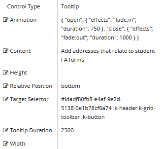
Example: Tooltip with Text on a Grid Control
Control Property Settings
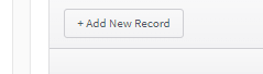
Rendered Component
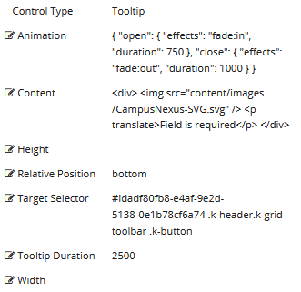
Example: Tooltip with Image and Text on a Grid Control
Control Property Settings
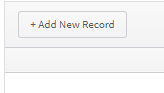
Rendered Component
-
Animation — The value must be false or a valid JSON specification.
(false must be all lowercase, true is not valid)
Example
{ "open": { "effects": "fade:in", "duration": 750 }, "close": { "effects": "fade:out", "duration": 1000 } }
-
Content is the text to display when hovering over the target element.
-
If this value is bound, it must be enclosed in double braces, e.g., {{vm.models.myToolTip}}.
-
Allowable suffix characters: starts with letter, then letters, numerals or underscore.
-
HTML is supported. If you want translatable HTML, make sure the element that contains the text has the "translate" attribute added. This will be picked when the POT file is generated and be available for translation. A string with no HTML does not need a "translate" attribute as it will be embedded in a div with the attribute.
Example 1
Content value for a tooltip with text:
Only Add new addresses that relate to FA forms
Example 2
Content value for a tooltip with an image and text that will be translated.
<div>
    <img src=”Content/Custom/Images/MyCustomImage.png” />
    <p translate>My custom text</p>
</div>
-
-
Height is an optional property to override the default height.
-
Numeric values are treated as pixels.
-
This property cannot be bound.
-
-
Relative Position is the position of the tooltip relative to the element. If there is not enough room in a container, a tooltip may override the chosen position.
-
Target Selector is a CSS selector for the tooltip target. Choose a CSS selector which targets (usually a unique) container element for a tooltip. (Using an element would be too broad a selector. )
For a class selector, use a dot in front of the class name: e.g., “.myClass”
For an Id selector, use a # in front of the Id: e.g., “#myId”
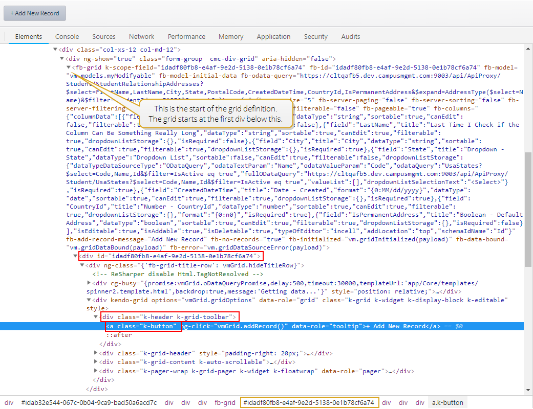
To find a unique CSS selector path to an element:
-
Access the rendered form in a browser.
-
Right-click the content of interest (e.g., Add New Record button) and depending on browser select the equivalent to the Inspect Element context item.
-
On the Elements tab of the browser tools, locate the element's CSS class and Id.

The highlighted line shows the class name for the button. In our example it is:
- class="k-button"
The div above the button has the class name:
- class="k-header k-grid-toolbar"
The id for the div is found higher up in the hierarchy. In our example it is:
- <div id="idadf80fb8-e4af-9e2d-5138-0e1b78cf6a74">
These three items are required to specify the Target Selector value in the Tooltip component. The format requirements are:
- Ids have a # prefix.
- Classes have a . (dot) prefix.
- Elements have no prefix.
In our example the Target Selector value is specified as:
- #idadf80fb8-e4af-9e2d-5138-0e1b78cf6a74 .k-header.k-grid-toolbar .k-button
Note that there is no space between .k-header and .k-grid-toolbar. This indicates that the CSS classes are in the same element (not in a hierarchy).
Also note that .k-button alone would not have been unique because there are other .k-button classes within the grid.
Lastly, note that we did not choose every element or class in the path hierarchy (we skipped some) and used only the ones that would make the path unique. (There are many combinations that would result in a unique path).
-
-
Tooltip Duration is the amount of time in milliseconds a tooltip is displayed (default=750). The value must be greater than 0. If it is set to 0, a form validation error will occur.
-
If this value is bound, it must be enclosed in double braces, e.g., {{vm.models.myToolTip}}.
-
Allowable suffix characters: starts with letter, then letters, numerals, or underscore.
-
-
Width is an optional property to override the default width.
-
Numeric values are treated as pixels.
-
This property cannot be bound.
-