Radio Button
You can use the Radio Button component to represent a set of options, only one of which can be selected at any time. The selected value will be accessible within a workflow definition.
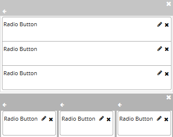
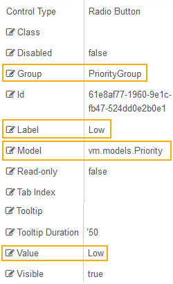
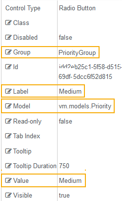
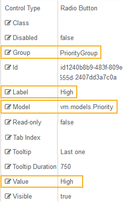
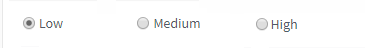
The mutually exclusive options must be associated with a Group. For example, a Group could be labeled "Priority" and could contain three options labeled "Low", Medium", and "High".
For each option, drag a Radio Button component into the Layout pane. Arrange the components horizontally or vertically. Specify the property settings for each control.
Properties
Control Property Settings
Rendered Components
Workflow Argument
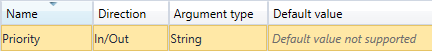
For workflow arguments used with the Radio Button in Forms Builder 3.5 and later, see Default Argument Types for Components.
-
Class is an optional CSS class (or space separated classes) added to the top level of the control. CSS specific to the control can be applied. The class must be defined in a Renderer CSS file. For more information, see Custom Styles.
-
Disabled sets a control to disabled.
-
Must be true or false, or a binding beginning with "vm.models.".
-
A property array string index requires single quotes, e.g., vm.models.xxx.CustomProperties['yyyyy'].
-
An expression can be used that evaluates to true or false, e.g., vm.models.myvalue==7 (>,<, !=, ==, >=, <=).
-
If comparing to a string, it must be in single quotes.
- (true and false must be all lowercase)
-
-
Group is the name for a group of radio controls. All radio buttons that work together must have the same group name. Use a unique argument name.
Note:
As a best practice, place grouped radio buttons in their own individual form sections. Additionally, it's recommended to copy the text of this field into the Title field of the form section. The copied value will then be:
-
Displayed at the top of the section when the form is rendered.
-
Read by a screen reader application that describes the section.
-
-
Id is required. It can be any valid JavaScript id attribute value. (Must start with a letter followed by 0 to 9, a to z, dash, or underscore characters).
-
Using a globally unique identifier (GUID) from GuidGen or GuidGenerator prefixed by at least one letter prevents a clash with any other id.
-
Id should contain only a to z (uppercase or lowercase), 0 to 9, dash, or underscore. It should not have spaces.
-
Binding is not supported for this property.
-
-
Label is the value displayed in the label.
-
If this value is bound, it must be enclosed in double braces, e.g., {{vm.models.myLabel}}.
-
Allowable suffix characters: starts with letter, then letters, numerals, or underscore.
-
-
Model is required for binding to a workflow argument or another control. If the Model property is not specified, the component will be displayed on the form, but any values the user enters on the form cannot be captured or used in the workflow.
-
The Model value must always start with "vm.models.", e.g., vm.models.myArgument.
-
This value may initialize the control, and may be updated by the control, and if matched to a workflow argument, is available in the workflow (readable or writable).
-
Ensure your model argument is defined in your workflow for custom components if it is used in the workflow. Otherwise, a workflow argument is not required.
-
The casing of an argument used in the workflow MUST match the "vm.models." suffix casing.
-
If the model addresses CustomProperties or MultiValueCustomProperties, the property identifier string must be enclosed in single quotes, e.g., vm.models.myentity.CustomProperties['mycustomprop']
If an OData query is specified and this binding is specified, it will be overwritten with the value of the OData query results and thus be available read-only in the workflow.
If only "Model Data" is specified and the workflow variable is either not initialized or set to an empty array, this value will be initialized to the "Model Data" value.
Construction of the model in the workflow is done by assigning data from a provider.
-
-
Read-only makes the control read-only. It is set to false by default. If you want the component to be read-only, set the property value to true. It is typically used for an input box.
-
Can be bound to a workflow argument or another control's value.
-
A property array string index requires single quotes, e.g., vm.models.xxx.CustomProperties['yyyyy'].
-
An expression can be used that evaluates to true or false, e.g., vm.models.myvalue==7 (>,<, !=, ==, >=, <=).
-
If comparing to a string, it must be in single quotes.
-
(true and false must be all lowercase)
-
-
Tab Index allows you to specify the order of elements that are brought into focus when the user presses the Tab key on the rendered form. Allowed values are -1, 0, and positive numbers.
-
A value of "-1" removes the element from the sequential tab order preventing keyboard users from focusing on it.
-
A value of "0" means the element is ignored in the tab order, but that does not mean users cannot tab to and focus an element.
-
A value of "1" sets the element as the first item to gain focus when tabbing through the page followed by any higher numbered tab indices, followed by any other keyboard focusable elements such as buttons. required fields, and CAPTCHA.
The tab index value should not match another control's tab index.
-
A blank value (default) will not add a tab index in the HTML.
For more information, see https://html.spec.whatwg.org/multipage/interaction.html#the-tabindex-attribute and https://www.alexlande.com/articles/cross-browser-tabindex-woes/.
Note: The tab index property applies to the radio button group. If a different tab index is specified for each radio button in a group, the tab index of the first radio button will be used for the group.
-
-
Tooltip is the value to display when hovering over the control's label.
-
If this value is bound, it must be enclosed in double braces, e.g., {{vm.models.myTooltip}}.
-
Allowable suffix characters: starts with letter, then letters, numerals, or underscore.
-
-
Tooltip Duration is the amount of time in milliseconds a tooltip is displayed (default=750). The value must be greater than 0. If it is set to 0, a form validation error will occur.
-
If this value is bound, it must be enclosed in double braces, e.g., {{vm.models.myToolTip}}.
-
Allowable suffix characters: starts with letter, then letters, numerals, or underscore.
-
-
Value of the individual radio control in the group. This must be a string value, which may be a number. If the value needs to be a number, it must be converted to one in a workflow.
- If this value is bound, it must be enclosed in double braces, e.g., {{vm.models.myMessage}}.
- Allowable suffix characters: starts with letter, then letters, numerals, or underscore.
- Values for each control in the group should be different.
-
Visible makes the control visible or hidden.
-
Can be bound to a workflow argument or another control's value. This property is dynamic.
-
A property array string index requires single quotes, e.g., vm.models.xxx.CustomProperties['yyyyy'].
-
An expression can be used that evaluates to true or false, e.g., vm.models.myvalue==7 (>,<, !=, ==, >=, <=). If comparing to a string, it must be in single quotes.
-
(true and false must be all lowercase)
-
Specify a Default Selection
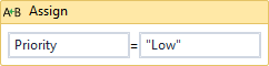
The Radio Button component does not set a default selection for the Group. If you want to preselect an item in the Group, use an Assign activity in the workflow to initialize the Group. Place the Assign activity in the workflow State associated with the form with the Radio Button components.
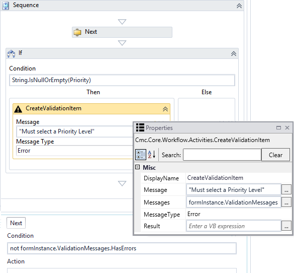
Create a Validation Item
The Radio Button component does not provide a Required setting for the Group. If you want to ensure that the user selects an option in the Radio Button Group, add a CreateValidationItem activity to the workflow. Place the activity on the Next transition that follows the form with the Radio Button components.
You can use the Radio Button component to represent a set of options, only one of which can be selected at any time. The selected value will be accessible within a workflow definition.
The mutually exclusive options must be associated with a Group. For example, a Group could be labeled "Priority" and could contain three options labeled "Low", Medium", and "High".
For each option, drag a Radio Button component into the Layout pane. Arrange the components horizontally or vertically. Specify the property settings for each control.
Properties
Control Property Settings
Rendered Components
Workflow Argument
For workflow arguments used with the Radio Button in Forms Builder 3.5 and later, see Default Argument Types for Components.
-
Class is an optional CSS class (or space separated classes) added to the top level of the control. CSS specific to the control can be applied. The class must be defined in a Renderer CSS file. For more information, see Custom Styles.
-
Disabled sets a control to disabled.
-
Must be true or false, or a binding beginning with "vm.models.".
-
A property array string index requires single quotes, e.g., vm.models.xxx.CustomProperties['yyyyy'].
-
An expression can be used that evaluates to true or false, e.g., vm.models.myvalue==7 (>,<, !=, ==, >=, <=).
-
If comparing to a string, it must be in single quotes.
- (true and false must be all lowercase)
-
-
Group is the name for a group of radio controls. All radio buttons that work together must have the same group name. Use a unique argument name.
-
Id is required. It can be any valid JavaScript id attribute value. (Must start with a letter followed by 0 to 9, a to z, dash, or underscore characters).
-
Using a globally unique identifier (GUID) from GuidGen or GuidGenerator prefixed by at least one letter prevents a clash with any other id.
-
Id should contain only a to z (uppercase or lowercase), 0 to 9, dash, or underscore. It should not have spaces.
-
Binding is not supported for this property.
-
-
Label is the value displayed in the label.
-
If this value is bound, it must be enclosed in double braces, e.g., {{vm.models.myLabel}}.
-
Allowable suffix characters: starts with letter, then letters, numerals, or underscore.
-
-
Model is required for binding to a workflow argument or another control. If the Model property is not specified, the component will be displayed on the form, but any values the user enters on the form cannot be captured or used in the workflow.
-
The Model value must always start with "vm.models.", e.g., vm.models.myArgument.
-
This value may initialize the control, and may be updated by the control, and if matched to a workflow argument, is available in the workflow (readable or writable).
-
Ensure your model argument is defined in your workflow for custom components if it is used in the workflow. Otherwise, a workflow argument is not required.
-
The casing of an argument used in the workflow MUST match the "vm.models." suffix casing.
-
If the model addresses CustomProperties or MultiValueCustomProperties, the property identifier string must be enclosed in single quotes, e.g., vm.models.myentity.CustomProperties['mycustomprop']
If an OData query is specified and this binding is specified, it will be overwritten with the value of the OData query results and thus be available read-only in the workflow.
If only "Model Data" is specified and the workflow variable is either not initialized or set to an empty array, this value will be initialized to the "Model Data" value.
Construction of the model in the workflow is done by assigning data from a provider.
-
-
Read-only makes the control read-only. It is set to false by default. If you want the component to be read-only, set the property value to true. It is typically used for an input box.
-
Can be bound to a workflow argument or another control's value.
-
A property array string index requires single quotes, e.g., vm.models.xxx.CustomProperties['yyyyy'].
-
An expression can be used that evaluates to true or false, e.g., vm.models.myvalue==7 (>,<, !=, ==, >=, <=).
-
If comparing to a string, it must be in single quotes.
-
(true and false must be all lowercase)
-
-
Tab Index allows you to specify the order of elements that are brought into focus when the user presses the Tab key on the rendered form. Allowed values are -1, 0, and positive numbers.
-
A value of "-1" removes the element from the sequential tab order preventing keyboard users from focusing on it.
-
A value of "0" means the element is ignored in the tab order, but that does not mean users cannot tab to and focus an element.
-
A value of "1" sets the element as the first item to gain focus when tabbing through the page followed by any higher numbered tab indices, followed by any other keyboard focusable elements such as buttons. required fields, and CAPTCHA.
The tab index value should not match another control's tab index.
-
A blank value (default) will not add a tab index in the HTML.
For more information, see https://html.spec.whatwg.org/multipage/interaction.html#the-tabindex-attribute and https://www.alexlande.com/articles/cross-browser-tabindex-woes/.
Note: The tab index property applies to the radio button group. If a different tab index is specified for each radio button in a group, the tab index of the first radio button will be used for the group.
-
-
Tooltip is the value to display when hovering over the control's label.
-
If this value is bound, it must be enclosed in double braces, e.g., {{vm.models.myTooltip}}.
-
Allowable suffix characters: starts with letter, then letters, numerals, or underscore.
-
-
Tooltip Duration is the amount of time in milliseconds a tooltip is displayed (default=750). The value must be greater than 0. If it is set to 0, a form validation error will occur.
-
If this value is bound, it must be enclosed in double braces, e.g., {{vm.models.myToolTip}}.
-
Allowable suffix characters: starts with letter, then letters, numerals, or underscore.
-
-
Value of the individual radio control in the group. This must be a string value, which may be a number. If the value needs to be a number, it must be converted to one in a workflow.
- If this value is bound, it must be enclosed in double braces, e.g., {{vm.models.myMessage}}.
- Allowable suffix characters: starts with letter, then letters, numerals, or underscore.
- Values for each control in the group should be different.
-
Visible makes the control visible or hidden.
-
Can be bound to a workflow argument or another control's value. This property is dynamic.
-
A property array string index requires single quotes, e.g., vm.models.xxx.CustomProperties['yyyyy'].
-
An expression can be used that evaluates to true or false, e.g., vm.models.myvalue==7 (>,<, !=, ==, >=, <=). If comparing to a string, it must be in single quotes.
-
(true and false must be all lowercase)
-
Specify a Default Selection
The Radio Button component does not set a default selection for the Group. If you want to preselect an item in the Group, use an Assign activity in the workflow to initialize the Group. Place the Assign activity in the workflow State associated with the form with the Radio Button components.
Create a Validation Item
The Radio Button component does not provide a Required setting for the Group. If you want to ensure that the user selects an option in the Radio Button Group, add a CreateValidationItem activity to the workflow. Place the activity on the Next transition that follows the form with the Radio Button components.