Progress Bar
You can use the Progress Bar component to visualize the progress of an operation such as progress through a form sequence. The component needs to be added to every form within the sequence.
The Visible property can be used to show or hide the Progress Bar on individual forms. The Visible property should be bound to the workflow if the same form will be used with and without a Progress Bar.
The Current Value property must be dynamically bound and is updated in the workflow as the user progresses though the sequence. If the Progress Bar is added to an end state form, a WaitForFormBookmark activity must be added to update the Current Value on the final step.
Properties
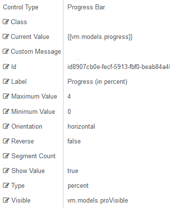
Control Property Settings
Rendered Component
Workflow Argument
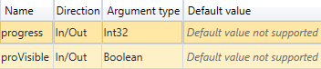
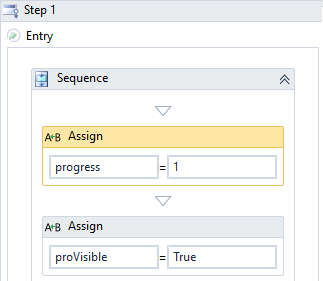
The workflow assigns an integer value to the "progress" argument starting with 1 on the Step 1 form and incrementing the integer for successive forms that display the Progress Bar.
The Visible property is bound to the "proVisible" argument. A value of true is assigned to make the Progress Bar visible on a form.
-
Class is an optional CSS class (or space separated classes) added to the top level of the control. CSS specific to the control can be applied. The class must be defined in a Renderer CSS file. For more information, see Custom Styles.
-
Current Value specifies the value for the Progress Bar, typically a positive integer. It is usually a bound value from a workflow, e.g., {{vm.models.progress}}. This value can be dynamically changed in the client. To show updated progress through form sequence, this value must be incremented in workflow forward transitions and decremented in workflow backward transitions. This is a required property.
-
Custom Message is the message that is displayed when the Type property is "custom".
-
If this value is bound, it must be enclosed in double braces, e.g., {{vm.models.myMessage}}.
-
Allowable suffix characters: starts with letter, then letters, numerals, or underscore.
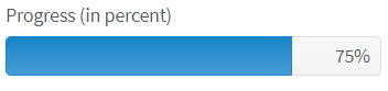
When the Type property is "percent", "segment", or "value", by default, the Label of the Progress Bar displays the Current Value of the progress indicator, e.g., "90%". You can hide the default Label by setting the Show Value property to false and use the Custom Message property to display a custom message, e.g., "You are almost done - only one more form to complete!"
-
-
Id is required. It can be any valid JavaScript id attribute value. (Must start with a letter followed by 0 to 9, a to z, dash, or underscore characters).
-
Using a globally unique identifier (GUID) from GuidGen or GuidGenerator prefixed by at least one letter prevents a clash with any other id.
-
Id should contain only a to z (uppercase or lowercase), 0 to 9, dash, or underscore. It should not have spaces.
-
Binding is not supported for this property.
-
-
Label is the value displayed in the label.
-
If this value is bound, it must be enclosed in double braces, e.g., {{vm.models.myLabel}}.
-
Allowable suffix characters: starts with letter, then letters, numerals, or underscore.
-
-
Maximum Value specifies the high-end range of the Progress Bar, typically a positive integer indicating the highest value when the Progress Bar is filled. This is a required property.
-
Minimum Value specifies the low-end range of the Progress Bar. The Minimum Value should be the progress value on the first form, usually 0 or 1.
Note: The Minimum Value and Maximum Value should be the first and last value for the Current Value property. The number of forms in a sequence should be shown (including the end state if a filled Progress Bar is to be displayed there). The Maximum Value should equal the number of forms or number of forms-1 depending on if the first form shows progress or is empty. These values would be different only if the Progress Bar is being used in another way (see Use Case: Compare Numeric Data) .
-
Orientation specifies the orientation of the Progress Bar. Choose from supported orientations.
-
horizontal (default)
-
vertical
-
-
Reverse specifies if the progress direction will be reversed. The default is false.
-
This value cannot be changed dynamically.
-
An expression cannot be used.
-
(true and false must be all lowercase)
-
-
Segment Count, if the Type property is set to
segment, defines the number of sections displayed in the Progress Bar. Typically, this will be set to the same value as the Maximum Value (i.e., you have to know the maximum number of steps in the sequence). -
Show Value specifies if the progress status (number or percent) will be shown.
-
Must be true or false (default), or a binding beginning with "vm.models.".
-
This value cannot be changed dynamically, so an expression cannot be used.
-
(true and false must be all lowercase)
-
-
Type specifies the measurement unit type of the Progress Bar. Choose from supported types:
-
customdisplay based on Custom Message property -
percentdisplay based on percentage -
segmentdisplay based on segments as set by the Segment Count -
value(default) display based on numeric value
-
-
Visible makes the control visible or hidden.
-
Can be bound to a workflow argument or another control's value. This property is dynamic.
-
A property array string index requires single quotes, e.g., vm.models.xxx.CustomProperties['yyyyy'].
-
An expression can be used that evaluates to true or false, e.g., vm.models.myvalue==7 (>,<, !=, ==, >=, <=). If comparing to a string, it must be in single quotes.
-
(true and false must be all lowercase)
-
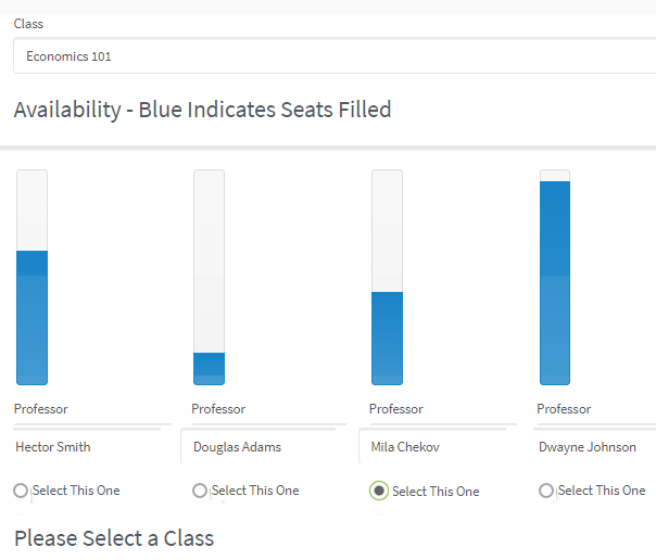
Use Case: Compare Numeric Data
The Progress Bar component can also be used as a bar graph to compare numeric data. The example below shows a form that displays the seats taken in different classes. When the user selects a seat in a class, the workflow increments the number of seats taken and the bar graph displays the current value.