Custom Classes for the Default Scheme
| CSS Code | Rendered |
|---|---|
|
/****************Custom classes for the default theme (Blue theme) *********************/ |
|
|

|
|
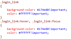
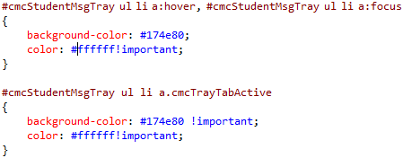
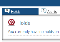
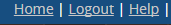
Background color and text color of the login link in default.aspx |
|
|
|
|
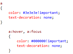
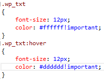
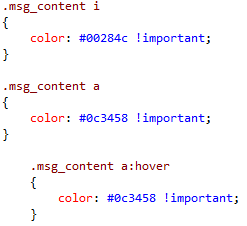
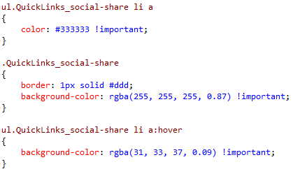
For all anchor tags |
|
|

|
|
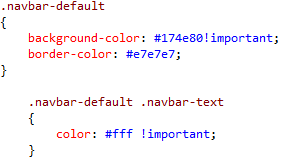
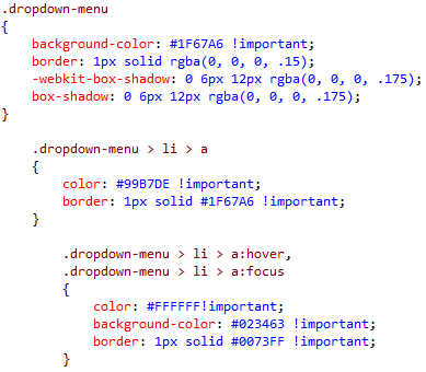
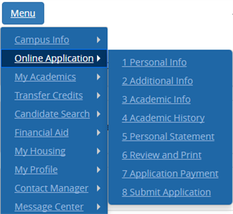
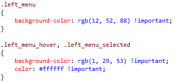
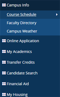
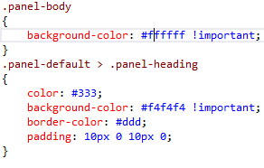
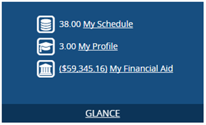
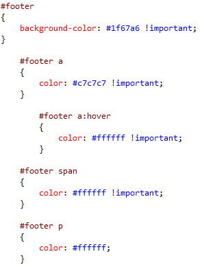
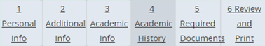
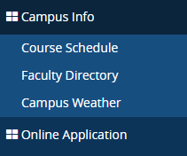
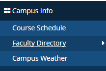
Mainly for blue background we used .navbar-default class and for text .navbar-text for example: header, footer, left-menu… |
|
|
|
|

|
|
|
|
|
|
|
|
|
|

|
|
|
|

|
|
|
|
|
|

|
|
|
|
|
|
|
|
|
|
|
|
|
|
|
|


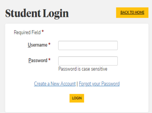
CSS Classes for Login Pages Added in Version 22.1
.login_text {
    padding: 21px 5px 5px 5px;
    font-size: 25px;
    text-align: center;
    font-family: open_sansregular, serif;
}
.loginbtn_text {
    padding: 5px;
    font-size: 36px;
    font-family: open_sansregular, serif;
    text-align: left;
    font-weight: 400 !important;
}

.backHome_text {
    text-align: right;
    font-weight: 600 !important;
    padding-right: 4px !important;
}
.panel_body_padding {
        padding: 0px;
    }
    .loginbtn_text {
        padding: 0px;
    }
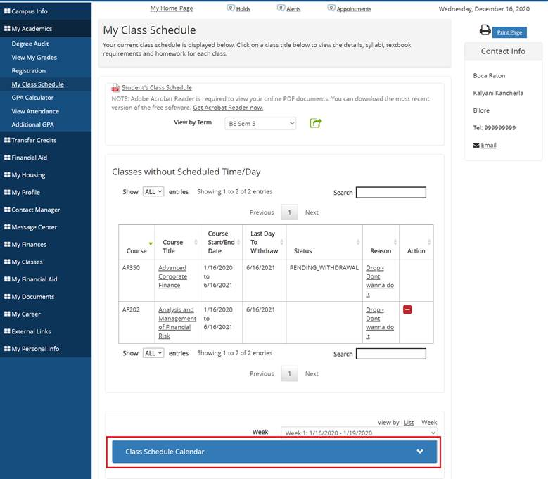
Custom Classes, CSS, and JS Added in Version 21.3
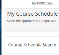
New Bootstrap Panel in My Class Schedule
Public > global > css > bootstrap_custom.css
#classCalendalPanel .panel-title > a {
    color: #ffffff !important;
    text-decoration: none;
    background-color: #337ab7;
    font-size: 16px;
}

#classCalendalPanel .panel-heading a:before {
    font-family: 'Glyphicons Halflings';
    content: "\e114";
    float: right;
    transition: all 0.5s;
}

#classCalendalPanel .panel-title a[aria-expanded="true"]:before {
    -webkit-transform: rotate(180deg);
    -moz-transform: rotate(180deg);
    transform: rotate(180deg);
}
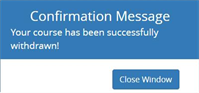
Confirmation Message Text
The Confirmation message was not visible in dark background. The text was changed to white.
Public > global > css > bootstrap_custom.css
.confirmMsg {
    color: #ffffff;
}
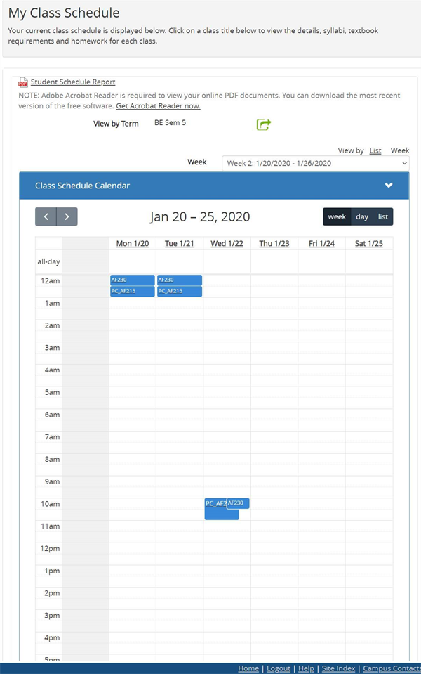
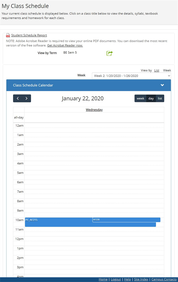
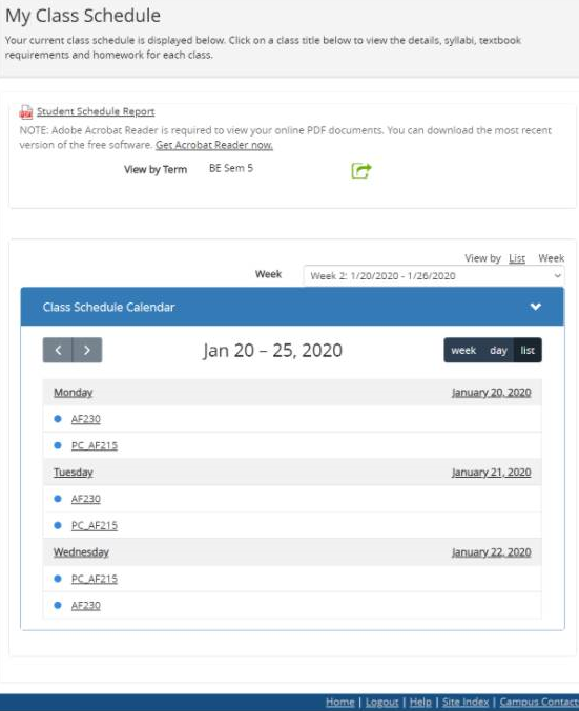
CSS and JS Files for Calendar
New CSS and JS files to implement full calendar in Student > My Academics > My Class Schedule. The calendar uses all standard defined classes of CSS files.
Public > global > css > schedulefullcalendar.css
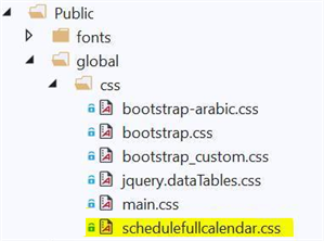
Scripts > schedulefullcalendar.js
Week view
Day view
List view
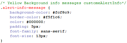
Background for Alert-Info Messages
Public > global > css > main.css
/* Yellow Background info messages  customeAlertInfo*/
.alert-info-message {
    background-color: #fcf8c9;
    border-color: #f5f1c6;
    color: #000000;
    padding: 5px;
    font-size: 14px;
}
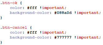
Ok and Cancel Buttons
Public > global > css > main.css
.btn-ok {
    color: #fff !important;
    background-color: #088a0d !important;
}

.btn-cancel {
    color: #fff !important;
    background-color: #777777 !important;
}

CSS Classes for Compose Email Popup Added in Version 22.1
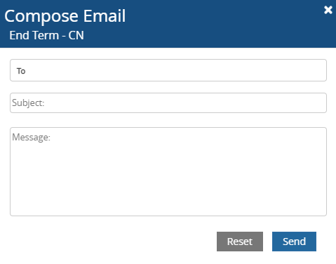
.btnClose {
    color: #fff;
    opacity: unset;
}
.form-email-text {
    position: relative;
}
.MessageStyle {
    left: 10px;
    font-size: 0.9em;
    color: #444;
    top: 9px;
}
.emailTo {
    padding: 5px 5px 5px 35px;
    width: 100%;
    border: 1px solid #ccc;
    border-radius: 4px;
}

.emailSub {
    padding: 5px 5px 5px 2px;
    width: 100%;
    border: 1px solid #ccc;
    border-radius: 4px;
}

.emailMsg {
    padding: 5px 5px 5px 2px;
    width: 100%;
    border: 1px solid #ccc;
    border-radius: 4px;
}

.lblTo {
    position: absolute;
    left: 10px;
    font-weight: bold;
    font-size: 0.8em;
    color: #444;
    top: 9px;
}