The topic "Repeater" is not available in Version 3.5.
Repeater
You can use the Repeater component to create a collection of form sections that will be repeated or deleted when the user clicks the Add or Delete button. When the collection is repeated, it will show the fields (blank or initialized) to be filled in while retaining the input of the previously completed section. When the Delete button is clicked, the collection added last is removed.
The Repeater is basically a tabular component comprised of rows of components like Text Boxes, Drop-down Lists, etc. Each one of these components has all the properties that they have as individual components.
Properties
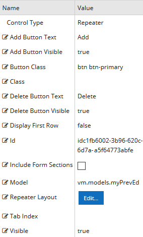
Control Property Settings
Rendered Component
-
Add Button Text is the value displayed in a link or button.
If this value is bound, it must be enclosed in double braces, e.g., {{vm.models.myLabel}}.
Allowable suffix characters: starts with letter, then letters, numerals, or underscore.
Mixed text and bindings are allowed.
-
Add Button Visible determines if the button is visible.
Must be true or false, or a binding beginning with "vm.models.".
A property array string index requires single quotes, e.g., vm.models.xxx.CustomProperties['yyyyy'].
An expression can be used that evaluates to true or false, e.g., vm.models.myvalue==7 (>,<,!=,==,>=,<=).
If comparing to a string, it must be in single quotes.
(true or false must be all lowercase)
-
Button Class is the CSS class for the button. The default is
btn btn-primary.-
The class
btn btn-primaryis a Bootstrap class that renders as a blue button with white text. -
You can customize the CSS Class by selecting a different Bootstrap class or adding your own class in a custom CSS.
-
-
Class is an optional CSS class (or space separated classes) added to the top level of the control. CSS specific to the control can be applied. The class must be defined in a Renderer CSS file. For more information, see Custom Styles.
-
Delete Button Text is the value displayed in a link or button.
If this value is bound, it must be enclosed in double braces, e.g., {{vm.models.myLabel}}.
Allowable suffix characters: starts with letter, then letters, numerals, or underscore.
Mixed text and bindings are allowed.
-
Delete Button Visible determines if the button is visible.
Must be true or false, or a binding beginning with "vm.models.".
A property array string index requires single quotes, e.g., vm.models.xxx.CustomProperties['yyyyy'].
An expression can be used that evaluates to true or false, e.g., vm.models.myvalue==7 (>,<,!=,==,>=,<=).
If comparing to a string, it must be in single quotes.
(true or false must be all lowercase)
-
Display First Row causes the first Repeater row to display even if there is no data supplied by a workflow argument.
-
The first bound array value will be created with empty property values.
-
Delete will not be available for the first row.
-
This is not dynamically bindable (cannot take an expression) and must be set before the form is rendered.
-
If data is defined for the first row, this actually does nothing except prevent the first row from being deleted.
-
(true or false must be all lowercase)
-
-
Id is required. It can be any valid JavaScript id attribute value. (Must start with a letter followed by 0 to 9, a to z, dash, or underscore characters).
-
Using a globally unique identifier (GUID) from GuidGen or GuidGenerator prefixed by at least one letter prevents a clash with any other id.
-
Id should contain only a to z (uppercase or lowercase), 0 to 9, dash, or underscore. It should not have spaces.
-
Binding is not supported for this property.
-
-
Include Form Sections causes each Repeater row to be enclosed in a form section panel.
-
When checked, each repeat is embedded in form section panels corresponding to the number of form sections in the Repeater layout. "Merge With Next" and "Merge With Previous" should be checked appropriately on each of the layout form sections so that each repeat is in one containing panel.
-
When unchecked, individual repeats are not in form sections; however, the entire Repeater control is by default, unless it is merged with other form sections.
-
-
Model is required for binding to a workflow argument or another control.
-
The model value must always start with "vm.models.", e.g., vm.models.myArgument.
-
This value may initialize the control, and may be updated by the control, and if matched to a workflow argument, is available in the workflow (readable or writable).
-
Ensure your model argument is defined in your workflow for custom components if it is used in the workflow. Otherwise, a workflow argument is not required.
-
The casing of an argument used in the workflow MUST match the "vm.models." suffix casing.
-
If the model addresses CustomProperties or MultiValueCustomProperties, the property identifier string must be enclosed in single quotes, e.g., vm.models.myentity.CustomProperties['mycustomprop']
Construction of the model in the workflow is done by assigning data from a provider.

Models for controls used within the Repeater Layout that are row specific must use this model with a special array row number index, [$RepeaterRowNumber], followed by a dot and the property name. $RepeaterRowNumber is replaced by the actual row number index during render.
An Entity Field property within it can be addressed with vm.models.myRepeater[$RepeaterRowNumber].myEntityProperty.
For a Component property, the model value is prepopulated with a placeholder vm.models.myRepeater[$RepeaterRowNumber].<Repeater Property Placeholder> that needs to be replaced by the user. For example, a Text Box Component in the Repeater can be addressed with vm.models.myRepeater[$RepeaterRowNumber].myText
These model values will be available in workflow arguments in exactly the same way as other arguments without the vm.models. prefix.
Note the types of these arguments are defined as dummy underscore arguments when the workflow is initially created. If modifications are made later, the workflow arguments can be updated following the same pattern.
For more information, see Repeater Workflow Arguments.
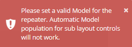
If the model is not specified in the Property Settings for the Repeater Control, the following message is displayed when you click the Repeater Layout Edit button.
-
-
Repeater Layout — Click the Edit button to specify the layout of the Repeater component. See Example: Create a Repeater below.
-
Tab Index allows you to specify the order of elements that are brought into focus when the user presses the Tab key on the rendered form. Allowed values are -1, 0, and positive numbers.
-
A value of "-1" removes the element from the sequential tab order preventing keyboard users from focusing on it.
-
A value of "0" means the element is ignored in the tab order, but that does not mean users cannot tab to and focus an element.
-
A value of "1" sets the element as the first item to gain focus when tabbing through the page followed by any higher numbered tab indices, followed by any other keyboard focusable elements such as buttons. required fields, and CAPTCHA.
The tab index value should not match another control's tab index.
-
A blank value (default) will not add a tab index in the HTML.
For more information, see https://html.spec.whatwg.org/multipage/interaction.html#the-tabindex-attribute and https://www.alexlande.com/articles/cross-browser-tabindex-woes/.
-
-
Visible makes the control visible or hidden.
-
Can be bound to a workflow argument or another control's value. This property is dynamic.
-
A property array string index requires single quotes, e.g., vm.models.xxx.CustomProperties['yyyyy'].
-
An expression can be used that evaluates to true or false, e.g., vm.models.myvalue==7 (>,<, !=, ==, >=, <=). If comparing to a string, it must be in single quotes.
-
(true and false must be all lowercase)
-
Example: Create a Repeater
-
Drag the Repeater Component into the Layout pane for the form.
-
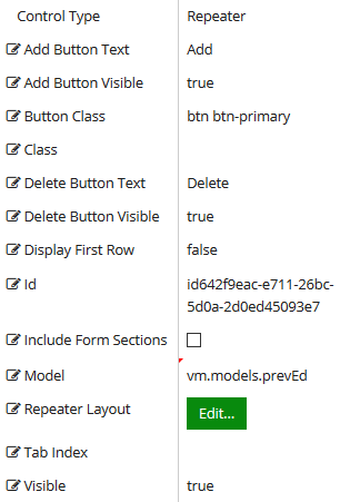
Specify the Control Property Settings for the Repeater. See Properties above.
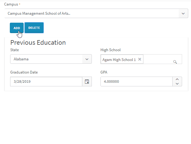
In our example, we specified vm.models.myPrevEd and accepted the defaults for the remaining properties.
-
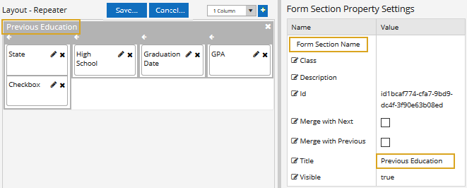
Click the Edit button for the Repeater Layout.
The Repeater Layout pane will replace the Form Layout pane, and the Components tab will show a subset of components that are available for use in a Repeater.
-
Select the number of Columns for the Repeater section and click the
 button.
 -
Drag Fields and/or Components into the Repeater Layout pane and specify the properties for the selected controls.
Bound values in the Repeater are addressed with the model value and a row index placeholder which is substituted when the form is rendered. For more information, see Binding Values in a Repeater Layout.
In our example, the Repeater has 4 bound entity Fields that are assigned the following model values in the Repeater Layout pane:
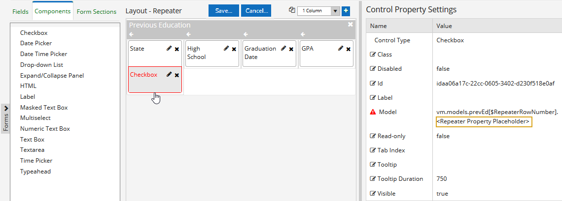
Example: Model Values for Entity Fields in the Repeater Layout Pane Field Control Type Model Value State Drop-down List vm.models.myPrevEd[$RepeaterRowNumber].State High School Single-select Search vm.models.myPrevEd[$RepeaterRowNumber].HighSchoolId Graduation Date Date Picker vm.models.myPrevEd[$RepeaterRowNumber].Gpa GPA Numeric Text Box vm.models.myPrevEd[$RepeaterRowNumber].GraduationDate When you drag a Component into the Repeater Layout pane, the model value in the Control Property Settings is populated with a <Repeater Property Placeholder> as shown below for a Checkbox. You must replace the placeholder with an appropriate value, e.g., "myCheckbox".

Example: Model Value for a Component in the Repeater Layout Pane Model Value Prepopulated value: vm.models.myPrevEd[$RepeaterRowNumber].<Repeater Property Placeholder> Edited/saved value: vm.models.myPrevEd[$RepeaterRowNumber].myCheckbox If you do not replace the placeholder, the following message will be displayed when you try to save the form: "Errors were detected in some controls, some form sections or the form. This may mean your form will either not render as expected or may malfunction completely. Do you still want to save?"
-
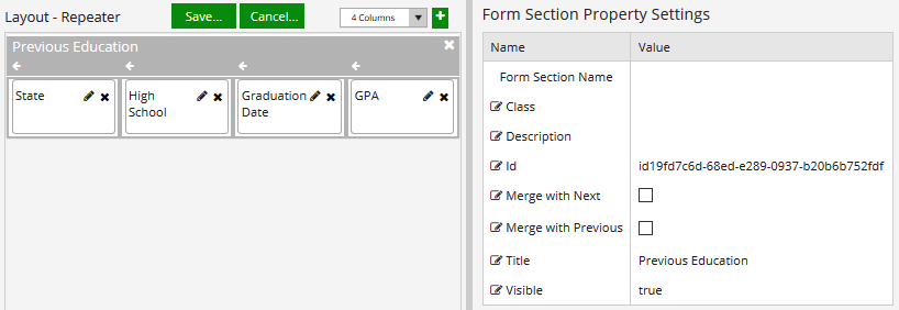
Click the section bar of the Repeater in the Layout pane and specify the Form Section Property Settings. In our example, we specified the Title "Previous Education". You can style the Repeater like any other form section. For more information, see Form Sections.
If you had two form sections in a layout, the first one could have "Merge with Next" checked, and the 2nd one would have "Merge with Previous" checked. In that case, the two form sections would have minimal space and no border between them. These properties work in pairs with one form section merging into the next.
-
Click the Save button above the Repeater Layout pane to save your design (or click Cancel to discard your changes). You will be returned to the form layout.
-
Add the form with the Repeater component to a sequence and test the rendered sequence.
-
Locate the workflow for the sequence in Workflow Composer and review the initial arguments for the sequence.
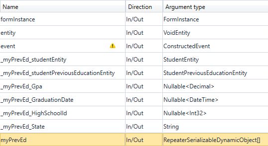
The myPrevEd argument of type RepeaterSerializableDynamicObject[] was created based on the model value in the Repeater Control Property Settings.
The dummy arguments _myPrevEd_studentEntity and _myPrevEd_studentPreviousEducationEntity of type StudentEntity and StudentPrevious EducationEntity were created.
The dummy arguments _myCheckbox, _myPrevEd_State, _myPrevEd_Gpa, etc. were created for the model values in the Repeater controls.
For more information, see Repeater Workflow Arguments.
Binding Values in a Repeater Layout
Bound values in the Repeater are addressed with the Repeater model and a row index placeholder which is substituted when the sequence is rendered.
Example
The model for the Repeater Control Property Settings in the is vm.models.myRepeater.
Any binding in the layout which needs to be row-relative (i.e., row-specific) needs to provide an index to the property.
For example, Renderer addresses a Text Box control in the Repeater Layout as:
vm.models.myRepeater[$RepeaterRowNumber].myText
$RepeaterRowNumber should be treated as case sensitive.
If a component property is not row-relative, that is to say it has the same value on every Repeater row, then it can just be a regular binding like vm.models.myLabel.
The Debug JSON will correspond to the path. In the example above, it would look like this:
“myRepeater”: [
    {
    “myText”: “This is text in row 1”
    },
    {
    “myText”: “This is text in row 2”
    }
]
This JSON shows “myRepeater” is an array of two objects, with each object having one property with a value. Please see https://www.w3schools.com/js/js_json_syntax.asp for more information on JSON syntax.
Repeater Workflow Arguments
When a sequence is saved for the first time, workflow arguments are created for a Repeater. The Repeater model is created as a RepeaterSerializableDynamicObject[], an array which works exactly like a SerializableDynamicObject[] with a DataDictionary to reference its values.
In addition, each of the model properties within the Repeater Layout also gets a workflow argument. However, these are dummy arguments. They are not used in either a form or the workflow and only tell Forms Builder the type of each Repeater Layout argument. They are used during deserialization of the JSON Entities string to workflow arguments and tell the deserializer what type to use.
The format of the dummy workflow arguments is:
_<repeater model name>_<control model name> => Direction: In/Out => Argument type of control model
In the "myRepeater" Text Box the additional argument created would be:
_myRepeater_myText of type String
For an Entity Field such as "State" from the Student Entity bound to a model "vm.models.myRepeater[$RepeaterRowNumber].State", the dummy argument would be:
_myRepeater_State of type String
Note: For Entity Fields you can also use the ObjectCopier<> activity to copy one object to another object without having to iterate through the object properties.
Repeater
You can use the Repeater component to create a collection of form sections that will be repeated or deleted when the user clicks the Add or Delete button. When the collection is repeated, it will show the fields (blank or initialized) to be filled in while retaining the input of the previously completed section. When the Delete button is clicked, the collection added last is removed.
The Repeater is basically a tabular component comprised of rows of components like Text Boxes, Drop-down Lists, etc. Each one of these components has all the properties that they have as individual components.
Control Property Settings
Rendered Component
-
Add Button Text is the value displayed in a link or button.
If this value is bound, it must be enclosed in double braces, e.g., {{vm.models.myLabel}}.
Allowable suffix characters: starts with letter, then letters, numerals, or underscore.
Mixed text and bindings are allowed.
-
Add Button Visible determines if the button is visible.
Must be true or false, or a binding beginning with "vm.models.".
A property array string index requires single quotes, e.g., vm.models.xxx.CustomProperties['yyyyy'].
An expression can be used that evaluates to true or false, e.g., vm.models.myvalue==7 (>,<,!=,==,>=,<=).
If comparing to a string, it must be in single quotes.
(true or false must be all lowercase)
-
Button Class is the CSS class for the button. The default is
btn btn-primary.-
The class
btn btn-primaryis a Bootstrap class that renders as a blue button with white text. -
You can customize the CSS Class by selecting a different Bootstrap class or adding your own class in a custom CSS.
-
-
Class is an optional CSS class (or space separated classes) added to the top level of the control. CSS specific to the control can be applied. The class must be defined in a Renderer CSS file. For more information, see Custom Styles.
-
Delete Button Text is the value displayed in a link or button.
If this value is bound, it must be enclosed in double braces, e.g., {{vm.models.myLabel}}.
Allowable suffix characters: starts with letter, then letters, numerals, or underscore.
Mixed text and bindings are allowed.
-
Delete Button Visible determines if the button is visible.
Must be true or false, or a binding beginning with "vm.models.".
A property array string index requires single quotes, e.g., vm.models.xxx.CustomProperties['yyyyy'].
An expression can be used that evaluates to true or false, e.g., vm.models.myvalue==7 (>,<,!=,==,>=,<=).
If comparing to a string, it must be in single quotes.
(true or false must be all lowercase)
-
Display First Row causes the first Repeater row to display even if there is no data supplied by a workflow argument.
-
The first bound array value will be created with empty property values.
-
Delete will not be available for the first row.
-
This is not dynamically bindable (cannot take an expression) and must be set before the form is rendered.
-
If data is defined for the first row, this actually does nothing except prevent the first row from being deleted.
-
(true or false must be all lowercase)
-
-
Id is required. It can be any valid JavaScript id attribute value. (Must start with a letter followed by 0 to 9, a to z, dash, or underscore characters).
-
Using a globally unique identifier (GUID) from GuidGen or GuidGenerator prefixed by at least one letter prevents a clash with any other id.
-
Id should contain only a to z (uppercase or lowercase), 0 to 9, dash, or underscore. It should not have spaces.
-
Binding is not supported for this property.
-
-
Include Form Sections causes each Repeater row to be enclosed in a form section panel.
-
When checked, each repeat is embedded in form section panels corresponding to the number of form sections in the Repeater layout. Normally, "Merge With Next" and "Merge With Previous" should be checked appropriately on each of the layout form sections so that each repeat is in one containing panel.
-
When unchecked, individual repeats are not in form sections; however, the entire Repeater control is by default unless it is merged with other form sections.
-
-
Model is required for binding to a workflow argument or another control. If the Model property is not specified, the component will be displayed on the form, but any values the user enters on the form cannot be captured or used in the workflow.
-
The Model value must always start with "vm.models.", e.g., vm.models.myArgument.
-
This value may initialize the control, and may be updated by the control, and if matched to a workflow argument, is available in the workflow (readable or writable).
-
Ensure your model argument is defined in your workflow for custom components if it is used in the workflow. Otherwise, a workflow argument is not required.
-
The casing of an argument used in the workflow MUST match the "vm.models." suffix casing.
-
If the model addresses CustomProperties or MultiValueCustomProperties, the property identifier string must be enclosed in single quotes, e.g., vm.models.myentity.CustomProperties['mycustomprop']
Construction of the model in the workflow is done by assigning data from a provider.
Models for controls used within the Repeater Layout that are row specific must use this model with a special array row number index, [$RepeaterRowNumber], followed by dot and the property name. For example, a Text Box control in the Repeater can be addressed with vm.models.myRepeater[$RepeaterRowNumber].myText An entity property within it can be addressed with vm.models.myRepeater[$RepeaterRowNumber].myEntity.myEntityProperty. $RepeaterRowNumber is replaced by the actual row number index during render.
These values will be available in workflow arguments in exactly the same way as other arguments without the vm.models. prefix.
Note the types of these arguments are defined as dummy underscore arguments (e.g., _prevEd_studentEntity) when the workflow is initially created. If modifications are made later, the workflow arguments can be updated following the same pattern.
For more information, see Repeater Workflow Arguments.
-
-
Repeater Layout — Click the Edit button to specify the layout of the Repeater component. See Example: Create a Repeater below.
-
Tab Index allows you to specify the order of elements that are brought into focus when the user presses the Tab key on the rendered form. Allowed values are -1, 0, and positive numbers.
-
A value of "-1" removes the element from the sequential tab order preventing keyboard users from focusing on it.
-
A value of "0" means the element is ignored in the tab order, but that does not mean users cannot tab to and focus an element.
-
A value of "1" sets the element as the first item to gain focus when tabbing through the page followed by any higher numbered tab indices, followed by any other keyboard focusable elements such as buttons. required fields, and CAPTCHA.
The tab index value should not match another control's tab index.
-
A blank value (default) will not add a tab index in the HTML.
For more information, see https://html.spec.whatwg.org/multipage/interaction.html#the-tabindex-attribute and https://www.alexlande.com/articles/cross-browser-tabindex-woes/.
-
-
Visible makes the control visible or hidden.
-
Can be bound to a workflow argument or another control's value. This property is dynamic.
-
A property array string index requires single quotes, e.g., vm.models.xxx.CustomProperties['yyyyy'].
-
An expression can be used that evaluates to true or false, e.g., vm.models.myvalue==7 (>,<, !=, ==, >=, <=). If comparing to a string, it must be in single quotes.
-
(true and false must be all lowercase)
-
-
Drag the Repeater Component into the Layout pane for the form.
-
Specify the Control Property Settings for the Repeater. See Properties above.
In our example, we specified the Model value vm.models.prevEd and accepted the defaults for the remaining properties.
-
Click the Edit button for the Repeater Layout.
The Repeater Layout pane will replace the Form Layout pane, and the Components tab will show a subset of components that are available for use in a Repeater.
-
Select the number of Columns for the Repeater section and click the
 button.
 -
Drag Fields and/or Components into the Repeater Layout pane and specify the properties for the selected controls.
Bound values in the Repeater are addressed with the model value and a row index placeholder which is substituted when the form is rendered. For more information, see Binding Values in a Repeater Layout.
In our example, the Repeater has 4 bound fields that are assigned the following model values in the Repeater Layout pane:
Example: Model Values for Controls in the Repeater Layout Pane Field Control Type Model Value State Drop-down List vm.models.prevEd[$RepeaterRowNumber].studentEntity.State High School Single-select Search vm.models.prevEd[$RepeaterRowNumber].studentPreviousEducationEntity.HighSchoolId Graduation Date Date Picker vm.models.prevEd[$RepeaterRowNumber].studentPreviousEducationEntity.Gpa GPA Numeric Text Box vm.models.prevEd[$RepeaterRowNumber].studentPreviousEducationEntity.GraduationDate -
Click the section bar of the Repeater in the Layout pane and specify the Form Section Property Settings. You can style the Repeater like any other form section. For more information, see Form Sections.
In our example, we specified the Title "Previous Education".
If you had two form sections in a layout, the first one could have "Merge with Next" checked, and the 2nd one would have "Merge with Previous" checked. In that case, the two form sections would have minimal space and no border between them. These properties work in pairs with one form section merging into the next.
-
Click the Save button above the Repeater Layout pane to save your design (or click Cancel to discard your changes). You will be returned to the form layout.
-
Add the form with the Repeater component to a sequence and test the rendered sequence.
-
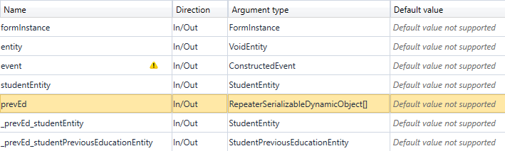
Locate the workflow for the sequence in Workflow Composer and review the initial arguments for the sequence.
The prevEd argument of type RepeaterSerializableDynamicObject[] was created based on the Model value in the Repeater control property settings.
The dummy arguments _prevEd_studentEntity and _prevEd_studentPreviousEducationEntity arguments were created based on the Model values in the State, High School, Graduation Date, and GPA fields.
For more information, see Repeater Workflow Arguments.
Binding Values in a Repeater Layout
Bound values in the Repeater are addressed with the Repeater model and a row index placeholder which is substituted when the sequence is rendered.
Example
The model for the Repeater Control Property Settings in the is vm.models.myRepeater.
Any binding in the layout which needs to be row-relative (i.e., row-specific) needs to provide an index to the property.
For example, Renderer addresses a Text Box control in the Repeater Layout as:
vm.models.myRepeater[$RepeaterRowNumber].myText
$RepeaterRowNumber should be treated as case sensitive.
If a component property is not row-relative, that is to say it has the same value on every Repeater row, then it can just be a regular binding like vm.models.myLabel.
The Debug JSON will correspond to the path. In the example above, it would look like this:
“myRepeater”: [
    {
    “myText”: “This is text in row 1”
    },
    {
    “myText”: “This is text in row 2”
    }
]
This JSON shows “myRepeater” is an array of two objects, with each object having one property with a value. Please see https://www.w3schools.com/js/js_json_syntax.asp for more information on JSON syntax.
When a sequence is saved for the first time, workflow arguments are created for a Repeater. The Repeater model is created as a RepeaterSerializableDynamicObject[], an array which works exactly like a SerializableDynamicObject[] with a DataDictionary to reference its values.
In addition, each of the model properties within the Repeater Layout also gets a workflow argument. However, these are dummy arguments. They are not used in either a form or the workflow and only tell Forms Builder the type of each Repeater Layout argument. They are used during deserialization of the JSON Entities string to workflow arguments and tell the deserializer what type to use.
The format of the dummy workflow arguments is:
_<repeater model name>_<control model name> => Direction: In/Out => Argument type of control model
In the "myRepeater" Text Box above, the additional argument created would be:
_myRepeater_myText of type String
If an Entity field had been used in the Repeater layout such as a StudentEntity State property bound to a model vm.models.myRepeater[$RepeaterRowNumber].studentEntity.State, then the dummy argument would be:
_myRepeater_studentEntity of type StudentEntity
The JSON with two rows in this case would look like:
“myRepeater”: [
    {
    “studentEntity” : {
        “State”: “CA”
        }
    },
    “studentEntity” : {
        “State” : “AZ”
        }
    }
]
Caveat: You cannot use a standard component to create an Entity field. Entity fields have extra properties to designate the type they are associated with. A component dropped from the Components tab does not. Doing this will cause errors during a transition, unless you manually create a workflow dummy argument which describes the type and allows the workflow argument RepeaterSerializableDynamicObject[] to be populated.