File Upload
You can use the File Upload component to upload files in a form.
When files are uploaded to Forms Builder, they are stored temporarily in a table named UploadStorage. To retrieve the files and use them in a workflow, use the GetAttachments activity.
In Forms Builder 3.4 and later, users can retry uploading a file using the same File Upload component when the webpage was reloaded, or the network connection was interrupted during the first try. In previous versions, an error was displayed.
Enhancements in Forms Builder 3.5
In Forms Builder 3.5, the code for the File Upload component was completely revised to provide new functionality such as the "Required", "Required Message", and "Tab Index" properties. When you drag the File Upload component into the Layout pane, the underlying functionality will be that of the new component. Existing forms that already include the File Upload component continue to execute the previous version of the code.
For existing forms, if you want to use the “Required” property, you need to:
-
Remove the File Upload component from the previously created form and then re-drag the component into the Layout pane.
-
Update the GetAttachments activity in the workflow with the new ControlIdentifier value.
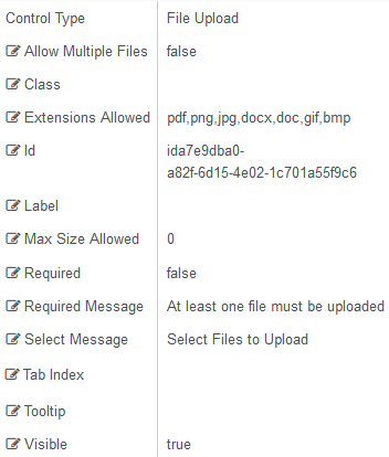
Properties
Control Property Settings
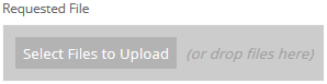
Rendered Component
-
Allow Multiple Files allows upload of multiple files.
-
If this value is bound, it must start with "vm.models."
-
A property array string index requires single quotes, e.g., vm.models.xxx.CustomProperties['yyyyy'].
-
An expression can be used that evaluates to true or false, e.g., vm.models.myvalue==7 (>,<, !=, ==, >=, <=).
-
If comparing to a string, it must be in single quotes.
-
(true and false must be all lowercase)
-
-
Class is an optional CSS class (or space separated classes) added to the top level of the control. CSS specific to the control can be applied. The class must be defined in a Renderer CSS file. For more information, see Custom Styles.
-
Extensions Allowed is the list of allowed extensions for upload, in comma separated format, such as pdf, docx, png. This must be a comma separated list of extensions (no spaces and no periods).
Note: If you use dynamic binding for the Extensions Allowed property, for example,
{{vm.models.myFileTypes}}, no server-side validation can be performed for potential security risks (such as uploading an .exe file). It is therefore your responsibility to perform these checks in the workflow. -
Id is required. It can be any valid JavaScript id attribute value. (Must start with a letter followed by 0 to 9, a to z, dash, or underscore characters).
-
Using a globally unique identifier (GUID) from GuidGen or GuidGenerator prefixed by at least one letter prevents a clash with any other id.
-
Id should contain only a to z (uppercase or lowercase), 0 to 9, dash, or underscore. It should not have spaces.
-
Binding is not supported for this property.
-
-
Label is the value displayed in the label.
-
If this value is bound, it must be enclosed in double braces, e.g., {{vm.models.myLabel}}.
-
Allowable suffix characters: starts with letter, then letters, numerals, or underscore.
-
-
Max Size Allowed is the maximum allowable size of an uploaded file in bytes. 0 (default) means unlimited.
-
If this value is bound, it must begin with {{vm.models. and end with }}.
-
Allowable suffix characters: starts with letter, then letters, numerals, or underscore.
Notes
-
If this control is bound to a model, depending on the product, the Max Size allowed may be limited by the service used to persist the attachment.
-
If you use dynamic binding for the Max Size Allowed property, no server-side validation can be performed for potential security risks (such overloading the server with very large files causing a "Denial of Service Attack"). It is therefore your responsibility to perform these checks in the workflow.
-
-
Required makes the control required and will raise a validation error on the form. It is set to false by default. If input is required, set the property value to true. The rendered form will display a red asterisk (
 ) next to the component.
-
Can be bound to a workflow argument or another control's value.
-
A property array string index requires single quotes, e.g., vm.models.xxx.CustomProperties['yyyyy'].
-
An expression can be used that evaluates to true or false, e.g., vm.models.myvalue==7 (>,<, !=, ==, >=, <=).
-
If comparing to a string, it must be in single quotes.
-
(true and false must be all lowercase)
-
-
Required Message is optional. It overrides the default "Required" message.
-
If this value is bound, it must be enclosed in double braces, e.g., {{vm.models.myMessage}}.
-
Allowable suffix characters: starts with letter, then letters, numerals, or underscore.
-
-
Select Message is the text to display in the upload button.
-
If this value is bound, it must be enclosed in double braces, e.g., {{vm.models.myMessage}}.
-
Allowable suffix characters: starts with letter, then letters, numerals, or underscore.
-
-
Tab Index allows you to specify the order of elements that are brought into focus when the user presses the Tab key on the rendered form. Allowed values are -1, 0, and positive numbers.
-
A value of "-1" removes the element from the sequential tab order preventing keyboard users from focusing on it.
-
A value of "0" means the element is ignored in the tab order, but that does not mean users cannot tab to and focus an element.
-
A value of "1" sets the element as the first item to gain focus when tabbing through the page followed by any higher numbered tab indices, followed by any other keyboard focusable elements such as buttons. required fields, and CAPTCHA.
The tab index value should not match another control's tab index.
-
A blank value (default) will not add a tab index in the HTML.
For more information, see https://html.spec.whatwg.org/multipage/interaction.html#the-tabindex-attribute and https://www.alexlande.com/articles/cross-browser-tabindex-woes/.
Note: When Tab Indexes are specified on a form with File Upload component, after the user uploads a file, the focus will shift to the default tabs (e.g., buttons) at the end of the form. The Shift+Tab key combination can be used to go backwards in the tab order to fill in any other items after the file upload or any time an item on the form is missed.
-
-
Tooltip is the value to display when hovering over the control's label.
-
If this value is bound, it must be enclosed in double braces, e.g., {{vm.models.myTooltip}}.
-
Allowable suffix characters: starts with letter, then letters, numerals, or underscore.
-
-
Visible makes the control visible or hidden.
-
Can be bound to a workflow argument or another control's value. This property is dynamic.
-
A property array string index requires single quotes, e.g., vm.models.xxx.CustomProperties['yyyyy'].
-
An expression can be used that evaluates to true or false, e.g., vm.models.myvalue==7 (>,<, !=, ==, >=, <=). If comparing to a string, it must be in single quotes.
-
(true and false must be all lowercase)
- When the control is not visible (usually based on some condition) and is a required field, the required field validation will not be triggered.
-
You can use the File Upload component to upload files in a form.
When files are uploaded to Forms Builder, they are stored temporarily in a table named UploadStorage. To retrieve the files and use them in a workflow, use the GetAttachments activity.
In Forms Builder 3.4 and later, users can retry uploading a file using the same File Upload component when the webpage was reloaded, or the network connection was interrupted during the first try. In previous versions, an error was displayed.
Enhancements in Forms Builder 3.5
In Forms Builder 3.5 and later, the code for the File Upload component was completely revised to provide new functionality such as the "Required", "Required Message", and "Tab Index" properties. When you drag the File Upload into the Layout pane, the underlying functionality will be that of the new component. Existing forms that already include the File Upload continue to execute the previous version of the code.
For existing forms, if you want to use the “Required” property, you need to:
-
Remove the File Upload component from the previously created form and then re-drag the component into the Layout pane.
-
Update the GetAttachments activity in the workflow with the new ControlIdentifier value.
Control Property Settings
Rendered Component
Properties
-
Allow Multiple Files allows upload of multiple files.
-
If this value is bound, it must start with "vm.models."
-
A property array string index requires single quotes, e.g., vm.models.xxx.CustomProperties['yyyyy'].
-
An expression can be used that evaluates to true or false, e.g., vm.models.myvalue==7 (>,<, !=, ==, >=, <=).
-
If comparing to a string, it must be in single quotes.
-
(true and false must be all lowercase)
-
-
Class is an optional CSS class (or space separated classes) added to the top level of the control. CSS specific to the control can be applied. The class must be defined in a Renderer CSS file. For more information, see Custom Styles.
-
Extensions Allowed is the list of allowed extensions for upload, in comma separated format, such as pdf, docx, png. This must be a comma separated list of extensions (no spaces and no periods).
Note: If you use dynamic binding for the Extensions Allowed property, for example,
{{vm.models.myFileTypes}}, then no server-side validation can be performed for potential security risks (such as uploading an .exe file). It is therefore your responsibility to perform these checks in the workflow. -
Id is required. It can be any valid JavaScript id attribute value. (Must start with a letter followed by 0 to 9, a to z, dash, or underscore characters).
-
Using a globally unique identifier (GUID) from GuidGen or GuidGenerator prefixed by at least one letter prevents a clash with any other id.
-
Id should contain only a to z (uppercase or lowercase), 0 to 9, dash, or underscore. It should not have spaces.
-
Binding is not supported for this property.
-
-
Label is the value displayed in the label.
-
If this value is bound, it must be enclosed in double braces, e.g., {{vm.models.myLabel}}.
-
Allowable suffix characters: starts with letter, then letters, numerals, or underscore.
-
-
Max Size Allowed is the maximum allowable size of an uploaded file in bytes. 0 (default) means unlimited.
- If this value is bound, it must begin with {{vm.models. and end with }}.
- Allowable suffix characters: starts with letter, then letters, numerals, or underscore.
Notes:
-
If this control is bound to a model, depending on the product, the Max Size allowed may be limited by the service used to persist the attachment.
-
If you use dynamic binding for the Max Size Allowed property, then no server-side validation can be performed for potential security risks (such overloading the server with very large files causing a "Denial of Service Attack"). It is therefore your responsibility to perform these checks in the workflow.
-
Required makes the control required and will raise a validation error on the form. It is set to false by default. If input is required, set the property value to true. The rendered form will display a red asterisk (
) next to the component.-
Can be bound to a workflow argument or another control's value.
-
A property array string index requires single quotes, e.g., vm.models.xxx.CustomProperties['yyyyy'].
-
An expression can be used that evaluates to true or false, e.g., vm.models.myvalue==7 (>,<, !=, ==, >=, <=).
-
If comparing to a string, it must be in single quotes.
-
(true and false must be all lowercase)
-
-
Required Message is optional. It overrides the default "Required" message.
-
If this value is bound, it must be enclosed in double braces, e.g., {{vm.models.myMessage}}.
-
Allowable suffix characters: starts with letter, then letters, numerals, or underscore.
-
-
Select Message is the text to display in the upload button.
-
If this value is bound, it must be enclosed in double braces, e.g., {{vm.models.myMessage}}.
-
Allowable suffix characters: starts with letter, then letters, numerals, or underscore.
-
-
Tab Index allows you to specify the order of elements that are brought into focus when the user presses the Tab key on the rendered form. Allowed values are -1, 0, and positive numbers.
-
A value of "-1" removes the element from the sequential tab order preventing keyboard users from focusing on it.
-
A value of "0" means the element is ignored in the tab order, but that does not mean users cannot tab to and focus an element.
-
A value of "1" sets the element as the first item to gain focus when tabbing through the page followed by any higher numbered tab indices, followed by any other keyboard focusable elements such as buttons. required fields, and CAPTCHA.
The tab index value should not match another control's tab index.
-
A blank value (default) will not add a tab index in the HTML.
For more information, see https://html.spec.whatwg.org/multipage/interaction.html#the-tabindex-attribute and https://www.alexlande.com/articles/cross-browser-tabindex-woes/.
Note: When Tab Indexes are specified on a form with File Upload component, after the user uploads a file, the focus will shift to the default tabs (e.g., buttons) at the end of the form. The Shift+Tab key combination can be used to go backwards in the tab order to fill in any other items after the file upload or any time an item on the form is missed.
-
-
Tooltip is the value to display when hovering over the control's label.
-
If this value is bound, it must be enclosed in double braces, e.g., {{vm.models.myTooltip}}.
-
Allowable suffix characters: starts with letter, then letters, numerals, or underscore.
-
-
Visible makes the control visible or hidden.
-
Can be bound to a workflow argument or another control's value. This property is dynamic.
-
A property array string index requires single quotes, e.g., vm.models.xxx.CustomProperties['yyyyy'].
-
An expression can be used that evaluates to true or false, e.g., vm.models.myvalue==7 (>,<, !=, ==, >=, <=). If comparing to a string, it must be in single quotes.
-
(true and false must be all lowercase)
-