Create and Customize the Chart for a View
You can create a chart for a view. Once you have created a chart for a view, the chart is empty until you add the data series and customize the chart.
Once you have created a chart, there are a number of options for customizing it. The options will vary depending on the type you selected for Chart Type (Bar, Column, or Pie).
Large amounts of data can increase the time it takes to display a chart. If there is data that you do not need or need to analyze, you can improve performance by filtering the data in the query. For example, if the view contains information for 2010-2015 and you only need data for the first quarter of 2014, you can add a filter in the query. For more information, refer to Filter Values in Grids.
Prerequisites
You must have either:
- Created the View
- Been given full access to the View by the staff member who created it
While you do not have to be authorized to use the Views tile or Views pages, you must have Views - Module Data authorization for the type of data in the View.
For example, to access Views that contain Admissions data, you must have Views - Admissions Data authorization.
The data that you add to a chart must be a Selected Property in the view. If you need to add Selected Properties to the view, refer to Specify the Data Displayed in a View.
Access Method
Select the Views tile > Explore Views tile > select a View in the Views Explorer window.
Once you have created a chart, select a view in the Views Explorer window > select Chart in the View Type list.
Procedure to Create a Chart for a View
-
Select in the View Type list and select Chart. A blank chart is displayed.
-
Select the option for Chart Type.
-
If you want to save your changes so that they are displayed the next time you select Chart in the View Type list, select Save on the toolbar.
The chart will be empty until you add the data series you want in the chart.
Procedure to Add or Edit a Data Series
You can specify a maximum of one data series if you selected Pie.
-
If the Chart Configuration window is not displayed, select Show Chart Configuration.
-
In the Data Series box, select Add Data Series.
-
Specify and select the appropriate values.
Value Action to Take Legend Name Specify the name you want in the legend for the series. Value Field Select the Property that you want aggregated. In most cases, this will be a numerical value. If you want to count a Property that is not a numerical value, select Id. Id will compare the Property in the Category field to every occurrence in your view and count the number of occurrences. Category Field Select the Property that Anthology Student uses to categorize the data before it is aggregated. Aggregate Select how the data is aggregated.
- average (Average the values.)
- count (Totals the number of occurrences found.)
- first (Use the first occurrence found.)
- max (Use the largest value found.)
- min (Use the smallest value found.)
- sum (Sums all of the values found and displays 0 if no values are found.)
- sum or null (Sums all of the values found and displays NULL if no values are found.)
-
If you selected Bar or Column for Chart Type, repeat steps 2-3 until you have added all of the data.
-
Select Apply. A progress bar indicates that the chart is being generated and then it is displayed.
-
If you want to save your changes so that they are displayed the next time you select the Chart in the View Type list, select Save on the toolbar.
Examples
| Example Task | Object in the Query | Values to Select for the Data Series | ||
|---|---|---|---|---|
| Value Field | Category Field | Aggregate | ||
| Chart the average cost of new and used books by publisher. | Books for Course | Price - New | Publisher | average |
| Price - Used | Publisher | average | ||
| Chart the number of documents by status. | Documents | Id | DocumentStatus.Name | count |
| Chart the number of tasks due on specific dates. | Tasks | Id | Task Due Date | count |
| Chart the total amount invoiced by lead sources. |
Lead Source Expense |
Invoice Amount | LeadSource.Name | sum |
Additional Tasks for Data Series
If you need to delete a series, select the X next to the data series in the Data Series box.
Procedure to Customize a Chart
-
If the Chart Configuration window is not displayed, select Show Chart Configuration. The Chart Configuration window displays.
-
In the Chart Configuration window, use the boxes shown to configure and customize the chart.
-
Select Apply. A progress bar indicates that the chart is being generated and then it is displayed.
-
If you want to save your changes so that they are displayed the next time you select Chart in the View Type list, select Save on the toolbar.
Options to Improve Readability and Analysis
The table provides information about some of the less common options for customizing charts that can improve readability and analysis.
| Chart Type | Options | Box in Chart Configuration | Action to Take |
|---|---|---|---|
| All types | Display a pop-up window with the value on the Category axis and the exact value on the Value axis. | General | Select the Show Tooltip check box. |
| Bar or Column | Change to a scale that is not linear. For example, there is a concentration of small values on a large scale and the small amounts are not visible in the chart. | Value Axis | Select the Logarithmic option. |
| Display totals of related values in a single bar or column when the sum of the values needs to be reviewed as well as the individual value for the series. | Data Series | Select the Stack option. | |
| Display the relative differences between the values for each Series. | Data Series | Select the Stack 100% option. | |
| Reduce the number of labels on an axis for sequential values. | Category Axis and Value Axis | For the axis, change the Label step from 1 to the nth number you want displayed. | |
| Rotate the labels on an axis so that they are easier to read. | Category Axis and Value Axis | For the axis, in the Rotate Labels By field. | |
| Sum the values for a range of dates at the interval you specify (such as the sum for a week or month). | Category Axis |
Specify the Minimum Date and Maximum Date in the range and select one of these options. - Fit (The best fit of the remaining options in this list is determined by Anthology Student.) - Weeks - Months - Years |
|
| Pie | Change the alignment of the labels so that each label is aligned with the slice. (Requires that the Show Data Label box is checked.) | General | Select Circle. |
| Change the alignment of the labels so that they are in the same column are flush left. (Requires that the Show Data Label box is checked.) | General | Select Column. | |
| Draw attention to one or more slices by separating the slices from the rest of the pie chart. | General | Under Explode Slices, select Add and select the slice that you want exploded in the list. | |
| Show the labels for the pieces of the pie chart. | General | Select the Show Data Label check box. |
Example of a Customized Chart
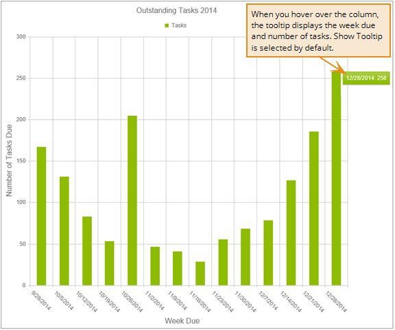
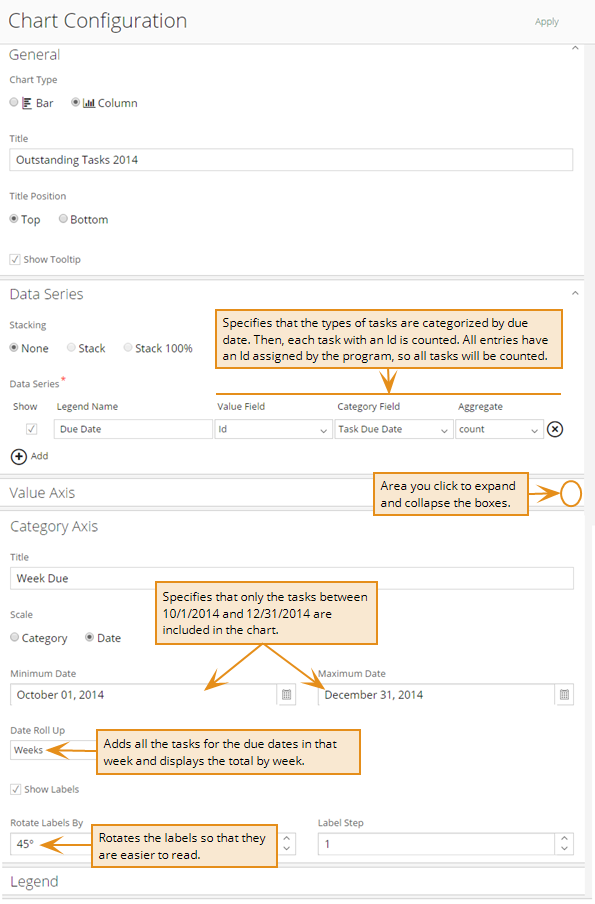
The example is a column chart that can be used to review the number of tasks due by week for the remainder of a year. The illustration for Chart Configuration shows the data series and customizations made to the chart.
The following illustration shows the chart that is generated for the example.