Accessibility
Anthology is invested in the usability and accessibility of all our products and services. Our products are generally designed and developed with internationally recognized Web Content Accessibility Guidelines (WCAG) in mind. Conformance to accessibility standards is further detailed in the accessibility conformance report (ACR), which is available upon request.
Semantic Structure and Navigation
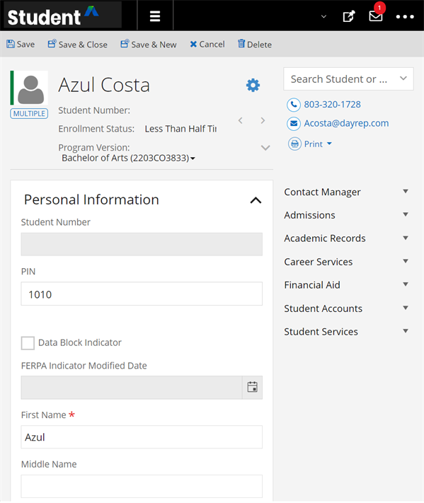
Anthology Student is structured logically by headings and landmarks. This gives users the ability to quickly understand the structure of any page in the application and easily move to the appropriate section of the page or content item.
Structure by Headings
Headings provide a clear and logical structure to content. They define the hierarchy of information on a web page, allowing users to understand how different sections relate to each other. Screen reader users often navigate through a web page using a list of headings. Properly structured headings allow them to quickly jump to relevant sections, making it much faster and more efficient to consume content. Clear headings also reduce cognitive load for all users. They provide visual cues that help users understand the content's context and flow, which is particularly important for long or complex pages.
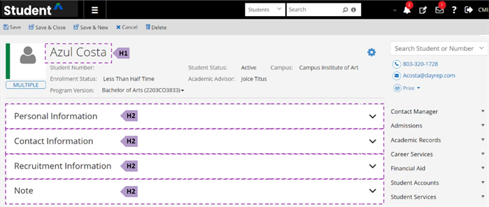
Structure by Landmarks
Landmarks are regions of a page that users of assistive technologies such as screen readers might want quick access to.
Landmarks in Anthology Student include Banner, Main, and Aside.
Keyboard Navigation
Anthology Student's product team works continuously to implement operable features using the industry standard keyboard interactions. We consider the requirements for each component, enabling users to perceive and operate the functionality correctly. Users can navigate the application sequentially using the keyboard. Interactive elements receive a visible focus border in the order content is visually arranged, preserving meaning and operability.
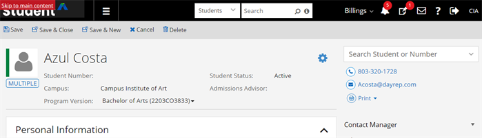
Skip to Main Content
Anthology Student includes a skip link as a mechanism to bypass blocks of content that are repeated on multiple pages — such as the header or navigation — allowing users to jump directly to the main content area. This feature enables keyboard-only and screen reader users to avoid repeated content and to navigate faster through the page.
Users can tab until the "Skip to main content" link receives the keyboard focus or get a links list with the screen reader and select it from the list.
Responsive Design
To best support users with different device sizes and those with low vision, Anthology Student's pages reflow when the browser zoom is used. When zoom is enabled to 150%, the content will be presented in one column so that there is no need to scroll in multiple directions.
High Contrast Mode
In Anthology Student, users can personalize their experience by leveraging device settings or third-party tools to change color and contrast settings (e.g., high contrast mode on Windows or color schemas provided by other tools).
Assistive Technology Compatibility
For the best experience with screen readers, we recommend these combinations:
| Screen Reader | Operating System | Browser |
|---|---|---|
| JAWS | Windows | Google Chrome |
| NVDA | Windows | Firefox/ Google Chrome |
| VOICEOVER | MAC OS | Firefox/ Google Chrome |
Accessibility Reference
The tables lists the methods for accessing user interface controls. For forward navigation, use the Tab key. For backward navigation, use the Shift + Tab keys.
| User Interface Controls | Keystrokes |
|---|---|
| Input Text Box | |
| Input Text Area | |
| Masked Input Text | |
| Numeric Input Text | |
| Check Box | Spacebar to check/clear a check box |
| Radio Button |
Arrow keys to navigate between the options Tab to leave the group of radio buttons |
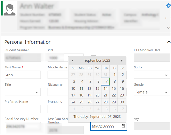
| Date Picker |
Alt+Down to open the calendar pop-up Left arrow key to highlight previous day Right arrow key to highlight next day Up arrow key to highlight same day for Previous Week Down arrow key to highlight same day for next Week Ctrl + Left arrow key to access previous month Ctrl + Right arrow key to access next month Ctrl + Up arrow key to access Month/Year/Decade and Ctrl + Down for reverse operation Enter key to select the Day/Month/Year/Decade Alt+Up arrow or Esc to close the pop-up |
| Time Picker |
Alt + Down to open the time slot list Up arrow key to highlight previous time slot Down arrow key to highlight next time slot Enter key to select the time slot Alt + Up arrow or Esc to close the pop-up |
| Drop-down/Combobox |
Alt + Down to open the list Up/Down arrow key to hover on list records Enter key to select the list record Alt + Up arrow or Esc to close the pop-up |
| Multiselect Drop-down List |
Alt + Down to open the list Up/Down arrow key to hover on list records Enter key to select/clear the highlighted record Alt + Up arrow or Esc to close the pop-up Left/Right arrow key to hover on previously selected records (Closed pop-up) Backspace to remove last selected record (Closed pop-up) Delete key to remove the highlighted record (Closed pop-up) |
| Multiselect pop-up |
Alt + Down/Spacebar to open the pop-up Tab key to navigate on the records Up/Down arrow key to hover on the records Spacebar to select the list records Enter key to select the Buttons Esc to close the pop-up |
| Search pop-up |
Spacebar/Enter key to Open Tab/Shift tab to access the grid records Space Key to check/clear the check boxes Enter key to select the Buttons/Hyperlinks Esc to close the pop-up |
| Tree view |
Up/Down arrow key to hover on items Right arrow key to expand the parent item Left arrow key to collapse the parent item Spacebar/Enter key to select the item |
| Grid toolbar (Icons/Buttons/Hyperlinks) |
Right/Left arrow key to navigate to toolbar Icons/Buttons/Hyperlinks Enter/Spacebar to select the Icons/Buttons/Hyperlinks |
| Grid toolbar drop-down (Split buttons) |
Right/Left arrow key to navigate to toolbar drop-downs (Split buttons) Alt + Down to open the list Up/Down or Space key to access the drop-down Enter key to select the list records Alt + UP arrow or Esc key to select the list records |
| Grid Pager |
Tab key to navigate on the Pager Enter key to enter into the inner pager elements Tab /Shift tab to access pager elements Esc key to exit from the pager elements |
| Collapse/Expand | Enter key to Expand/Collapse |
| Scheduler |
F10 to focus on the toolbar Right/Left arrow key to navigate to toolbar Icons/Buttons/Hyperlinks Down arrow key to enter into Scheduler calendar Enter key to open calendar event. Ctrl + C key to create a new class day |
| Buttons | Enter/Spacebar to select the buttons |
Examples
 Time Picker
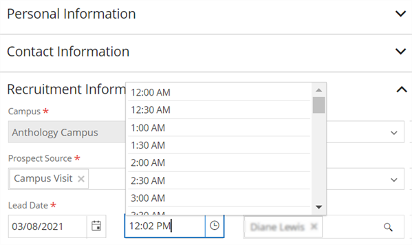
Improvements to Accessibility
Anthology made several enhancements to accessibility. Examples include:
-
Pages were enhanced to notify staff members when new page content is loaded.
-
Several enhancements were made to the Student Profile so that it is more accessible (such as improved navigation for tiles and accessible name for icons in the header).
-
Search in the command bar and search results page were enhanced to make them more consistent and easier to navigate.
-
The keyboard focus on message dialogs was enhanced with keyboard support for shortcuts to reach the grid links within the Student and Tasks tiles, and proper HTML structure was added for the links and the notifications menu.
-
Screen readers announce the selected object from the drop-down menu in the Global search box. This provides context to the screen reader user about the scope of the search.
-
Ctrl + S keyboard shortcuts can be used to save a Task.
-
When on a cell with a link, Enter AND Alt + O keyboard shortcuts can be used access links within the Student and Tasks tiles.
-
The Student profile print menu returns focus to menu when the dialog closes.
-
Student profile program version selection provides proper Role, ARIA-label, and ID.
-
The Degree Progress Audit course fulfillment dialog header displays the selected Course Code and Name for context and notifies the user after successful completion.
-
The Course Registration child grid cells announce column headers for screen reader users.
Accessibility was also improved for these common elements in the interface.
- Fields used to select dates and times
- Fields with a type ahead component
- Toolbar buttons on pages
- Tabs on pages
- Tree views
- Pop-up search
Feedback
We welcome your feedback on the accessibility of our products. Tickets for accessibility issues can be submitted at https://support.anthology.com/.